
***please note this was written a few weeks ago and pertains to the maps posted then**
How would you react if your hometown was bombed?
Yes, that was a shocking question that, hopefully, brought up some sort of emotion. Rage? Sadness? Fear? It is easy for us to be able to continue on with our daily lives and never fully be able to understand the horrors that other countries go through on a daily basis. We wake up, go to school or work, see our friends and family, eat good meals, and go to bed. Yes, some of us hit the daily bump in the road or have a particularly stressful workload one week, but we are never fearing for our lives.
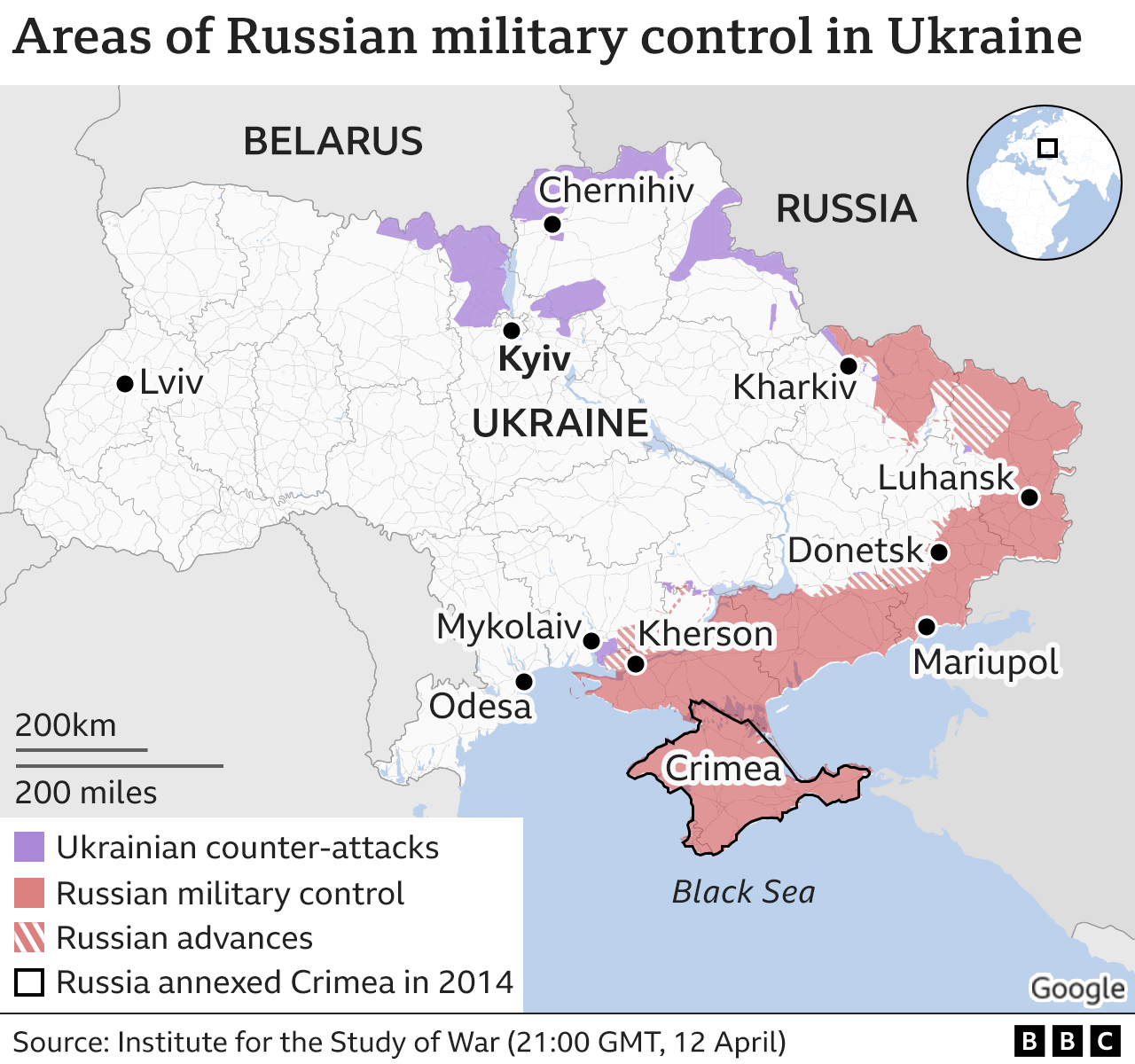
In Ukraine, however, the people’s daily routines have been turned into a constant state of fear as Russia invades them from all sides. Since the start of the conflict, maps have been popping up everywhere. So, when it came to finding a map for this week’s blog post, I found myself drawn to not one, but a series of maps that depict the ongoing struggle in Ukraine. I found these maps on BBC’s website and they were complimented by an article that provided further background to the maps. The source for these maps was BBC’s visual journalism team, who worked to put them the maps together with the article. What is the most fascinating about this collection of maps is that they are ongoing in terms of not only being updated in real time as the conflict continues, but also, we live in a world where technology allows for the continuous updating of maps, making them different from pervious wars where this was not an option. We are on day 34 of the Russian invasion of Ukraine. When I started writing this post a few days ago, the real time updates were vastly different than the ones I am about to tell you. As of today, Ukrainian forces have been able to retake key areas to the north-west of Kyiv. Russians advances around Chernihiv, Sumy, or Kharkiv stall, but port city of Mariupol looks likely to fall to
This deserves status of “Map of the Week,” or rather “Maps of the Week” not only because of their prevalence in society right now as a conflict but also because of how they are able to present the ongoing conflict. In understanding these maps from the perspective of the rhetoric of cartography and how it can tie into social issues, the first thing one must understand is how all maps are rhetorical. In Hartley’s Deconstructing of the Map, he makes the point that all maps create an argument when it comes to social and political issues.
What strikes me the most interesting about these maps is how simple and straightforward they are. There is no excessive key or too much detail in the maps – they all provide a visual to the struggle in Ukraine. The maps on BBC’s page have shown the Russian advances over the past few days, and there are individual maps that each depict Russian advances from each side of its attack on Ukraine. Because these maps are journalistic by nature, they have a need for being simple and straightforward. All journalistic maps serve a different purpose than, say, a scientific or geographical map. They are not done by trained cartographers; they are made by graphic artists who are making them based on the facts they are receiving from their reporters. It is not a bad thing that the maps I am discussing aren’t made by trained cartographic professionals, it allows us to see a different side of the mapping story. Not only is mapping just as much of an art form as a science, it also can be derived from the facts found from the world to paint a picture for those around them to gain a better grasp of the conflict.
One critique I have of these maps is that while I like how they have one or two very clear and direct arguments, they don’t really manage to encapsulate the true nature of this conflict. These maps don’t allow for us to get a sense of Ukraine’s response or fighting tactics and you can’t get a sense of how the communities are being affected or what struggles they are facing through the attacks. While we still need maps like this, they can’t give us a sense of what the people of Ukrainians are going through in terms of their resistance or how they are being treated on the ground. The maps are simple and easy to read but they also in a sense almost dehumanize the conflict and make it seem like a black and white issue. For example, one map has white, gray, and red used to depict the current situation of Russian progress slowing in the south. Areas shaded in red are areas under Russian military control. Areas shaded in with red lines symbolize the Russian advances. It has red arrows to demonstrate the direction of Russian advances in the south of Ukraine. Another map shows how Mauripool is surrounded by Russian forces. It is a zoomed in view of the city with shaded red areas meaning Russian Control and areas shaded in white lines depict where the Russian advances are. There are only four locations highlighted on the map: mass grave sites, the maternity hospital, the theatre, and the port. These two maps, while depicting a straightforward version of the conflict, fail to show us the underlying issues and struggles of the Ukrainian people. However, I will add that the maps are further explained in the article, so they are not standing alone. This does allow for readers to gain a better sense of understanding for the conflict as the maps work to supplement the article, but if the maps were to stand alone one would likely not get the same understanding.
So, how would you want the world to depict your hometown if it was in the middle of a conflict? Would you like the simplistic maps? Or would you want everyone to feel the same fear you’re feeling?
Team, The Visual Journalism. “Ukraine War in Maps: Tracking the Russian Invasion.” BBC News, BBC, 13 Apr. 2022, www.bbc.com/news/world-europe-60506682.
I really appreciate how at the beginning of your post, you situated the reader in the shoes of Ukrainians suffering from having their hometowns bombed and destroyed. I think you make really thought-provoking points about how the map is simple and easy to understand, however, it almost dehumanizes the conflict because it is so uncomplicated. I agree with your critique when you suggest how the map silences the struggles that Ukrainians are experiencing on the ground, and it is a very “one-sided” map. I say this because it shows Russia’s attacks on Ukraine, yet does not show how Ukraine is responding or fighting against Russian troops. In addition, I think this map is very relevant and a great choice for “map of the week” because it is a major conflict going on today.
Having never studied maps of bombsights, I found your choice particularly interesting and loved how you related it back to Harley. I really enjoyed your blog post becasue of how current the topic is. We have all seen maps of Europe before, and I’m sure there are some exciting maps from previous conflicts, but because the Ukraine crisis is so current, these maps are new to me. Seeing the maps as a political argument really opened my mind to the connection places have with conflict. Considering this is such a heated issue, the bombed spots were calculated and provided their own rhetoric. It would be exciting to look into why those places were attacked and learn more about who lives there and its motive.
I thought the question, How would you react if your hometown was bombed?, listed at the forefront of your post, was a great way to incite an emotional response to how I read the post because I had never previously viewed this conflict from a personal correlation. I completely agree that the map is straightforward to read and understand, and I thought your comparison playing on the fact of maps being like art was right in line with Hartley’s Deconstructing of the Map. Additionally, I thought your critique on how the map doesn’t “allow us to get a sense of Ukraine’s response or fighting tactics” was also very interesting because, for a map that is seemingly in support of Ukraine, it essentially frames the country as being defenseless (which is not the case as they have had one of the most profound actions of citizens taking arms in recent years).