Atlas of the Week: Illustrated Atlas of the City of Richmond

This Illustrated Atlas of the City of Richmond, created in 1887, presents a bird’s eye view of the city of Richmond. The atlas details many different structures, from buildings of commercial use to places of worship, railroad lines, sewers, property lines, monuments, and more. It uses color coding to differentiate the different structures and markers and notes the owners and inhabitants of the structures while also labeling neighborhoods by the names they still go by today. This atlas is really interesting given the current political climate throughout recent years in Richmond and the removal of many of the landmarks and monuments that are highlighted throughout the atlas. 

Beers, F. W. Illustrated atlas of the city of Richmond, Va. [Richmond, Va.: F. W. Beers, 1877] Map. https://www.loc.gov/item/2005630891/.

Posted in Atlases of the Week | Comments Off on Atlas of the Week: Illustrated Atlas of the City of Richmond

Map of the Week: Spending Per Student, By School District – Our Tax Dollars & Education

(Turner et al.)

Have you ever thought about where your tax dollars are going? How are they making a difference? Are they making a difference? This map, “Spending Per Student, By School District,” published by the National Public Radio organization, encapsulates the great divide that exists within the United States surrounding education. More specifically, the map deals with the spending inequalities between different school districts on a national scale, while it is typically addressed on just the state by state level. In calling attention to this national disparity, the creators of this map are speaking to an issue that is often overlooked and silenced, but in reality is much worse than many people could imagine. This map exposes school districts nationwide for using seemingly unfair practices when it comes to the distribution of money and resources, and highlights areas that take advantage of poor districts and communities in their handling of funds. Many other maps, such as one’s published by EdBuild, a company established to bring sense to the ways in which states fund public schools, follow suit. 

While researching the details of this map and various other ones that present similar information, I discovered that funding inequality nationally is worse overall than even the most unequal state in the U.S, which really puzzled me. How could the total disparity across 50 states be worse than an individual one? And the most unequal one? To answer that question, Rebecca Sibilia, EdBuild’s CEO and founder, explains that, “In states that do have a high number of students in concentrated poverty… they’re funding all education at a lower level than states that have a lesser number of students in concentrated poverty (Barnum).” So essentially, it comes down to the amount of money that our country dedicates to education being simply too little, which I’m sure most of the population is already aware of, yet the degree and scale of inequality may not be fully appreciated. From there, we are able to see the breakdown of the ways in which different states use their money and how they distribute it based on a variety of factors. So, while the amount of money awarded to schools on a national level is important to take into consideration when talking about inequalities, it ultimately depends on the state-level. 

In analyzing the map that I chose for this week’s blog, I realized that a great deal of Southeastern states seemed to be spending below the national average per student in most of their school districts, compared to more central states that seemed to be spending above the average. Despite these trends, there are definitely districts in both of these areas that are outliers, spending a great deal more or less than the average, but for the most part these different parts of the U.S seem to be drastically different in terms of educational spending measures. After doing some more research, I began to understand that the big determinant of how much money is allotted to a public school correlates to the property tax within that area. Which kind of makes sense, right? Because public schools are zoned, which means that the people living near the school are the ones who will be attending the schools. But, this brings up a dilemma. By basing the funding of the public schools on local property taxes, that automatically determines that certain districts will have more money than others because the value of properties varies from neighborhood to neighborhood, and with that comes tax revenues. So, while this may seem like a sensical way to allot money to these public schools, it presents an inequality right from the get go. 

It would be interesting to analyze the same map but of racial demographics, and observe whether or not a pattern is in place where traditionally marginalized groups fall into these areas with lower tax revenue and thus less money for their school districts. We already know there is a major achievement gap within education, largely due to institutional racism, because of systems exactly like this. Majority minority school districts are receiving less funding, and in turn, those students receive fewer resources, experience more teacher turnover, and go to school in uncomfortable and sometimes unsafe conditions.

To patch this inequality, some school districts have taken the authority in compensating for that imbalance by providing more funding to certain schools. But, according to Tramene Maye, the principal of Livingston Junior High School in rural western Alabama, this compensation is not the norm. And, most of the nation’s superintendents and principals will tell you that whether they can afford a year-round art teacher or new textbooks depends at least in part on the property wealth around them (Turner et al.). So ultimately, there is no quick fix for this nationwide spending dilemma over education, and rather it might need to be approached on a district by district level, as the current system works fine for some parents who live in districts that can spend lavishly in educating their children while others can’t. 

In analyzing this map and researching the background of educational funding nationwide, I found many silences. My sister is currently in the process of receiving her masters in education from The University of Virginia, and deals with the issues brought about by a lack of funding on a daily basis. After speaking with her about things such as where the materials she uses to decorate her classroom or the interactive materials she uses to teach her students comes from, I began to find cracks in the funding system. She informed me that many teachers spend their own, hard earned, money on things like markers, paper, classroom decorations, etc., which led me to question whether or not this map took that into account. I don’t think it does. Also, I thought about my own time in a city public school for elementary school and middle school and remembered organizations like the Parents Association (PTA) and other clubs that raised money for a variety of different things. While I understand that this map is speaking directly to the issue of national funding and it would be impossible to gauge the amount of volunteer work and teacher money that adds to the money a school has, I think that this became a silence within the map. I also think that the spatialization of education disparities speaks to an even larger issue that deals more with qualms of race, ethnicity, crime, poverty, and other environmental factors, based on location. It’s evident based on the map that areas dealing with the most disparities are those of lesser opportunity and privilege, which leads me to believe there is a follow up article and map to this one. 


Works Cited: 

Barnum, Matt. “New Map: School Funding Inequality, Often Measured by State, Is Far 

Worse Nationally than You Think.” The 74 New Map School Funding Inequality Often Measured By State Is Far Worse Nationally Than You Think Comments, 22 May 2016, https://www.the74million.org/article/new-map-school-funding-inequality-often-measured-by-state-is-far-worse-nationally-than-you-think/. 

Turner, Cory, et al. “Why America’s Schools Have a Money Problem.” NPR, NPR, 18 Apr. 

2016, https://www.npr.org/2016/04/18/474256366/why-americas-schools-have-a-money-problem


Posted in Maps of the Week | 1 Comment

Atlas of the Week: Improbable Places

Atlas Choice

Atlas of Improbable Places: A Journey to the World’s Most Unusual Corners by Travis Elborough

The following atlas was published in 2016 and is composed of geographical and informational maps of places across the globe, but its central focus happens to be some of National Geographic’s weirdest and most unusual – ranging from hidden labyrinths to deserted cities. This atlas is a rather intriguing take on what we see with traditional geographic maps, instead of noting the mass of the world that we wish to know about, it pin points and highlights nitty gritty, unspoken of, and unknown places. It’s interesting, because traditionally we see maps as our way of expanding our range of the world, but this atlas puts our focus on the miniscule – and we can argue that it certainly broadens our understanding of the spaces we occupy or don’t occupy by calling into attention what we often don’t pay attention to.

Posted in Atlases of the Week | Comments Off on Atlas of the Week: Improbable Places

Map of the Week!: The Lost Colony of Roanoke

Source: https://www.ancient-origins.net/sites/default/files/field/image/watercolor-map.jpg

Map of the Week! Critique

The Historical Context

In May of 1587, a group of 100-odd English settlers sailed across the Atlantic to the island of Roanoke. Located on the coast of what is now known as North Carolina, John White, an explorer and watercolor artist, arrived in the summer of that same year, with hopes of establishing a functioning colony like many of the waves of European settlers had hoped for in the recently discovered, supposedly-promised land of resources and prosperity. The island of Roanoke had already been previously explored by the English the year prior but had to sail back to the mainland to gather more provisions before attempting to permanently settle on the island. However, this issue remained unresolved as within the first few months of their stay, the colonists supposedly begged White to return to England and bring back even more supplies. The group of colonists faced hardships of not being fully equipped to settle on new land due to drought and natural deterrents, but also dealt with aggressive two-sided conflict with nearby indigenous tribes. White left in August, just around one month after the group’s arrival. What was meant to be a short period of time away turned into a three year departure, due to England’s looming international war conflicts with Spain as well as possible French pirate attacks out on sea. John White did not return until August of 1590, only to realize the colonists, including his daughter, Eleanor White Dare, and granddaughter, Virginia Dare, were gone. What was left of the colonists, who showed no signs of leaving hastily or forced, was a single word carved into a wooden fence post: Croatoan.

Theorizing and the Possible Truth

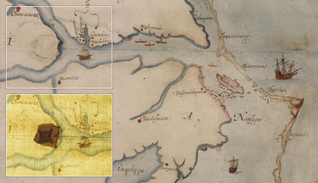
While stories of missing and deceased colonists were consistent throughout early colonial American history, it is the colony of Roanoke that lives on as an exceptional historical mystery, due to the fact that the whereabouts and the fate of the colonists White left behind were never substantially, singularly proved. Historians have debated and offered extensive explanations as to what had happened to the lost colony, and even White attempted to sail a little further south along the coast to what is now known as Hatteras island in order to find the colonists himself before moving back to Europe and passing away another few years later. No mass graves have been found that could be linked to the lost colony, and the theories that many have proposed have possible explanations that range from being killed by local tribes in the area to even outlandish suspicions of aliens and cannibalism. However, one theory and one approach towards discovering the truth behind Roanoke involves the following map, created by John White, detailing the coast of North Carolina, and includes both Roanoke island and Hatteras island. While some have noted the map has stellar accuracy to current satellite imagery of the same area, taking into account natural changing coastlines, what is most intriguing and discussed about the map is that there is a four-pointed star shape hidden underneath a small patch of paper, seen in the zoomed in image of the map above. One prominent theory about this detail of White’s map is that perhaps it represents a fortified location in which the lost colony resettled, moving inland due to the struggles they were facing on the island. Other theories suggest that White had actually known their whereabouts and covered the shape to hide from English spies.

Counter-mapping, Deconstructing Maps, and Why Award This ‘Map of the Week’

The watercolor map created by the Roanoke colony’s governor deserves a spotlight as ‘Map of the Week’ due to the way it serves as a rather intriguing artifact that can either define or redefine an American history. What is most interesting about the Lost Colony of Roanoke goes beyond the settlers’ disappearance, but instead is rooted in the unknown. As much as theorists can expand upon or cultivate new theories regarding what happened to the 100-odd English settlers that White left behind, they still remain as theories. In our discussions of counter-mapping, utilizing maps to challenge the notion of maps as a whole, this map and its relation to a renowned historical mystery plays well into how we learn that maps are fluid, are reimagined, and are transformed throughout their existence. A map, especially one that is strictly geographical and locative, by its technical nature should reveal to us the relationships of spaces and the things that occupy that space. White’s map does this to an extent, however, the small patch of extra paper and the figure hidden beneath it reveals a plethora of possible secrets and relationships that we are unable to fully uncover. Maps can be privileged in nature; what I mean by this statement is that, in example, White’s map is one of few primary sources regarding the colonists of Roanoke and the potential uncovered truth of where that community’s whereabouts may lie. He claims a sense of authority with this map. His identity as the map maker and a map maker in this context is unparalleled, because we lack significant information regarding the beginnings of the colony’s existence up till and beyond their disappearance. The Roanoke map privileges on colonial expansion and exploration, because we are now relying on this artifact to provide possible answers, thus erasing the potentials of other narratives. What is most ironic however, is that this map counters that predetermined contract between maps and viewers, because while it does reveal details about the location it visualizes, it does not offer us the clear answers we need. We may see White’s map as a great historical artifact of information we don’t have full access to, but it also gatekeeps it to an extent as well. We’ve discussed previously the dangers and limitations of visual mapping and visual rhetoric as a whole. It’s important to understand the intention of map-makers and the visual components they offer us, but in this case, what is being offered and what is being included, only adds to the mystery. It does not solve it.

With historical, colonial exploration style maps such as this one, they are meant to provide us with first-hand information and experiences of what it was like to interact with land in that time given the technology they had and the knowledge they had of the world around them. They allow us to reimagine a world in which discovery was at its peak; for us, it is the excitement of being able to trace back places to their origins of being understood as a place. This style and era of mapping is our way of creating and introducing new forms of the relationship between people and place. We have discussed before the problematic nature of defining land in this way, however, White’s map and his perspective of the region of the colonists’ disappearance is incredibly intriguing, because of the possible conclusions that may come from it. We may look at this map and think: White deliberately hid the star shape, White may have made a mistake, White may know what it represents, he may not have, or perhaps… it may not represent anything in relation to the colony at all. 

Blog Link

https://www.lost-colony.com/gallerymain.html

A website exhibiting various maps and map-creators of the same regional location, all relating to the Lost Colony.

Works Cited

Bergara, Ryan. The Mysterious Disappearance of Roanoke Colony. YouTube. YouTube, 2017. https://www.youtube.com/watch?v=xjmXzYdxuTQ. 

Emery, Theo. “Map’s Hidden Marks Illuminate and Deepen Mystery of Lost Colony.” The New York Times. The New York Times, May 4, 2012. https://www.nytimes.com/2012/05/04/us/map-markings-offer-clues-to-lost-colony.html. 

Goetten, Katelyn. “Map of the Week: Lost Colony of Roanoke.” Ubique, 2021. https://ubique.americangeo.org/map-of-the-week/map-of-the-week-the-lost-colony-of-roanoke/. 

“John White’s Attempt to Rescue the Roanoke Colonists.” National Humanities Center. Accessed February 11, 2022. http://nationalhumanitiescenter.org/pds/amerbegin/exploration/text6/white.pdf. 

Mahnke, Aaron. “Making a Mark.” Episode. Lore Lore, no. 28, February 22, 2016. 

“Roanoke Colony Timeline.” World History Encyclopedia RSS. Accessed February 11, 2022. https://www.worldhistory.org/timeline/Roanoke_Colony/. 

Wood, Karenne. “The Roanoke Colony.” South Atlantic Review 77, no. 1/2 (2012): 178–79. http://www.jstor.org/stable/43738980.

Posted in Maps of the Week | Comments Off on Map of the Week!: The Lost Colony of Roanoke

Map of the Week: Map of Chicago, Rapid Transit Lines

Have you ever seen a subway map? Do you ever wonder about the history of transit and the location the map is displaying? The “Map of Chicago rapid transit lines (1926)” depicts a historical period in Chicago when private business was a significant factor in developing Chicago’s early modern transportation systems. For example, by 1900, there were at least 17 distinct street railway enterprises and four elevated agencies each with their individual stations, stops, materials, and expenses.

As a result of private enterprise’s involvement in the development of Chicago’s landscape, early transit competition emphasized systematization of retailing, manufacturing, and services in the center of Chicago’s main business district, known as the “Loop.” The “Loop” is “a half-mile-square section of downtown Chicago” consisting of almost 40 percent of the total assessed land value and has “L” lines (History).

This map relates to Dennis Wood’s The Power of Maps. Wood believes maps don’t just represent reality, they shape it. Moreover, Wood explains how maps can invoke a vision and create a sense of hope. Another aspect of Wood’s analysis is that he demonstrates how maps present the audience with what seems like straightforward pieces of data and truth, but they can erase the complexity of past contexts (Wood). The development of Chicago’s transportation system in the 1920s had many cultural and economic effects. For example, Chicago residents decided to distance themselves from the maelstrom of the Loop. On the other hand, upper class Chicago citizens lived in a suitable carriage ride away from the center of downtown. Individuals who could afford to live in these conditions, chose to live in lower density locations (History).

Consequently, the “Map of Chicago rapid transit lines (1926)” conveys the concept that maps are social constructions. Capitalism is presented at the core within this map. Wealthy private business owners bought and designed the new landscape of Chicago’s transit. The results were that lower class citizens faced the challenge of living in lesser developed areas than they already were. On the other hand, the upper class business owners and citizens profited on the new Chicago transit and the businessmen gained even more wealth (Wood). 

Similar to Wood’s The Power of Maps, Deconstructing the Map by JB Harley emphasizes how context, conditions, and histories outside the map are just as important as what is in the map itself. Maps function as codes and structures within the mapmaker’s creation (Harley). In relation to the “Map of Chicago rapid transit lines (1926),” by the 1920s, competition, disputes over consolidation and fares, poor management, and the need to satisfy stockholders with profits were causing challenges for the city of Chicago. The city attempted to get the necessary help to buy the transit business and make them public, but ultimately failed. However, the city of Chicago was successful in reframing policies that would make the private enterprises develop better services (History). 

The “Map of Chicago rapid transit lines (1926)” relates to Harley’s point of reflection that all maps are rhetorical. Maps make an argument, in which they function as texts. Moreover, maps depict the tensions between technical cartographic principles amongst social and cultural values. This specific map engages with social and political issues such as how private businesses’ emphasis on capitalism affected minority groups and other enterprises. Within the context of Chicago’s landscape and architecture in the 1920s, maps are shaped by cultural and social values. Maps legitimize potentially problematic aspects of power and social relationships as private businesses were able to capitalize on the suffering of lower class citizens in poorly developed areas (Harley). 

As a result of “L” lines being incorporated into Chicago’s landscape and map, throughout the 1920s, the number of cars in Chicago increased significantly. This amount of cars caused the roads in Chicago to become clustered and The Cook County Superintendent of Highways gave a warning that construction of roads was not up to date with auto registration. Nonetheless, Chicago decided in favor of automobiles in the 1920s. Consequently, the “Map of Chicago rapid transit lines (1926),” according to Crampton and Krygier’s “An Introduction to Critical Cartography,” functions as a social process of persuasion and rhetoric. The “L” lines are visually appealing on a map to the people of Chicago. This map demonstrates to the audience that Chicago’s landscape has become wider and there is more space for automobiles to travel. Thus, the “Map of Chicago rapid transit lines (1926)” displays a powerful representation of economic opportunities and aspirations, despite the fact that the certain citizens in Chicago suffered and that the environment is being affected negatively (Crampton & Krygier. 

Finally, historical cartography like this must be researched to discover some of the effects of “L” lines. For example, the “Map of Chicago rapid transit lines (1926)” has the title at the bottom stating: “Rapid Transit Lines … Fast-Reliable,” which is supposed to impress the user with efficiency. And certainly, the transit lines on the map demonstrate just how fast and conveniently local Chicago citizens can travel from one place to another using local transportation. But there are major consequences to this efficiency. These new transit lines and methods changed Chicago’s architecture and housing demographics as prices became more expensive. Also, the “L” lines created more space for automobiles, which caused Chicago roads to become too crowded and filled with pollution.

Works Cited

“Chicago: Transit Metropolis.” National Museum of American History, 25 July 2018, https://americanhistory.si.edu/america-on-the-move/essays/chicago-transit-metropolis#:~:text=The%201920s%3A%20Transit%20in%20Transition&text=Chicago%20residents%20increasingly%20chose%20to,offered%20mobility%20to%20many%20more. 

Crampton and Krygier, “An Introduction to Critical Cartography,” 11-33 Kim, “Critical Cartography 2.0,” 15-25

Harley, “Deconstructing the Map,” 1-20 Special Issue of Cartographica (2015), 1-28, 41-53

Turnbull, “Maps and Theories,” 1-11

Wood, The Power of Maps, 4-27


Posted in Uncategorized | 1 Comment

Atlas of the Week: An Everyday Queer New York

The Maps – An Everyday Queer New York (jgieseking.org)

I chose to highlight a project by Jen Jack Gieseking called, An Everyday Queer New York for our Atlas of the Week. This project highlights the city of New York, the LGBTQ+ community, and is a great example of countermapping. The maps highlight popular spots for the LGBTQ+ community to meet within the city. These meeting spots range from bars, places to meet for political and social activism, LGBTQ-run businesses, and more. Gieseking’s intention is to portray the LGBTQ+ experience accurately while demonstrating diversity within the city. If you check out Gieseking’s website, he offers two different maps, teaching and research tools, and a link to his book, An Everyday Queer New York, where you can learn about the LGBTQ+ experience in a large, diverse city.

Posted in Atlases of the Week | Comments Off on Atlas of the Week: An Everyday Queer New York

Map of the Week: The Executive Abroad


The Executive Abroad – American Panorama

In our generation, it is hard to imagine living in a world with limited travel options. International travel by plane only became accessible to the public in the mid 1900’s. At this point in history, the world had already been through two world wars and numerous other global conflicts. Take a minute to consider how limited travel options potentially impacted foreign policy and relations. Now, travel has evolved to allow accessible plane service for our Presidents to fly out to anywhere in the world instantaneously. Do you think previous conflicts could have been avoided if global leaders were able to meet face to face? What are the positive and negatives to the addition of fast, accessible global travel from a political and social perspective?

The Executive Abroad is a map found within American Panorama, a project by the Digital Scholarship Lab at the University of Richmond. American Panorama sheds light on American history, both past and present social issues, and important political topics through interactive mapping techniques. The Executive Abroad highlights the international travel of all presidents and secretaries of state. The map is important for understanding the evolution of travel and its connection to the United States’ evolving stance on foreign policy.

Except for Theodore Roosevelt and Winston Churchill, presidential travel was virtually non-existent before Franklin D. Roosevelt. FDR was the first president to officially travel by plane outside of the United States with the intention to meet with Churchill in North Africa to discuss strategies for World War II. Following FDR, as social and political issues began to become increasingly more prominent on the global scale, presidents began to place an emphasis on the importance of international travel. The map shows this spike in travel, representing the United States intention to establish themselves as an important international power. Placing Washington D.C. at the center of the map is a further representation of this, intentionally mapped at the center of the globe to affirm America’s strength, power, and influence on the international scale.

In addition, the map shows the frequency of visits to each geopolitical region over time. Through careful observation and research, viewers can see how each president and secretary of state approached their time in office through their frequent travel trends. Their destinations reflect the intentions of each president, some of their most important policies, or might even be the result of major events occurring during that specific time. For example, following September 11, 2001, George W. Bush had a greater number of visits to Western Europe where he addressed issues regarding the War on Terror. By displaying the number of visits, categorized by both color and density, viewers can pinpoint the important policies of each president or the critical international events of that time.

Visually, the map is colorful and fun to interact with. The bright colors contrast the navy-blue background, the separate colors representing different number of visits. The choice of colors is interesting, with yellow representing the densest areas of travel. Lighter colors are typically an unorthodox choice for representing dense areas, but the Executive Abroad takes a different and unique approach, using lighter colors to signify the frequently traveled locations. Another interesting feature of the map is a “How To Use” feature that proved to be both helpful and reliable. The guide instructs viewers how to select presidents or secretaries and explains what the graph shows. The short description is useful, allowing users to feel well-versed and knowledgeable upon opening the map.

Lastly, to critique the visual appearance of the map, it is important to discuss the proportions of the globe and how they differ from what we are normally used to seeing on traditional portrayals of the world. We can see certain areas of the map, like East Asia, are disproportionate to their actual size on a “traditional” map. Australia, which is portrayed on the left side of the globe, is completely disproportionate to both its size and location. I wonder if this is purposeful and possibly artistic. Since the cartographers had an intention to place Washington D.C. in the middle of the map, they knew this would skew the proportions. Again, I wonder if the intention was to place emphasis on the United States, making its scale reliable and near perfect while skewing other nations and areas to whatever fit the mold. Another small critique would be how the names of the president circulate the globe, making some of them difficult to read when they are upside down. It makes it challenging to find a president, but if you follow the years along the side, it makes it much easier, but you must be well-versed in knowing when each president served in office.

Overall, the map does a fantastic job exploring the evolution of both travel and the United States’ evolving role as an international superpower. This newfound idea of power, represented through travel, dismissed the potential power of other nations. It’s important to draw attention to the cartographers’ choice to make the president the central unit of the map. By doing so, the map is not only placing emphasis on the power of international travel, but the power of each individual president. Indicating through visual rhetoric that these presidents are the most important feature of the map is a symbol of individual power. Assuming the centrality of the presidency has its benefits, but also questions the American system of power and democracy. The U.S. prides itself on maintaining democratic values, but this map gives us a different look, one that portrays the presidents as holding a higher status. The United States crossing into international territory demonstrates their need to be in control and at the forefront of foreign policy. These presidents not only wanted to maintain peace but spread American ideas of democracy and stability. Traveling internationally reinforced these values, placing the United States at the top of the global food chain.


Posted in Maps of the Week | Comments Off on Map of the Week: The Executive Abroad

https://www.bacartography.org/autoras 

For our Blog of the Week, I chose to highlight the Borderlands Archives Cartography (BAC) website. The small site focuses on discussing harmful rhetoric surrounding the U.S.-Mexico border throughout the 19th and 20th centuries. On the BAC, authors Maria Álvarez and Sylvia Fernández provide a digital map that they update with newspaper articles on border relations. The map illustrates the differing perspectives of the U.S.-Mexico border over three distinct periods of time from varying geographical points.

Posted on by Ceara Nolan | Comments Off on Blog of the Week: Borderlands Archives Cartography

Atlas of the Week: EJAtlas

https://ejatlas.org

The atlas I chose for our “Atlas of the Week” is the EJAtlas. Created by multiple environmental justice organizations around the world, the EJAtlas is a platform that catalogs local environmental impact studies and marks their findings on an interactive map. The EJAtlas specifically focuses on illuminating the detrimental impacts of mining, industrial plants, fracking, etc. on marginalized communities. On EJAtlas’s website, viewers can see the locations of harmful environmental practices, click on various community studies, and overview the relationship between high levels of environmental disturbance and local health.

Posted in Uncategorized | Comments Off on Atlas of the Week: EJAtlas

Map of the Week: WFP 2020 Hunger Map

WFP-0000118395

Introduction

In the last two years, the rate of undernourishment and chronic hunger has universally increased. As the pandemic lingers, countries in every part of the world are experiencing produce shortages, dealing with an increasing homeless population, and attempting to fix unforeseen weaknesses in their food system. The recent attention towards the hunger crisis reminds us now, more than ever, that undernourishment is a broad, spatial issue that affects communities globally. The vastness of chronic hunger, as exhibited in the pandemic era, makes it a prime social issue to illustrate through maps.

The map I chose for our “Mappenstance” blog’s Map of the Week is the World Food Programme’s (WFP) 2020 Hunger Map. The World Food Programme is a division of the United Nations (UN) that focuses on eliminating chronic hunger, providing nutritional provisions in times of global crisis, and promoting food security on-site and in the government worldwide. Outside of their direct assistance to regions in need, the World Food Programme also works on fostering a deeper understanding of global hunger through public reports and media campaigns. One of their main educational tools is the annual “Hunger Map” report. Starting in 2018, the World Food Program’s Hunger Map report shows a color-coordinated outline of countries with varying percentages of undernourishment. Additionally, the maps outline trends in global hunger and predict statistics for the next ten years.

Maps & Global Hunger 

The World Programme’s 2020 Hunger Map addresses chronic hunger in different regions. What initially attracted me to the issue of world hunger is how it serves as an indicator for deeper societal concerns. Hunger maps not only reflect lapses in nutrition and food security but also denote an underlying cause and effect relationship. Behind the labels of “undernourished” and “chronically hungry”, there are foundational problems that emerge through nutrition map data. According to the World Food Programme, “political conflict, climate change, natural disasters, inequality and -most recently- the COVID-19 pandemic” together form the bedrock of global hunger. When we look at the World Food Programme’s map, we are not evaluating an isolated concern, but rather beginning a discussion on the roots of the data.

Map Analysis

The 2020 Hunger Map illustrates a three-year collection of data from 2017 to 2019. Specifically, the World Food Programme’s map charted the prevalence of undernourishment, also known as PoU, by percentages in the total population. Individual country statistics were then assigned a color that coordinated to a percentage range for the PoU: blue for less than 2.5%, green for 2.5% to 5%, yellow for 5% to 14.9%, orange for 15% to 24.9%, red for 25% to 34.9%, and maroon for 35% and above. At the bottom of the map, the World Food Programme stated that their definition for undernourishment was “the condition in which an individual’s habitual food consumption is insufficient to provide the amount of dietary energy required to maintain a normal, active, healthy life” (WFP). To decrease the chances of miscalculations and improper reporting, the World Food Programme also calculated their data as three-year moving averages.

When viewing the map, the territorial boundaries between what western society considers to be developed and undeveloped, first and third world are especially evident despite the international bounds of the UN and WFP. While the United States, Canada, Russia, China, Australia, and the entirety of Western Europe are mapped in blue (less than 2.5% of the population suffering from undernourishment), Africa, South Asia, the Middle East, and regions of South America are largely labeled with yellow, orange, and red. Although the organizations lack a dominant Western perspective and have no propagandistic intentions, the UN and WFP’s objective to enlighten the public on chronic hunger was subverted by the persuasive visual rhetoric of maps. The topic of visual rhetoric and the “rhetoric of display” is discussed in Lawrence Prelli’s Rhetorics of Display. As stated in the introduction of Prelli’s book, “the rhetoric of ‘manifestation’ and ‘showing’ – the rhetoric of display – is the dominant rhetoric of our times…An important dimension for rhetorical studies of display is how visual displays influence our attitudes and feelings, shape and reinforce our beliefs and values, and constrain what we write, say, or otherwise think about them” (Prelli 9, 10). Utilizing the rhetoric of display, the 2020 Hunger Map reinforces the cultural and regional stereotypes of so-called “undeveloped” societies. Although unintentional, the map promotes preconceived Western notions about areas considered to be “third world” – regions that, with continued visual rhetoric, will forever be linked to the label of  “undeveloped”. Additionally, by stating that the number of undernourished individuals will reach 840 million in the next ten years without social intervention, the World Food Programme is upholding the notion that some regions need the assistance of the “first world”.

Conclusion

The inadvertent rhetoric spawned from the 2020 Hunger Map proposes a broader conversation about maps and their role in social justice campaigns. On one hand, maps stand as incredible tools capable of turning once fathomless global issues into widespread movements for change. From an alternate perspective, the schematic portrayal of social issues over-simplifies the complex reality that resides behind all map data. Reports like the Hunger Map increase understanding about undernourishment, spark donations, and boost media coverage, yet the broad spatialization of issues with no alternate context unintentionally reinforces longstanding stereotypes. The World Food Programme’s 2020 Hunger Map presents an interesting quandary to reflect on as we continue studying maps: Does the benefit of public awareness and support outweigh the potential of fortifying harmful cultural conventions?


Posted in Uncategorized | 1 Comment