
Introduction
In the last two years, the rate of undernourishment and chronic hunger has universally increased. As the pandemic lingers, countries in every part of the world are experiencing produce shortages, dealing with an increasing homeless population, and attempting to fix unforeseen weaknesses in their food system. The recent attention towards the hunger crisis reminds us now, more than ever, that undernourishment is a broad, spatial issue that affects communities globally. The vastness of chronic hunger, as exhibited in the pandemic era, makes it a prime social issue to illustrate through maps.
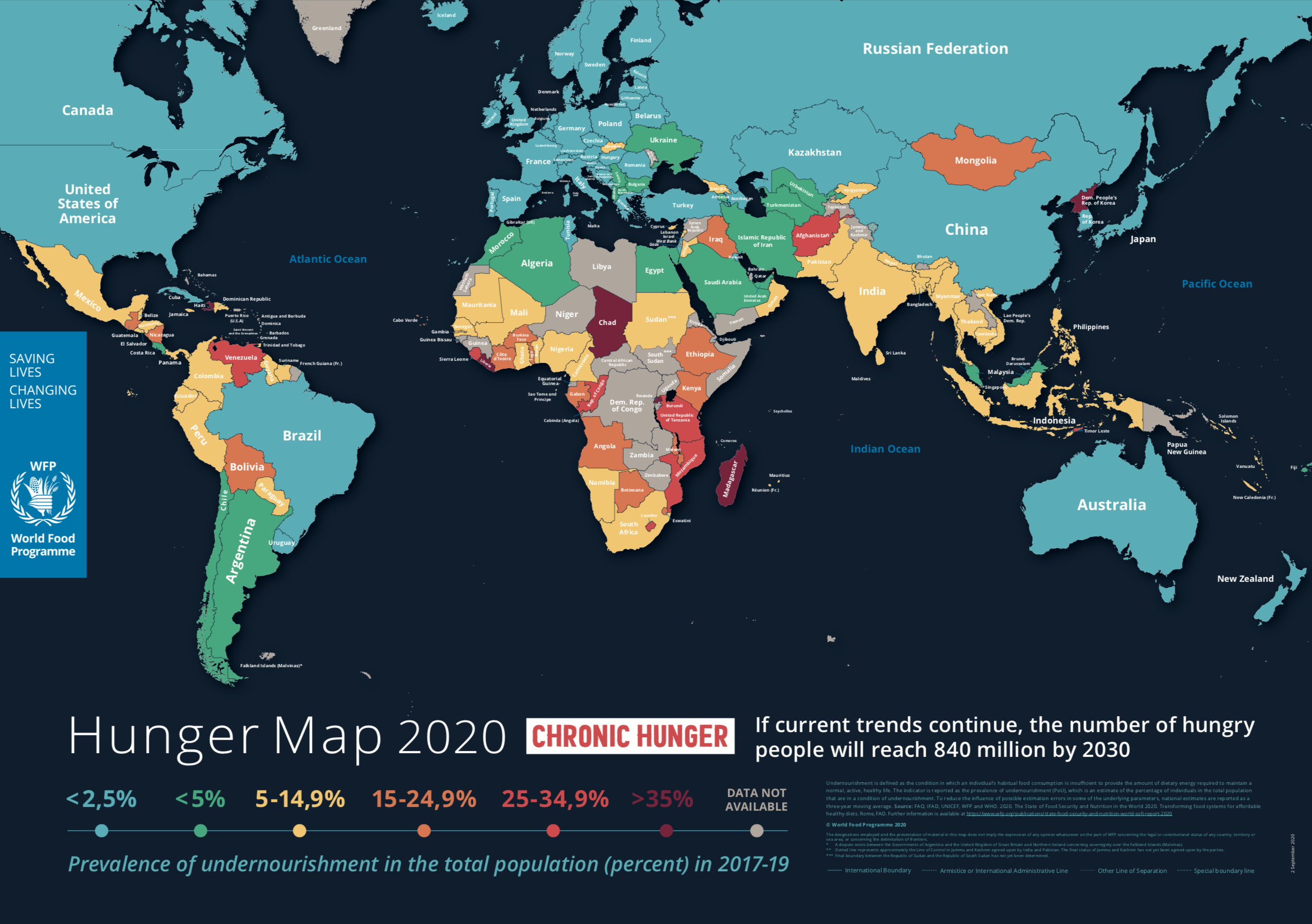
The map I chose for our “Mappenstance” blog’s Map of the Week is the World Food Programme’s (WFP) 2020 Hunger Map. The World Food Programme is a division of the United Nations (UN) that focuses on eliminating chronic hunger, providing nutritional provisions in times of global crisis, and promoting food security on-site and in the government worldwide. Outside of their direct assistance to regions in need, the World Food Programme also works on fostering a deeper understanding of global hunger through public reports and media campaigns. One of their main educational tools is the annual “Hunger Map” report. Starting in 2018, the World Food Program’s Hunger Map report shows a color-coordinated outline of countries with varying percentages of undernourishment. Additionally, the maps outline trends in global hunger and predict statistics for the next ten years.
Maps & Global Hunger
The World Programme’s 2020 Hunger Map addresses chronic hunger in different regions. What initially attracted me to the issue of world hunger is how it serves as an indicator for deeper societal concerns. Hunger maps not only reflect lapses in nutrition and food security but also denote an underlying cause and effect relationship. Behind the labels of “undernourished” and “chronically hungry”, there are foundational problems that emerge through nutrition map data. According to the World Food Programme, “political conflict, climate change, natural disasters, inequality and -most recently- the COVID-19 pandemic” together form the bedrock of global hunger. When we look at the World Food Programme’s map, we are not evaluating an isolated concern, but rather beginning a discussion on the roots of the data.
Map Analysis
The 2020 Hunger Map illustrates a three-year collection of data from 2017 to 2019. Specifically, the World Food Programme’s map charted the prevalence of undernourishment, also known as PoU, by percentages in the total population. Individual country statistics were then assigned a color that coordinated to a percentage range for the PoU: blue for less than 2.5%, green for 2.5% to 5%, yellow for 5% to 14.9%, orange for 15% to 24.9%, red for 25% to 34.9%, and maroon for 35% and above. At the bottom of the map, the World Food Programme stated that their definition for undernourishment was “the condition in which an individual’s habitual food consumption is insufficient to provide the amount of dietary energy required to maintain a normal, active, healthy life” (WFP). To decrease the chances of miscalculations and improper reporting, the World Food Programme also calculated their data as three-year moving averages.
When viewing the map, the territorial boundaries between what western society considers to be developed and undeveloped, first and third world are especially evident despite the international bounds of the UN and WFP. While the United States, Canada, Russia, China, Australia, and the entirety of Western Europe are mapped in blue (less than 2.5% of the population suffering from undernourishment), Africa, South Asia, the Middle East, and regions of South America are largely labeled with yellow, orange, and red. Although the organizations lack a dominant Western perspective and have no propagandistic intentions, the UN and WFP’s objective to enlighten the public on chronic hunger was subverted by the persuasive visual rhetoric of maps. The topic of visual rhetoric and the “rhetoric of display” is discussed in Lawrence Prelli’s Rhetorics of Display. As stated in the introduction of Prelli’s book, “the rhetoric of ‘manifestation’ and ‘showing’ – the rhetoric of display – is the dominant rhetoric of our times…An important dimension for rhetorical studies of display is how visual displays influence our attitudes and feelings, shape and reinforce our beliefs and values, and constrain what we write, say, or otherwise think about them” (Prelli 9, 10). Utilizing the rhetoric of display, the 2020 Hunger Map reinforces the cultural and regional stereotypes of so-called “undeveloped” societies. Although unintentional, the map promotes preconceived Western notions about areas considered to be “third world” – regions that, with continued visual rhetoric, will forever be linked to the label of “undeveloped”. Additionally, by stating that the number of undernourished individuals will reach 840 million in the next ten years without social intervention, the World Food Programme is upholding the notion that some regions need the assistance of the “first world”.
Conclusion
The inadvertent rhetoric spawned from the 2020 Hunger Map proposes a broader conversation about maps and their role in social justice campaigns. On one hand, maps stand as incredible tools capable of turning once fathomless global issues into widespread movements for change. From an alternate perspective, the schematic portrayal of social issues over-simplifies the complex reality that resides behind all map data. Reports like the Hunger Map increase understanding about undernourishment, spark donations, and boost media coverage, yet the broad spatialization of issues with no alternate context unintentionally reinforces longstanding stereotypes. The World Food Programme’s 2020 Hunger Map presents an interesting quandary to reflect on as we continue studying maps: Does the benefit of public awareness and support outweigh the potential of fortifying harmful cultural conventions?
Ceara, I really like the map you picked for your blog post! I know that when I think of hunger issues, I tend to only really think about issues in the United States or just issues in my communities or my city but, this map shows the hunger issues at large throughout the world. I also like how you pointed out that the pandemic has worsened hunger issues throughout the world, with food chain supply shortages, nearly empty grocery stores during the pandemic, and the number of people that lost jobs and employment, hunger issues have only gotten worse over the past few years. I also like how you discussed how this map shows the foundational problems that cause nutrition and food insecurity.