Road Atlas


This atlas is important in the connectivity of the United States. This series of maps will link every state, city, town, and neighborhood to one another with accurate road formations and updated geographic structure. The atlas suggests a strength and unity found only in the United States of America.

Posted in Uncategorized | Comments Off on Road Atlas

Coffee Map

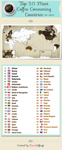
Whether it be Dunkin’ Donuts, Starbucks, or your at home Maxwell House blend, coffee is crucial around the world; this map titled “Top 50 Most Coffee Consuming Countries” is exactly what its name suggests, maintaining uniqueness in its orientation and appearance. It includes a list of the top 50 countries that drink coffee (per capita), accompanied by a map that shades in the most caffeinated countries with a brown pigment. The countries that drink the most coffee have a darker shade of brown, while the countries that are lower on the list have a lighter, almost tan, brown. Finally, the countries that didn’t make the list are an empty white. I think from this map, we can conclude that there is a high prevalence of coffee all over the world. In economic terms, coffee is classified as a normal good, meaning that there is an increase in demand for coffee as a result of an increase in wealth or income. Thus, the countries that have the highest GDP consume, typically, the most coffee.

In addition, the placement of the continents in this map is extremely significant. The map places a focus on Japan, the author’s home nation. Naturally, this would be a logical reasoning behind the placement of continents; still though, itdoesn’t stay true to the purpose of the map. The top coffee-consuming countries are the Scandinavian countries and Canada; surely, one would think the map would be focused on Europe or North American because of these nations. This goes to say a lot about the author; she is firstly and fore mostly a blogger. She tackles the cultural angle of this map and its implications, demonstrating a geographical love for coffee around the globe. In short, her focus isn’t entirely about cartography. Simply, she is a woman with a blog who seeks to represent something she loves and reflect on her home country as well. This map serves as a manner of adapting to new surroundings in the United States, while making the world seem much smaller than it is, democratically demonstrating how coffee affects all peoples of the world, not just those in a particular region.

Furthermore, the inset that she places in the bottom left-hand corner of the map to depict Europe is extremely important to the foundation of the map’s purpose. Europe clearly dominates the map with having almost all of its countries ranked on the “Top 50” list. Therefore, this inset proves to be quite useful to the audience that this map is directed toward. In addition, the other inset on the bottom right-hand corner of the map is showing a close-up shot of the island of Hispañola, consisting of the countries of Haiti and the Dominican Republic. This inset is useful because it is not easily visible at first glance on the entire map; it is necessary to place emphasis on this part of the world, making it known the audience that these countries are ranked as well.

In total, this map speaks a lot about the amount of coffee consumed all around the world, and that it is such a hot commodity anywhere you go, saying much about global caffeine culture. Asia’s area is whiter because of their high tea intake, coffee’s number one substitute. But other than there, North America, Europe, Brazil, Australia, and Japan take the cake when it comes to dominating the coffee world. In this map, the theme of authorship plays a huge part in its creation. The map’s center focuses are coffee and Japan, two things that the mapmaker is passionate about. This relates back to class themes that tell us that maps are simply products of their masters, meant for a purpose while also reflecting on the characteristics and attitudes of their cartographers. In this case, the author of this map not only chooses to express a personal interest in coffee, but also aims to expand her knowledge. As a blogger, she aims for her work to become viral with the capacity to be retweeted and/or reposted elsewhere. Clearly, this map has purpose deeper than realized at first analysis.


Posted in Uncategorized | 5 Comments

This atlas is of the Middle East and North Africa. What is interesting about this atlas is the choice of the area to provide maps for. An atlas of a specific continent, country, or the world, would make sense geographically. But the choice of subject or this atlas is based on culture/religion of the areas. Popular social constructs of these areas has made it possible and acceptable to think of the Middle East and North Africa as geographically distinct.

Posted in Uncategorized | Comments Off on

“The East Coast of Florida is Paradise Regained”

In 2011 Florida had in come from tourism of $67 billion, spent by 87.3 million tourists making tourism one of the largest business sectors in FL, and the largest tourism economy in the world [1]. The areas that cater to tourism in Florida are largely centered on the East Coast, and this was influenced by the development of the Florida East Coast Railway by Henry Flagler. A map is used by Flagler so that his advertisement immediately has credibility to readers, and appeals with an image of paradise. For the most part when the U.S. expanded, the expansion was to the west, with the East Coast already being developed. Flagler sought to transform Florida form simply being a territory into a destination. The map of “The East Coast of Florida is Paradise Regained” was a way that tourism to Florida was encouraged.

After joining John D. Rockefeller and helping to turn Standard Oil into a monopoly, Flagler’s wife was diagnosed with tuberculosis and the couple began to spend the winter months in Jacksonville to avoid colder weather, and Flagler noticed a lack of any outlet for “vacationing”. After[2] his first wife died, he went on his honeymoon with his second wife to St. Augustine and his interest in Florida was increased. Over the next two years he reduced his work with standard oil, and bought or built four hotels, a hospital, several churches, and electric, water, and sewer utilities. After trying to persuade a local short-line rail company to make a route to his hotels he ended up buying the company and having the line built himself. Once he was invested in railroads, he connected Jacksonville to St. Augustine. To promote better transportation in the state, the Florida Legislature passed a bill granting 8,000 acres of land for every mile of rail laid. Flagler took advantage of this and built a complete railway all the way down the east coast of Florida, and at several points he built resorts, including the then largest in the world. Having the largest stake in the development of Florida Flagler stood to profit the most, and once he had the structure to turn a profit he just needed a steady supply of people willing to go to an unknown destination.

Before his hotels, the main use of his railway would have been to transport produce from farms. By increasing the number of people who stayed at his hotels, he would increase the money he made from both his resorts and his railways. One of the ways that he tried to get people to come to Florida was through this map, and its portrayal of the places accessible by his trains. The map gives a sense of Florida being an opportunity waiting for whoever decides to take advantage of it, and this idea of unclaimed land appeals to the imagination of Americans with its similarity to Western Expansion, and the possibility for the current generation, or anyone who missed the chance to move West during the height of Western Expansion, to now leave their mark.

The map is centered around Florida which is blown hugely out of proportion. The size and dominance of Florida suggests that Florida is more important than it actually is. Other than Florida, the only land that has any label are neighboring islands, which are accessible by Flagler’s steamships. Florida becomes the not only the center of the world, but essentially the world itself, and the F.E.C. railroads, shown in red are the veins necessary for the function of Florida.

The title of the map openly calls Florida paradise, and the idea of Florida as a paradise is supported by other visual aspects of the map. Most of the map is ominously dark, except for the east coast of Florida, which is illuminated by a light coming out of the sky, implying that some higher power is showing favor on this area and that anyone who was in the area would benefit, and that this is one of the few, if not the only place, not oppressed by the storm that is everywhere else. The whole world, being comprised of Florida, is shown coming out of clouds or fog. The phrasing of the title is a play on the name of a 17th century poem, “Paradise Lost” by John Milton, which is an epic poem based on the bible. By having a title similar to the famous poem, the map is able to package a large story into a 9 word title that is intended to have its audience associate the East Coast of Florida with a long lost promised land.


[1] http://www.flgov.com/gov-rick-scott-another-record-year-for-florida-tourism-2/

[2] https://flaglermuseum.us/history/flagler-biography


Posted in Uncategorized | 2 Comments

Team Map Presentation: The Nuclear Club

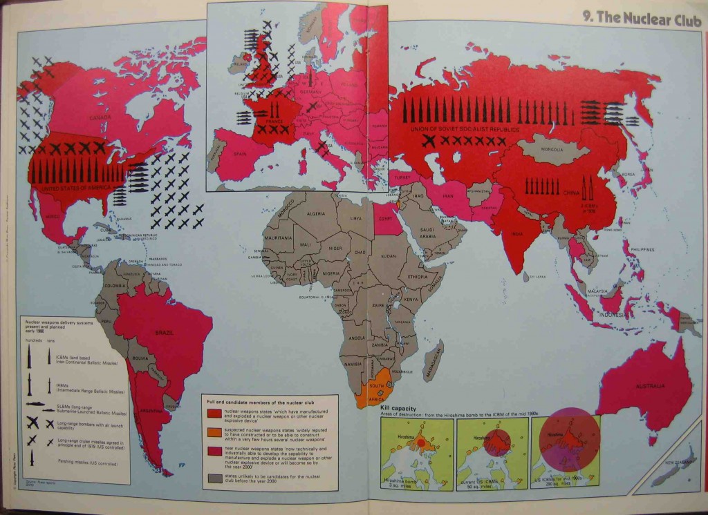
In his map “The Nuclear Club” Michael Kidron makes a strong argument against the stockpiling of nuclear weapons. At the time that he made this map, the United States and Russia were in the middle of the Cold War, each trying to develop more powerful nuclear weapons than the other and create a larger reserve of the same weapons. However, the author centered the map with the European Land. With even just a cursory glance, the coloring of the map makes a statement; only using red and gray. The vivid red evoke a sense of blood and suffering ,which is apparent that the countries in red are involved in something probably related to blood and violence. The countries such as African countries in gray are being largely left out of the conflict. After the red gets his reader’s attention, he presents the large number of weapons that each of the countries already has, the power of the weapons tied in to Hiroshima, and the fact that each of the countries has enough power to kill most of the people on the planet. The map legend in the corner of the map contend that the escalating power of the nuclear weapons threats the countries all over the world.  Using oversized icons to represent the number of a given type of weapon, the weapons are apparently taking over the country. By boldly showing the danger of a single weapon and the huge number of these weapons that are already in existence, Kidron makes a firm argument against the excessive stockpiling of nuclear weapons. During the cold war period , the map protests the endangered world and upholds the peace instead of simply rendering the militaristic power of each state.

Shuyi Chen, Jack Worstell and Christopher Bowles


Posted in Uncategorized | Tagged | 2 Comments

Children’s World

Looking at the map, you notice that there is an overwhelming amount of blue area. Looking closer, it doesn’t even look like a map, much less a map of the entire world. If not for the title, “Children’s World Map,” it would be hard to believe that this is a map at all. As indicated by the line beneath the title, this map only includes countries that have a ban on the corporal punishment of children. Corporal punishment is defined as the use of physical force causing pain, but not wounds as a means of discipline. This map is compelling because it uses a few techniques to make an argument to promote social change.
This map was published by an organization called Save the Children. Save the Children works to better the lives of children around the world. The corporal punishment of children is something that his organization is against, and it is displayed in this map. This shows how non-profit organizations can use cartography to as a tool to protest state power. The first thing that stands out is the small number of countries drawn on the map. Also, the size of the countries compared to the rest of the map. Both of these indicate that they are pushing for more countries to place a ban on corporal punishment. These countries are considered “safe” for children by the organization because these countries have placed a ban on corporal punishment. This map is drawn to show how little of the world is “safe” for children. The fact that there are not many countries, and the choice to draw them small indicate that Save the Children believes there should be more countries that ban the corporal punishment of children in order to fill up more of the map.

The words and labels on the map play a part in sending the message this map intends. The title, “Children’s World Map,” as well as the labeling of the oceans, clarifies that this is a map of the entire world, because it is difficult to tell due to the small number of countries. The title also indicates that this is the “children’s world,” the world where children live without corporal punishment. The line under the title clearly defines the criteria for making the map, which helps to hint at the hidden agenda of the map. The labelling of the ocean not only makes it more obvious that it is a world map, but it also indicates that they could expand this map in future editions. The hope is that there will be a bigger map with more countries in future versions of this map.

This map makes effective use of its “silences”. J.B. Harley wrote about “silences” in maps and the kind of power they can have on the reader. A big “silence” in this map is all the countries that were not included. This map uses this “silence” to focus the reader on what is not on the map as opposed to what is on the map. Leaving the countries off of the map entirely is more powerful than, say making the countries a different color.

Although the map was originally released in Sweden, the map had ties to the United Nations, which gave it more of an international audience. Sweden was the first country to ban the corporal punishment of children. This means that the map was intended to show the rest of the world the countries that were following Sweden. Most of the countries that qualified for the map are in Europe, indicating that they are spreading awareness, but haven’t spread worldwide yet. This map asserts that these countries are more advanced on the issue of corporal punishment and hints that Europeans have to help the rest of the world catch up with them. Essentially, they are creating a new world with this map that is still under construction.

Posted in Maps of the Week | 5 Comments

National Atlas of USA: Exports and Imports


During the Cold War tensions between the United States and Soviet Union were at an all-time high. Both superpowers were locked in fierce competition to best each other, whether that was in sports, science, and most deadly of them all, nuclear power. The races that took place over this forty year period arguably advanced humanity much further than had these two nations not been at odds. The root of this tension could be found in a fundamental ideological disagreement over how nations should be governed; communism or democracy. Therein lies the source for multiple deadly wars and the division of the entire globe into these two camps. Emerging from this period is the Warsaw Pact, headed by the Soviets, and the North Atlantic Treaty Organization, otherwise known as NATO, which was headed by the United States. These two institutions fought for their respective ideological beliefs using both military and economic aid.

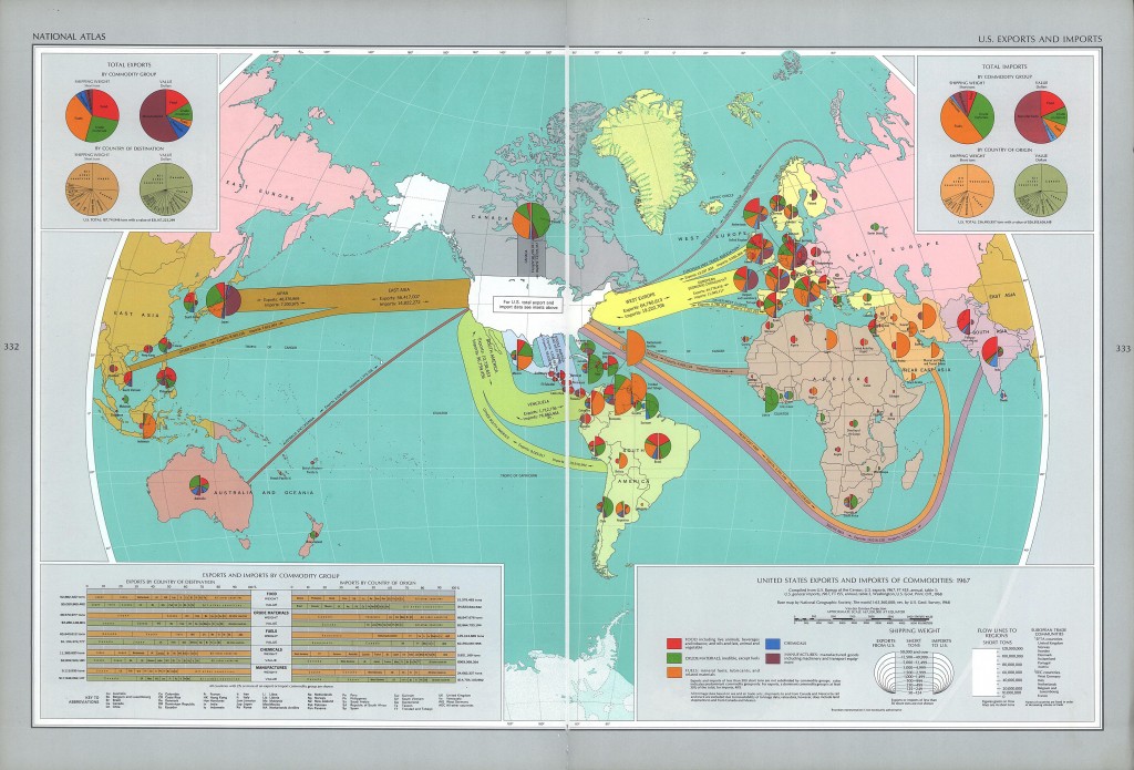
The economic aid that came from the United States goes as a perfect example of how soft power can be effectively used to drive a message or goal. The United States during this period were concern with first containing communism and then eventually destroying communism wherever it stood. In the National Atlas of the USA, specifically the Map of Exports and Imports, cartographers and scientists attempt to show the spread and distribution of American aid throughout the globe. As you observe on the map, there is no place on Planet Earth that the United States’ money and supplies could not reach 1970, even within the Soviet Union itself.

Through the use of overarching trade lines that connect with foreign nations, the map shows the dominance of the US Economy in respect to the rest of the world. The lines reach every corner of the globe and draw all nations towards the US. As a glistening, pristine white colored nation, the United States is strategically situated in the middle of the globe to stress its integral nature to the complex global economy that existed in the 1970s. The creation of pie charts within each nation offers a insight into the rich and diverse trade that existed and was unique to each country that the United States exchanged with.

Furthermore, the straightforward numeric statistics present on the map seek to show the vibrancy of the US Economy, while hiding many of the cultural and social implications that the Cold War created. For instance, trade to South East Asia is shown on the map, though effects of the Vietnam War (which was at its peak during the production of this map) are selectively hidden so that the viewer is only exposed to the economic prosperity of the global economy that hinged on the United States.


-Reece Syal and Quincy McKoy

Posted in Uncategorized | Comments Off on National Atlas of USA: Exports and Imports

The Nuclear Club Round Up

The Nuclear Club – Michael Kidron – London – 1981

In the advent of the nuclear age, Kidron’s map of doom intends to terrorize its audience. A perhaps exaggerated take on the 1981 world nuclear arsenal, this map makes no attempt to sugar coat the fact that nuclear war would destroy our world. Offering us no solution to the mess, Kidron seems satisfied to simply point fingers at the superpowers. For emphasis, the blast radii of early and later bombs are displayed beneath the map. The bombs so devastating as to end a world war become dwarfed by the modern ICBM. A visible tension among continents borne by vivid red tones and weaponry spilling across oceans presents both a mutually assured destruction, and the gridlock associated with an intractable conflict. Kidron was not only a publisher, but an economist as well, who argued that state spending on arms was a burden on capitalist expansion, and wanted to illustrate that point to readers. He incorporates subtle economic aspects into the map, such as the expansive stockpile of weaponry coupled with a hefty price tag, intended to alert readers of just how costly this endeavor may be. With the projected future of nuclear programs across the globe, one might only wonder how the world could ever turn back. Nuclear technology cannot be undiscovered, but will their horrific power be enough to quash any prospect of future use?

Cameron R. & Griffin T.

Posted in Uncategorized | 1 Comment

Atlas of the Week: The Military Atlas of WWII

This weeks atlas is a compilation of 180 maps from World War II. By plotting the battles of land, air, and sea, this atlas tells the complete story of WWII. It is even able to capture the ebb and flow of the fortunes from both sides. All maps are in full color and contain a key to help readers decode the battles.

Posted in Uncategorized | Comments Off on Atlas of the Week: The Military Atlas of WWII

Map of the Week: Around the World in 80 Beers


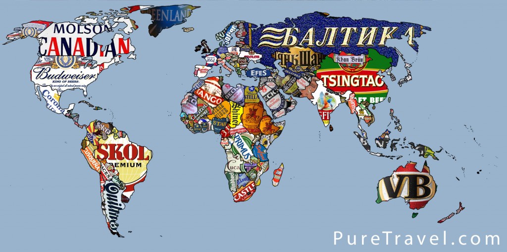
For thousands of years, beer has been used by mankind to temporarily break free from the rigidities of society. Yet beer has undoubtedly come to represent more than just a refreshing drink, it has progressed into a product of national identity. In some countries, beer has even become ingrained in the culture. For example, Budweiser can be found in the hands of hundreds of thousands of Americans every Sunday as fans cheer on their favorite NFL football team. In Europe, brewing companies have devoted billions of dollars to ensure that soccer fans identify themselves with their country’s  beer. By using the logos of different breweries to represent different countries, this map effectively communicates the values and culture of each country. At the same time, however, the author is reducing these complex nations to brands that don’t necessarily offer a fair representation of each nation’s ideology, reminding us that maps are a product of human construct.

Continue reading

Posted in Maps of the Week | Tagged | 5 Comments