Atlas of the Week: Atlas of the Civil War


The Atlas of the week is the “Atlas of the Civil War: A Complete Guide to the Tactics and Terrain of Battle” created by Stephen Hyslop and published in 2009. This Atlas shows maps, photos, and documents from the Civil War era, taking the audience back in time to 1861. The artifacts in this atlas display strategies, show clashes, and inform us on political turmoil during the civil war era. This atlas does a magnificent job capturing the  war and correlates directly to my map of the week. Go check it out!

Posted in Uncategorized | Comments Off on Atlas of the Week: Atlas of the Civil War

Atlas of the Week: Campaign Atlas to the Great War

A map of The Ottoman Empire and its vast rail system in 1914

This week’s atlas is an online collection of World War I operations and situation maps hosted by the United States Military Academy’s Department of History. The maps included track major engagements and territorial arrangements across all fronts throughout the war. The maps are ordered chronologically, with the first being “The World in 1914” and the last “The World in 1919.” Additionally, the maps are prefaced with a table of symbols used so that anyone can make sense of the maps. All of this, coupled with the fact that the atlas is available online for free and for anyone to access makes it a remarkable resource for those interested in learning more about the Great War.

Posted in Uncategorized | Comments Off on Atlas of the Week: Campaign Atlas to the Great War

Blog of the Week: National Park Maps

This week’s blog is an online collection of U.S. National Park maps. This site contains a huge amount of maps for every one of the 59 National Parks, ranging from topographic projections to trail guides and even camping and lodging maps. Also embedded on the page for each park is an interactive Google Earth image box that allows you to explore the surrounding area, switch to a satellite view, and easily obtain directions to the parks.

Posted in Uncategorized | Comments Off on Blog of the Week: National Park Maps

The Best Night Of Your Life: Charting Population Through Drinking Establishments

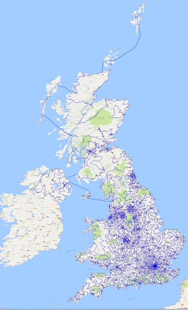
The ‘pub crawl’ is a ubiquitous facet of British popular culture. The premise is simple: you and your friends proceed from one bar to the next, typically without a structured, predefined plan for the evening. But what if you did have the night charted out? What if you had the mathematically perfect bar-hopping experience laid out in front of you? Behold: the mother of all pub crawls. This week’s selection depicts the shortest route possible between every pub in the United Kingdom.

This map was created by the Faculty of Mathematics at the University of Waterloo as an exercise of the ‘Traveling Salesman Problem’ or TSP. The TSP is a classic fixation of cartography: given a series of locations, what is the shortest route possible that visits all locations exactly once and returns to the origin? The problem may appear trivial when considering a small sample of locations, but at large scale – say, 24,727 pubs large – the complexity increases exponentially. While the TSP may seem like an esoteric brain-teaser for computational mathematicians, it has vital real world applications. After all, what profession doesn’t concern itself with efficiency? City planners want to plot roads that quickly transport people to as many essential locations as possible. Sanitation departments want to devise optimal routes to save time and money. Nurses want to make their rounds swiftly to ensure every patient receives the attention they require. That’s why the UK pub crawl map is so significant – it’s the single largest TSP ever completed, and a monumental step forward in the automation of these problems.

More than the methods and meaning behind the map, however, my interest lies in the relationships unintentionally hinted at by this geovisualization. Upon first glance, the map appears to be a complex labyrinth of lines that carve intricate contours into the landscape. In reality, there is but one line on the map which traverses the whole United Kingdom, and every change of direction reveals a little information about the demography of the area. Take for example the varying line density across the map. Major cities are labelled on the map not by their names (they are in fact obscured), but by the deep blue that seemingly outlines their jurisdictions. London is most noticeable, as the line work reaches its peak density in and around the southern capital. So why does the concentration of line segments matter? In a way, it’s a means of charting population density, which makes sense; it stands to reason that the more people there are in an area, the more pubs there will be, meaning the more unique locations the line must hit, resulting in a higher density of line segments within that area. This results in an area like London being rendered in dark blue while the whole of Scotland has a measly few line traversals across the entire country. Personally, I found this surprising at first, not because I was unaware of Scotland’s sparse population, but because my popular perception of Scottish excessive drinking overrode my initial understanding of what the map was really illustrating. This is not a map of alcohol consumption. It’s a map of physical establishments of business, and those are always going to be more plentiful in population centers.

Similar to viewing the map at a national level and easily being able to identify London as a populous area, changing the scale to the county of Oxfordshire allows us to see the most popular areas at a local level.

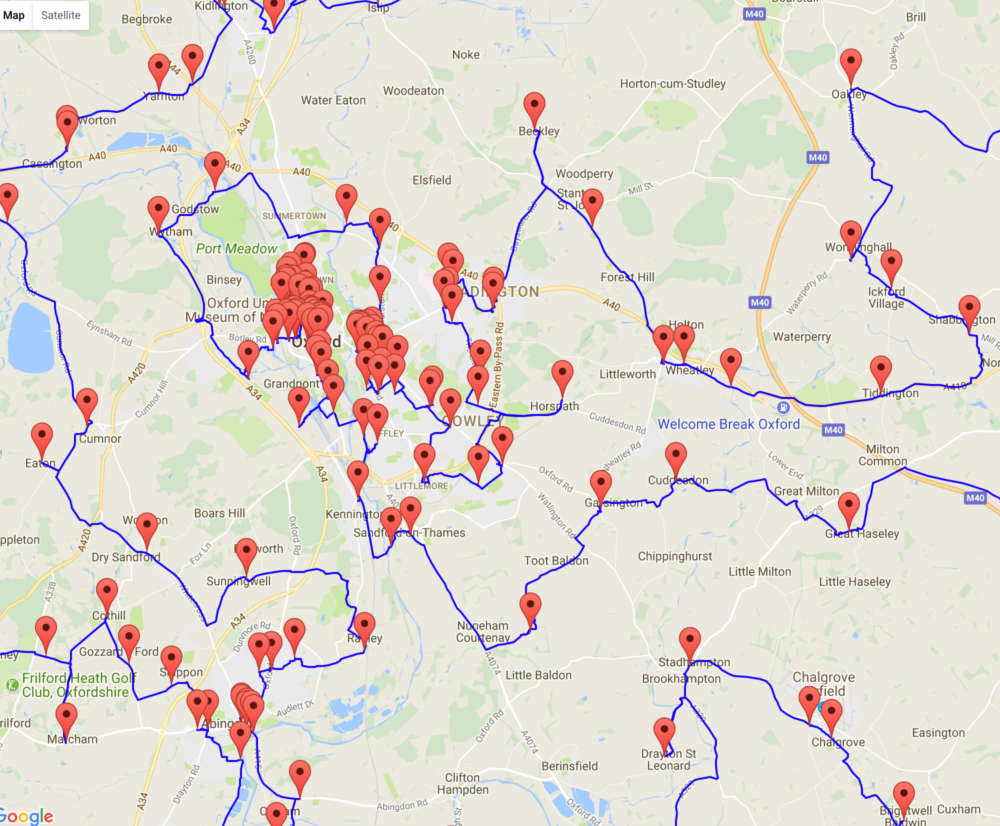
How accurately does this correlate with the actual population distribution of the city? Surprisingly well, in fact. Take a look at this map of Oxfordshire population densities I found online:

Source: plumplot.co.uk

It may be hard to tell by looking between the two maps, but a strong relationship exists between the presence of pubs and heightened population density (what I’ve affectionately dubbed the ‘Pub-Pop. Correlation’). Using image editing software I overlaid the maps onto one another by matching topographical features (thankfully they utilized the same basemap). The composite image:

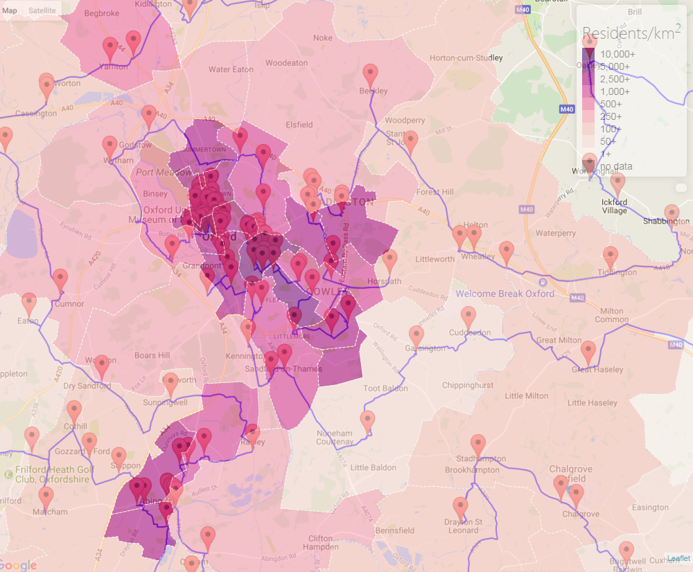
The correlation is clear: people live where pubs lie. The darkest sections of the population density visualization correspond directly with the most pub-heavy regions. But these maps actually show entirely different datasets. The population map may tell us where people live, but the pub map illustrates where people choose to spend their time. In a way, this is a far more significant statistic. Everyone has access to census data, but to truly know where people tend to be, down to the street level, is powerful. In the case of Oxford, the combined map demonstrates that the residential and recreational districts are one and the same, which is to be expected of a college town. Again, this should come as no surprise; after all, pubs are social nodes; they are places of comings and goings – sorts of physical landmarks of our connections to others. Therefore, from this composition of maps (and indeed from the pub map alone), it is also possible to infer the most popular roadways within the city. From tracing the blue line through Oxford (in which it seems to radiate out of the University), it’s easy to get the sense that the busiest streets are those in the immediate vicinity of the various colleges around town.

So what happens if you take the colleges out of the equation? After conducting similar analysis on the center of London, it becomes clear that the correlation isn’t nearly as strong.

Population map source: plumplot.co.uk

At first glance, the two data sets appear to line up fairly well; the most densely populated district is also the most dense with pubs. However, beyond that, the shadings of population density fail to correspond with the drinkeries (noticeably directly north of the London Bridge). This may seem insignificant, but it reveals a rather important distinction between the cities of London and Oxford. There’s more movement within London. People don’t mix leisure and residence as much as in Oxford. It’s a cosmopolitan capital city and one of the largest economic centers in the world, not a college town. As a result, London has specialized to craft socially-constructed ‘drinking districts’ that exist aside from where people actually live.

As I mentioned above, when I first viewed this map I was mostly intrigued in the prospect of using pub placement as an unconventional metric for measuring population density. After all, at the national scale, it already appears similar to a population heat map. It wasn’t until I actually cross referenced this map with population data that I realized the danger of assuming the correlation exists across the country. From a strictly data perspective, the map displays the same parameters of information at every locale, but if you were to look at the map and believe you could infer the same population trends from Oxford as from London you would be sorely mistaken. This map is deceptive. That may come as a surprise considering its objective, mathematical nature, but one must consider that all maps operate through their selectivity. The information that is withheld often shapes the audience’s perceptions even more than what is shown, no matter if it’s a conscious decision or not.  So the next time you’re looking for something to do in the UK, take this map, make good choices, don’t make assumptions about correlations that may or may not actually exist, and have a safe 28,269.4 mile journey.

Works Cited

24,727 UK Pubs. University of Waterloo Faculty of Mathematics,
www.math.uwaterloo.ca/tsp/road/uk24727_tour.html.

 Jacobs, Frank. “The Shortest Route Between All the Pubs in the UK.” Big Think, The Big Think, Inc., 10 Jan. 2017, www.bigthink.com/strange-maps/the-shortest-route-between-all-the-pubs-in-the-uk.

Plumplot. “Inner London population statistics.” Inner-London population stats in maps and graphs.,
www.plumplot.co.uk/Inner-London-population.html.

Plumplot. “Oxford population statistics.” Oxford population stats in maps and graphs.,
www.plumplot.co.uk/Oxford-population.html.


Posted in Maps of the Week | Tagged , , , , , | Comments Off on The Best Night Of Your Life: Charting Population Through Drinking Establishments

Atlas and Blog of the Week

Atlas of the Week:

My atlas of the week is the Atlas of Improbable Places by Travis Elborough and Alan Horsfield. With stunning maps designed by Horsfield, this atlas transports readers to some of the most unique destinations on Earth. First, readers journey to ancient cities such as Ani in modern-day Turkey and ruins in Mexico of villages destroyed by lava. Elborough’s enticing writing then steers readers toward the secrets of cities like Beijing and Berlin before illustrating enigmatic destinations such as the Island of Dolls in Mexico and the “Door to Hell” Crater in Turkmenistan. The beautiful marriage of Elborough’s writing and Horsfield’s cartography creates an incredible voyage that traverses some of the most mysterious sites around the world. Critics have deemed the atlas “deliciously gloomy, sometimes spooky, and often kooky”—this atlas is not for the faint of heart, but anyone with a curious and adventurous inkling will certainly devour its creativity.

Blog of the Week:

http://www.openculture.com/category/maps

Open Culture’s map archives offer a very unique and eclectic set of maps. Readers can find maps separating the U.S. into a mere 38 states, depicting all the languages spoken in Europe, illustrating Roman roads in the form of modern subway maps, and from ancient civilizations. Whether readers want to find something visually stunning, uniquely crafted, or historically relevant, there is a map for everyone on Open Culture. It also displays maps sometimes via more unique media such as interactive maps or time lapses.


Posted in Atlases of the Week, Uncategorized | Comments Off on Atlas and Blog of the Week

You Are What You Eat: U.S. Food Geography

It is no secret that Americans love their food. The rise of the fast food industry in the 1950s tempted Americans with juicy hamburgers and crispy French fries. Consumer culture from the 1950s to the 1970s transformed processed foods like Oreos, Coke, and Ritz Crackers into hot commodities for both American and global buyers. Even today, new culinary movements have fueled the American foodie; sustainable eating encourages sourcing food organically and locally, and veganism has been mounting in popularity as dairy and meat alternatives become more accessible to consumers. In this sense, no matter how one looks at it, food has been and always will be a prime component of the American identity. But how do these gastronomical identities vary across state borders? Do many states share similarities in their culinary preferences, or are there typically regional or even state specialties? Jim Gaffigan’s Food Geography attempts to uncover the answers to these questions, with a bit of humor injected into his response.

Gaffigan’s map first manifests itself in one of his novels that is called Food: A Love Story. The book was published in 2015, and he addresses a variety of comical food dilemmas such as the inventions of coconut water and pretzel bread. Therefore, even with this slight context, it is not difficult to see that the map is designed to offer a chuckle to its audience. In addition, Gaffigan is not a cartographer; he is actually a comedian. This fact contradicts Americans’ typical perspectives on cartographers. Most often, we seek the input of experts when we scrutinize maps, for we put a colossal premium on maps’ accuracy. However, the recent mapping revolution has allowed all sorts of unexpected individuals such as Gaffigan to offer their very own contributions to the mapmaking scene.

The map itself depicts just the United States, but the plethora of symbols makes it quite difficult to understand at first glance. Fortunately, Gaffigan provides a detailed legend. On a broader level, Gaffigan carves the country into regions according to the cuisine that is most prominent there. For instance, most of the southern United States from parts of Texas to Florida to Virginia is deemed EATING BBQLAND; this region is tastefully represented with an image of some baby back ribs. The southwestern states comprise MEXICAN FOODLAND with its telltale taco, stretching from Southern California to Austin, Texas. The Pacific Northwest is COFFEELAND, the Midwest shines in either STEAKLAND or SUPER BOWL SUNDAYFOODLAND, and Alaska holds its reigning title as the only state in BLUBBERLAND—of course depicted with a humpback whale. Louisiana is ambiguously deemed FOOD ANXIETYLAND with a large warning sign. In addition to providing symbols for each of these regions, Gaffigan also thoughtfully orders them by color to make even simpler distinctions between them. These examples affirm Dennis Wood’s notion that a map links a territory to what comes with it; this map illustrates what one would find in a particular region, conveying information that is more easily associated with that region when it is lined out on a map. Therefore, the map links a territory to the culture that is found there, such as the Midwest’s football fascination that bleeds into its unique cuisine.

Moreover, Gaffigan offers even more analysis into the United States’ culinary complexities by highlighting local specialties. A second legend at the bottom of the map exhibits these dishes, and it takes a bit of a keen eye to ascertain them on the map. New York City unsurprisingly yields to pizza and bagels. Cincinnati chili does not miss its opportunity to show itself off. Cheese, bratwurst, and hamburgers all find their niches in Wisconsin. Chicken, both hot and winged, comfortably hails from Tennessee and Buffalo, New York. Gaffigan even points out that the enigmatic toasted ravioli finds its origin in St. Louis. The map certainly does not appear to skimp out on Americans’ food favorites.

One significant fact to bring to light is that this map was designed by a comedian, not a cartographer. Gaffigan has his own intentions and interests to portray, but they differ significantly from what one might observe on a traditional map. For instance, this map’s primary purpose is entertainment. In essence, there is no true educational or intellectual objective in this map whatsoever. The map is not rooted in fact, and it is unlikely that any data was collected specifically for the fabrication of the map. However, it is much more likely that Gaffigan took his own observations of his surroundings and amalgamated them into a map for the purpose of comedy. He seeks to make people laugh with his work, whether that be by watching his shows, reading his novels, or examining his map. Additional scientific data certainly would do little to incite more laughter within his audience, so he opts blatantly to flaunt his opinions instead. Viewers understand that his work will inevitably have partiality injected into it, for he is a comedian who voices his opinions on and perception of the world. In this sense, maps can have objectives that are not necessarily educational—they may serve commercial, political, or even (as in this case) comedic purposes as chosen by the cartographer. This lack of intellectual origin does not make the maps any less prevalent, but it merely enables audiences to observe more unique perspectives on the world.

This map is also noteworthy because it deals heavily with notion of conventions and maps as social constructs. The beliefs reflected in the map are stereotypes; most Americans tend to accept these perspectives without a second thought. No one questions their validities, even if they know that the map may be extreme. This trust in these stereotypes stems from their roles as social constructs. They are simply norms in American society that have been present since citizens’ births. For instance, no one questions New York City’s reign as a pizza powerhouse, yet the delectable joints of Richmond, Virginia simply do not bear the same renown. By the same token, who says that San Diego is the only credible destination for fish tacos? Society shapes these views, making it nearly impossible for individuals to formulate their own opinions on local and regional delicacies. Yet individuals trust the map, for it affirms what the conventions have already established for them.

Still, these conventions hinder gastronomic diversity from materializing. The map only affords a surface-level depiction of American food culture. It neglects to recognize the incredible international cuisines that have made names for themselves across the country. Hawaiian poke bowls have taken California by storm. New York City offers any cuisine imaginable from Ethiopian to Lebanese to Brazilian. And who could forget about the dozens of Chinatowns across the country that greet consumers with a culinary journey to the Eastern Hemisphere? The map’s failure to emphasize these different cuisines constructs a gaping hole in the United States’ culinary culture; after all, in recent years, they certainly have secured a space right alongside hamburgers and macaroni and cheese in Americans’ palates. Instead, the map chooses to accentuate more “American” foods. Today, a true “American” cuisine consists of much more culinary diversity, despite what the map’s conventions may insist.

Finally, despite the lack of representation for the ever-growing international food scene, the map conveys an overall sense of nationalism. The map establishes regional and local cuisines as something of which Americans should be devoutly proud. It creates an identity around shared food culture. Furthermore, state borders are eliminated. In this sense, Gaffigan makes fewer distinctions between states, instead drawing comparisons on a more generalized scale. This tactic enables Americans to feel more connected to each other and more unified as a nation. Put simply, food brings people together.

In short, Jim Gaffigan’s Food Geography rallies Americans around some of their dearest treasures: pizza, coffee, barbecue, ice cream, and much more. Gaffigan’s comedic nature crafts the map into an article of entertainment as opposed to that of scholarly study. An academic map regarding gastronomical aspects of the United States would most likely focus on different forms of agriculture in each region. Or perhaps more credible cartographers would simply derive their legitimacy from concrete data that reveals which foods are consumed most often in different states. But nevertheless, with a cozy role in American culture, what is America without its food?

References:

“Food: A Love Story.” Jim Gaffigan. http://www.jimgaffigan.com/books/food-a-love-story. Accessed 28 September 2017.

 “A Journey Through the History of American Food in 100 Bites.” The Salt. NPR, November 15, 2014.


Posted in Maps of the Week | 4 Comments

Atlas Selection: Transit Maps of the World

My atlas selection is entitled Transit Maps of the World. It is a book of maps showing every train route in the world. This is the first Atlas to ever depict this subject matter which makes it particularly ground breaking.  Mark Ovenden, the creator of this map, uses bright colors and sharp, clean lines to draw the viewer’s attention to specific routes. Overall, this atlas is especially noteworthy as it shows how cartography and maps in general are used in the 21st century.

Source: “27 Best World Atlases For Map Lovers In 2017.” Brilliant Maps. November 06, 2016. Accessed October 06, 2017. http://brilliantmaps.com/world-atlas/#food.

Posted in Uncategorized | Comments Off on Atlas Selection: Transit Maps of the World

Blog of the week: Big Think

Link: http://bigthink.com/articles?blog=strange-maps

This blog is particularly interesting in that it is not dedicated solely to maps. “Big Think” publishes articles about a variety of topics, such as  Surprising Science and Personal Growth. In addition to intriguing articles, this blog has a strange maps section. This section has maps that depict history, explain environmental issues and even discuss current political topics, such as Catalan independence referendum and the effect it will have on the geographical layout of Spain. I encourage you to peruse this blog and hope that you find its map selection just as interesting as I do!

Posted in Uncategorized | Comments Off on Blog of the week: Big Think

Map of the Week: Marshall Islands Navigational Chart

While this map may look like nothing more than a piece of modern art or a failed attempt at woodworking, it is in fact a 19th century Navigational Chart from the Marshall Islands of Micronesia. Although it is commonly referred to as a chart and its appearance may differ from that of a “normal” map, the navigational chart serves the same basic functions of all maps: to visually present information with hopes of deepening or clarifying one’s overall understanding of a topic or layout of an area.

The Marshall Islands are composed of more than one thousand islands or islets that extend over hundreds of miles. Due to the large distance between islands, Marshallese (inhabitants of the Marshall islands) had to become proficient sailors. As the Marshallese became more skilled sailors, they began to expand their routes, traveling to farther islands. With this expansion of travel and addition of routes came the need for a tool that could map out routes, this tool took the form of the Navigational Chart.

While each chart differs slightly in appearance, the majority of them are made from interwoven sticks with shell detailing, representing islands. The horizontal and vertical sticks support the structure and the diagonal sticks show wave and tide movement. The Marshallese would study the map by focusing on the locations of the shells and the positioning of the diagonal sticks, adjusting their routes as they saw fit. Unlike 21st century maps that are portable (either on your phone or collapsible paper maps) this map did not travel and would instead be studied before the voyage was made.

This map is particularly unique as its simplicity reflects both its function and the culture that created it. Unlike world maps being created during the 19th century, this map does not include any extravagant borders, fancy font, or eye catching colors. The Marshallese did not include these details, not because of their lack of sophistication or elegance, but rather because they were more focused on the functionality of the map rather than the artistry of it. The Marshallese did not need the map to be grandiose, they just needed it to show them where to go. The materials used to create the map not only add to the simple appearance but are representative of the resources that were available and important to the Marshallese culture.

Maps are out of date as soon as they are printed. Our world changes so quickly that it is impossible for a  map to be perfectly up to date. In order to ensure that the navigational maps were as useful as possible, the Marshallese had to update the maps quite frequently to show new islands or a change in the tide movement. Fortunately for Marshallese cartographers, the simplicity of the maps made the updating process rather quick.  If each map included extra details, like that of an extravagant border which is not necessary to its function but more for show, the maps would take longer to update and the function and reliability of the map would be sacrificed.

While this map may not be of any use to you, as you are not sailing around the Marshall Islands in the 19th century, it is important to recognize how powerful this map was and continues to be. In the 19th century, the peak of this maps power, the navigational charts aided the expansion of the Marshallese culture by providing a way to chart new discoveries and find new routes. Today, these charts are being made not as navigational tools but as souvenirs. These souvenir charts do not function like that of a 19th century navigational chart but they symbolize  the power and importance of navigation charts in Marshallese culture.

We, members of the western culture, have a very specific idea of what a map should look like and how it should be used, often putting more emphasize on familiar looking maps. This navigation chart forces us to step outside of our comfort zone and acknowledge that our westernized concept of maps limits our exploration of other cultures. Looking at maps like this allow us to expandour concepts of maps and see that although different cultures produce different maps, they all have similar functions and goals. Overall, this chart, and navigational charts like it, should be admired due to their relative simplicity and immense practicality, and should be remembered because of the tremendous power it held in the Marshallese culture.

Sources:

“Marshall Islands.” Wikipedia. October 03, 2017. Accessed October 04, 2017.

“Navigation charts.” Khan Academy. Accessed October 04, 2017. https://www.khanacademy.org/humanities/ap-art-history/the-pacific/a/navigation-charts.

I also used some prior knowledge about these maps that I learned in Art History

Posted in Uncategorized | 1 Comment

Blog Link: Esri – Maps We Love

This blog has dozens of maps to explore – and many of them are live maps. Live maps allow us to see progression over time more clearly.  Click the link to check some of the live maps out!

Link to the blog: http://www.esri.com/products/maps-we-love


Posted in Uncategorized | Comments Off on Blog Link: Esri – Maps We Love