Atlas of the Week: ArcGIS

For my Atlas of the Week, I wanted to include an atlas that had information about multiple categories that would provide the audience with an immersive experience. With this in mind, I came across ArcGIS and its innovative cloud-based user system. There is no longer the need to go to multiple sources in order to come across maps of different content. With just a click of the button, one can immerse themselves into maps of transportation, topography, imagery, and base maps. One can honestly get lost in the ever-increasing amount of maps uploaded every day by its users.

Atlas Link: https://www.arcgis.com/home/gallery.html#c=esri&t=maps&o=modified


Posted in Atlases of the Week | Comments Off on Atlas of the Week: ArcGIS

Map of the Week: A Map of Every City

Image result for a map of every city

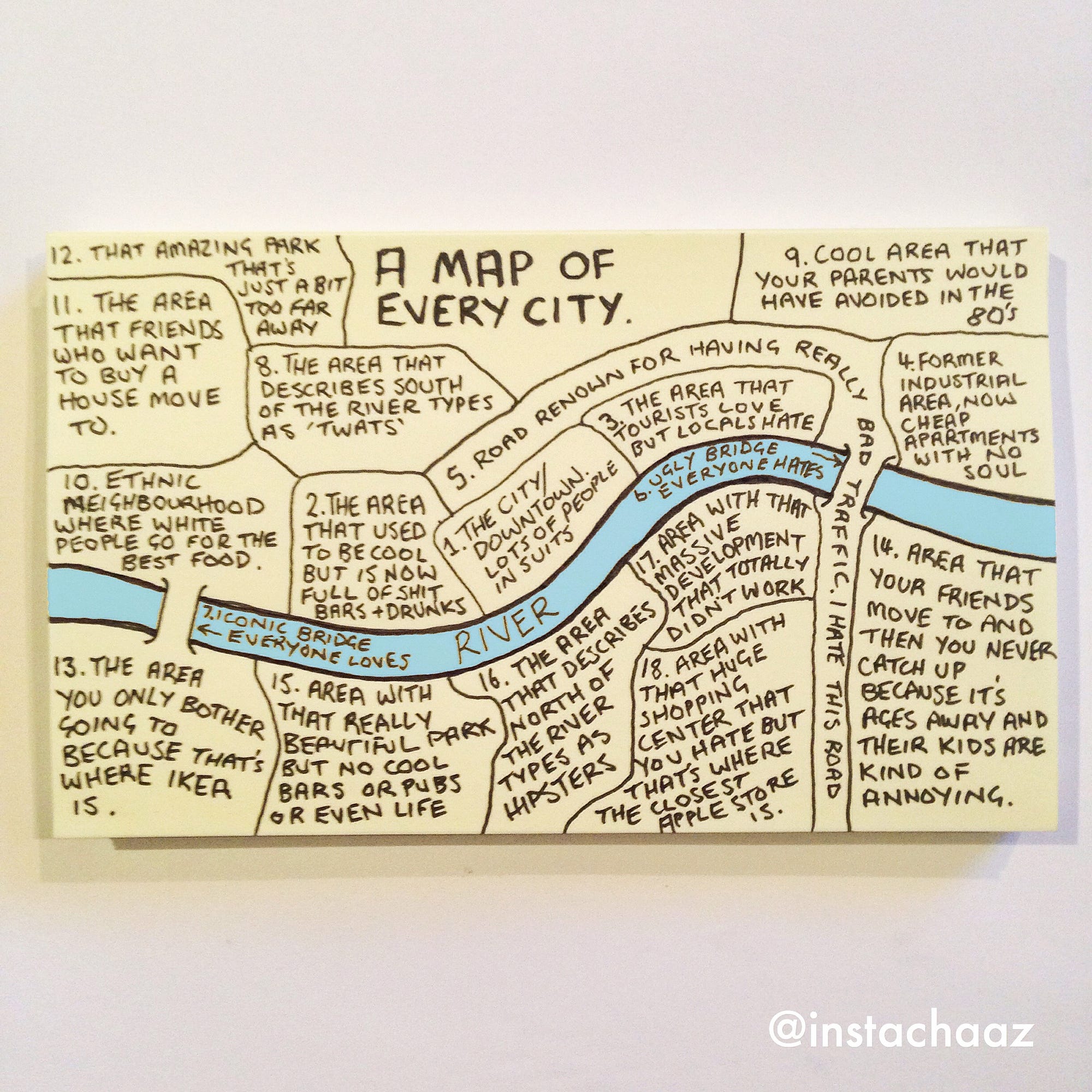
Growing up in a rural area, at the base of an extinct volcano, outside Penshurst, Chaz Hutton would be one of the last people to come to mind in being able to create a somewhat accurate interpretation of something so complex, such as a city, more or less on a Post-It Note. Yet, he achieves what most mappers fail to do, which is to connect with the audience on a personal level. Maps denote credibility, intellectual competence, and scholarly ability. When one looks at Hutton, we see his gelled hair, outgrown facial hair, and a crumpled T-shirt. We do not see a cartographer. Like the initial impressions of a person, maps too, fall under the same surface judgment. Hutton’s A Map of Every City is simple, almost child-like, far from any type of cartographic material to praise. After a close reading of the intricate descriptions within, one can immediately appreciate and acknowledge the complexity and social constructs of class and race present, but with every map comes a perspective: a middle-aged white man, profoundly showed through the acknowledging reference to the “ethnic neighborhood” where white people go to for good food. In order to display his interpretation in a non-judgmental and conflicting way, Hutton forgoes labels, intricately selects neutral colors, acknowledges his race’s influence, and uses humor as a unifying tool.

Maps usually include labels, color differentiation, and the ignorance of the influence of certain cultures. Yet, with the inclusion of those characteristics, also creates division. Labels are restrictive. By naming what something is, one is narrowing the spectrum for imagination and foregoing the connective tissue between the mapper and audience. General descriptions gradually and subtly paint a picture of the place by slowly engaging the audience into the atmosphere and scenery. Cartography is not science but art. When we think of art, color is an integral part, because they denote emotion and mood. What makes Hutton’s map so unique and interesting is his choice to use the Post-It note’s default color. Doesn’t that counteract the choice of no labels? No. Cultures have different interpretations of colors, but to put it simply and universally, dark tones are usually tied to negativity, while bright and light to positivity. If Hutton’s purpose was to help connect people, then his choice is valid. By placing color on an area, it is again, narrowing the spectrum for imagination and restricting the area to its color. Blue is an anomaly. Cultures usually have no emotional attachment towards it, making it the perfect color and contrast for the river and the map. His contrasting use of blue is vital towards the “readability” of the map because it provides a point of reference where one can distinguish south and north. The creation of separate labels to different parts of the city catalyzes the notion of sovereignty between the two, invoking certain social stigmas being north to wealth and south to poverty. Yet, the only mention of stark class differentiation based on geographical placement on the entire map is the playful banter between the northern “hipsters” and southern “twats” in areas 8 and 16, creating an almost uniform area layout.

By using colloquialism as a transport for his humorous acceptance in his work, he touches upon the fragile subject of gentrification and the dominating influence of his culture, further expanding his reach and relatability towards the audience, either agreeing or acknowledging his interpretation. Humor, magnified through maps’ and cartography’s general absence of it, creates a pathway where people of different backgrounds can relate to him. In areas 4 and 17, he highlights the pitfalls of gentrification: “Cool Area that Your Parents Would’ve Avoided in the 80’s” and “Area With that Massive Development That Totally Didn’t Work.” Area 2 displays the effects of time, “The Area That Used To Be Cool, But Now Is Full Of Shit Bars + Drunks” Most importantly and as mentioned earlier, is his mention of the “ethnic neighborhood.” By including that area, he is not only including his predominantly white perspective on the city but also allowing for relatability from the minorities. It is not to say that by including this, completely dissolves the social barriers present between, but creates a peephole into the perspective that of Hutton, for isn’t that all an artist can do.

Hutton, his perspective, and his map are different from the norm but isn’t that what mapping and mapmaking are about. Mapping, specifically, should change with time. It should progress with the technology and historical context around, so to say that Hutton is not of worthy cartographic ability, is to go against the very characteristics that serve as the foundation.  By intricately choosing general descriptions over labels, uniformity over differentiation in colors, and humor, he achieves what most cartographers fail to do, which is to connect and unify people of different race and class.

Posted in Maps of the Week | Comments Off on Map of the Week: A Map of Every City

Fragile/Failed States Map

By: Sam Hyson and Evan Palmberg

The Failed States Index map was first created in 2005 by the combination of the think tank Fund for Peace and the magazine Foreign Policy. The name was changed from the Failed States Index to Fragile States Index in 2014. The goal of the map is to assess a country’s vulnerability to collapsing. The map has been interactive in the past few years and contains an accompanying article with descriptions about why countries has changed in the rankings and what has caused these changes.

Links to 2016 and 2017 maps:

2016: http://foreignpolicy.com/fragile-states-index-2016-brexit-syria-refugee-europe-anti-migrant-boko-haram/

2017: http://fundforpeace.org/fsi/

In general, Scandinavian countries rank among least fragile states, along with countries like Canada and Australia. On the other end of the spectrum, the most fragile states often come from Eastern and Central Africa, as well as the Middle East. All of the countries are ranked on a scale from 0-120, with 120 being the maximum level of fragile a country can be. This 120 scale comes from a series of 12 indicators ranked out of 10, separated into three categories: social indicators, economic indicators, and political indicators.

While this map seem mathematical-based and unbiased, that is not the case. Since this map has been made by American companies, it has received critique for being biased, having flawed metrics, and failing to predict important events. Looking through the various years of maps, the argument can be made that these rankings are nicer to American allies, and more critical of America’s enemies, like North Korea. Additionally, this map does not reflect certain parts of countries that are either better or worse then the ranking for the entire country.

This map also brings up the discussion of what it means for a country to be a “failed” state.  By calling a country a “failed” or “fragile” state, this may mislead policymakers to want to intervene in the country and help, when this may not always been necessary or the best course of action. Similarly, titling a country as “failed” presents a negative connotation to the rest of the world. This may have been part of the reason for the decision to change the name of the map. Calling a state “failed” creates the idea that a state is beyond saving, and there is nothing that can be done. Meanwhile, “fragile” causes people to think that there is still some hope for the country, but it needs to be done quick because the country is very susceptible to failing. This was a very important change that will hopefully lead to countries being further up the fragile states scale. While this map may seem simple at first, the connotation in its title and American bias that is presented creates critique about the Fragile States Index.

Posted in Uncategorized | 2 Comments

Atlas of the Week

For my atlas of the week, I had chosen a pretty rudimentary world atlas at first glance.  However, upon closer consideration, you see that this atlas is a completely interactive experience, allowing viewers to use feature such as: population, hemispheres, oceans, distances, and many others.  This gives the viewer a whole slew of information about the world they live in.


http://www.worldatlas.com/aatlas/world.htm

Posted in Uncategorized | Comments Off on Atlas of the Week

Blog of The Week

In this blog, the curator breaks down the Library of Congress’s map depicting the route that Lewis and Clark would have taken in terms of maneuvering the Mississippi River.  The original map was created by Nicolas de Finiels.  The blog goes into the detail and process of making this map.


http://www.bigmapblog.com/2014/missouri-river-map-used-by-lewis-and-clark-1798/

Posted in Uncategorized | Comments Off on Blog of The Week

North Korean Prison Camps Map

By: Katherine Queally and Morgan Tolan

Google Earth was released in June of  2001. It is an interactive computer program that uses satellite images, aerial photography and GIS data to create a 3D world that viewers can explore. People use it to look at places they wouldn’t be able to see otherwise. This map was very different than the traditional maps we’ve been studying because it is more technologically advanced and interactive. It shows how cartography has greatly changed over time with all the technological advances that have come out. The projection, in this particular image,  is limited because a specific location is being focused on. The map and Google Earth itself is very transparent, not much can be hidden. This is concerning for many people because it brings up privacy issues. People are not warned when photos for Google Earth are being taken, so different aspects of their lives can be exposed that they may not want exposed. There is a surplus of information available to the public and it can be used in the wrong way. For example, entries to houses are exposed which can lead to robberies. The surplus of information can also lead to terrorist attacks because it makes it easier for terrorists to plan with such a realistic, detailed map available to them.  


The technology used by Google Earth allow for the maps to use realistic colors, showing a particular area in the same colors that it appears in real life, making the maps seem like an unbiased replication of reality. However, as we have learned in this course, all maps have bias’.  Google Earth being an American based company, takes on a very pro-America bias. This bias is illustrated through the different ways that Google Earth shows North Korean prison camps and American military bases. Google Earth has clear pictures of the prison camps while they take the liberty of blurring out the American military bases. This strategic blurring (or not blurring as is the case with the North Korean prison camps) shows Google Earth’s bias towards American protection. While this bias is not a particularly negative one, as it allows for greater security of the American people, all viewers and users of Google Earth maps should be aware of the hidden bias that these maps contain.

At the beginning of our presentation, we asked the class to view their town (or an area that they are familiar with) on Google Earth. We then asked them to reflect on what they saw, specifically looking to see their thoughts on the invasiveness of the maps. We found that the majority of our classmates thought that Google Earth was not too invasive, they were more intrigued with the quality of the images. People noted that the maps offer an interesting perspective and allow for navigation around a specific area. We then presented photos of the North Korean prison camps (the photo at the top of the post). People began ask questions regarding the legality of the maps, wondering how we could see a section of the world that we can not physically visit. We discussed how google Earth is a private company, which gives them a little more wiggle room as to what they can and cannot do. Throughout our discussion our conversation with the class was mostly focused on the invasiveness of Google Earth, as it pertains to our own individual lives (our homes) and our greater protection as American citizens.


This map and Google Earth in general, are particularly important in that they show how cartography has changed as technology improves. This transformation of cartography has created maps that the audience can interact with to explore new areas of the world. In conclusion, Google Earth uses satellite imagery, aerial photography and GIS data to create  powerful maps that both increase our knowledge of our world and allow for the exploration of areas that we can not visit in person.

Posted in Uncategorized | Comments Off on North Korean Prison Camps Map

The Nuclear Map Presentation

In 1981, English cartographers Michael Kidron and Ronald Segal published “The State of the World Atlas”. The atlas was composed of zealous, vibrantly colorful maps that highlighted an array of international affairs by translating economic, political, and social indicators into visual form. Among these maps was the “Nuclear Club” map. The “Nuclear Club” was intended to generate support against the Cold War and paint a cynical image of the United States and Russia.

First, the map is titled the “Nuclear Club” because it divides nations into those who have nuclear powers, those capable of having nuclear powers and those who do not have nuclear powers. Countries with nuclear powers are symbolized by a harsh, dark tone of red, while countries without nuclear powers are symbolized by a dark tone of gray. For the countries with nuclear powers, their militaristic powers are symbolized by icons of missiles, planes and submarines. Further, the spatial projection of this map shows viewers that Europe is geographically caught in between the United States and Russia, thus caught in between nuclear war if the Cold War were to escalate. By using phrases such as “kill capacity” and “kill zone” the map becomes more radical, and, in turn, plays to the audience’s emotions during a time of fear and crisis. In essence, the projection, harsh colors, militaristic icons and warlike language are intended to evoke fear in viewers, specifically European viewers, so that they are swayed against the Cold War and mass weapon stockpiling.

William Roberts and Ellie Ronan

Posted in Uncategorized | Comments Off on The Nuclear Map Presentation

Team Map Presentation: The Nuclear Club

The “Nuclear Club” map was released as a part of the 1981 “State of the World Atlas” by Michael Kidron and Ronald Segal. Published by the Pluto Press – a radical leftist group based out of London – this atlas features a myriad of fanatical maps. The map doesn’t attempt to hide its strong anti-American bias, and could have possibly been designed in protest of the then-recent election of conservative Ronald Reagan to the presidency. The stiffly anti-nuclear stance taken by the Pluto Press was ridiculed at the time of publication, but grew to be the mainstream position overtime.

The map itself divides the countries of the world into those who have manufactured and exploded a nuclear weapon (i.e. members of the ‘nuclear club’), those that are able to or soon will be able to, those that are suspected to have the capacity, and those that are unlikely to before 2000. Countries that are part of the ‘nuclear club’ have their nuclear arsenals depicted in large black symbology that seems to almost comically spill over the boundaries of the states. An inset at the bottom of the map entitled “Kill Capacity” visualizes the explosive radius of the ‘Little Boy’ dropped on Hiroshima, current American ICBMs, and projected American ICBMs for the mid-1980s. Interestingly no mention of Soviet weapons is made here, despite the fact that the USSR detonated the Tsar Bomba over two decades before the publication of this map, and it remains to this day the largest explosion ever recorded. The map also places an unconventional emphasis on Europe by enlarging the continent with an inset in the dead center of the layout. This serves to only elevate European nations onto the same geopolitical stage as the U.S. and the U.S.S.R., but it also conveys the notion that any missile launched by the Americans or the Soviets would have to travel over Europe. Finally, the map’s projection of Siberia and Alaska is problematic because it artificially enlarges the space between them. The Bering Strait is made to be roughly the size of a sea and the Aleutian Islands are simply not included on the map. This strange method of depicting the spatial placement of the U.S. and U.S.S.R.’s extreme boundaries again serves to elevate Europe’s centrality in the nuclear conflict by essentially eliminating the possibility of sending missiles over the Pacific.

Posted in Uncategorized | 1 Comment

Map Presentation: Lunar Wall Mosaic

The Lunar Wall Mosaic was created in 1962. This map shows the moon’s surface, which represents different craters and mountains. After examination of this map, most people would not be interested because it is hard to understand the main idea of it or see specific locations on the moon. Map was made specifically for astronauts to land on the moon, they needed to know exact details of the surface such as its slope and composition. Which are labeled at the bottom of the map, but the important fact of this map is its actual creation not its presentation. Lunar mapping gave people an opportunity to visit and study the moon. This map also represents a political situation between United States and Soviet Union during the Cold War.

The two powerhouses at the time that were interested in lunar maps the most during that time were the United States and the Soviet Union. These two countries were engaged in so called “Space Race” where they competed to explore space in that way showing their power. As a result, the ability to map the moon carried political background. By mapping the moon U.S and USSR demonstrated the ability of organizing their resources and power. Because these two countries were involved in the Cold War, lunar mapping became a form of some sort of mental war. These countries wanted to show their power and be one step ahead in education and knowledge of the moon.

Posted in Uncategorized | Comments Off on Map Presentation: Lunar Wall Mosaic

Team Map Presentation: Failed/Fragile States Index Map

The Failed States Index Map is a collection of maps produced annually since 2005 by Fund for Peace, an independent nonprofit research organization based in Washington DC. Fund for Peace uses 12 indicators such as security apparatus and state legitimacy to determine the stability of countries, in order to fulfill its goal of preventing violent conflict and promoting sustainable security. The maps are published by Foreign Policy magazine. For our presentation, we compared the 2006 map and the 2016 map, to see the evolution of countries and compare them to others in the region.

Produced in the post-9/11 era, both maps emphasize the growing concern of security and stability. These maps reflect an interconnected world marked by globalization and reiterate how the state of one nation can dramatically affect others.

Consistent with the idea that every map has a purpose no matter how neutral it seems, the Failed States Index Maps use a scientific projection in order to appear credible and legitimate. With Fund for Peace and Foreign Policy magazine being American organizations, the maps perpetuate the idea of US superiority as America is giving itself the authority to define what nations are considered failed. Despite the organization’s use of a standardized system for establishing what makes a failed state, there is always someone deciding what each country gets as a score, further proving that every map has a bias. A significant portion of the class discussion arose from the definition of a ‘failed’ state.

In our presentation, we asked vital questions like “why did the cartographers change the name from failed states to fragile states,” and “how does the definition of country borders affect a state’s status.” In doing this we aimed to progress the idea of perspective, as different nations hold different views on the global politics that influence modern day cartography and this map in particular. With modern maps like these, keeping a neutral stance is important to avoid alienating readers and forcing nations to censor the presented information. However, we believe it is important to draw distinctions between the different ratings (i.e. fragile states vs. HDI) in order to better establish what the fragile states map really represents in a country.

We also used the interactive feature of the maps by having classmates test their assumptions of failed states while exploring the index. The way that their perceptions aligned and contrasted with the map reinforced the idea of maps as a social construct, as maps have the ability to influence opinion.

Posted in Uncategorized | Comments Off on Team Map Presentation: Failed/Fragile States Index Map