
By: Katherine Queally and Morgan Tolan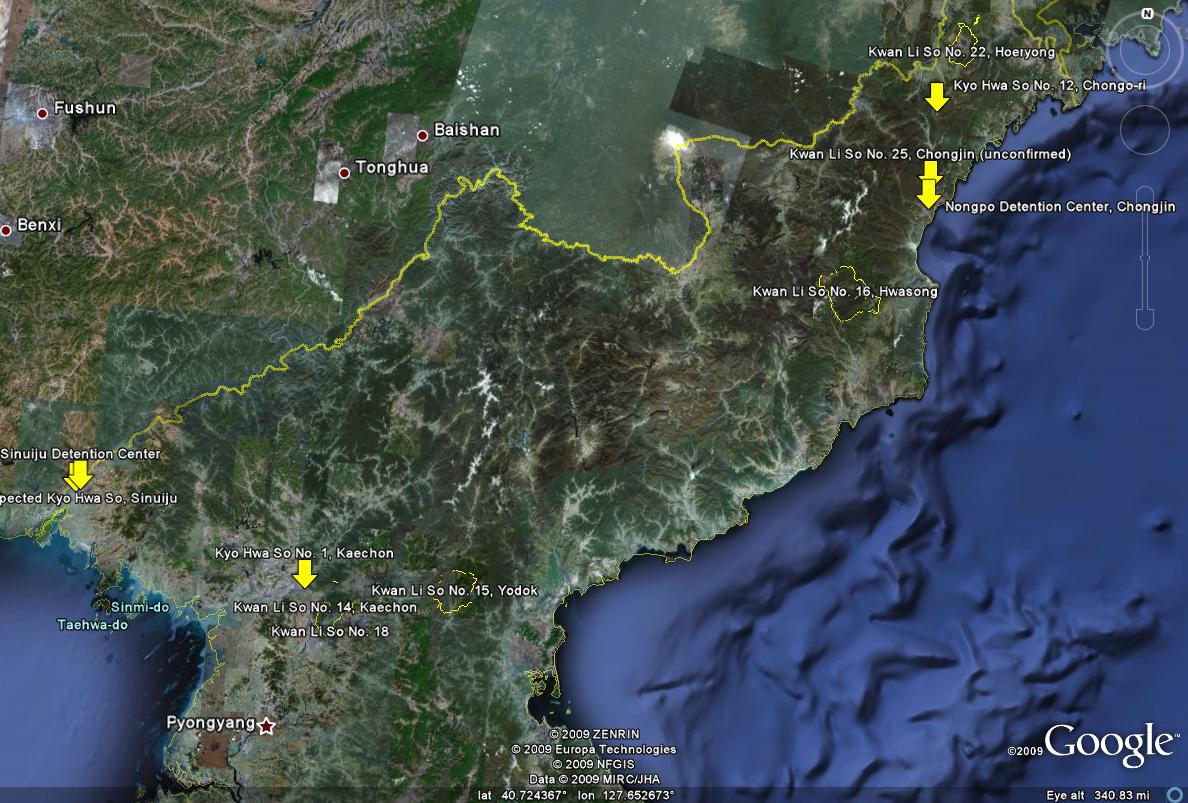
Google Earth was released in June of 2001. It is an interactive computer program that uses satellite images, aerial photography and GIS data to create a 3D world that viewers can explore. People use it to look at places they wouldn’t be able to see otherwise. This map was very different than the traditional maps we’ve been studying because it is more technologically advanced and interactive. It shows how cartography has greatly changed over time with all the technological advances that have come out. The projection, in this particular image, is limited because a specific location is being focused on. The map and Google Earth itself is very transparent, not much can be hidden. This is concerning for many people because it brings up privacy issues. People are not warned when photos for Google Earth are being taken, so different aspects of their lives can be exposed that they may not want exposed. There is a surplus of information available to the public and it can be used in the wrong way. For example, entries to houses are exposed which can lead to robberies. The surplus of information can also lead to terrorist attacks because it makes it easier for terrorists to plan with such a realistic, detailed map available to them.
The technology used by Google Earth allow for the maps to use realistic colors, showing a particular area in the same colors that it appears in real life, making the maps seem like an unbiased replication of reality. However, as we have learned in this course, all maps have bias’. Google Earth being an American based company, takes on a very pro-America bias. This bias is illustrated through the different ways that Google Earth shows North Korean prison camps and American military bases. Google Earth has clear pictures of the prison camps while they take the liberty of blurring out the American military bases. This strategic blurring (or not blurring as is the case with the North Korean prison camps) shows Google Earth’s bias towards American protection. While this bias is not a particularly negative one, as it allows for greater security of the American people, all viewers and users of Google Earth maps should be aware of the hidden bias that these maps contain.
At the beginning of our presentation, we asked the class to view their town (or an area that they are familiar with) on Google Earth. We then asked them to reflect on what they saw, specifically looking to see their thoughts on the invasiveness of the maps. We found that the majority of our classmates thought that Google Earth was not too invasive, they were more intrigued with the quality of the images. People noted that the maps offer an interesting perspective and allow for navigation around a specific area. We then presented photos of the North Korean prison camps (the photo at the top of the post). People began ask questions regarding the legality of the maps, wondering how we could see a section of the world that we can not physically visit. We discussed how google Earth is a private company, which gives them a little more wiggle room as to what they can and cannot do. Throughout our discussion our conversation with the class was mostly focused on the invasiveness of Google Earth, as it pertains to our own individual lives (our homes) and our greater protection as American citizens.
This map and Google Earth in general, are particularly important in that they show how cartography has changed as technology improves. This transformation of cartography has created maps that the audience can interact with to explore new areas of the world. In conclusion, Google Earth uses satellite imagery, aerial photography and GIS data to create powerful maps that both increase our knowledge of our world and allow for the exploration of areas that we can not visit in person.