Andy Woodruff’s Map Blog

http://www.cartogrammar.com/blog/

Andy Woodruff and three fellow cartographers create interactive web maps from “data to design to code” for their company Axis Maps. Andy mainly focuses on mapping in Massachusetts, but has also mapped his past residencies in Madison, Wisconsin and Dayton, Ohio area.

Posted in Uncategorized | Comments Off on Andy Woodruff’s Map Blog

McKim’s Disneyland Map 1958

An orange border with cartoon characters surrounds the center of lush green vegetation, colorful attractions, and passageways. The pop of pink brightly labels each attraction with a name for its special Disney entertainment theme. This popular vintage 1958 fun map by cartographer Sam McKim was first sold as a souvenir to park goers at Disneyland through a promotion with Sunkist Orange Juice (Mousemaps). Given its vibrant colors, extravagant detail and minutia, this map still creates a sense of wonder around a destination designed to transport us from our ordinary existence to the happiest place on earth. McKim’s map exemplifies the geographic imagination by allowing us to travel through a make-believe small American town to explore America’s history and its future through various theme parks that make us have pride in America.  

Geographic imagination has a variety of meanings, including individual mental images and discussions about cultures, spaces, and differences (Sage Pub). Through geographic imagination people develop a sense of boundaries and a way to think about the relative importance of places and the relationships between “our” places and “other” places (Sage Pub).  Places on the “fun map”, such as Frontierland and Tomorrowland, challenge Americans to think optimistically about how we prevailed in the past and how we can succeed in the future. The map, like the theme park, allows us to imagine Disney’s vision of America as a land of opportunity where we can all find happiness, even if we know it isn’t true.

In the 1950s, Americans needed to escape the tension of the Cold War and to be reassured that the American dream and its values still existed (Fernandez 2008). Disneyland maps allowed Americans to forget their worries and imagine their past and future in a glorious way. Disneyland contains a theme park devoted to Walt Disney’s interpretation of America’s history in the wild west, complete with cowboys and Native Americans. Moving towards the upper left hand of the fun map, “Frontierland” takes us back to 19th century America and the western movement to California — the location of Disneyland, built inside an orange (Frontierland). All the way to the top right of the map, Tomorrowland represents the future in science and  the space age (Tomorrowland). In 1957, America had announced that it would attempt to launch an artificial satellite into space, and two days later the Soviet Union announced the same (The Space Race 2010). America could imagine winning the race through the maps as the United States representing goodness over the U.S.S.R. representing evil. While examining across the map from left to right, Americans were given the opportunity to view America’s past, present, and future through the comfort of rose colored glasses.

Disney Imagineers included a 100-acre parking lot on the map as an attraction to show its confidence in the future expansion of the park and the large numbers of people who would travel to visit. Disneyland is easily accessible for those coming from suburban California and just a few hours from San Diego and Los Angeles. The Imagineers used a legend as a symbol to assist in predicting future developments, police (lost and found) and first aid. Sam McKim’s fun map brings science fiction into the mix to include elephants and large sailboats demonstrating the art of exaggeration and the popularity of science fiction during this time period.

Walt Disney claimed that “Disneyland will never be completed. It will continue to grow as long as there is imagination in the world” (Van Eaton Galleries). Sam McKim took a snapshot of an active day at Disneyland even though the space is constantly changing on a millisecond basis. The ever-changing and evolving landscape of Disneyland makes it the perfect place to map. As Dennis Wood says, maps do not evolve but the process of mapmaking constantly changes.

Sam McKim’s 1958 fun map of Disneyland and the versions that followed were used as souvenirs and strategic marketing tools to lull families into returning to America’s favorite family vacation destination. Starting with a map for funding, then maps for souvenirs and advertisements, and later for directions, Disney’s Imagineers were masters of mapmaking. Disneyland maps are a continuing work of commercial art, helping Disney to earn profits and remain an American icon.

Works Cited

Disneyland Maps, www.mousemaps.com/MouseMaps/Introduction.html.

Fernández, Manuel. “Carl Barks and the Disney Comic Book: Unmasking the Myth of Modernity.” The Journal of Popular Culture, Wiley/Blackwell (10.1111), 14 May 2008, onlinelibrary.wiley.com/doi/full/10.1111/j.1540-5931.2008.00534_2.x.  

“Frontierland.” Frontierland | Disneyland Park, disneyland.disney.go.com/ca/disneyland/frontierland/.  

“Geographical Imagination.” SAGE Knowledge, sk.sagepub.com/reference/geography/n477.xml.

“History of the Original 1953 Disneyland Presentation Map.” Van Eaton Galleries, 13 May 2017, vegalleries.com/themap.

History.com Staff. “The Space Race.” History.com, A&E Television Networks, 2010, www.history.com/topics/space-race.

“Tomorrowland.” Tomorrowland | Disneyland Park, disneyland.disney.go.com/au/disneyland/tomorrowland/.  

Wood, Denis, and John Fels. The Power of Maps. Routledge, 1993.

Posted in Maps of the Week | 5 Comments

United States Exports and Imports of Commodities: 1967

      This map was made by the National Geographic Society, and uses annual reports for the data. As you can see, America is centered in the map with a very distinct white color compared to other countries, giving a greater importance to it. The cartographer used different widths of lines to correlate with how many imports and exports that were being transported. The four biggest being Asia, Canada, South America, and Europe. The pie charts and the bar chart in the bottom left corner give a more exact breakdown of the exports and imports of the United States.

Although  very visually pleasing, this map does reflect some of the events that were occurring throughout the 1960’s. At the time, the Cold War and the Vietnam War were at their peaks. The exports to Europe and to Southwest Asia correlate with this by having more exports to these countries. With the amount of exports the United States were sending to countries, there was bound to be some political agendas trying to be met.

Posted in Uncategorized | Comments Off on United States Exports and Imports of Commodities: 1967

Team Map Presentation – “How Communists Menace Vital Materials”

How Communists Menace Vital Materials was produced in conjunction with a US Congressional report vindicating the Soviet Union for their extension of Communism across continental borders into the Third World. In 1956, when this map was released, Khrushchev was altering international politics by looking outwards to export their leftist views and leave behind an autarchic past. Fear ran rampant through US politicians as the Soviets challenged their monopoly on soft power internationally. This fear was translated onto this map. When you first glance at this projection, the hammer and sickle imply nefarious goals and the six techniques for the red thrust are descriptions of active hostility. This is a propaganda piece by the US hypocritically painting the Soviets as abusers of weaker states for their resources, inciters of civil violence, and manipulators seeking to spread their leftist ideology.

Posted in Uncategorized | Comments Off on Team Map Presentation – “How Communists Menace Vital Materials”

Atlas of the Week: The Atlas of Design

The Atlas of Design has some of the world’s most beautiful and intriguing cartographic design. New volume of full-color maps is published every two years. They have three volumes of maps now, which includes plenty of cool maps, such as Map of Gatwick and Heathrow Worker Locations.

http://atlasofdesign.org/

Posted in Uncategorized | Comments Off on Atlas of the Week: The Atlas of Design

Blog of the Week: Mapping the Creatures Living Beneath Our Feet

When most people think about maps, the first impression they have is that map is about depicting the material or abiotic features of the world. However, this blog shows some map about actual living things, such as soil biodiversity around the world. I hope this blog can give another impression about map, which can be vivid.

http://phenomena.nationalgeographic.com/2016/05/25/mapping-the-creatures-living-beneath-our-feet/

Posted in Uncategorized | Comments Off on Blog of the Week: Mapping the Creatures Living Beneath Our Feet

Territorial Disputes in Waters Near China

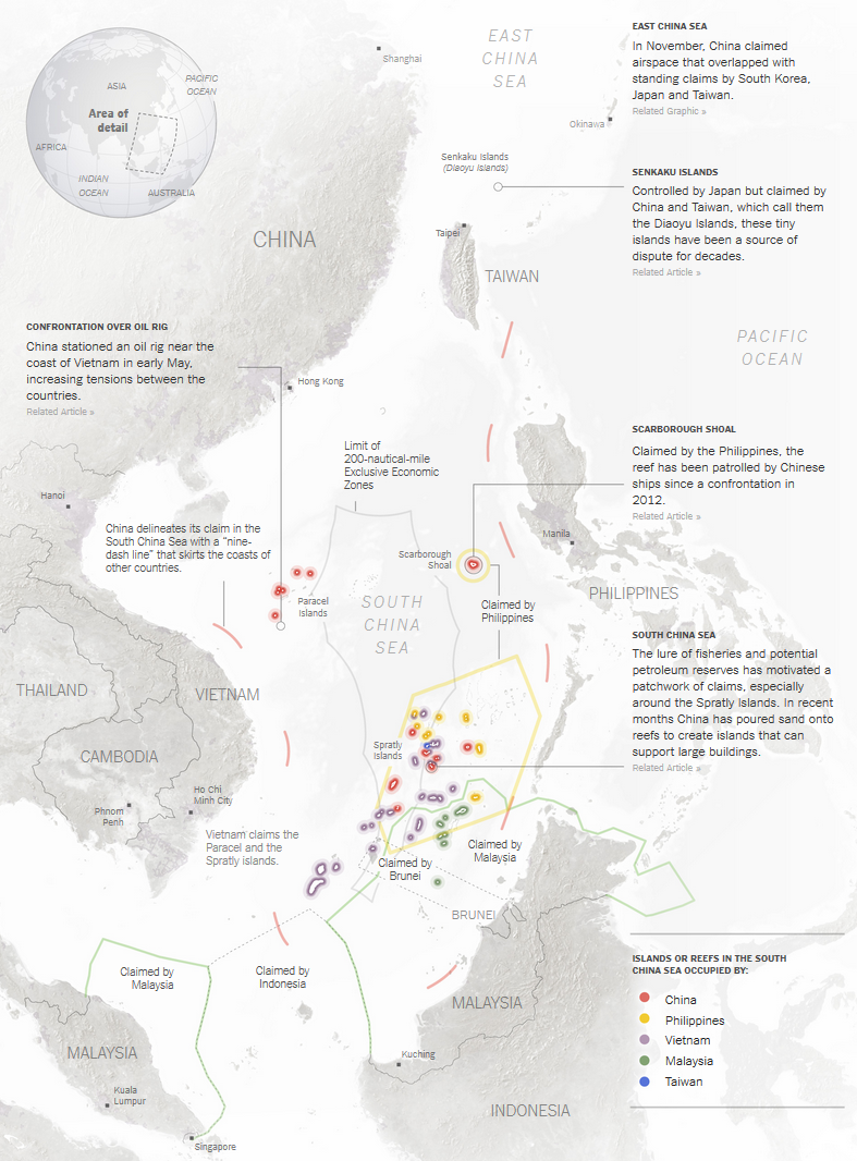
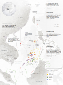
Everyone has the experience of scrambling for something when he/she was a child, such as toy cars or dolls. Sometimes, lots of countries will also scramble for one thing like a naive child. Since the 1970s, the territorial dispute in the waters near China has become furious, especially around the South China Sea. There are several countries that have competing territorial claims over the South China Sea, including China, the Philippines, and Malaysia. Maps can show us a nation’s assertion of sovereignty in a direct way. At the moment of the map is noticed, it declares the territorial sovereignty to its audience. Therefore, this map, Territorial Disputes in Waters Near China, is made to show the conflicting claims of territorial sovereignty among Eastern Asian countries and connect the power of ownership in the waters.

Around the bottom of the map, there are lots of countries claiming that at least some part of the South China Sea belongs to them. However, what value does this sea area have to cause so many countries to be eager to own it? To answer that, we need to disclose the silence underneath the map itself in that the hidden political message also can exert a social influence through omissions as the map itself does. First of all, the South China Sea is incredibly rich in natural resources. By estimation, its oil and gas holdings amount to around 20 billion tons. That is how it gets its title“the second Persian Gulf. It also contains more than 35 kinds plural of rare metal, which are crucial for manufacturing industries. Besides its material resources, the South China Sea is also famous for its biodiversity. There are more than 15,000 kinds of fishes live in the waters. All of these natural resources can bring huge economic interests to the countries that have the territorial sovereignty.

In addition, the geo-strategic significance of the South China is another factor that attracts those countries. Located in a marginal area of the Pacific Ocean, the South China Sea carries over 3 trillion in trade each year. Unequivocally, the South China Sea is one of the most desirable seas in the world.

After discovering the silence of the map, it is the time to look at the map itself. In the left corner, there is a three-dimensional earth to give audience a realistic geographic imagination of the location of the waters in the world. Around the center, which represent the South China Sea, are the claimant countries: China is to the west; Philippines is to the east; Malaysia lies to the south.

This map uses colorful lines as a tool to draw the sea boundaries and employs colorful points as signifiers to represent the islands or reefs in the South China Sea occupied by different countries. For instance, China is signified by red: the red line refers to its claimed water boundaries, and the points represent the islands China occupies currently. From the map, we can see that China claims that the entire sea areas belong to it; Philippines asserts the south-west part of the South China Sea is its territory; Malaysia declares it has south part of the waters.

Even though the map is able to distinguish territory via boundaries, there is no absolute right or wrong in this dispute. Every nation involved in this dispute has its own reason to make the claims. For instance, China bolsters its claims through archaeological evidence, including the naval expeditions to Spratly Islands in Han and Ming Dynasties. Also, since Ming Dynasty, Chinese fishermen and merchants have lived on the waters. However, this map does not show these historical facts and choose to simplify the history. On the other hand, according to Convention on the Continental Shelf, which is created for codifying the rules of international laws relating to continental shelves, Malaysia claims that it has the sovereignty. As for Philippines the assertion is based on the Proximity Principle, which is a system of jurisdictional rights, and reinforced by the explorations of a Philippine explorer, Tomas Coma, in 1956[1]. Since those variable reasons, the sovereignty of the South China Sea is always controversial.

The map tries to show the territorial dispute in the South China Sea objectively. However, that is impossible because maps themselves are biased representations of the world. The cartographer of this map, Derek Watkins, who is a graphics editor at New York Times, inevitably reveals his own interests served by this map in the illustration part. The illustration part focuses on what China did to strengthen its control over the South China Sea, such as “stationed an oil rig near the coast of Vietnam in early May” and “poured sand onto reefs to create islands that can support large buildings.” Those descriptions portray China as a greedy beast, which is eager to control the sea and will get it with any methods it has. However, other countries also took actions to strengthen their military control in the sea area, like when the Philippines and Japan performed a joint military exercise in 2015. Watkins chooses not to write down these facts because he may have personal bias towards China. Also, the American cultural bias, which is against china and tries to weaken Chinese power, affect him to create the map in some extent.

Overall, Territorial Disputes in Waters Near China is a meaningful and successful map. It uses signifiers and colors to show each nation’s assertion of sovereignty in a clear way. In addition, to help audience understand the dispute and add details to the map, Watkins provides crucial political texts, including the Chinese actions and the current situations around the waters. However, he only presents a partial picture of the dispute and simplifies the history because of his personal bias, which may be influenced by the American cultural bias. But no one can judge those competing countries decisively because interest is the nature of nations. Also, the same works for maps because the nature of map are bias and cultural choices. By looking at this map, the audience can get the general picture of the territorial disputes in one of the most valuable and controversial sea areas in the world – the South China Sea.


[1] Kraska, James, and Raul A. Pedrozo. International maritime security law. Martinus Nijhoff, 2013..

Posted in Uncategorized | 2 Comments

Population Problem

Image result for there are more people in this circle than outside of it

While in the U.S. we might feel as though we are the center of the universe sometimes, the reality is that life revolves around southeast Asia. My map shows that the world truly is skewed in population.  I believe the mapmaker either used this map to defend a claim of some sort, spread awareness on an issue, or simply offer new information to change perspectives.

The circle of area that has been marked on this map contains more people in it than the entire rest of the map’s area does combined.  At first, this may seem impossible considering all of Africa, Europe, North America, and South America are out of the circle.  With a deeper look, we can see that six of the ten most populous countries right now are inside the circle.  These countries are China (1st), India (2nd), Indonesia (4th), Pakistan (6th), Bangladesh (8th), and Japan (10th).  This map, although funny and incredible, can be a major sign of trouble. The world is growing in population and some areas are overheating due to overpopulation.  This problem is particularly evident in Asia and most specifically the circle.  The reason for this is that there are too many people in not enough space.  The population densities in Asia are all among the greatest in the world.  Countries like Canada, Russia, and the United States are bigger than China and India, yet hold a significantly smaller population.  While the U.S. is fittingly third in population, Russia is ninth, and Canada is staggeringly the 38th most populated country in the world, despite being the second largest in area.

There are a number of reasons I can see this map was made.  First of all, this map is supposed to show that the largest hub of life in the world is in South Asia.  I personally know that I was surprised to see Indonesia and Bangladesh had larger populations than Russia.  Among the largest 100 countries in the world, the top three in density are Bangladesh, The Republic of China (Taiwan), and South Korea.  All three of these countries are inside of the circle of area from the map.  Other countries in the circle in the top 30 of population density rank as follows: India (7th), Philippines (11th), Japan (12th), Sri Lanka (12th), Vietnam (14th), Pakistan (16th), North Korea (19th), Nepal (23rd), China (27th), Indonesia (28th), Thailand (30th).  Thus, fourteen of the thirty densest countries in the world are in Southern Asia.  Given the major problems south Asian countries face regarding pollution and other environmental issues, I believe the author of this map was hoping to spark a sort of diaspora from South Asia.  Potentially I think the author wants for people living in this area and out of it to see this map and understand that there must be a dispersion of population to help the environmental problems in the world.  If even a modest number of these people emigrated to another area of the world, there would be a more even spread of population which would be better for fighting against global warming and pollution on earth.  Another explanation of the author’s goal could be to show that the center of the earth is really South Asia.  The area of the world with the most population ought to hold a lot of power in the world of global politics.  In this way, this author could be advocating for a more Asian centralized international political sphere.  The reason the author used a map instead of any other medium, is because it allows the reader to really visualize the absurdity of the statistic.

As an American, this map shows me the magnitude of that area of the world.  It seems as though America is an incredible hub of life until it is compared to South Asia.  I think as Americans we also like to think of ourselves as the center of the global political sphere, when in reality South Asians most likely live in their own world separate from the other areas of the earth.  Also, given the current situation and tensions between the United States and this area of the world, it is mind-blowing to consider how many people are really involved in the global conflicts that involve southeast Asia.   While many different conclusions can be drawn about this map depending on perspectives, the simplicity of the fact that less than a fifth of the land area on earth contains more than half of the entire global population is staggering for sure.

Posted in Uncategorized | 3 Comments

Letts’s Bird’s Eye View of the Approaches to India

At first glance, most people would be deceived by the well-chosen color and the exquisite details of the map, and hence consider this piece as a painting. Actually, Letts’s Bird’s Eye View of the Approaches to India is a panoramic map made in Britain in 1900. It conveys the ideas of maintaining British control over her colonies and expanding the empire into Afghanistan, by applying the bird view, mapping the borders of surrounding nations, and adding artistic details.

The map looks over to Afghanistan, the border of the Russian Empire and of Persia from the northwest border of British India, present-day Pakistan. The bird’s eye view provides a good sense of the Afghani territory, where the rivers and mountains are clearly drawn and labeled. This perspective includes most of the territory of Afghanistan and extends further to the north. In the time when strong European powers spread their colonies all over the world and competed with each other, the impression of unlimited territory suggested the idea that there were infinite land and resources beyond India, waiting for Great Britain to obtain. Borders are represented by red dotted lines. The bright color makes the borders more obvious. Moreover, mapping out the border of the Russian Empire reduces the distance between the two great powers, and hence gives a sense of competition and tension to the reader. Another little detail of the red border line is that they are labeled as British, Russian and Persian borders but not the Afghani border even though they encircle the Afghani territory. This design reveals the author’s understanding that Afghanistan was not considered as an independent nation, but rather a piece of land that can be taken over by the surrounding stronger nations. The finishing touch of the map is adding the two British soldiers in their red uniforms located in the lower right corner near the British border. The soldier on the left is pointing to Afghanistan and seems to be talking about the future, where Afghanistan becomes a new colony of Great Britain.

The political message of the map is clear due to the way that the author drew the map and the elements he added to it. He did not focus on exact geographical locations or accurate scale. Instead, he emphasized the overall structure of the territory and artistic details like using red dotted lines to represent borders and adding British soldiers. Considering its geological accuracy, artistic style and intention, this map is not geographical cartography, but more of a historical cartography that reveals political and historical information. In this sense, this map is a propaganda map that introduces the idea of colonizing Afghanistan to the readers and appeals for public support on colonial expansion.

Ironically, the results did not turn out as the British empire expected. In 1919, the Third Anglo-Afghan War ended British control over Afghanistan foreign policy. In 1947 Britain passed the Indian Independent Act and soon the Indo-Pakistan war took place. As Denis Wood claimed in his book The Power of Maps, the map is outdated the moment it is completed. It belongs to the past and can hardly foresee the future.

Posted in Maps of the Week | 2 Comments

Blog of the Week: If You Love Maps, This Blog Is for You

Some blogs are hard to understand as they are made by cartographers as they explain maps in a way that are difficult to understand for everyday people. This blog is not by professional cartographers, but by normal people who find maps intriguing, and want to share the magic of maps. Definitely worth visiting if unique or interesting maps are something that you want to see more of.

http://phenomena.nationalgeographic.com/2016/05/11/if-you-love-maps-this-blog-is-for-you/

Posted in Uncategorized | Comments Off on Blog of the Week: If You Love Maps, This Blog Is for You