Global Internet Usage Based on Time of Day

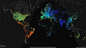
My Map of the Week, “Global Internet Usage Based on Time of Day,” is a unique outlook on the global internet usage of certain areas of the world, depending on the time of day. The map is almost like a short video which changes color depending on the time of day which is demonstrated by a wave like image showing daylight. The color changes vary from red to purple, red being the highest amount of internet usage and purple being the lowest. The map is interesting as it shows a measure of internet usage based on time of day around the world, however, one could argue the reliability of the map. There is a direct relationship between science and mapping, but Wood would argue that we can’t fully trust the science behind a map. Even if the map is scientific, this does not mean it is fully credible. For instance, where did the mapmaker find these statistics? Furthermore, there is no quantitative measurement, rather a qualitative one, which is extremely vague to the viewer of this map. This map conveys a quite obvious point in which the internet is most heavily used in the day time, and least used in the darkest hours of the night.

The justification of this map being the map of the week is because of its direct relation to our maps class. This map is relying on science to be accurate and justifiable. Also, this map gives certain outlooks on the world’s internet usage at a certain point in time. Studying mapmaking is dependent on analyzing maps in a screenshot of time and analyzing how the time affects the map. Wood would argue that this map can be critically analyzed in a specific location and time frame. The map is also a video, or a loop, which breaks mapping standards. One could argue this is a revolutionary map. This is a map thats gives a specific category, internet usage, a broad outlook worldwide. It gives a broad outlook on the world because the map uses a universal standard and color grade to depict internet usage. In doing so, the reader can easily view the map and see how internet usage varies in association to location and time.

The map is unique due to interactive movement and intelligent mapmaking decisions. By looking at this map we can further understand the world in which we live and further our knowledge of other countries and how they differ from us. This map gives the reader the ability to learn a plethora of information on different countries. This map not only informs us on how we have a greater and easier opportunity to access the internet, but how this gives an unfair advantage in education, research, economics and more. Although the internet is looked at as being a small perk of living in a Western nation, the mapmaker is implying how something small, can have a larger and more powerful effect on the world. The mapmaker used a black background and  white borders in order to for the colors to pop and to show that the internet has no boundaries. The internet can be used in anywhere at any time, even the ocean. The water could have been blue, but the mapmaker intelligently chose to make the map black to demonstrate the power of Western nations, and the inability of third world countries to access the internet. Furthermore, the map helps demonstrate our privilege and the ways in which we differ from the rest of the world. By looking at the map, one can see that the larger first world countries have completely shaded in areas. This demonstrates that most people have access to the internet and are connected to and using it constantly throughout the day. Even in the nighttime, Western nations are constantly experiencing far greater internet usage than third world countries in peak daytime hours.

It makes you realize that the world is dominated by a new age of social media and internet usage for work, studies, socializing, and for our own personal reason and enjoyment. If you look at the other third world countries, there is little internet usage or certain smaller areas the have a small shaded area. This depicts the power we, as well as other first world countries have. Although internet doesn’t exactly correlate to power, it does give a sense of opportunity and privilege that others do not possess. The internet is used as a tool to further knowledge and research. The internet has many work benefits and the advance in technology almost wipes out labor work demand in third world countries.

Having the opportunity to use the internet for studying and working further benefits individuals and the country. It helps expand a countries knowledge and resources through things like research and trade. Countries that can expand knowledge through research are constantly growing and countries that can use the internet for trade help a country gain resources and expand. This map critically implies that internet usage is a colossal resource that first world countries possess which give an uneven edge and help them maintain and expand power.


Posted in Uncategorized | 1 Comment

Failed/Fragile States Index Map

The Failed/Fragile States Index was created by The Fund For Peace. The FFP was Founded in 1957 and is an independent, nonpartisan, non-profit organization based in Washington, D.C. and Abuja, Nigeria. It works to prevent conflict and promote sustainable security globally by building relationships and trust across diverse sectors. The index is used as an early warning for a nation’s vulnerability to collapse and to call for effective policy responses. In the 2010, the FFP changed the name of the index from Failed to Fragile and also altered the the scale for how close a nation is to collapse of succeed. The map incorporates a unique feature of interactivity that allows its users to explore each country in depth in connection to its ranking.

Given that the map was designed by the Fund For Peace, it is clear the goal of this map was to raise awareness to the countries that are most in need of assistance across the world.  There are, however a few issues with this map. The main one being the label of “failed states”. The main problem with this label is that it writes off certain countries as failures despite lacking much context.  While they have a system they believe in that factors in many different statistics to determine their rankings, the terms “success” and “failure” are objective terms that mean different things to different people.

They have since updated their map to the title “Fragile States Index” and it is now an interactive map that gives more detail on every country and why it is ranked where it is.  For example, areas like South Sudan are now singled out and spotted as a clear area that needs help, whereas the 2010 map somewhat grouped areas of Africa together. Thus, in many ways the FFP is much more successful now with their map today than in 2010.


Posted in Uncategorized | Comments Off on Failed/Fragile States Index Map

Atlas of the Week

The Routledge historical Atlas of Jerusalem is a historical atlas that gives an overview of Jerusalem from biblical times to present day. This atlas offers clear pictures and maps of the past 150 years. It does a great job of depicting the impact of Jewish people on the development of Jerusalem. This relates back to our class because we have studied maps that are pretty historical and show a lot of bias. These maps can be seen to show bias as well.

Posted in Uncategorized | Comments Off on Atlas of the Week

Blog of the week: Map of Jerusalem

I chose this blog site because i really find jerusalem very interesting and i love the country. this site was super interesting to me, seeing the maps and blog posts about the map… if you get the chance to subscribe to see some maps, you definitely should.. you will not be disappointed. Jerusalem is a beautiful place and I cant wait to go and see it again.

http://wscisrael2018.blogspot.com/p/map-of-jerusalem.html


Posted in Uncategorized | Comments Off on Blog of the week: Map of Jerusalem

Atlas of the Week: Transit Maps of the World

The Transit Maps of the World is a complete collection of historical and current maps of every rapid-transit system on earth. With nearly three hundred different colorful maps to explore, this is every map lover’s dream. This atlas is special because it includes rare and historic maps, diagrams, and photographs, some of which are available for the first time since their original publication. This collection of maps will help its readers see the world in a new way and excite a new appreciation for transportation worldwide.

Posted in Atlases of the Week | Comments Off on Atlas of the Week: Transit Maps of the World

The World Through the Ages

The most conventional way to evaluate a country’s health and well-being is usually associated with the economy. This includes statistics such as the overall GDP of the nation, average income per capita, and net exports. These are valuable pieces of information to help paint a picture of a countries health and success. However, there are other significant statistics that do the same thing without examining monetary data. By calculating the median age of a country, you can evaluate it by a different set of standards according to reproductive health. If a country has a very high median age, it indicates that a large portion of the population is elderly, and the birth rate of that country must be rather low. In contrast, if a nation has an especially low median age, it indicates a large portion of population is quite young and the birth rates must be relatively high. The information is portrayed on a map to help paint a picture of the information spatially in the world. It is more impactful to see the ages on a map rather than in a graph or chart. It helps the audiences understand where in the world these ages are common and helps them compare their nation to others. This map provides helpful and relevant information because it paints a picture of the overall population in connection to their age and birth rates.

Over the past fifty years, rapid population growth has been increasingly problematic in a world of finite and scare resources. When the birth rates of a country are particularly high, it causes the population of that country to rapidly increase in a matter of years. Regardless of the country’s economic status, managing resources such as land, water, food, jobs, and shelter with a rapidly increasing population becomes a menacing issue. On the bright side, according to Our World in Data, the fertility rate in the world has halved over the past fifty years which has shown great progress. However, there is still a lot of work to be done to get every country to healthy levels of reproduction. With this in mind, the birth rate of a country is very telling of the countries health because it indicates how effective the nation is at managing family planning programs and distributing contraceptives.

The Northern African nation of Niger has the highest fertility rate in the world. The fertility rate is the average number of children a woman gives birth to in her childbearing years. Niger has a fertility rate of 6.62 children per woman. This is a very concerning number because it means that the population is growing at a rate greater than any nation. With so many children being born, the amount of resources available for each newborn child decreases. In developing nations such as Nigeria, there are indignant areas that lack access to contraceptives and the knowledge to make smart reproductive decisions which result in high birth rates. As depicted in the map, Niger has the youngest median age of any nation. There are so many children being born that fifty percent of the population is below the age of fifteen. To put this into context, America’s median age is 37.6 and it has a fertility rate of 1.84 children.

This map is worthy of the title “map of the week” because it portrays the well-being of every country in a new and significant way. A benefit of portraying this information with a map is that it helps visualize a complex idea of median ages in a very clear and pleasing manner. On the flip side, it uses a simplified representation of each country with its corresponding median age and prevents new ways of thinking about the problem. The use of the map reduces the complexity of the countries and their unique situations to a single number which takes away from each nation’s story.

This map uses the Mercator projection which is a very conventional portrait of the world to help the audience digest the information more easily. It also uses bright colors to be easily contrasted against each other with the youngest median ages in green and oldest in dark red. This is effective in drawing the audience to the countries of youngest or oldest age. As the audience is able to interpret, the nations of youngest median age are nations that are rather undeveloped while the older median age countries are the developed nations of the world. This division between undeveloped and developed nations is amplified in the use of such contrasting colors. It effectively spatializes the data, but it is incapable of providing a solution to the problem or argument being made and this is where the use of map can get tricky. This map is making the argument that the countries with low median ages tend to be the nations that are less developed. This makes sense considering the map was made by the CIA, an American organization, which implies there is a bias involved. The CIA takes interest in knowing this sort of information because it can keep notice of nations that are struggling, and nations are thriving. This allows it to understand which countries need aid and which countries might be a potential rival or threat to America. The political agenda of the map favors developed nations, especially America, because it portrays the major developed nations with rather healthy median ages. At the same time, it illustrates a sense of urgency to aid the countries with concerning young median ages. This map helps audiences see the world according to age and helps people to understand how those nations are affected by it. At the end of the day, this map effectively brings forward a key issue in society by challenging how maps can convey complex topics.
Sources:

https://www.statista.com/statistics/262884/countries-with-the-highest-fertility-rates/

https://ourworldindata.org/fertility-rate

Posted in Maps of the Week | 1 Comment

Story Maps

Story maps is a modern blog that wants to tell a story within all of its interactive maps. This blog focuses on mapping interesting events and places around the world providing you with interactive maps as well as images to bring you directly into the reality of the map.

https://storymaps.arcgis.com/en/gallery/#s=0


Posted in Uncategorized | Comments Off on Story Maps

Atlas of the Week

The New Concise World Atlas is an annually updated Atlas created by some of the world’s finest cartographers. This atlas offers clear and full images of the most recent topographic and political maps. This Atlas also offers cartography diving into the depths of the ocean’s seafloor as well as satellite imagery. This Atlas relates to class in terms of it’s current publishing of political and satellite development maps.

Posted in Atlases of the Week | Comments Off on Atlas of the Week

Pursuit of Happiness

The map titled, “A decade of migration” offers many implications to migration in the 90’s and early 2000’s and is a very accurate depiction of what was going on in the world and especially in Europe around this time. While there is not a lot of data on the author of this map, with a small bit of research, it is clear to identify his/her accuracy in the portrayal of migration over this decade of time. In the early and late 90’s there were multiple events that contributed to a large amount of both internal and international migration as people sought after a safer more peaceful lifestyle as well as economic and job opportunities.

In the 1990’s Germany was a strong contributor in the process of migration. With the fall of the Berlin Wall, this enabled Germans living in mainly eastern Germany and the old Soviet Union to move freely inside of Germany. A large part of this migration was internal and Germans fled to a more unified part of Germany as well as western Germany. With the Cold War going on around the early 90’s, this gave many people in Eastern Europe the incentive to migrate to safer zones that were less vulnerable to war and attack. Many of which migrated to Western Europe and North America. On top of internal migration in Germany there was a lot of migration out of Eastern Europe due to a longstanding war in the Balkans. The Balkans War was fought throughout the 90’s between different ethnic groups which were mainly due to military conflicts causing people to feel an urgent sense of fear, giving them incentive to flee Eastern Europe and migrate to parts of western Europe and central Asia. These were two of the main implications for a large part of migration coming out of Eastern Europe during these times. This historical context is directly related to the map in the way that the cartographer chooses to use Eastern Europe as the center piece of the map. The legend shows that the largest Intra-zone migration was in and around Eastern and Western Europe. This shows the cartographers intentions to connect the map reader with the importance of the context around Eastern Europe in the 90’s. It also shows the bias of the cartographer in the way that he finds migration in Eastern Europe to be the most important part of this time. On top of a large portion of migration being from eastern Europe another large portion was in South Asia. Another focus of the map is on South Asia. During this decade South Asian migration both internally and to North America was at it’s highest rates. Many migrated within South Asia or to North America seeking growing economies and strong job opportunities which were both flourishing in both areas during this time. Specifically in Asia, many were struggling in terms of poverty and saw opportunity in South and Southeast Asia.

A large portion of this map is tied to the legend. The spirals not only reflect the amount of people (in millions) based on size but also implies the cartographers view on the world during this time. He uses the spirals to symbolize the world as rapidly changing on a big and small scales all over the world. He uses this symbol to represent the world as continually spiraling and people are forever moving around and changing their lives. In terms of the cartographers choice of color, he chooses colors that strongly reflect a sense of power and emotion. Most all of the arrows of international migration are into countries filled with a sharp green. Green primarily reflects spring and opportunity and a positive new beginning. The coloring also connects to how the map reflects power. The bright green regions are countries that are strongly developed and have a strong economic and political power. This ties into what many migrants in the European and Southern Asia regions were looking for.

In conclusion, this map offers extremely relevant and interesting information about migration in the 90’s and early 2000’s. He emphasizes the amount of conflict in Europe and how that caused migration in the way that he centers Eastern Europe. The cartographer uses a very cartoonish and easy to understand legend that has a strong connection between the map and the reader. His legend offers the thought of the world continually spiraling and ever changing while also bringing a sharp contrast of colors into the map to help understand the power of countries at this time. While maps never change and they represent a snapshot in time, the cartographer reminds the reader of the importance of understanding what is happening in the world around us and how migration may effect different people around the world. Specifically for most of us, it reminds us to appreciate the country we live in as we come to realize our lives are not in danger by war or poverty and migration is unnecessary and is not easy to do for most families around the world.


Works Cited:

Stratfor. “The Refugee Crisis: What Europe Can Learn From the Past.” Stratfor, Stratfor, 5 Oct. 2015, worldview.stratfor.com/article/refugee-crisis-what-europe-can-learn-past.


“Balkans War: a Brief Guide.” BBC News, BBC, 18 Mar. 2016, www.bbc.com/news/world-europe-17632399.


“Looking for a Home.” The Economist, The Economist Newspaper, 29 Aug. 2015, www.economist.com/news/europe/21662597-asylum-seekers-economic-migrants-and-residents-all-stripes-fret-over-their-place-looking.

Posted in Maps of the Week | 2 Comments

Lunar Wall Mosaic 1962

by Alex Beran and Abra Granger

The USAF Lunar Wall Mosaic was created in 1962 and was intended for astronauts to land on the moon. This map allowed the United States to win the space race against the Soviet Union. The ability to win the space race revealed which country had better resources and technology. Astronauts needed to know the exact slope and composition of the surface in order to land on the moon. If a country can map the moon, then it is likely that they can map any other place as well. The power to map the moon is a form of psychological warfare. The moon is way further away from the U.S. than the Soviet Union is. If the U.S. can map and get to the moon, then they can most definitely accurately map the Soviet Union too. Another theme of power is that a country can exert their dominance by “owning” and “naming” territories on the moon.

Lunar mapping began in the 1600s, reached its peak during the space race, and dwindled after the U.S. landed on the moon. Cartographers began mapping this moon using Earth-like techniques which they ditched due to the lack of air and water erosion on the moon. Cartographers, in fact, used airbrushing techniques instead to make the map look less like the earth. To impose a sense of power, a country can express ownership by naming territories on the moon.

In class, we discussed how political power is concomitant with the map’s existence. With questions encompassing what it means to have the technology to map the moon in relation to the concept of a “Space race”, we guided the class through the political power and scientific advances that were employed to carry out the making of the lunar map. Proceeding the warm-up questions, we invited the class to participate in a debate on whether the Lunar Wall Mosaic was more scientific, or more political. This debate furthered the depth of conversation about the overall ideology and context of the map. On the one hand, the map could not have been created if not for the U.S. Air Force’s military agendas. On the other hand, the longevity of the scientific advancements outlive the political agendas of the time. However, we can conclude that both political and scientific influences play major roles in the creation of this map.

Posted in Uncategorized | Comments Off on Lunar Wall Mosaic 1962