
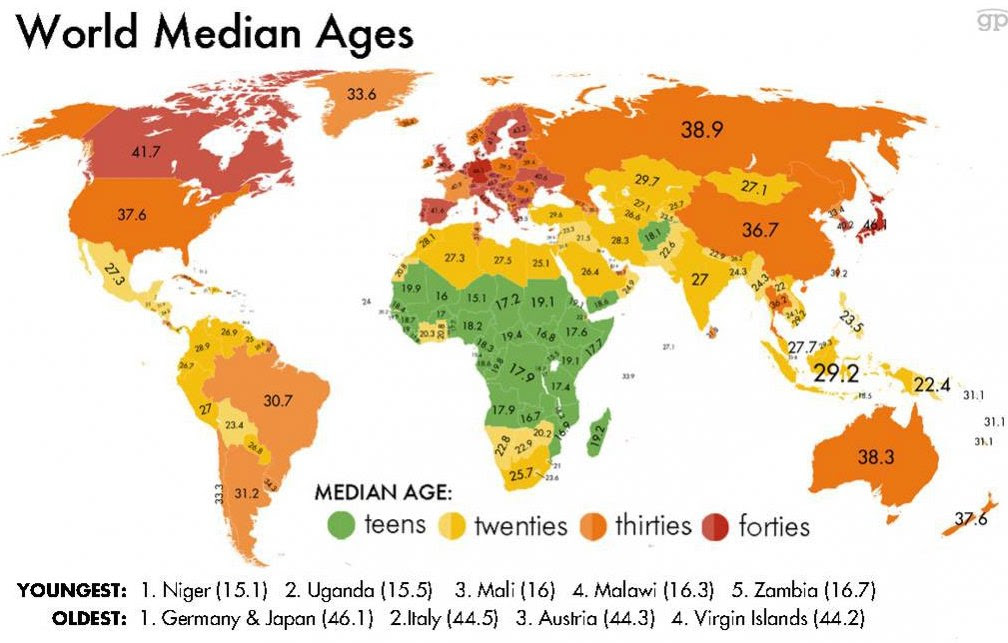
The most conventional way to evaluate a country’s health and well-being is usually associated with the economy. This includes statistics such as the overall GDP of the nation, average income per capita, and net exports. These are valuable pieces of information to help paint a picture of a countries health and success. However, there are other significant statistics that do the same thing without examining monetary data. By calculating the median age of a country, you can evaluate it by a different set of standards according to reproductive health. If a country has a very high median age, it indicates that a large portion of the population is elderly, and the birth rate of that country must be rather low. In contrast, if a nation has an especially low median age, it indicates a large portion of population is quite young and the birth rates must be relatively high. The information is portrayed on a map to help paint a picture of the information spatially in the world. It is more impactful to see the ages on a map rather than in a graph or chart. It helps the audiences understand where in the world these ages are common and helps them compare their nation to others. This map provides helpful and relevant information because it paints a picture of the overall population in connection to their age and birth rates.
Over the past fifty years, rapid population growth has been increasingly problematic in a world of finite and scare resources. When the birth rates of a country are particularly high, it causes the population of that country to rapidly increase in a matter of years. Regardless of the country’s economic status, managing resources such as land, water, food, jobs, and shelter with a rapidly increasing population becomes a menacing issue. On the bright side, according to Our World in Data, the fertility rate in the world has halved over the past fifty years which has shown great progress. However, there is still a lot of work to be done to get every country to healthy levels of reproduction. With this in mind, the birth rate of a country is very telling of the countries health because it indicates how effective the nation is at managing family planning programs and distributing contraceptives.
The Northern African nation of Niger has the highest fertility rate in the world. The fertility rate is the average number of children a woman gives birth to in her childbearing years. Niger has a fertility rate of 6.62 children per woman. This is a very concerning number because it means that the population is growing at a rate greater than any nation. With so many children being born, the amount of resources available for each newborn child decreases. In developing nations such as Nigeria, there are indignant areas that lack access to contraceptives and the knowledge to make smart reproductive decisions which result in high birth rates. As depicted in the map, Niger has the youngest median age of any nation. There are so many children being born that fifty percent of the population is below the age of fifteen. To put this into context, America’s median age is 37.6 and it has a fertility rate of 1.84 children.
This map is worthy of the title “map of the week” because it portrays the well-being of every country in a new and significant way. A benefit of portraying this information with a map is that it helps visualize a complex idea of median ages in a very clear and pleasing manner. On the flip side, it uses a simplified representation of each country with its corresponding median age and prevents new ways of thinking about the problem. The use of the map reduces the complexity of the countries and their unique situations to a single number which takes away from each nation’s story.
This map uses the Mercator projection which is a very conventional portrait of the world to help the audience digest the information more easily. It also uses bright colors to be easily contrasted against each other with the youngest median ages in green and oldest in dark red. This is effective in drawing the audience to the countries of youngest or oldest age. As the audience is able to interpret, the nations of youngest median age are nations that are rather undeveloped while the older median age countries are the developed nations of the world. This division between undeveloped and developed nations is amplified in the use of such contrasting colors. It effectively spatializes the data, but it is incapable of providing a solution to the problem or argument being made and this is where the use of map can get tricky. This map is making the argument that the countries with low median ages tend to be the nations that are less developed. This makes sense considering the map was made by the CIA, an American organization, which implies there is a bias involved. The CIA takes interest in knowing this sort of information because it can keep notice of nations that are struggling, and nations are thriving. This allows it to understand which countries need aid and which countries might be a potential rival or threat to America. The political agenda of the map favors developed nations, especially America, because it portrays the major developed nations with rather healthy median ages. At the same time, it illustrates a sense of urgency to aid the countries with concerning young median ages. This map helps audiences see the world according to age and helps people to understand how those nations are affected by it. At the end of the day, this map effectively brings forward a key issue in society by challenging how maps can convey complex topics.
Sources:
https://www.statista.com/statistics/262884/countries-with-the-highest-fertility-rates/
https://ourworldindata.org/fertility-rate
This map is very important because it shows the issues a country can face when dealing with overpopulation. This map is obviously political in nature as it is created by the CIA. A great point made was that struggling countries have lower median ages. This relationship is important because it shows that high fertility rates can negatively impact an economy. This is clear in the African continent, which is known to be less developed than the rest of the world. I found it interesting that the younger median ages were colored green instead of red because we usually equate green with good and red with bad.