
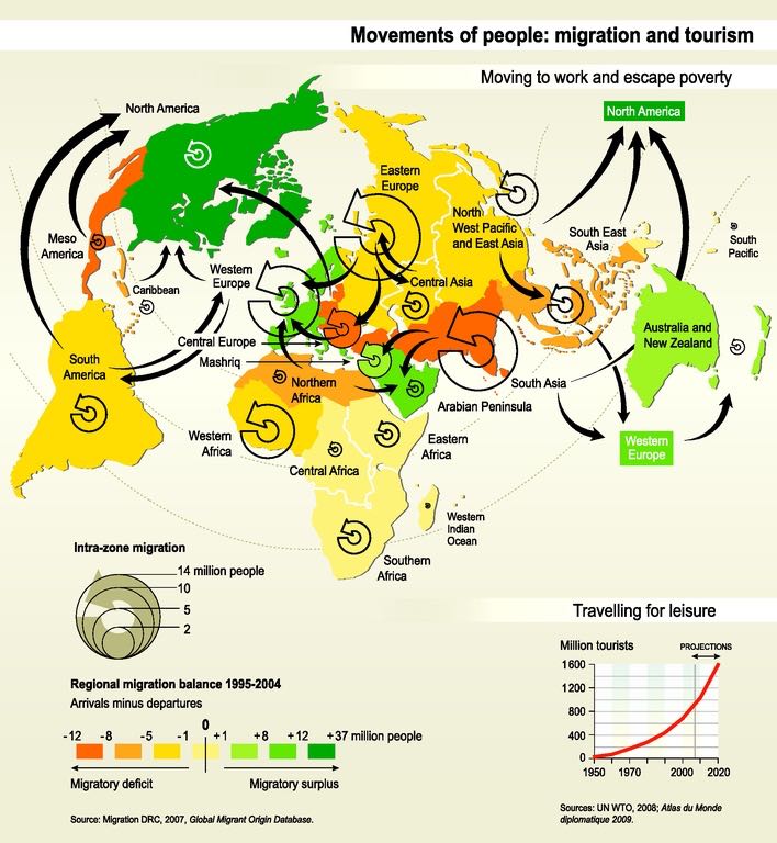
The map titled, “A decade of migration” offers many implications to migration in the 90’s and early 2000’s and is a very accurate depiction of what was going on in the world and especially in Europe around this time. While there is not a lot of data on the author of this map, with a small bit of research, it is clear to identify his/her accuracy in the portrayal of migration over this decade of time. In the early and late 90’s there were multiple events that contributed to a large amount of both internal and international migration as people sought after a safer more peaceful lifestyle as well as economic and job opportunities.
In the 1990’s Germany was a strong contributor in the process of migration. With the fall of the Berlin Wall, this enabled Germans living in mainly eastern Germany and the old Soviet Union to move freely inside of Germany. A large part of this migration was internal and Germans fled to a more unified part of Germany as well as western Germany. With the Cold War going on around the early 90’s, this gave many people in Eastern Europe the incentive to migrate to safer zones that were less vulnerable to war and attack. Many of which migrated to Western Europe and North America. On top of internal migration in Germany there was a lot of migration out of Eastern Europe due to a longstanding war in the Balkans. The Balkans War was fought throughout the 90’s between different ethnic groups which were mainly due to military conflicts causing people to feel an urgent sense of fear, giving them incentive to flee Eastern Europe and migrate to parts of western Europe and central Asia. These were two of the main implications for a large part of migration coming out of Eastern Europe during these times. This historical context is directly related to the map in the way that the cartographer chooses to use Eastern Europe as the center piece of the map. The legend shows that the largest Intra-zone migration was in and around Eastern and Western Europe. This shows the cartographers intentions to connect the map reader with the importance of the context around Eastern Europe in the 90’s. It also shows the bias of the cartographer in the way that he finds migration in Eastern Europe to be the most important part of this time. On top of a large portion of migration being from eastern Europe another large portion was in South Asia. Another focus of the map is on South Asia. During this decade South Asian migration both internally and to North America was at it’s highest rates. Many migrated within South Asia or to North America seeking growing economies and strong job opportunities which were both flourishing in both areas during this time. Specifically in Asia, many were struggling in terms of poverty and saw opportunity in South and Southeast Asia.
A large portion of this map is tied to the legend. The spirals not only reflect the amount of people (in millions) based on size but also implies the cartographers view on the world during this time. He uses the spirals to symbolize the world as rapidly changing on a big and small scales all over the world. He uses this symbol to represent the world as continually spiraling and people are forever moving around and changing their lives. In terms of the cartographers choice of color, he chooses colors that strongly reflect a sense of power and emotion. Most all of the arrows of international migration are into countries filled with a sharp green. Green primarily reflects spring and opportunity and a positive new beginning. The coloring also connects to how the map reflects power. The bright green regions are countries that are strongly developed and have a strong economic and political power. This ties into what many migrants in the European and Southern Asia regions were looking for.
In conclusion, this map offers extremely relevant and interesting information about migration in the 90’s and early 2000’s. He emphasizes the amount of conflict in Europe and how that caused migration in the way that he centers Eastern Europe. The cartographer uses a very cartoonish and easy to understand legend that has a strong connection between the map and the reader. His legend offers the thought of the world continually spiraling and ever changing while also bringing a sharp contrast of colors into the map to help understand the power of countries at this time. While maps never change and they represent a snapshot in time, the cartographer reminds the reader of the importance of understanding what is happening in the world around us and how migration may effect different people around the world. Specifically for most of us, it reminds us to appreciate the country we live in as we come to realize our lives are not in danger by war or poverty and migration is unnecessary and is not easy to do for most families around the world.
Works Cited:
Stratfor. “The Refugee Crisis: What Europe Can Learn From the Past.” Stratfor, Stratfor, 5 Oct. 2015, worldview.stratfor.com/article/refugee-crisis-what-europe-can-learn-past.
“Balkans War: a Brief Guide.” BBC News, BBC, 18 Mar. 2016, www.bbc.com/news/world-europe-17632399.
“Looking for a Home.” The Economist, The Economist Newspaper, 29 Aug. 2015, www.economist.com/news/europe/21662597-asylum-seekers-economic-migrants-and-residents-all-stripes-fret-over-their-place-looking.
Jeremy,
i really like this map and blog post.. i think it was very thorough and well researched. i also really liked the map and thought it was very interesting… i learned alot just by looking at the map and seeing all of the migration that took place in the 90s and 2000s…
There is no doubt this map is fascinating and crucial. It shows readers a changing world with continuous migration all over the world. Firstly, the title of the map captures my attention. Instead of saying “map of migration,” it uses more engaging words – “the Pursuit of Happiness” This tile relates the map itself to people’s daily life to show its significance. However, what inspires me is the way Jeremy connects this map to Legends and Color choices. The legend can communicate value. In this map, the cartographer use legends to show the world in his/her mind – the world always keep changing and spiraling, just like the spiraling arrows. Jeremy did a terrific job in disclosing those legends. Likewise, Colors play an important role here to show the state power. Also, Jeremy discovers the historical background behind the map to illustrate why those immigration happens, like the fall of the Berlin war. Indeed, the map is not merely a map. It can show the network of international relations as well in a transparent way. When we look at the map, we should not only look at its superficial projection but also dig into its silence.