Atlas of the Week- Dartmouth Atlas Project

The Dartmouth Atlas Project provides a huge selection of regional or national atlases and reports. For more than 20 years, the Dartmouth Atlas Project has documented glaring variations in how medical resources are distributed and used in the United States. The project uses Medicare and Medicaid data to provide information and analysis about national, regional, and local markets, as well as hospitals and their affiliated physicians. They have displayed their information by separating each report by the title and a brief summary. Then they attach a pdf to access the full report of each one.

Posted in Atlases of the Week | Comments Off on Atlas of the Week- Dartmouth Atlas Project

Bad Dieting Kills Millions of Us, but not Equally

This map displays the impact of bad dieting on the world. It shows the number of deaths per 100,000 in every country. When looking at this map it is shocking to see the impact bad diets have on the world. We are lucky to have the living environments that we do, and we often forget that other places are not so fortunate. Bad Diets Are Responsible for More Deaths Than Smoking, Global Study Finds. Poor diet is the leading risk factor for deaths from lifestyle-related diseases in the majority of the world, according to new research. About 11 million deaths a year are linked to poor diet around the globe and this map portrays how each country is affected differently.

First, the map does a good job of easily being able to display this information without it being confusing. The title perfectly tells the reader what exactly they are looking at along with the legend that shows what each color means. The lighter the color the fewer deaths and the darker the color means more deaths. From the colors, you can tell that location does have an impact on the deaths from a bad diet. Both North and South America along with Australia and the United Kingdom are displayed with lighter colors while countries mainly in the Middle East along with parts of Africa and Asia are displayed with darker colors. There are many different reasons why each country has different amounts of deaths. This study used data from 195 countries in 2017 to try and figure out why exactly their bad diets were resulting in deaths. Lack of grains and too much sodium turned out to be the biggest factors which turned into 3 million deaths. Insufficient fruit followed that with 2 million deaths.

From taking this class I have learned that you have to apply outside knowledge in order to really engage and understand the map you are looking at. Knowing the data that this map presents; you can infer that living conditions, as well as geography, has a lot to do with the locations of these deaths. Poor eating habits include under- or over-eating, not having enough of the healthy foods we need each day, or consuming too many types of food and drink, which are low in fiber or high in fat, salt, and/or sugar. The country on this map with the highest number of deaths is Uzbekistan. Uzbekistan is a country located in the Middle East (and formerly a part of the Soviet Union) and has been established as the country with the worst eating habits that lead to death. They tend to consume too much salt and not enough fruits and vegetables. This can also be related to lots of other countries too. When examining this issue data may not be totally accurate. Researchers are not able to look at death and determine with lifestyle choices ultimately lead to the death because in most cases when people have bad diets, they also develop other issues as well. Mortality rates are influenced by more than just diet.

This map can be interesting to lots of different people in lots of different ways. If you just want to analyze the impact of unhealthy diets or if you just want to try and understand the impact of geography along with different living conditions, then this map would be a good read for you. In class, we have talked about recognizing why the author created their map. Authors tend to create something in order to inform, persuade, or entertain. I think the author of this map really wanted to accomplish all three. She effectively informed readers about an issue and creates persuasion to want to change this issue while also just providing an interesting map to look at. All the reasons why she created it were why I chose to write about it. This map automatically stood out to me when I read the numbers on the scale at the bottom. It is crazy to me the number of people that are simply dying from poor dieting and I really wanted to look at a deeper meaning because even countries with good living conditions have hundreds of thousands of deaths. This map is successful in showing how bad diets kill millions of us, but not equally.


Source: https://www.popsci.com/diet-kills-more-people-worldwide-than-any-other-risk-factor/

Posted in Maps of the Week | 2 Comments

CIA Atlas of the Middle East (1993)

The CIA’s 1993 Atlas of the Middle East presents a wealth of information on probably the single most geopolitically important and complex region in the world at the moment. There are maps that show the region’s topography, oil reserves, freshwater sources, history, and much more that combined provide a comprehensive picture of the Middle East as it stood in 1993. The changes in the region between then and now become very apparent as you look through the atlas, and a lot of the information is just interesting to look at visually thanks to how it is presented.

Posted in Atlases of the Week | Comments Off on CIA Atlas of the Middle East (1993)

Germany: Ethnographical Map

“Don’t judge a book by its cover” doesn’t just apply to books: a map that seems plainly informative at first glance can have many hidden implications. One such map is Germany: Ethnographical Map, produced in 1918 by the British War Office. It displays, as one might expect, the majority ethnic groups in Germany and the surrounding area. Importantly, the map was published prior to the end of World War I, as seen in Germany’s borders; it still includes Alsace-Lorraine (the area surrounding Strassburg in the southwest of Germany) and a significant amount of territory in what is today Poland. Some of the things that make this map particularly interesting include the choice to include the Netherlands yet not East Prussia and Germany’s Polish territory, its submap of population density, the extra information on the ethnic German population in Schleswig-Holstein (the German side of the Danish-German border region), and how the map in a sense predicts the British policy of appeasement and some of the key factors in the lead up to World War II some two decades later.

A good place to start when critiquing maps is what the cartographers choose to include and exclude from the map. The choice to include Germany in a map about Germany makes perfect sense of course, as does the inclusion of what was at the time the Austro-Hungarian Empire (the areas included in the map are today primarily part of the Czech Republic and Austria), given that the UK was at war with both countries. What is not immediately obvious is why the British chose to include the Netherlands, especially when we can clearly see that the map had to be expanded west somewhat awkwardly to include all the Dutch territory. Their reasoning for the decision to include the Netherlands might be their proximity to the British Isles, the fact that the Dutch are generally considered a Germanic people, and/or Germany’s control of the Netherlands for much of the war, but it’s not at all clear. We also can see also that they decided against including Germany’s eastern territory, and instead included it in an adjoining map on Poland. This clearly points to the idea that the British consider Poland to be its own separate region with its own history and culture; essentially they want Poland to have its own nation-state, which makes sense considering they were at war with Germany at the time this map was published and would rather prefer it if the Poles rose up against Germany to form their own country.

Beyond the central map, there are also a small map detailing the population density of Germany and a bar chart showing the makeup of some of the towns in Schleswig-Holstein. From the population density map, the main thing to take away is that northern Germany is much more sparsely populated than the south or the west. Outside of a few key cities like Hamburg and Berlin, there are only 25-50 people per square kilometer in the north, as compared to many areas of the south and west with 100-150. Outside of that information, the population map is relatively uninteresting, with the only interesting part being the choice to include it in the first place—the map seems to be included actually just to inform people. The information on Schleswig-Holstein is quite interesting, as on the map it is one of only two regions where the cartographers decided to indicate a mixture of ethnicities, with the other region being the borders of what is today the Czech Republic. The choice to include extra information on the Danish-German border over the German-Czech border places more emphasis on regions closer to the UK yet again. Long term of course, the German-Czech border turned out to be much more historically important.

Anyone who has taken a history course that at some point went over World War II probably recognizes the term Sudetenland, the border regions of the Czech Republic that prior to the end of WWII were inhabited almost entirely by ethnic Germans. This fact was of course used by Hitler as justification for invasion and annexation of this region, which was allowed by the major European powers in the Munich Conference led by British Prime Minister Neville Chamberlain and his appeasement policy. In this map, published by the British two decades prior, we can already see exactly what Hitler used to justify his aggression and a part of why the British decided to pressure Czechoslovakia to concede the land to him. We can see a similar idea in the ethnography of Alsace-Lorraine, which in this map is shown as ethnically German. That region would then be given back to France (Germany had annexed it in its unification war against France in 1870) in the Treaty of Versailles, among many other punitive provisions which provided yet more fuel for German-French tensions. This ethnographic map of Germany which seems relatively simple at first glance, just providing the ethnic groups of the area around Germany, actually manages to in a sense predict some of the key forces driving the start of World War II. It is this fact, along with its other interesting submaps, extra information, inclusions, and exclusions, that make it a worthy map of the week.

One thing this map demonstrates particularly well is the power of maps to connect somewhat abstract concepts like ethnicity to particular spaces. On a more local level in the places we live, we often connect certain areas of town with particular cultures, but it can be hard to express where one culture ends and another begins spatially. Maps are a particularly powerful tool for authoritatively communicating these spatial relationships: west of this particular line is Dutch, east is German, but to the north we have another line and then the Danes. And in areas where the ethnic divisions are a bit more muddled like the borders of Czechoslovakia, maps can still show this complexity in a clear visual manner as this map does by alternating the colors in a particular pattern; in the legend at the bottom left of this map, this pattern doesn’t even need to be explained as it’s so clear visually what the alternating rectangular sections represent. When trying to relate otherwise abstract regions with similarly abstract concepts, there really is no alternative to maps.

Posted in Maps of the Week | 2 Comments

Historical Atlas of My Family Lineage

This historical atlas isn’t technically a historical atlas, but that is what my family has always called it. I was born and raised in the United States, with no language ties to Montenegro. However, my father and his whole family are from Montenegro and have drawn maps and recorded the family history for centuries. The first record is from around the 1450s. My family lineage drew the maps to show the regions that each generation lived in and show the family’s movement. The maps may not be the most geographically sound and detailed, yet, they provide enough context for the family to add to them. The book is filled with lists that use the maps to provide the context for each reader. This atlas isn’t necessarily connected to the United States or its international relations; however, I thought it would be interesting to share a family or personal atlas with the FYS 100 class. In a way, as a first-generation Miljanic to be American, the atlas is now connected to the United States.

Posted in Atlases of the Week | Comments Off on Historical Atlas of My Family Lineage

Wealth Year 1500 Map

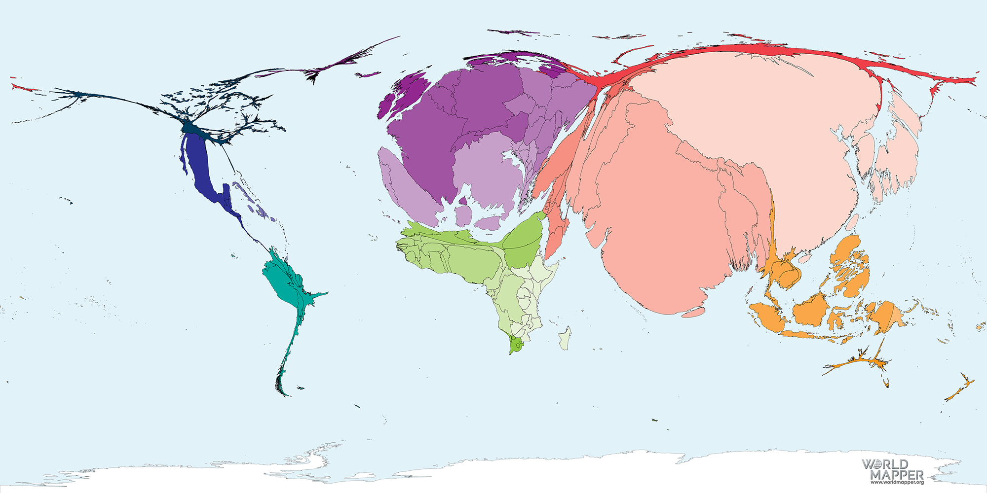
Living in America for my entire life has resulted in me having a bit of an American-centric view of life and maps. I have never had trouble finding America on the map, since it is a vast continent that takes up a considerable portion of maps. In the Wealth Year 1500 map, America is almost nonexistent, which is a drastic change from how America is usually depicted. While the North American continent itself may not have changed in shape in reality, the Wealth Year 1500 Map enables observers to visualize and understand political, social, and economic concepts concerning the world in 1500. While the GDP concept may not have existed in 1500, the Wealth Year 1500 map turns the proportion of worldwide Gross Domestic Product, or GDP, in USD in purchasing power parity produced in each continent in 1500 into something that people can visualize. The Wealth Year 1500 map is a cartogram: a thematic map that alters geographic size to emphasize an argument. In the Wealth Year 1500 map, the cartogram enables observers to explore the scale of wealth located in each continent in turning points in history. The continents’ geographical shapes aren’t necessary to the map since the focus is on the continents’ size and distortions rather than the detailed aspects of topography and borders. There is too much data to be processed with too many symbols, which can confuse observers, as Denis Wood claims in his book Rethinking the Power of Maps. While the numerical data may not be evident in the map, distortion displays the concepts that the mapmakers are attempting to convey. Visualizing the wealth located in each country lets observers create a sense of understanding about where power and money were focused in reference to the rest of the world, which lends a hand to understanding history. 

When observers first look upon the Wealth Year 1500 map, the European countries’ sheer size is quite shocking. Many economically important events, such as the industrial revolution or imperialism, hadn’t occurred yet. In addition, wealth in 1500 was defined quite differently compared to how wealth is defined currently. European countries’ size evidently conveys that the most wealth, or gross domestic product per person, was concentrated in these countries. France alone is larger than North America, which is a vast continent. However, Europe as a region isn’t necessarily the largest. Southern and Eastern Asia are the largest regions that have the largest GDPs in 1500. It is important to note that Southern and Eastern Asia were the most populous regions at the time, which makes Europe’s size in comparison quite impressive. The 1500s mark the point in history where Europe sees extreme exponential growth, while Eastern and Southern Asia grow at a reasonably steady rate. Due to the extreme economic exponential growth, due to colonialism and the Industrial revolution later in history, Europe surpasses Asia on an economic scale. The Wealth Year 1500 map affirms the beginning of the economic shift between the two regions, making the map a proposition, and shows observers the genuine comparison between the two using physical size. 

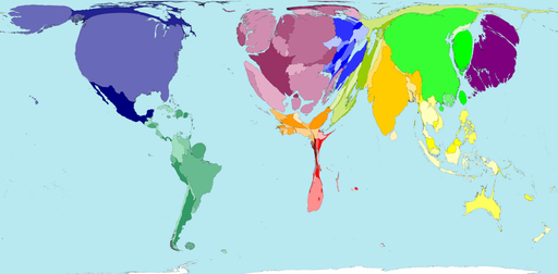
To further explore the Wealth Year 1500 map’s significance, the Wealth Year 2002 map lets observers compare the drastic difference between the two time periods wealth distribution. As Wood states, “Time is always present in the map because it is inseparable from space,” and because of it, observers can dive deeper into history. In the Wealth Year 2002 map, the wealth, or GDP, is focused in the United States, which is comparable in size to the entirety of Europe or Asia. Compared to the Wealth year 1500 map, where North America was nonexistent, the 2002 map allows observers to understand the exponential economic growth of the United States truly. Over 500 years, wealth distribution had been altered so drastically. In 2002, Africa resembled North America in the 1500 map, which conveys the continent’s sizable economic decay. The map may not explore the reasons for the changes, but the map is a resource that creates a visual representation of the change that historians and political scientists can use. Yet, the simplification of data in both maps can be somewhat harmful as well. The map doesn’t account for specific inequalities between the continents, such as corruption or a lack of natural resources. Also, the 1500 Year map doesn’t account for the differences in how wealth was valued or measured since GDP wasn’t a universal way of measuring wealth yet, which could create inaccuracies in the map. However, the comparison of the maps does allude to the historical events that took place in the 500 years. 

In a way, these maps are not only economic maps but also indirect political maps. Economics and politics are incredibly intertwined, and that is a transparent fact when looking at these two maps. As Andrew Jackson said, “Money is power.” North America in 1500 had extremely low GDP while also having no power or relations with the international world. Now, the North American continent accommodates the most influential superpower globally, the United States, which has the largest GDP. Texts can state the dramatic change of GDP on each continent, yet, a visual representation of this change makes the argument much more evident. 

The Wealth Year 1500 map, accompanied by the Wealth Year 2002 map, creates a visual representation of wealth distribution using GDP data and provides essential context to observers when looking at history. These two maps can be used for various reasons and can be interpreted separately. Scholars can apply the maps to several different subjects, such as politics, economics, history, and social analysis. Yet, these maps are explicitly propositions, as they are statements that affirm or even deny the existence of wealth levels in each region in a particular year. Not only are the cartograms easy to understand, but they can imply data not directly presented by using symbols, distortions, and color. Different colors are used for each continent, and some countries are shaded in much darker to confirm where more wealth was concentrated. The more vibrant colors in countries are considered to have more wealth, which can be assumed universally by most observers. For those reasons, the Wealth Year maps deserve the title of “Map of the Week.”

Works Cited

“Wealth Year 1500.” Worldmapper, Worldmapper, 25 Mar. 2020, worldmapper.org/maps/wealth-1500/. 

“Wealth Year 2002.” Worldmapper Archive: The World as You’ve Never Seen It Before, Worldmapper, archive.worldmapper.org/display.php?selected=170. 

Wood, Denis. Rethinking the Power of Maps. Guilford Press, 2010.

Posted in Maps of the Week | 1 Comment

Atlas of the Civil War

This atlas of the American Civil War features maps, photos, and stories of the bloodiest war on American soil. War atlases are very cool because they show Battlefields and the routes soldiers took throughout the course of a battle. It also has battle plans that offer a comparison of how close the plan was to reality. In war, maps are very important because they determine how you will get from point A to B. Also, the civil war territories and how they are divided at different points in the war is interesting.

Posted in Atlases of the Week | Comments Off on Atlas of the Civil War

Map of the Americas-Graham Eisen

My choice for the map of the week is the “Map of the Western Hemisphere” from the Mercator-Hondius Atlas published all the way back in 1606. Hence the name, the atlas includes work from Gerard Mercator and Jodocus Hondius. Living in Europe at the turn of the seventeenth century makes it hard to accurately map the western hemisphere due to the lack of full exploration and knowledge of the land. Despite this, Mercator and Hondius were up for the challenge of creating a map that resembles the general shape of what we know as North and South America. Unfortunately, Mercator died in 1594, during the atlas’s creation, which forced Hondius to complete most of the map. Although it still uses a Mercator projection, the map is credited as Hondius’s work.

The significance of the map being published in 1606 is important because of the events that took place shortly after. The following year in 1607 Jamestown, the first English settlement in the Americas was established. This marked the beginning of European settlers permanently living on this land. The map serves as a foundation for what was known about the land to the people that were now living there. Although the continents are shaped differently than how we see them on maps today, the general shape is close enough to the point where we know what is being mapped. Certain landmarks can be seen that are still known today such as the Gulf of Mexico, Baja California, and the Caribbean. Also, California, Patagonia, Brazil, and Cuba, among others, are all names that can be found in the same spots we see now over 400 later. These names have been around for many years leading up to the time they were mapped by Hondius despite no Europeans living there. The indigenous people living in the Americas already had locations mapped and named in the region. The European explorers took this knowledge and claimed it as their own. This was the first step in the colonization of the region; first, they took the information, then the land.

The bottom left corner features an illustration of the indigenous people from South America. The image depicts women cooking food while the men are eating. Based on the clothing and pottery it seems that the map makers had accurate information on who lived there. Due to the size of the region, I believe that these people were the ones that helped give the explorers the information they needed for all of the names and topography we see on the map. There is too much on the map for it to have been made without outside help. Another piece of information that I’m surprised about the map was the known topography of the area. The centers of the landmasses are much more empty when compared to the coasts but still have mountains and rivers. Since boats can only reach the coasts, that information cannot be mapped by explorers, and anything more inland had to be indigenous information. Although it is not hard the map coastal mountains, all mountains and rivers are clearly labeled and follow a very similar direction to the way we know them today. Before they officially settled on the land, explorers encountered the indigenous people and used their knowledge to gain an understanding of the area. 

In addition to the people, the map also includes fish and ships, a British delicacy… or is it fish and chips? Anyway, scattered throughout the ocean are fictional sea creators and large explorers’ ships. For me, these both express the idea that although the land has been “discovered” there is more that is unknown. The Spanish Empire claimed that they found America despite the fact that they used information from people already living there. They felt they had the right to claim it solely based on the power they had. The ships scattered throughout the map show that they are still attempting to understanding what is unknown and conquer more land. Without saying it, this map shows the power of colonialism and what was going to happen in the coming decades. The fact that the map had so much detailed information despite no Europeans settling there shows the power of exploration at the time.

On the surface, this may seem like an outdated map of the western hemisphere. This makes it deserving of the map of the week because of the hidden story within the map. Knowing that the map was made before Jamestown was established shows the control that Europe had all over the world. Hondius was able to create a labeled map of a region that hadn’t been fully explored by Europe. Access to guns and ships allowed Europe to have power over less developed areas of the world. Reading into the narrative of the map changes it from a harmless “Map of the Western Hemisphere” into a map of the upcoming events of colonization that will take place. This course has allowed me to understand that maps have a narrative beyond the image it appears to show. 

See Map here


Posted in Maps of the Week | Comments Off on Map of the Americas-Graham Eisen

Atlas of Space, Patrick Barry(03/05/2021)

See the source image

The Atlas “National Geographic Atlas of Space: Exploring Our Solar System and Beyond” gives a visual representation of all the pertinent scientific knowledge of our place in the stars. If you are interested by the vastness of the cosmos and want a perspective by scientists and astronomers alike about our place scientifically within the universe then this is an excellent read. It is a rational statement of our known knowledge displayed in an artistic and awe-inspiring way with beautiful visuals and factual text for context. This Atlas is a good example of when science and art can overlap by plainly stating the reality of fact.


Posted in Atlases of the Week | Comments Off on Atlas of Space, Patrick Barry(03/05/2021)

Blog on Triton, by Patrick Barry(03/05/2021)

The Voyager 2 spacecraft flew by Triton, a moon of Neptune, in the summer of 1989.

This blog by the Nasa Science Solar System Exploration website discusses the mystery of the moon Triton. A distant body orbiting Neptune in a retrograde orbit distinguishes itself from other moons in the solar system as it was captured by Neptune and did not form around it but came from somewhere else. Visited only once by Voyager 2 using dated technology the Blog discusses efforts to map its surface and peel back its secrets to learn what lies beneath the ice. The blog takes interest in the efforts and creative endeavors taken by the scientists to make a stunning map image from limited data.

Map of Triton | NASA Solar System Exploration

Posted in Uncategorized | Comments Off on Blog on Triton, by Patrick Barry(03/05/2021)