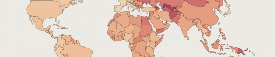
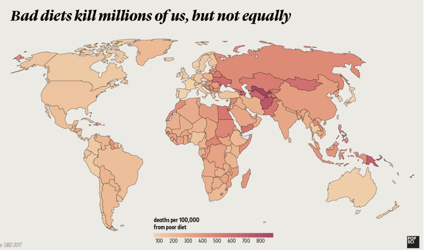
This map displays the impact of bad dieting on the world. It shows the number of deaths per 100,000 in every country. When looking at this map it is shocking to see the impact bad diets have on the world. We are lucky to have the living environments that we do, and we often forget that other places are not so fortunate. Bad Diets Are Responsible for More Deaths Than Smoking, Global Study Finds. Poor diet is the leading risk factor for deaths from lifestyle-related diseases in the majority of the world, according to new research. About 11 million deaths a year are linked to poor diet around the globe and this map portrays how each country is affected differently.
First, the map does a good job of easily being able to display this information without it being confusing. The title perfectly tells the reader what exactly they are looking at along with the legend that shows what each color means. The lighter the color the fewer deaths and the darker the color means more deaths. From the colors, you can tell that location does have an impact on the deaths from a bad diet. Both North and South America along with Australia and the United Kingdom are displayed with lighter colors while countries mainly in the Middle East along with parts of Africa and Asia are displayed with darker colors. There are many different reasons why each country has different amounts of deaths. This study used data from 195 countries in 2017 to try and figure out why exactly their bad diets were resulting in deaths. Lack of grains and too much sodium turned out to be the biggest factors which turned into 3 million deaths. Insufficient fruit followed that with 2 million deaths.
From taking this class I have learned that you have to apply outside knowledge in order to really engage and understand the map you are looking at. Knowing the data that this map presents; you can infer that living conditions, as well as geography, has a lot to do with the locations of these deaths. Poor eating habits include under- or over-eating, not having enough of the healthy foods we need each day, or consuming too many types of food and drink, which are low in fiber or high in fat, salt, and/or sugar. The country on this map with the highest number of deaths is Uzbekistan. Uzbekistan is a country located in the Middle East (and formerly a part of the Soviet Union) and has been established as the country with the worst eating habits that lead to death. They tend to consume too much salt and not enough fruits and vegetables. This can also be related to lots of other countries too. When examining this issue data may not be totally accurate. Researchers are not able to look at death and determine with lifestyle choices ultimately lead to the death because in most cases when people have bad diets, they also develop other issues as well. Mortality rates are influenced by more than just diet.
This map can be interesting to lots of different people in lots of different ways. If you just want to analyze the impact of unhealthy diets or if you just want to try and understand the impact of geography along with different living conditions, then this map would be a good read for you. In class, we have talked about recognizing why the author created their map. Authors tend to create something in order to inform, persuade, or entertain. I think the author of this map really wanted to accomplish all three. She effectively informed readers about an issue and creates persuasion to want to change this issue while also just providing an interesting map to look at. All the reasons why she created it were why I chose to write about it. This map automatically stood out to me when I read the numbers on the scale at the bottom. It is crazy to me the number of people that are simply dying from poor dieting and I really wanted to look at a deeper meaning because even countries with good living conditions have hundreds of thousands of deaths. This map is successful in showing how bad diets kill millions of us, but not equally.
Source: https://www.popsci.com/diet-kills-more-people-worldwide-than-any-other-risk-factor/
This was a very cool map that taught me something I had not known. I’ve always known the importance of a good diet but never realized the large impact it has across the world. The United States has diet issues but other countries clearly struggle more most likely due to other conditions as Cori says. Cori makes a good point by talking about what isn’t seen. We only see diet deaths but there is more information needed to understand the full picture.
I think this map is super interesting. While it is pretty well known that the US has diet issues, it is interesting to see how many countries are struggling even more with diets. The layout of the map makes it really easy to see the degree to which each country struggles with malnutrition. I think this map is important because it highlights an important topic that doesn’t get talked about all that often.