Atlas of the Week

I chose Strange Maps: An Atlas of Cartographic Curiosities by Frank Jacobs for this week because I think it pairs really well with our class discussions. The Atlas questions the confines of what it means to be a map. Additionally, it pairs political commentary with mapping which is very interesting; this further suggests the connections between perception and political advantage. The manipulation of space in this Atlas to portray the realms of thinkers such as More and Orwell is significant as it suggests the relation between power, conquering land, and the portrayal of this physically on paper.

Posted in Uncategorized | Comments Off on Atlas of the Week

Map link: Kirk Goldsberry NBA Shot Maps

https://www.washingtonpost.com/sports/2019/04/29/kirk-goldsberry-once-mapped-food-deserts-flood-data-now-his-maps-are-changing-nba/

These maps are very different than most maps we have talked about in class. Kirk Goldsberry is a cartographer who now maps shots on a basketball court. Kirk Goldsberry has a book, Sprawlball, with hundreds of maps, and this article puts it as, “At its heart, “SprawlBall” is a book of maps. It’s a geography book” (Strauss). This link is just an article with a couple of maps, as I could not find a website that contained a great number of his maps, but if you look up “Kirk Goldsberry Shot Maps” on Google Images, hundreds of unique and interesting maps will show up. I think Kirk Goldsberry’s work is a novel way of using maps.

Posted in Uncategorized | Comments Off on Map link: Kirk Goldsberry NBA Shot Maps

Atlas of the Week: Atlas of Remote Islands

The Atlas of Remote Islands is a collection of fifty mysterious islands. These obscure islands are all vastly different and have their own histories. This atlas is filled with full-color maps and incredible pictures. These islands are not well-known to most people but still can be of importance, and many of these islands were discovered on the recent side of exploration. We think of most locations in the world to be well known in 2021 but these locations are so rarely visited that there is still much to learn.

Posted in Uncategorized | Comments Off on Atlas of the Week: Atlas of Remote Islands

The Unmeasured World

The prize-winning, map of the month, “The Unmeasured World” is a map generated using other maps. The mapmaker dug through one hundred choropleth world maps posted on Reddit in order to win this map competition. They collected data on how often world countries contribute data to various types of maps on Reddit. A choropleth map is one that uses colors, shades, or patterns to display the proportions of a statistic for a certain area. It is meta that this choropleth map was made using other choropleth maps. This mapmaker analyzed data from other maps to create a new set of data for their own map. In the background above and below the actual world map on this graphic, many of these choropleth maps are named in very light text. These words are easy to miss, but the following are some of the Reddit choropleth maps used: “Cigarette consumption,” “frequency of intercourse,” “number of bicycles per 100k inhabitants,” “number of official languages,” “blood donations per 1000 population,” and “median income per capita.” All these Reddit maps are filled with data on countries, but often, some countries are left blank. “The Unmeasured World” is a choropleth map showing the distributions of posted data to Reddit by country.

“The Unmeasured World” shows that many countries do not contribute data to the Reddit maps. There are many reasons a country may not have data on a map. For example, Greenland, Western Sahara, and North Korea all were data-less in over fifty percent of Reddit maps, but all for different reasons as explained within the white text boxes covering the oceans. Greenland is not an independent state, so its data is embedded within Denmark, Western Sahara is a disputed territory, so they do not have official statistics, and North Korea’s statistics are discarded by most non-governmental organizations. Most of the world’s leading global powers score in the high nineties, as they consistently conduct reliable censuses, and have other ways of gathering massive amounts of data. Developing countries will not prioritize the conduction of censuses with their money and time, when they have to focus on more pressing issues, such as poverty, lack of clean drinking water, and education. 

The beauty of choropleth maps is it is easy to see trends in the data. Europe and North America are both covered in maroon (90%-100%), with many of the other countries in the orange and yellow (70%-90%), while only one of Africa’s fifty-four countries had data in more than ninety of maps (South Africa). The majority of Africa is covered in the orange colors that represent around sixty to eighty percent. This gives information on the governments and status of African countries, and how they struggle for one reason or another to have data in many categories. It can be problematic to assume that these data holes are always developing countries as it can lead to inaccurate conclusions about the state of the country.

In addition, each of these one hundred choropleth maps came from Reddit, either created by a Reddit user or pulled in from somewhere else. People who use the open platform, Reddit, have access to a computer and the internet which suggests they are in developed countries. The target audience with these maps is also individuals in developed countries. Reddit is not a professional or reliable source. Users of Reddit can post anything they want, and it may be difficult to judge their biases and motivations.

Below the world map, a list of all the countries that appear in less than 100% of the maps is shown. Many of the choropleth maps used have no data on certain countries, but those countries still appear on the maps. For example, Greenland only had data in twenty-two maps, but it still was shown in every single one, thanks to its size. Numerous countries that are commonly left off maps are small islands in either the Caribbean or Oceana, so naturally, without being included on many maps, they score low in data. Even when included in maps, these countries score poorly in how often they have data, with many of them having data in less than twenty-five percent of maps, despite all countries appearing in at least thirty-eight percent.

On the far left, the overall average is given, at 65.8 percent. In general, higher populated countries had data in a larger percentage of maps. It would’ve been interesting to see a weighted average using the population of countries. I think the weighted average by population would be significantly higher than the average posted on this map. The average for micro-states is 22.8 percent, although what criteria define ‘micro-states’ are not given. “Micro-states” generally means countries with a small landmass and small population, but it is unclear what this map used to determine how small, small actually is. It makes sense that these countries don’t have much data, as many of these were countries that didn’t even appear on every map. The dependent territories, like Greenland and French Guiana, had an average of 23.7 percent. This statistic is not surprising either considering their data is buried as a subset of the country they are connected to. This map provides an “Ordinary Average” of 79.3 percent, but what the “Ordinary Average” refers to is not defined. It could possibly be all the countries that are not micro-states, but I would guess that number would be lower than approximately eighty. So it is unknown what qualifies the countries as ordinary. I would say this graphic of statistics is a flaw of this map, leaving out what these statistics actually represent.

Some bias in “The Unmeasured World” comes from the choice of choropleth maps analyzed. The mapmaker chose which maps out of the thousands on Reddit to include in their work. Some maps may provide more information less common to developed countries. For example, two of the choropleth maps used to create “The Unmeasured World” are “infant mortality” and “number of bicycles per 100k inhabitants.” Infant mortality is a statistic that most countries will have data on, as it’s likely the United Nations or another world organization collects this information. On the other side, it’s unlikely that developing countries will have data on the number of bicycles per 100k inhabitants.

Another interesting aspect of this map is the four pictures at the corners. Although it might not be clear at first glance, the four pictures in the corner are all connected. It starts with the top left, where a man in a suit sits in an office ready to write something down. The charts on the wall let us infer he is gathering data for a choropleth map. In his hand, he is calling on the phone. In the other three pictures, different countries are shown for reasons why their data is not reaching the caller in the first picture. The top right picture is depicting Greenland. The man is saying to call Denmark for the statistics. The bottom right picture shows North Korea, which is clear by the uniform the soldier is wearing. He has cut the telephone wire showing how North Korea is an oppressive dictatorship that controls its citizens while cutting off communication to the outside world. The bottom left picture is unclear what country it is illustrating, although it might not be supposed to be a specific country. A text box on the map discusses how Somalia has been stuck in a civil war for almost thirty years, so the picture may be showing Somalia’s conflict and therefore how it’s ignoring the phone. But the picture may also be French Guiana, Eritrea, or one of the Caribbean islands. The back of the truck reads “OTA” but that didn’t lead me to any specific country. Please respond to this post if you think you know which country it is supposed to be. All these pictures exhibit stereotypes about countries that the mapmaker chose to include. This map has a lot going on and can be overwhelming at first glance, but with loads of interesting information, this map has a great story to tell. 


Works Cited

Imgur. “The Unmeasured World [2048 × 1448].” Imgur, 2021, imgur.com/DtHVMY6. Accessed 7 Oct. 2021.

Jacobs, Frank. “The World’s Data Holes, Quantified.” Big Think, Big Think, 31 May 2017, bigthink.com/strange-maps/the-worlds-data-holes-quantified/. Accessed 7 Oct. 2021.

Posted in Uncategorized | 1 Comment

Blog of the Week: Cartoblography by Kenneth Field

Field is an academic cartographer and geographer from the United Kingdom. He has taught since 2011, talking and writing about cartography. This blog is a look into his perspective on all different types of maps from all over the world.

https://cartoblography.com


Posted in Uncategorized | Comments Off on Blog of the Week: Cartoblography by Kenneth Field

Blog Link: Sound Cartography

https://soundcartography.wordpress.com/

The blog that I chose to submit to our class collection is called Sound Cartography. This blog examines sound maps from all over the world and looks to analyze them. Sound maps can give people a new method to study human populations, movement, and the ways humans live their lives. While the blog seemingly has a focus on Europe, it offers a wide variety of sound maps attempting to capture different objectives.

Posted in Uncategorized | Comments Off on Blog Link: Sound Cartography

Atlas of the Week: Maps

I chose Maps by Aleksandra and Daniel Mizielinski as this week’s Atlas of the Week. In this class, we have talked about how maps can be weaponized and used as tools of the state, but we have also discussed the idea of maps as an artistic medium. This atlas falls into the latter category. The authors create maps for every region of the world with elaborate illustrations capturing not just the traditional borders, rivers, and cities of the planet, but also marks of cultural, historical, and contemporary significance. The maps in the atlas capture the people, animals, geography, architecture, and traditions of countless different locations. It creates a palatable method in which people can increase their knowledge of the planet through a fresh take on cartography. Maps of this nature are so important as they challenge the traditional belief that a map is a snapshot of a geographic location at a specific point in time, but instead offer a dimension of depth to the basic lines drawn on a piece of paper.

Posted in Atlases of the Week | Comments Off on Atlas of the Week: Maps

The Colonial Problem -1947

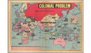
The Colonial Problem is a relative one. One would assume that the “colonial problem” this map references is in relation to the clearly defined European colonization of the Global South. As is shown through the map, large swaths of Africa and Asia remained under colonial rule through World War II and into 1947. The reality of this map however is that it represents an American attempt to fear-monger regarding the Soviet Union on the eve of the Cold War. The menacingly drawn “Union of Soviet Socialist Republics” is shaded with a vibrant and daunting shade of red in an attempt to create fear among its readers. While the main effort of the map is to show the reader the threat of the USSR, the moment it captures is wildly fascinating. With the global community, specifically Europe, reeling from the destruction of WWII, the United States and USSR on the precipice of the Cold War, and traditional colonial powers such as the British Empire and France on the verge of collapse, this map acts as a snapshot of a world in flux and at one of the most crucial breaking points in its history.

The clear starting point when analyzing this map is to examine the decisions of the mapmaker, Edwin Sundberg. Sundberg, an American cartographer, most notably omits half of the world in this map featured in the popular New York Sunday News.  The map only reaches as far west as Iceland, and the only visible parts of the Americas are Hawaii and a sliver of Alaska. Perhaps Sundberg simply viewed the Americas as irrelevant in the question of global colonialism at this point in time. Even more innocently, it is possible that he simply ran out of room on his paper when crafting this specific map. The reality though is that he could not show the Americas, specifically the mainland United States, without contradicting the main point of the map. Sundberg is attempting to show his reader the sheer size of the expansive Soviet Union and display the threat they pose to American domination. He most notably does this through the aforementioned use of color but also, more subtly, through blatant lies. Sundberg draws the Soviet Union as significantly larger than the entire continent of Africa, which it very simply, was not. The Soviet Union measured at roughly 22.4 million square kilometers (Rosenberg). On the other hand, Africa sits at over 30 million square kilometers (Dejardins). Again, the point of this substantial over exaggeration was part of a greater Red Scare that burdened the United States in the years following their victory alongside the Soviets in World War II.

Looking more deeply, had Sundberg included the Western Hemisphere, it would have shown the United States as a similarly massive country, though still nowhere near the size of the USSR. Even more notably though, it would have shown the reality of the United States sphere of influence. Just as the Soviet Union was able to expand past its original bounds following the Bolshevik Revolution and influence other nations in its proximity, the United States acted in a similar manner in the Western Hemisphere (History.com Editors). One cannot criticize the expansion of the Soviet Union through the addition of new Republics to the state while simultaneously defending the United States with colonial holdings in the Pacific as well as the Caribbean. Even further from basic colonial possessions though is the previously mentioned idea of a sphere of influence. While the Soviet sphere of influence represented Eastern Europe and parts of Asia, the United States maintained a sphere of influence in essentially the entire Western Hemisphere, specifically Latin America (Mishra). The acknowledgment of the American sphere of influence would spoil Sundberg’s argument of the growing threat of the Soviets by admitting that they do not have more influence as the United States. Sundberg’s choice to not draw the Americas seemingly stems from the idea that if something is out of sight, it is out of mind.

Beyond the political-driven decisions shown in this map, it captures an incredibly interesting, unstable, and internationally chaotic juncture in human history. As the World rebuilt from World War II and tensions between the two new global powers escalated into the Cold War, future conflicts are made clear in this map. For instance, a united Korea is noted with a caption that reads “Russia balks U.S. plans for independence.” This note acts as an eerie precursor to the impending Korean War, a proxy war in which the United States and USSR both fought to add Korea to their respective spheres of influence. The intersection of the demise of the British and French Empires along with the rising tensions between the two new global powers can also be seen in the map. A note describes that in French Indochina the “Natives revolt against French domination.” As French Indochina fell, it led to a turbulent period that culminated in another proxy war, the Vietnam War. The changing of the guard from British-French domination to American-Soviet domination, is only further highlighted from their loss of territory in other regions of the World. Sundberg points out that in India, the crown jewel of the British Empire, “Hindus and Moslems [were] moving towards independence.” In the Middle East, France granted independence to Syria and Trans-Jordan and control in Tunisia and Algeria had been “undermined by native opposition.” While Africa looks to be heavily colonized, upon closer examination, one quickly realizes that much of the territory controlled by Great Britain and France were trusteeships granted in the aftermath of World War II rather than permanent colonies. The map also remains silent over the Soviet Union’s “colonization” over Eastern Europe. As the USSR spread their influence over Eastern European countries such as Poland, Czechoslovakia, and Yugoslavia, the map makes no commentary regarding these efforts of de facto colonization, an interesting decision considering the map’s intended purpose is to create fear among American civilians.

The tides of global power were clearly in flux in the aftermath of World War II. Sundberg’s map illustrates the uncertainty of the time between the Second World War and the dawn of the Cold War. The status of nearly the entire Global South remained uncertain while the United States and USSR escalated tensions, and Great Britain and France scrambled to retain the power and glory of a previous era. While Sundberg effectively displays these ideas in his creation of his “Colonial Problem” map, his selective nature as the mapmaker is obvious. Sundberg attempts to weaponize his map to contribute to the ongoing Red Scare and lead his reader to a specific conclusion about the threat of the Soviet Union. His map forces the conclusion of the need for order in a chaotic world through the application of U.S. intervention despite the total exclusion of the United States.

Works Cited

Desjardins, Jeff. “Mapped: Visualizing the True Size of Africa.” Visual Capitalist, 19 Feb. 2020, www.visualcapitalist.com/map-true-size-of-africa/.

History.com Editors. “Soviet Union.” History.com, A&E Television Networks, 1 Sept. 2017, www.history.com/topics/russia/history-of-the-soviet-union.

Mishra, Pramod K. “THE SUPER POWERS AND THEIR SPHERES OF INFLUENCE.” Indian         Journal of Asian Affairs, vol. 1, no. 1, Manju Jain, 1988, pp. 49–59, http://www.jstor.org/stable/41950324.

P.J. Mode collection of persuasive cartography, #8548. Division of Rare and Manuscript Collections, Cornell University Library.

Rosenberg, Matt. “What Countries Were in the USSR?” ThoughtCo, www.thoughtco.com/what-was-the-ussr-1434459.

Posted in Maps of the Week | Comments Off on The Colonial Problem -1947

Atlas of the Week: Why Preserve the Night Sky?

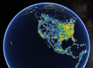
This atlas depicts the amount of light pollution in the world measured on the Bortle scale. High concentration areas of light pollution radiate white and red from the source, while more rural regions will appear to be green and blue, and no pollution zones appear black. Locations are ranked into different classes (Class 1: least pollution – Class 9: most pollution), on this scale. Not only is light pollution causing us to look through our eyes from a different perspective. The night sky is a map that has been around since the creation of the universe. It has helped our ancestors find their way across the globe, it has been the source of inspiration for writers, philosophers, and artists. It is a route of interconnection between science, spirituality, and religion. Seeing the night sky is not only a reflection of our harm to the planet, it is also a loss of culture. This map is a great tool to learn about how you are affected by artificial lights.


“North America in the New World Atlas of Artificial Sky Brightness,” as seen in Google Earth by Fabio Falchi taken from the Time article, “One-Third of the World’s Population Can’t See the Milky Way Thanks to Light Pollution

Source: https://time.com/4364938/milky-way-light-pollution/

Posted in Atlases of the Week | Comments Off on Atlas of the Week: Why Preserve the Night Sky?

Tracking COVID-19 Cases in the US (Interactive Map)

Be aware of COVID-19, but also the maps too… Our understanding of and behavioral response to COVID-19 has been undeniably well understood when placed into the context of maps. Their visualizations help everyday people and scientists track its dangerous spread. When well composed and produced, maps can build awareness and shape more thoughtful decision-making locally, nationally, or globally.

This particular COVID-19 map aims to show the number of cases and deaths of COVID-19 from “all-time” and for the last 7 days, in a pretty simplistic way. The map is published, updated, and configured by CNN. It receives all of its data from the Johns Hopkins Center for Systems Science and Engineering. Looking at this map for the first time, it appears professional, scientific. There are also countless sources to corroborate this illustration. However, an analysis of this map revealed multiple inconsistencies. Even a critical footnote on CNN’s page cites that actual data from this pandemic is undoubtedly missing. The transmission of this virus occurred quickly, and specific country resources were not being administered at the time. This results in an “incomplete picture” as data from infected people in the early stages were not recorded. This includes undiagnosed cases and asymptomatic people who were untreated, while at the same time, COVID deaths went untracked as the virus-infected countless communities.

While a map is vital to tracking something as widespread as COVID, it can only do so much. Maps are a constant battle with details and underlying portrayals. This map has to simplify some of the complexities of this pandemic, as certain intricacies would take up a lot of time and resources for researchers to source and obtain reliable information. This effect silences some significant data figures that would help the reader understand the reach of COVID-19 a little better. Some specific things to keep in mind that are excluded from this map are: variants aren’t tracked (COVID-19 is depicted as a whole), the role that politics play in science and how certain areas of the country have different ideas about masking, and the severity of the cases in infection from cold-like symptoms to hospitalizations. All of these are left out. 

Additionally, the most considerable neglect in this map is the failure to highlight the infection rates within the parameters of a county. For example, I live in Java, a town located in Pittsylvania County (VA). This county also contains the city of Danville. Are the statistics an accurate reflection of the transmissions that occur within my town of 900 people? Most definitely not; the majority of them are probably within the city of Danville. Still, for the sake of resources and providing a semi-specific guide, John Hopkins spent their time recording the county’s rate of infection rather than each town or city. From my perspective, this cartographic choice was practical. However, in cases such as maps, the more specific information maps reveal, the greater the insight into the whole circumstance it brings.

This map has a distinct approach in its projection. While mapping by county is an easy way to categorize data for the people that live there, it also makes certain areas appear more affected by COVID. Bigger counties such as those found in the west grab the readers’ attention more easily, because of their larger area. Smaller counties such as those found in the northeast are extremely infected but appear less of a hot spot for COVID-19. This takes the attention away from smaller counties with potentially higher infections and makes them seem less of a hub for COVID-19 spread. The color choice also plays a large part in the perception of this map. The choice of varying degrees of red was a big tell in this map. To most people, red is associated with negativity. The use of varying degrees of red put into perspective that regardless of how infected your county is, COVID-19 is still a severe threat. Everyone is at risk, and this map does not fail to present this with the color choice. The projection of the map plays a large part in the perspective of the readers’ analysis. This map emphasizes the seriousness of the virus but fails to do it in a way that would limit attention-grabbing distractions.

Previously data depicting globally-impact type maps were collected manually. With the resources of today, details, data, and knowledge can be shared with the world in an instant. This map tracks the county’s movement and infection of COVID since the first reported cases of the disease. It also is an underlying resource into the disproportional effect COVID has on specific regions in the United States. This map helps visualize those areas of need. This map goes a long way to helping us understand the details of COVID-19, but also has a long way to go in regards to presenting a more holistic approach to the infection and spread. This is certainly a map that has allowed us to approach the country in a tentative manner. In regards to future maps of this type, hopefully, it never has to be presented again.


Work Cited:

Hernandez, Sergio, et al. (unknown). “Tracking Covid-19 Cases in the US. (interactive map)” CNN, Cable News Network. Accessed on September 28, 2021 from

https://www.cnn.com/interactive/2020/health/coronavirus-us-maps-and-cases/.

Posted in Maps of the Week | 2 Comments