
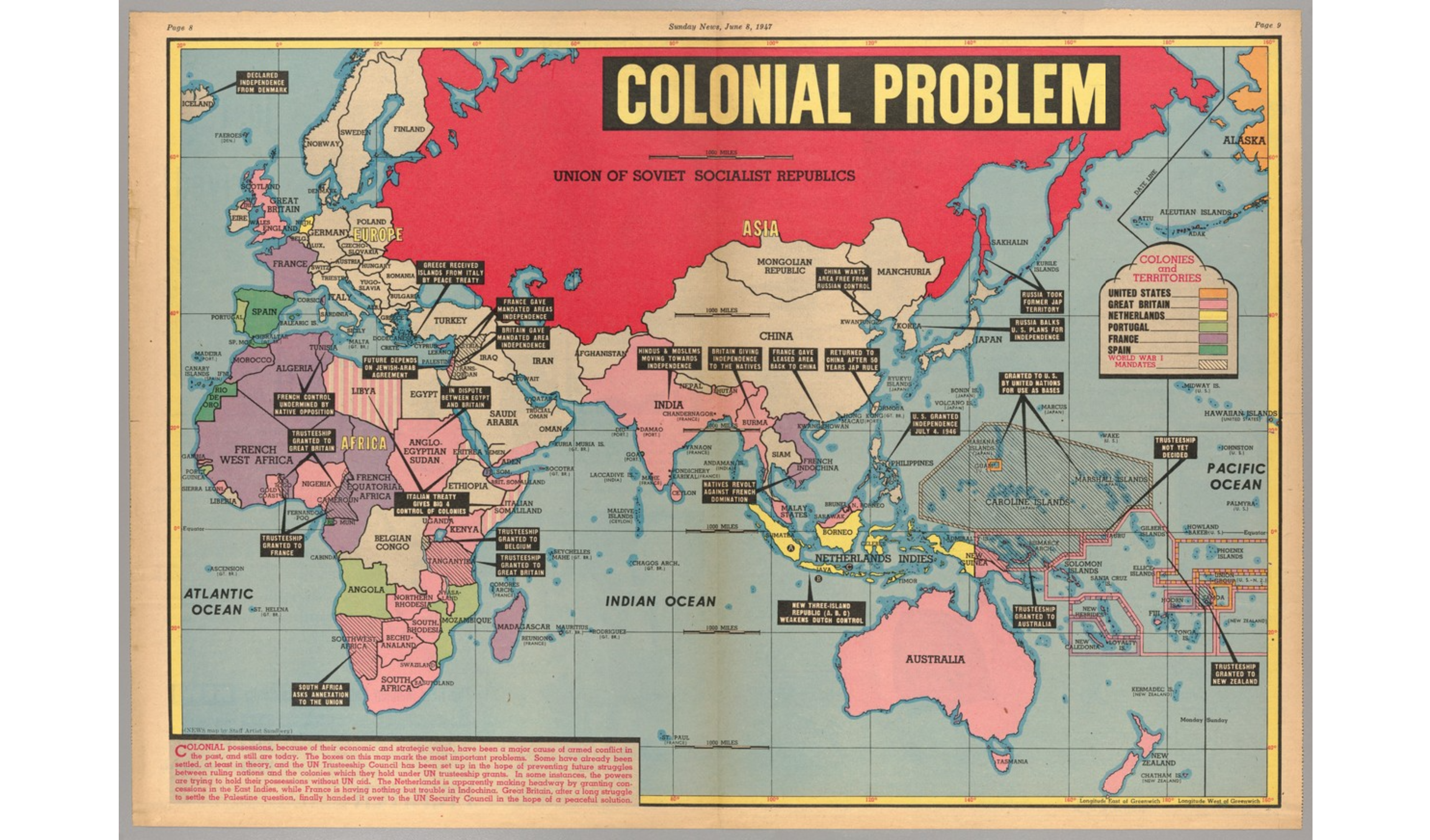
The Colonial Problem is a relative one. One would assume that the “colonial problem” this map references is in relation to the clearly defined European colonization of the Global South. As is shown through the map, large swaths of Africa and Asia remained under colonial rule through World War II and into 1947. The reality of this map however is that it represents an American attempt to fear-monger regarding the Soviet Union on the eve of the Cold War. The menacingly drawn “Union of Soviet Socialist Republics” is shaded with a vibrant and daunting shade of red in an attempt to create fear among its readers. While the main effort of the map is to show the reader the threat of the USSR, the moment it captures is wildly fascinating. With the global community, specifically Europe, reeling from the destruction of WWII, the United States and USSR on the precipice of the Cold War, and traditional colonial powers such as the British Empire and France on the verge of collapse, this map acts as a snapshot of a world in flux and at one of the most crucial breaking points in its history.
The clear starting point when analyzing this map is to examine the decisions of the mapmaker, Edwin Sundberg. Sundberg, an American cartographer, most notably omits half of the world in this map featured in the popular New York Sunday News. The map only reaches as far west as Iceland, and the only visible parts of the Americas are Hawaii and a sliver of Alaska. Perhaps Sundberg simply viewed the Americas as irrelevant in the question of global colonialism at this point in time. Even more innocently, it is possible that he simply ran out of room on his paper when crafting this specific map. The reality though is that he could not show the Americas, specifically the mainland United States, without contradicting the main point of the map. Sundberg is attempting to show his reader the sheer size of the expansive Soviet Union and display the threat they pose to American domination. He most notably does this through the aforementioned use of color but also, more subtly, through blatant lies. Sundberg draws the Soviet Union as significantly larger than the entire continent of Africa, which it very simply, was not. The Soviet Union measured at roughly 22.4 million square kilometers (Rosenberg). On the other hand, Africa sits at over 30 million square kilometers (Dejardins). Again, the point of this substantial over exaggeration was part of a greater Red Scare that burdened the United States in the years following their victory alongside the Soviets in World War II.
Looking more deeply, had Sundberg included the Western Hemisphere, it would have shown the United States as a similarly massive country, though still nowhere near the size of the USSR. Even more notably though, it would have shown the reality of the United States sphere of influence. Just as the Soviet Union was able to expand past its original bounds following the Bolshevik Revolution and influence other nations in its proximity, the United States acted in a similar manner in the Western Hemisphere (History.com Editors). One cannot criticize the expansion of the Soviet Union through the addition of new Republics to the state while simultaneously defending the United States with colonial holdings in the Pacific as well as the Caribbean. Even further from basic colonial possessions though is the previously mentioned idea of a sphere of influence. While the Soviet sphere of influence represented Eastern Europe and parts of Asia, the United States maintained a sphere of influence in essentially the entire Western Hemisphere, specifically Latin America (Mishra). The acknowledgment of the American sphere of influence would spoil Sundberg’s argument of the growing threat of the Soviets by admitting that they do not have more influence as the United States. Sundberg’s choice to not draw the Americas seemingly stems from the idea that if something is out of sight, it is out of mind.
Beyond the political-driven decisions shown in this map, it captures an incredibly interesting, unstable, and internationally chaotic juncture in human history. As the World rebuilt from World War II and tensions between the two new global powers escalated into the Cold War, future conflicts are made clear in this map. For instance, a united Korea is noted with a caption that reads “Russia balks U.S. plans for independence.” This note acts as an eerie precursor to the impending Korean War, a proxy war in which the United States and USSR both fought to add Korea to their respective spheres of influence. The intersection of the demise of the British and French Empires along with the rising tensions between the two new global powers can also be seen in the map. A note describes that in French Indochina the “Natives revolt against French domination.” As French Indochina fell, it led to a turbulent period that culminated in another proxy war, the Vietnam War. The changing of the guard from British-French domination to American-Soviet domination, is only further highlighted from their loss of territory in other regions of the World. Sundberg points out that in India, the crown jewel of the British Empire, “Hindus and Moslems [were] moving towards independence.” In the Middle East, France granted independence to Syria and Trans-Jordan and control in Tunisia and Algeria had been “undermined by native opposition.” While Africa looks to be heavily colonized, upon closer examination, one quickly realizes that much of the territory controlled by Great Britain and France were trusteeships granted in the aftermath of World War II rather than permanent colonies. The map also remains silent over the Soviet Union’s “colonization” over Eastern Europe. As the USSR spread their influence over Eastern European countries such as Poland, Czechoslovakia, and Yugoslavia, the map makes no commentary regarding these efforts of de facto colonization, an interesting decision considering the map’s intended purpose is to create fear among American civilians.
The tides of global power were clearly in flux in the aftermath of World War II. Sundberg’s map illustrates the uncertainty of the time between the Second World War and the dawn of the Cold War. The status of nearly the entire Global South remained uncertain while the United States and USSR escalated tensions, and Great Britain and France scrambled to retain the power and glory of a previous era. While Sundberg effectively displays these ideas in his creation of his “Colonial Problem” map, his selective nature as the mapmaker is obvious. Sundberg attempts to weaponize his map to contribute to the ongoing Red Scare and lead his reader to a specific conclusion about the threat of the Soviet Union. His map forces the conclusion of the need for order in a chaotic world through the application of U.S. intervention despite the total exclusion of the United States.
Works Cited
Desjardins, Jeff. “Mapped: Visualizing the True Size of Africa.” Visual Capitalist, 19 Feb. 2020, www.visualcapitalist.com/map-true-size-of-africa/.
History.com Editors. “Soviet Union.” History.com, A&E Television Networks, 1 Sept. 2017, www.history.com/topics/russia/history-of-the-soviet-union.
Mishra, Pramod K. “THE SUPER POWERS AND THEIR SPHERES OF INFLUENCE.” Indian Journal of Asian Affairs, vol. 1, no. 1, Manju Jain, 1988, pp. 49–59, http://www.jstor.org/stable/41950324.
P.J. Mode collection of persuasive cartography, #8548. Division of Rare and Manuscript Collections, Cornell University Library.
Rosenberg, Matt. “What Countries Were in the USSR?” ThoughtCo, www.thoughtco.com/what-was-the-ussr-1434459.