
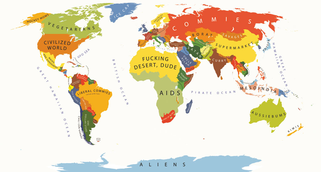
Borat, Chili con Carne and Soccer Moms: these are just a few of the labels that graphic designer Yanko Tsvetkov uses to distinguish parts of the known world. At first glance, these obscene, bright colored words take its readers aback with the audacity of the map’s creator to publish such a provocative map. They temporarily blind the audience into thinking that this piece of cartography has no credibility. Having created this map in 2009 as a part of his book, Atlas of Prejudice, Tsvetkov, going by the pseudonym alpha-designer, describes his work as “cartographic caricatures ridiculing the worst excesses of human bigotry and narrow-mindedness” (atlasofprejudice.com). But as we examine why the map has come to be, it is clear that Tsvetkov uses rhetorical symbolism (stereotypes) to begin the conversation about social conventions and cartography.
Tsvetkov uses a Mercator projection, a widely accepted and familiar depiction of the world. It slightly emphasizes the size of the northern hemisphere of the globe, while many argue that it does not reciprocate the same generosity to the southern hemisphere. However, it is not the projection that deems this map the focus of this week’s blog, but the author’s choice to marry two concepts that are hardly seen together: satire and cartography. He has pointed out the anomalies of stereotypes and maps: because of their ability to shape public opinion, they are often believed as the truth.
Every map has its silences, whether it be the lack of a representation of the wandering tribes of the jungles in the National maps of Peru, or the sea monsters used as distractions in the early stages of cartography –a way of saying, “we don’t know what’s out there but here’s a dragon!” All of these examples show how a map cannot share the full account of what is going on around the world. And yet despite that knowledge, people see maps as scientific constructions; they see maps as truths. On the surface, words such as ‘Commies”, “Uncle Allah”, and “Borat” all are tributes to popular culture’s depiction of the world, an obvious commentary on the skewed social norm. It can also be pointing out a flaw in the science of cartography, that even though it tries to be as scientific as possible, that maps, like stereotypes, are actually products of social construction.
Social construction is the idea that a map is based on the reality that is socially accepted at the time. This is directly speaking to how a map is a product of its time, meaning it lives within the context that was surrounding it at its creation. Stereotypes work in a similar manner, therefore there is a duality that is presented within this map. It brings out the point that people would rather believe what is shown to them, rather than question its motives. This is often the case with cartography. Due to the switch after WWII, when cartography became a “science,” once a map has been published analysis stops when it should just begin. Tsvetkov is trying to say that just like stereotypes, our blind acceptance of maps is a fault that should be mocked.
However, the map also demonstrates how its power is within its ability to create rhetoric, not by showing the reader what to think, but instead giving them ideas to think about. For example, although it is not clear what viewpoint the cartographer used to establish his stereotypes, one could easily argue that it is a western viewpoint, or more specifically an American view of the world since the United States of America is seen as the “civilized world.” Now the question that comes to mind is why did he choose America to be the civilized nation? Wouldn’t it make more sense if the author centralized it with Bulgaria, the country he was living in at the time of the publication of the map? Perhaps the author is trying to emphasize that no matter where one is in the world, the power of America –whether it be social, economic or military- is felt like an ever present shadow lurking behind the corner
It is clear that the Map of Stereotypes has achieved its goal of sparking conversation. Tsvetkov’s creative and crude representation of the world has managed to mock the idea of social norms. Yet, what is surprising is the method of delivery of his message. By choosing to publish a map, he shows the similarities of map and stereotype, proving that they are both social constructions and products of their time.
Kim D’Agostini
Source: http://www.theguardian.com/artanddesign/2012/feb/17/stereotype-maps-tsvetkov
This map of stereotypes first caught my attention because it made jokes about every nation on the world. It is funny that North Africa is just “fucking desert” and India only left “Curry” to be remembered. But, thanks to our course, I can analyze more of this map rather than simply laugh about it.
First, this map stands at American’s view of points. So the stereotypes of all countries are from American’s view. When I look at it, I won’t agree that China is just a “supermarket”. Canada in my view would be same as the United States. I don’t get why it is considered as “vegetarian”. This doesn’t mean either me or the cartographer wrong.
As Kim said in the article above, the map made a humorous satire about stereotypes. Truly, stereotypes put unfair judgements upon countries. However, can we really abandon stereotypes? When I was comparing my view to this cartographer’s, I was also partial and biased by saying Canada is same as America. Indeed, because we all have different life experiences and different backgrounds, it is natural that we view this world differently. Thus, stereotypes could not be eliminated. What the cartographer suggested here is that, don’t take our stereotypes as granted and be open to gain a more comprehensive view.
Jennifer He
Kim, this is a great analysis of Yanko Tsvetkov’s map. I also see this map as satire. This map shows the ridiculousness in believing a stereotype as the truth. A map is a perfect place to put such an argument. Maps with political borders and mountain ranges seem accurate and we routinely believe them to be true. When these crude remarks replace the geographic facts, it grabs the reader’s attention. People look to maps for truth and when they see this map, they are taken aback. Saying that all Brazilians are all “liberal commies” and all Mongolians as “savages” is obviously not a factual statement. The obscenity of this map makes readers err on the side of caution the next time they read a map or believe a stereotype.
Shayna Webb
Kim did a great job here with her choice of the “Map of Stereotypes”. Obviously this map is a satirical viewpoint of the stereotypes around the world. Its crudeness and blunt portrayal of the world is what drew me to commenting on this map. Overall, Kim does a nice critique on the rhetorical arguments this map is trying to make.
Maps are shaped by our own experiences so I am surprised it took this long in the course to generalize everyone’s experience or feelings towards other countries. When I say “everyone” it cannot obviously depict the entire world’s stereotypes so I would assume that it has a very United States centric viewpoint of the rest of the world. History had a lot to do with some of these stereotypes arising but the silences shine through this map much more than a typical one.
The silences seen on this map highlight its purpose. When looking back at maps this semester, we realized cartographers need to make choices in order to show their interests. Omissions are a big part of this and although they usually tend to be seen negatively, they are helping with the point of the map. By using a non scientific portrayal of the rest of the world, it takes away from a true picture of our world and creates biases that can be used for propaganda. Obviously, this is what Yanko Tsvetkov’s map is trying to do.
In conclusion, Kim picked a very interesting map that was making the argument about the United States’ stereotypes that they hold around the world. It is cartographic comedy that makes the reader view the silences that are prevalent and makes us think before we accept maps as scientific fact.
David Ruffini