Map Duo Presentation – William Guy and Michael Zhang

North Korea Prison Camp Maps

North Korean Prison Camps Map | Mappenstance.

Our presentation delved into the intricate system of prison camps in North Korea consisting of Kwan-li-so camps (political prisoners), labor reeducation camps, and regional and labor training camps. Since 2004, an estimated 400,000 inmates housed in these camps suffered from malnourishment, sickness, execution, and torture. We focused on the massive Camp 22, which is described as the most oppressive and deadly of North Korea’s prison camps. Camp 22 holds 50,000 prisoners, who are each in captivity until death with no possibility of release.  Despite the fact that Camp 22 is believed to have been dissolved in 2012 for unknown reasons, at least fifteen more large camps are still in operation, committing similar human rights violations. 

Historically, the truth about the horrific nature of these camps has been a mystery apart from interviews with former guards. With the introduction of highly detailed satellite imagery of North Korea, first-hand stories could now be supported publicly via these satellite photos. Images, for instance, display the mass graves as well as the perimeter traps and landmines that encircle the camps that the interviews claimed. Satellite technology also enabled the US State Department to corroborate North Korea’s claims of Camp 22’s closure as imagery supported the decommissioning of the prison camp. If we had just the word of the North Korean government to go by, it would be hard to believe that the camp had truly been shut down. Organizations like 38North.org and other platforms currently take advantage of the accessibility of satellite imagery to monitor North Korea’s nuclear and military installations. 

The North Korean prison maps are an example of how satellite imagery inherently ties into political issues as well as supports the Western dominance of information. Additionally, despite the fact that services such as Google Earth are widely accessible sources of information, Google can actively influence the public to adhere to its own agenda. Google can alter and label borders in the way they wish and distort and restrict certain areas on their map. The public often overlooks the potential of bias in satellite imagery, which only gives private providers such as Google even more power in the decisions they make. Although satellite imagery can still have limits and distortions, overall, it has brought to light restricted regions in North Korea and active violations of human rights, helping raise concerns for the international community.

Posted in Uncategorized | Comments Off on Map Duo Presentation – William Guy and Michael Zhang

Map of the Week: Unraveling the Borders of Israel and Palestine Through Time

Borders. No two nations have had more issues with this word and what it represents over the past century than Israel and Palestine. The brief history of these nations has been marked by constant conflict between one another, primarily over disputes about borders. Amid the current intensity surrounding the Israel-Palestine conflict, I’ve chosen to feature a map of the evolving borders between these two nations as my map of the week. However, before we get into the map details, to understand this map and the conflict that is occurring right now, we must first delve into the turmoil filled history between the two nations.  Maps are handy, but they can oversimplify things, especially in a complex conflict like this. Exploring the history behind these maps shows us their limitations in capturing the full story. It’s a reminder that the lines on a map might not show everything, especially when you consider the real-life experiences, cultural histories, and complicated politics between Israel and Palestine. Understanding the historical context helps us see where these maps might miss parts of the story, reminding us that they don’t always tell the whole tale.

History behind the 1st Map – 1946

After World War I concluded in 1918, the British assumed control over the entire region known as Palestine. Subsequently, in 1923, the League of Nations sanctioned a British mandate, which included the establishment of a Jewish national homeland in Palestine. Throughout the Mandate period, spanning from 1922 to 1947, there was a substantial wave of Jewish immigrants, with a sharp increase during the 1930s in response to Nazi persecution. This demographic shift caused discontent among the local Arab population, who were already fighting for independence from the British. These tensions led to a rebellion in 1937, which was followed up by several acts of terror from both the Arabs and the Jewish (un.org).

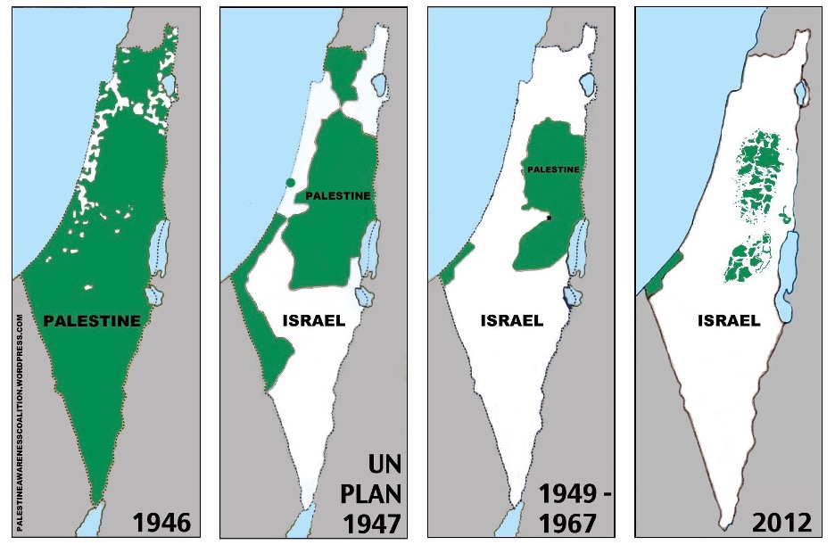
This conflict takes us all the way to 1946, where we can see the first of four maps, in which Palestine is still under British control. The map is very simplistic in portraying the region, but in doing this, it remains incredibly vague. The trade-off here is that while the map is easy to look at and analyze, it fails to include any basic context or anything that might help a viewer of this map. For example, there is no mention that the region is under British occupation. To add to the ambiguity, there are areas of white dotted throughout the northern half of Palestine, which remain entirely unlabeled. The only two labels are “Palestine” and “1946”. However, since we have looked at the history behind this region, we can assume the white areas are home to the growing Jewish population. This year marked a crucial point before the eventual creation of Israel in 1948.

History behind the 2nd Map – 1947

The second map showing the region in 1947 represents a crucial historical juncture prior to the major transformation of the region. In 1947, after more than two decades of control over the region, the British handed Palestine over to the United Nations. The UN proposed to terminate the mandate and separate Palestine into two independent states, one Palestinian Arab and the other Jewish, with Jerusalem internationalized (un.org). While several Jewish leaders accepted the proposal, there was strong opposition from many Palestinian Arabs, who argued that they represented most of the population and should be granted more territory.

In this map, we can see the boundaries proposed by the UN plan. While the country of Israel was not formed until 1948, it is labeled on the map flanked by the by the two Palestinian Arab controlled regions known as the “West Bank” and “Gaza Strip.” Once again, the map displays only the bare minimum. It fails to provide any Political context, demographic context, or tensions and conflict, which are necessary to understand the region at such a confusing time.

History behind the 3rd Map – 1948-1967

Almost immediately after the UN plan, Arab armies moved in to prevent the establishment of the Israeli state, leading to the 1948 Arab-Israeli War. This conflict involved Israel and five Arab nations, including Transjordan (now Jordan), Iraq, Syria, Egypt, and Lebanon. By the war’s end in July 1949, Israel expanded to control 77 percent of the former British Mandate, while Jordan took control of the West Bank and Egypt took control of the Gaza Strip. In addition, over half the of the Palestinian Arab population fled or were expelled (un.org).

This change is reflected in the map, which shows an expansion in Israeli territory relative to the previous map from 1947. However, the map fails to show how the former Palestinian territories are now under control Egypt and Syria, conveniently labeling them “Palestine.” Additionally, the third map features a small black dot where Jerusalem lies, the only feature in any map that does not pertain to the borders of Israel and Palestine. However, it remains unlabeled and does not distinguish that the city of Jerusalem was divided during this time. West Jerusalem was part of Israel while East Jerusalem was controlled by Jordan.

History behind the 4th Map – 2012

The period from 1967 to 2012 witnessed significant changes in the Israeli-Palestinian borders, marked by conflicts, negotiations, and geopolitical shifts. After the Six-Day War of 1967, Israel captured the West Bank, East Jerusalem, and the Gaza Strip, leaving Palestine with little to no territory. After several years, in 1993, The Oslo Accords established Palestinian governance over parts of the West Bank and Gaza Strip, although the exact borders were not finalized. From then on to 2012, the Israeli-Palestinian borders underwent significant transformations due to peace agreements, unilateral actions, and ongoing disputes.

In the 4th map segment, the transformation from the previous map segment is evident and confusing. Despite all the conflict and transformations that occurred in the Gaza Strip from 1967-2012, the border looks almost identical to the one portrayed in the 3rd map segment. On the other hand, the West Bank looks drastically different. Palestinian territories are dotted all throughout the area, with some of the green dots as small as specs of dust. Due to the confusion and conflict in the region, the borders can be incredibly vague and extremely difficult to establish on a map.

Propaganda?

After a quick look at the history between these two nations, only one word comes into mind when it comes to borders: “vague.” A different map could display an entirely different picture of the Israeli-Palestinian borders. In creating any map, cartographers are faced with the challenging task of making specific choices about borders and deciding which features to include or exclude. These choices inevitably reveal the biases of the mapmaker. Notably, the source of the first map is the Palestine Awareness Coalition, a fact visible in the bottom left-hand corner. Unsurprisingly, these maps were faced with opposition from Pro-Israeli media, which said that “these “series-of-four” maps are common in Pro-Palestinian media” and “have become an iconic feature of Palestinian propaganda” (Maynard). Rather than explicitly labeling them as dangerous propaganda, it’s important to recognize that these maps, particularly in their “four maps” style, may struggle to capture the full historical intricacies of the Israeli-Palestinian conflict. With a conflict as complex and polarizing as the one this map is dealing with, are maps the best tools right now to accurately show the immensity of this conflict? Or are they immediately problematic given maps’ rhetorical nature?


Citations

History.com. (2023, October 17). Palestine , Religion & Conflicts. https://www.history.com/topics/middle-east/palestine#the-partition-of-palestine

Maynard, J. (2020, July 12). “Disappearing Palestine” – the Maps that Lie. AIJAC. https://aijac.org.au/fresh-air/disappearing-palestine-the-maps-that-lie/

Mor, S. (2015, January). The mendacious maps of Palestinian “loss.” The Tower. https://www.thetower.org/article/the-mendacious-maps-of-palestinian-loss/

un.org. (n.d.). History of the question of palestine – question of Palestine. United Nations. https://www.un.org/unispal/history/


Blog Link

Mapillary Blog: https://blog.mapillary.com/
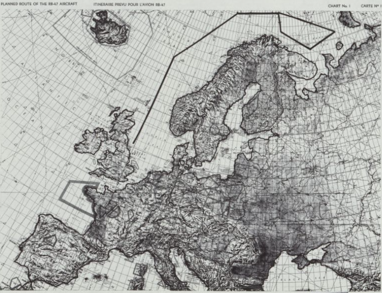
Atlas Choice

Cold War Map Gallery

This atlas features several unorthodox-looking maps from the Cold-War period that relate to the conflict between the United States and the Soviet Union. This is relevant to our class because a large portion of our class was dedicated to the impact of maps on Cold-War tensions. The atlas connects to our study of maps as rhetorical because there are several examples of how maps served as powerful tools for ideological communication and geopolitical influence during a period of intense global tension.


Posted in Maps of the Week | 1 Comment

Map Duo Presentation – Carter House and Ryan Soulis

North Korean Prison Camp Maps (Google Earth)

These maps display the precise locations of North Korean prison camps as well as zoomed in images of them in great resolution via satellite imagery with Google Earth. The set of maps shows over 15 camps, a few of which are dangerously close to nuclear testing sites, that have clear labor progress visible within them. The activity within these camps, as well as just their presence as a whole, show clear proof of North Korea’s human rights violations. This is significant as the nation had been denying the existence of these camps for years beforehand and has attempted to shift blame onto the United States, claiming the U.S. had “human rights abuses” of their own.

Google Earth publishing the images allows the general public to have easy access to seeing the cruelties of North Korea, which was never possible beforehand. This enables people to see what’s truly going on inside of their locked borders and also enables witnesses from inside the camps to have their stories corroborated. Without control of the narrative because of these new technologies as well as fast spreading of information on the internet, North Korea cannot hide their evils from the world. In this sense, Google Earth is used as a political tool for the United States saying to North Korea “you can’t hide from us” and displaying technological powers along with it.

This draws connections to FYS Rhetorical Lives of Maps through the Farman Article and how Google Earth transcends cartography and changes the whole landscape. Because these are true satellite images, it is extremely difficult to find bias and political influences which we have learned that all maps include. These maps also show the “democratization” of maps mentioned by Farman as everyone is able to have access to them online and possess their own uncontested opinions about them. With all of that taken into account, these maps are extremely relevant to this course and to cartography as a whole as they show the progress and digitization of cartography. Denis Wood’s argument that cartography is dead and becoming too “real” is seen through Google Earth and one can only imagine this continues to be proven true through technological advancements.

Posted in Uncategorized | Comments Off on Map Duo Presentation – Carter House and Ryan Soulis

Map Duo presentation by Peter and Yaozhuo

The map above is the second map in series.

A Cold War is a state of conflict between nations that does not involve direct military action but is pursued primarily through economic and political actions, propaganda, acts of espionage, or proxy wars waged by surrogates. In International relations literature, it is the period between shortly before the end of World War 2 till the breakup of the Soviet Union in 1990 which is known as the Cold War. During this period, the old rivalry between the West, led by the USA, and the Soviet block, led by the USSR resurfaced souring the relations. The main causes of the Cold war would be Struggle for Hegemony/Resources and Clash of Ideologies. As we all know, the Cold War era saw an influx cartographic propaganda, particularly between the US. and the Soviet Union. Such influx appeared in many aspects during the Cold War for the two countries to compete for their political sphere of influence and economics benefit. The three Henry Cabot Lodge’s Maps would be representatives of such cartographic propaganda era.

RB-47 Incident and Henry Cabot Lodge’s Response:

In July of 1960 a U.S. plane was on an electromagnetic observation flight over
international waters bordering USSR territory when it was shot down by the Soviets. The Soviets claimed that the plane was in their territory so they had reason to shoot it down (during Cold War) but the U.S. navigational system said otherwise. In Henry Cabot Lodge’s speech he uses these maps to defend the U.S. against Soviets’ accusations by proving they had lied and were in the wrong. Lodge uses his maps to make comparisons between the U.S. and the Soviets and in his speech he says, “The difference between the United States and the Soviet Union is that we shoot their planes with cameras. They shoot ours with guns and rockets…”

In the first map, the solid black line represents the planned route for the
American aircraft’s flight which shows that the planes were to fly over
international waters at all times (Never come within 50 miles of Soviet territory)
They took off from England and flew into the Baren Sea. This would’ve been the flight path if Soviet fighter jet didn’t force RB-47 off course. In the second map, the dotted line represents actual flight path of the plane. The large arrow labeled “Fighter” shows location of the Russian fighter jet. This fighter jet attempted to push the American Aircraft into Soviet Territory. The star labeled “Soviet Claim” is where the Soviets claimed RB-47 entered their territorial waters. However, the “Closest Point” dot on the map, determined by U.S. navigation systems, shows RB-47 still significantly outside of Soviet territory.
“1522Z Position” labeled by the cross/X ,where the solid line stops, is where RB-47 was shot down. The third map shows 6 Soviet flights getting dangerously close to U.S. territory for electronic reconnaissance. It is a great representation of how close the U.S. is to Russia. The dates ranged from March 1959 to February 1960, all before the RB-47 incident. In his speech, Lodge claims there are many more flights just like these that would help prove his point. The map also emphasizes how they were within 12 nm and we didn’t even get within 50 nm.

The three maps accurately shows maps from the US’s side of the Cold War. Maps prove that the USSR was lying about where they shot down the plane. With the maps being black and white large bolded symbols are used to
highlight important elements, such as large arrows, stars, and bolded lines.
Map #3 uses the small amount of space between Russia and Alaska to
reveal how close we really are and this could’ve been a fear factor during
the Cold War. It is easy to understand with a minimal amount of background info because of the simplicity of the maps.

These maps explains how the Soviets lied, why the Soviets should have committed a crime in connection with the missing plane event, and comparison of the flights actions with the fact of Soviets flights across the boundary. Such statements and demonstrations helped the United States to fight for more say and international attention in this event to gain international support and political benefits with a relatively just identity —asked the council to investigate the crime of the Soviet Union and demanded the release of the trapped people.

By showing the aircraft’s prescribed routine and other routes as well as the location information of each event points on the map, the map here realizes circulating through multiple contexts + cultures, driving theme on the map according to the term of “rhetorical life” of the map. The map is to help realize the transfer of ideas in the specific situation.

Posted in Uncategorized | Comments Off on Map Duo presentation by Peter and Yaozhuo

Yaozhuo Sun — Map of the Week: City Maps That Orient You Better Than Google Can

As a member of Generation Z, our inclination to rely on navigation tools like Google Maps and other satellite-based apps is ingrained in our travel habits. When we get to a new city, we use Google Maps on our phones to navigate to the destination we want; when we want to eat outside, we use Uber to get there, also with navigation by satellite map. While the precision and accuracy of these maps are unparalleled, offering realistic views and intricate details, the experience on our phone screens can feel as cold as the precision itself. The map above at first glance looks adorable or cartoon-like, as it is basically made of circles and text, but we can recognize this is the map of Manhattan. Why? Beyond the prominent titles, the distinctive city shape is the key to instant recognition. This prompts the question: What inspires this unique visual representation?

In 2009 after college, Archie Archambault, the map creator, found himself getting lost. He noticed that despite their practical utility, Google Maps failed to provide him with a local’s sense of neighborhoods, effective citywide navigation, or an accurate reflection of his personal perception regarding the time it took to travel from one point to another. “I was super absorbed in the GPS,” he told Slate. “But a Google map has a scientific feel. I wanted to communicate the idea of a city on paper.” Then, he started to draw a circle with a cross hair in it, dividing it into quadrants. He started exploring streets and neighborhoods by all means of transportation possible, getting an on-the-ground feel for the urban landscape. That first sketch led him to create his first map of Portland and became the genesis of a quirky map-making process that he still uses today.

Archie Archambault placed great emphasis on expressing the locals’ sense of community in his maps. “I build a map in my head and then I talk with locals to see if my perception matches up with their experience of a city,” Archambault said, adding that he tries to informally poll the widest range of people possible, including his favorite insider resource: real estate agents. “They are the ones who end up naming emerging neighborhoods,” he says, “and who really know the whole layout of a city.” Besides talking with locals, to pursue what he calls the “mental and cultural groundwork” to make each map, he transports himself in different cities according to  the culture and landscape of each city. He drove as locals do in Atlanta. He would ride a bike in D.C. and New Orleans. He said it was the easiest way to autonomously get around and at his own quick pace, to create a mental road map. Also, to get a feel for how locals perceive a city like Washington, D.C., the designer often asks locals to sketch their own mental map. Archambault’s maps are subjective and even familiar to people who really live in a city or certain area.

Archambault crafts minimalist maps tailored to different cities, such as shaping D.C. as an imperfect diamond and Manhattan as a long oval. His distinctive style, marked by typography and circles, follows a centuries-old tradition of circular maps. The circle, chosen for its gentle impact on the eye, is considered the simplest and most beautiful shape. Archambault employs text decoratively, drawing inspiration from The New Yorker’s New Yorkistan cover, aiming for clear, concise, and simple maps that subjectively reflect reality through local neighborhood names.

What I see through the map and the process of his design is that his maps are not cold construction displays, but subjective humanistic expressions with warmth. While we can navigate with maps on phone, it is just cold and superficial like that. Archambault ‘s map is humanistic and warm, we can see the culture and local spite of a city behind the map. With such subjective purpose, we see the subjective influence on the design of the map. It feels like we human are really an organic part of the city. Actually I think such map can somehow improve the charisma of cities because it really represents the unique of the cities which attracts people to visit and even make commercial impact. The specific cultures uncovered by the map maker and locals can somehow attract more people to settle down and even make new cultures themselves when they feel they are also part of the cities throughout the maps. It all comes from such subjective design style. It really embraces citizens. It is such subjective features that make the map such attractive and useful for people.


Reference:

Archambault, Archie. “Circular City Maps: Minimalist Designs Printed on a 19th Century Letterpress.” Slate, December 2013. https://slate.com/human-interest/2013/12/circular-city-maps-archie-archambault-designs-minimalist-city-maps-printed-on-a-19th-century-letterpress.html.

Pinterest. “Beautiful Landscape Painting.” Pinterest, Accessed November 26, 2023, https://www.pinterest.com/pin/45176802485938592/.

Posted in Maps of the Week | 2 Comments

Map Duo presentation by Tommy Cahill and Will Anar


2009 Failed States Index Map by Foreign Policy Magazine

Tommy Cahill

December 6, 2023

The 2009 Failed States Index by Foreign Policy Magazine is a Mercator Map projection of the world that organizes different countries on whether or not they can be qualified as a “Failed State.” The cartographers of the map used many different factors to create this map, as there are five different classifications that a country can fall into. These categories, ranging from most stable to least stable, are listed as “most stable”, “stable”, “borderline”, “in danger”, and “critical”.

According to the London School of Economics, a “failed state” is a country that is no longer “able to perform its basic security and development functions” (lse.ac.uk), and may also have certain regions of it controlled by paramilitary or rebel factions. Countries identified on the map under the “critical” category such as Afghanistan, Somalia, and the Democratic Republic of the Congo are commonly associated with large-scale government instability and political strife. Fragile states, such as Yemen or Niger, are at a severe risk of collapse, but could still enforce their national security to defend their boundaries, as a fragile state still has the capability to do so. However, these countries still struggle with faulty education systems, poor health care resources, and wide-scale government corruption.

This map is biased towards the United States and other western countries in a multitude of ways. For example, it would be a fair assumption that any country on this map highlighted in light or dark green holds an amicable relationship with the United States, the country where Foreign Policy Magazine is based. Many countries in yellow, orange, or red are more likely to have a more contentious relationship with the United States. The governments in green countries will be more likely to be democracies, republics, or hold other forms of multi-party governments opposed to the yellow, orange, or red countries, which may be more accustomed to one-party dictatorships.

Another way this map is also biased towards the United States is because the United States chooses to not collect data on Taiwan. Due to a 1972 visit to China by president Nixon, the United States agreed to recognize the People’s Republic of China over the island state of Taiwan. The Failed States Index does not collect any data on Taiwan, as they do not want to go against official U.S. diplomatic accords, but also acknowledge that the island of Taiwan operates under a different government than that of mainland China.  

Finally, if one compares the 2009 Failed States Index to the 2023 edition of the World Freedom Index, a map that analyzes everyday freedom such as the freedom of speech, the press, and economic mobility across the world, one will find a frightening similarity between the two maps. Take a look at the 2023 Freedom In the World map here:

https://freedomhouse.org/sites/default/files/2023-03/FIW_World_2023_DigtalPDF.pdf


Bilguun Anar Erdene

December 6, 2023


When looking at the map, there is an apparent division between the Western world and the rest of the world. This is a theme that appears recurrently through a wide range of maps regarding different categories such as wealth disparity, gender equality, discrimination policies, average lifespan, etc. It is important to ask how a “failed state” is defined. While many of the attributes seem justified, Foreign Policy Magazine took into account measurements that pertain primarily in Western societies. For example, Bhutan uses gross national happiness and health to determine how successful their nation is. They were the first country in the world to define happiness as a national policy. The very essence of freedom is also another subject that is nuanced and can have different interpretations among different cultures. 

This map, like most maps, is designed in a simple way to grasp the attention of the audience and briefly display the content that was collected. It ignores centuries of colonialism, foreign intervention, conflicts, genocide, and numerous other events that lead many of these countries to appear red or orange on the map. Many of the Western European countries and their former settler colonies are green because of their successful exploits of the indigenous people, and their global dominance over the past few centuries which established the global standards of the world we live in today. They continue to interfere and hinter the development of these countries that are in critical condition. 

Aside from looking at bias, it is difficult to judge countries based on a few attributes. Some countries are incredibly wealthy and have low crime rates, however they have no freedom of speech or expression and other constricting laws. Other nations have the freedom of speech and let people live freely, but have high levels of poverty, lack of infrastructure and high crime rates. The question is whether freedom or safety is more important?  This map groups a multitude of countries who have completely different standards of living into one group. This map gives a glimpse into the current state of the world, and is a great source of information for looking into America’s current state of foreign affairs. 

Works Cited


  • Freedom House. 2023. “Marking 50 Years in the Struggle for Democracy FREEDOM in the WORLD 2023 Highlights from Freedom House’s Annual Report 

on Political Rights and Civil Liberties ANNIVERSARY EDITION 50.” https://freedomhouse.org/sites/default/files/2023-03/FIW_World_2023_DigtalPDF.pdf.

Foreign Policy Magazine. 2009. Failed States Index Map. https://foreignpolicy.com/2009/06/21/the-2009-failed-states-index/.

Posted in Uncategorized | Comments Off on Map Duo presentation by Tommy Cahill and Will Anar

Luca Tenuto- Map of The Week

For much more than a century, Major League Baseball (MLB) has been an integral part of American sports culture. The league began in the 1860s with just eight clubs and has since expanded to become a flourishing national organization. This historical background is crucial to understanding an intriguing map that shows the most popular MLB clubs on Facebook broken down by county and made in 2014. This map provides insightful information on the geographical dynamics of baseball fans in addition to illustrating the scope of MLB’s influence. The relevance of this map, the historical background of MLB’s growth, and its connections to the larger topics of cartographic rhetoric will all be covered in this article. Based on Facebook likes in 2014, the map under examination provides a unique viewpoint on the regional spread of MLB fans. It sheds light on the strength and popularity of America’s pastime by highlighting the teams that have the largest fan bases in every US county. Given their legendary past and sizable fan base, the New York Yankees’ dominance over a significant portion of the map may not come as a surprise to many. But what’s really interesting about this map isn’t only the teams who are well-known—it’s also the ones that aren’t. 

Especially notable is the lack of a majority of supporters in any U.S. county for clubs such as the Oakland Athletics, Toronto Blue Jays, or New York Mets. Understanding the historical background of MLB’s growth is essential to appreciating the relevance of the map. As previously indicated, the league’s founding consisted mostly of eight clubs from the Northeast and Midwest of the United States. MLB’s impact grew as more clubs were added in other locations, creating new fan bases and expanding the league’s reach. Thanks to this growth, baseball was able to develop into a national pastime that is dear to the hearts of Americans. It also meant that certain teams would inevitably gain greater popularity than others, and this map illustrates how that expansion turned out. It ornaments the history of Major League Baseball’s expansion and the geographic variety of its fan base, serving as a visual depiction of the sport’s cultural influence. Additionally, the omission of some teams from the distribution of the map highlights the contrast between baseball’s long-standing titans and its less significant competitors. Another idea to think about would be the popularity of each team based on another form of data rather than facebook likes. Based on attendance, the most popular baseball teams are the Dodgers, Cardinals and Yankees. However that is not concurrent with the data presented in the map above. In the context of our course themes surrounding the rhetoric of cartography, this map offers several insights. 

Cartography is more than just drawing lines and shapes on a map; it is also about communicating information, uncovering patterns, and telling stories. The Facebook likes on this map tell the story of baseball’s popularity as it spread from its roots in the Northeast to every corner of the country. It demonstrates the power of data visualization by demonstrating how historical and cultural factors influenced the geographic distribution of MLB fandom. The absence of certain teams on the map serves as a subtle reminder of the complexities of regional allegiances, demonstrating how certain franchises have maintained their stronghold in specific areas.  This concept also has pull financially, the more supporters an organization has the more In conclusion, this map of the 2014 MLB teams with the highest Facebook likes is an engaging illustration of the cultural significance of the sport and the results of its growth over time. It is the “Map of the Week” because it illustrates how a well-made map can provide a distinct combination of geographical insights, historical context, and current data. By examining the map through the lens of cartographic rhetoric, we gain a deeper appreciation of how maps are not just static images but tools that help us understand the intricate relationships between culture, geography, and fandom in America’s favorite pastime.


Blog Link- https://www.instagram.com/maps_black/

This instagram page, though most posts are written in Spanish, offers comedic and interesting maps about a variety of topics. Including but not limited to sports, politics, and video games. 

Atlas Link- https://www.opportunityatlas.org/

The Opportunity Atlas shows which neighborhoods in America offer children the best chance to rise out of poverty. It’s really interactive and allows the user to see where opportunity has been missing. It could be used to develop solutions in order to help more people get out of poverty. 


Posted in Atlases of the Week, Maps of the Week | Comments Off on Luca Tenuto- Map of The Week

Map Duo Presentation: Gordon and Owen – Henry Cabot Lodge’s Maps and Security Council Speech


In the late 1950s and 1960s, America and the Soviet Union were at the height of the Cold War. Both countries were attempting to prevent the spread of the ideology of the other, and both were actively participating in espionage. Proxy wars raged around the globe as both global superpowers attempted to gain an edge over the other. Tensions often came to a head at UN General Assembly meetings, where ambassadors debated in front of a global audience to try to fault the other nation. 

In July of 1960, the USSR accused the United States of “new aggressive acts” and “creating a threat to universal peace.” In response, US Senator Henry Cabot Lodge used three maps to debunk the Soviets’ claims and turn the accusations on the Soviets in front of the UN Security Council and the rest of the world. 

The first and second maps that Lodge produced involved the RB-47 incident, where an American reconnaissance plane was shot down over international waters in the Barents Sea. Lodge used the second map to show how a Soviet fighter tried to force the American jet into Soviet airspace so that it could be shot down, while the first map was used as an overview of the RB-47’s planned flight path, showing that it stayed in international waters for the duration of the mission. Despite soviet claims, American instrumentals showed that the plane did in fact stay in international waters, and was shot down illegally. These maps effectively prove that the USSR violated international law in this case, which Cabot Lodge used to turn the Soviets’ claims on themselves. The cherry on the cake was that the Soviets rejected an investigation into the incident, which was almost concrete proof that the Soviet claims were false. 

The third map showcased Soviet reconnaissance flights that came close to US territory. In the northern Pacific Ocean, soviet spy planes came closer than 20 nautical miles from American territory six times in just two years. The worst case was a soviet flight that came just five nautical miles off the coast of St. Matthews Island, which was inside US airspace. The cartographer of this map used thick black lines so that the flights appeared closer to American territory than they seemed. Even so, this map effectively puts more blame on the USSR, since the US would have been justified in taking military action against the Soviet planes, unlike the RB-47 incident. 

This confrontation in the UN Security Council was just one of many instances of Cold War escalation in the second half of the twentieth century. Maps were used in many cases to throw the blame on the other nation. These maps are inherently political because the makers choose which situations they want to portray on the map and which they would rather omit to help their case. 

Posted in Uncategorized | 1 Comment

World Map of Stereotypes

            Spear Chuckers, Blood Suckers, Yankeeland and Absurdistan. No, those aren’t lazy steampunk terms, they’re moderately offensive country names in Martin Vargic’s World Map of Stereotypes. Vargic’s map is an incredibly detailed atlas of all sorts of crude -and funny- stereotypes of different places and people. While most of the stereotypes are just exaggerations based on stereotypical western views, the map’s purpose is definitely to entertain, rather than to inform. Vargic, a Slovakian artist who created the politically incorrect map as a teenager as part of his book “Vargic’s Miscellany of Curious Maps: The Atlas of Everything You Never Knew You Needed to Know”, designed it to be from the point of view of a westerner, albeit one who is just as self-critical as he is critical of other nations. The map is fairly apolitical, though Vargic himself leans left.It is best described as a South Park-style “mock everybody” atlas. Nobody is spared, though he does go after some regions harder than others.

            It’s hard to provide further historical context in this blog post, as the entire map is chock full of historical references. Explaining every last detail could fill hundreds of pages. Here’s just a small number of details to pour over. Norway (Black Metal) is full of Scandinavian images from fjords to “the movie Frozen”. Somalia (Pirates) is mostly pirate jokes, from “Capitan Phillips” to “Jack Sparrow”. (“Jack Sparrow Sea” is also the new name of the Caribbean.) India (Holy Cow) has everything from “Yoga” and “Snake Charmers” to “Diarrhea” and “Slums”.

            It should be noted that Vargic’s map isn’t just textboxes over a blank world. No, his map is an incredibly detailed parody. From a few feet away, it looks just like any other dense world map put out by National Geographic or Rand McNally. It is only when you look closely that you can see how different it is, the mark of effective parody. Even the margins are full of information, some useful (countries by average height), others less so (countries by average penis and breast sizes).

            It should be noted that Vargic’s map has just as many positive stereotypes as it has negative ones. Mexico (Tacos) has “Sombreros”, “Puebla”, and “Tequila” right next to “Meth superlab”, “Housekeeping”, and “Fence Jumpers”. He doesn’t let his home continent of Europe off the hook, either. France=Pubes, Poland=Buffer Zone, Greece=Sparta (with the major cities of “olive oil” and “gay statues”, and Great Britain as “Ye Olde America”.

All of these jokes have history and context behind them, showing the vast amount of research that Vargic had to do. Poland has spent the last 300 years as some sort of buffer zone between greater powers, from the Swedish Empire and the Holy Roman Empire in the 1600s, the Prussians and the Russians in the 1800s, Nazi Germany and the USSR in the 1930s, and NATO and the USSR during the cold war. Ancient Sparta is one of the most enduring symbols of Greece, the first state to harvest olives. Great Britain was the forebearer to the modern United States, and much of our politics and culture today remains descended from that of Britain.

            Speaking of America, that is where his uneven criticism seems to be most apparent. While most states have fairly positive or neutral names (Iowa= Soybeans, New Mexico=Roswell (with Albuquerque as Breaking Bad), Pennsylvania=Amish), he clearly does not have a positive view of the south, with names like Fat, Incest, Racists, KKK, and Tobacco. Given that Vargic himself has never been to America, this could be a reflection of who different states are thought of around the world.

He also neglects to poke fun at his own country of Slovakia, naming it “No Data” with the sole city of “Cave”. Of course, that could also be a reference to just how unknown Slovakia is to the English-speaking audience that the map was made for.

            In short, I chose this map because it is hilarious. Most of the maps on this blog are important but a bit dull; this one is nothing but laughs, even if the scholarly value is a bit low. It’s always valuable to have a laugh at ourselves, to take the piss out of the important business of mapping.


Blog link: https://projects.fivethirtyeight.com/redistricting-2022-maps/

Atlas link: https://map.jacksonjude.com/

The Atlas that I chose includes every electoral map in the last half century of American politics. Knowing the domestic political situation at all times helps inform the reasoning behind certain foreign policy decisions.


Posted in Uncategorized | 1 Comment

Map Duo Presentation by Grace and Matthew – Nuclear War Atlas

The Nuclear War Atlas is a compilation of 28 maps put together by geographer William Bunge in 1982. These maps were presented on a double-sided 20 by 34-inch poster that could fold into a 5 by 8-inch card. This atlas was designed for peace demonstrations, as during the Cold War people were concerned about the use of nuclear weapons. The combination of maps and writing highlight the danger of nuclear activity and push for the end of nuclear weapons.

Bunge reframed data from researched sources (Progress of Nuclear Energy, Health Physics, Child Psychology, etc.) into a clear and concise format. According to Bunge, selling the atlas was an excuse to talk peace during the summers and reinforced the need for a clear plan to save humanity. The original edition of the Nuclear War Atlas was published in Lobeck’s Physiographic diagram of North America. It is a famous example of radical, socially engaged cartography of the post war era. The Nuclear War Atlas was used in education displays by the anti-nuclear war movement and reflects the American fear that nuclear war could happen at any moment. Calling a single poster an atlas was a huge gesture and this claim opened doors for mapmakers to make new types of atlases. In the Nuclear War Atlas, Bunge emphasized the threat of nuclear weapons through the use of simultaneous contrast, when a light color is engulfed by a dark color, to draw on a distinction between the elements being mapped. 

The maps are divided into four subtopics labeled with titles (Blast, Radiation, Star Wars, The Future) in large red letters. Each map has an alarming, and sometimes sarcastic subtitle, and is accompanied by captions detailing the damage that would occur in a nuclear war or the consequences of past nuclear disasters. One major idea of the atlas is how we are responsible for our own demise through nuclear weapons. Perhaps the most persuasive aspect of the atlas is an image of an explosion captioned with a quote from Albert Einstein, who said, “Shall we put an end to the human race or shall we renounce war?”. To instill fear across the country, numerous maps emphasize the effect a nuclear bomb would have geographically in North America and the United States. The themes of proximity give an overall perspective of space and time and inevitably look toward the future. The Nuclear War Atlas is an example of activism concerning the destabilization of state power. Conveying the idea that this is a war mapped countries are waging on themselves, some maps make it seem as if certain countries (specifically the US and USSR) are going to blow the entire world up. These maps create fear of scientific advancements of nuclear weapons in the future and highlight dangers of nuclear weapons even when they are not being used, sometimes rhetorically subjugating the peaceful uses of nuclear technologies to militaristic ones. Bunge inverted the idea of technological superiority into fear of its aptitude for destruction. Although there is research behind the maps, some of their claims could be exaggerations. The map dramatically frames facts to inspire people to oppose nuclear weapons. 

During our presentation, we had a productive class discussion about the Nuclear War Atlas. The class had an opportunity to get engaged through a game in which they looked at a map and guessed the title. After discussing our thoughts on the maps, classmates had an opportunity to talk about their ideas and perspectives of the maps. Our discussion questions functioned well to guide the class in a discussion about the major themes and background of the Nuclear War Atlas. 

Posted in Uncategorized | 2 Comments