“Population” of the World

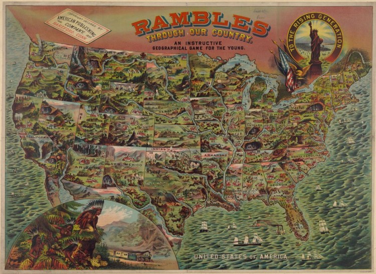
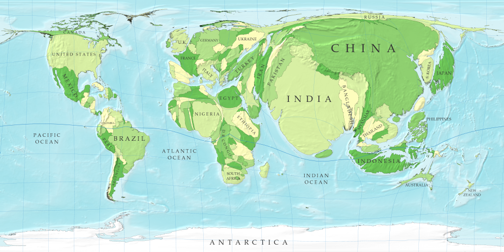
The outrageous balloon-shaped countries on this map serve a purpose other than comic relief from a stressful day. In a remarkably straightforward tone, physics professor Mark Newman briefly defines how cartography presents social and economic aspects of the world, and he uses the cartogram entitled “Population” to assist his explanation[i]. Newman’s physics background may explain why he utilizes the cartogram in a matter-of-fact manner (because physics deals with inarguable laws of science), and it is difficult to view the map as argumentative. However, the map’s depiction of the world contains bold yet subtle statements of interest. Newman’s cartogram subtly illustrates that the world is negotiable, and it depicts how internal and external relationships of a map can have significant implications, even if the map appears to be objective. The map’s relationships argue a “correct” size for population, and they make claims about the agricultural resources of the world.

On the surface, the cartogram’s design seems odd and distorted because it inflates countries; nevertheless, it is a basic and potentially accurate representation of the world’s population: the greater a country’s population, the larger the country. China is the most populated country in the world; therefore, it is the largest country on the map. The audience of the map can make conjectures about the population of other countries based on their respective sizes. The intuitive function of this map coupled with general knowledge of country populations allows the map, as Newman describes, to effectively and naturally portray geographic and social data[ii]. Because one assumes the data that the map portrays is accurate, it is difficult to argue that the inflated representation of the countries is incorrect. The world has no set formation; as long as there is adequate supporting evidence, most arguments regarding the composition of the world are potentially valid. Countries with more people may have more influence within the world and therefore deserve larger visual representations.

The transformation from data to image involves intricate choices that cause this map to express arguments about population size and its significance. Dr. Barney, a professor of rhetoric and communications, accurately describes maps as abstract creations that present the world in scaled-down and simplified versions[iii]. The key word is “creation”: Newman’s map creates its own reality. Newman had to make choices that left out certain information, and selectivity makes arguments that attempt to define reality. For example, Newman increased the sizes of entire countries based on their populations, rather than highlighting population focal points. As a result, countries such as India, China and the United States appear to have booming populations that are evenly distributed; conversely, a high percentage of these populations may be within a small region. In contrast, Russia appears meager (if not entirely inferior) when compared to these three countries because of its small size; however, Russia’s total population is actually ninth in the world[iv]. Newman’s choices make rhetorically charged comparisons, which appear to create a dominance hierarchy among countries. Selectivity helps create the specific population arguments of this map.

Focusing on scale, the size of different countries has significant value. First (the elephant of the map), the sizes of China and India have several implications. The obesity of these two countries literally causes the natural waistline of the Earth (i.e., the equator) to sag. Meanwhile, the Americas hardly distort the equator. The sizes of these continents in coordination with the equator seem to be stating that the Americas have a “correct” sized population, while Asia is over-populated. The map is subtly telling India and China that they need to reduce their populations to be healthy. Another implication relates to the Indian Ocean. Because India is so large, it appears to be literally and figuratively “swallowing” the ocean. The map seems to be claiming that India will exhaust its water supply if its population continues to grow. The map makes these rhetorical arguments about the size of countries because of the scale that Newman selected.

This cartogram effectively illustrates the general ability for maps to shape the audience’s view of the world. Cartograms are blatantly non-traditional and are not objective on purpose: it attracts attention. Because this map is able to capture an audience’s attention, it is then able to make an impact on the way they view the world. Historian Susan Schulten notes that the natural world is “negotiable” because boundaries and borders are subject to change[v]. Because the world does not have a single defined structure, maps are able to make persuasive statements about its composition without being easily refuted. The depiction of the Earth within “Population” is non-traditional and may seem absurd at first, but this presentation is actually a plausible perspective. Large populations most likely have more influence than smaller ones; perhaps society should view countries with more people as dominant. This cartogram is able to make claims about the configuration of the world with an impressive subtlety. “Population” naturalizes itself among its audience, and then it attempts to shape the way they view individual countries.

Relationships are the interactions surrounding a map, which can be within a map or outside of it (e.g., colors to differentiate areas or external culture that interacts with a map). According to cartographer Denis Wood, relationships define maps, and inter-map relationships communicate the world while external relationships make claims about it[vi]. In other words, actual components of a map interact to create a depiction of the world, and audience interaction with a map gives it influence. Components of maps can simultaneously have internal and external significance. One key component of this map is color. Within the map, the various shades of green serve as country dividers. The inter-map relationships of the colors distinguish countries.

The colors gain considerable value when connected with external culture. Geographers Denis Cosgrove and Veronica della Dora explain that colors have extraordinary communicative capabilities[vii]. Green has symbolic qualities. Outside of the map, green typically represents agriculture; therefore, the shades of green seem to communicate which countries have agricultural stability. For instance, Mexico, Egypt and Indonesia are dark green while Ethiopia and Thailand are a color similar to the color of sand. Put in the context of external culture, colors transform from country indicators to agricultural symbols. The map appears to assert which countries are flourishing versus which countries are depleting their resources. Although these claims may be inaccurate, the previously established credibility of the map makes a reader less likely to argue with them. Through external relationships, the colors gain novel significance that makes bold claims about the condition of the world.

Mark Newman created the cartogram “Population” to aid his definition of cartography, but interestingly, the choices he made during the creation of the map make rhetorically charged and political arguments. The map argues and attempts to convince its audience that various countries need to reduce their populations; countries with large populations are depleting their natural resources and suffocating less populated countries; and many countries lack agricultural stability. If Newman would have made different cartographic decisions, the map may have had entirely different messages; his selectivity has powerful implications. “Population” has a remarkable ability to illustrate how the natural world is negotiable, and because Newman presents the data as a map it feels natural and is easy to accept. The map highlights how internal and external relationships of maps define their scope and influence. The purpose of this map reaches far beyond a basic introduction to cartography; it subtly attempts to shape the world through rhetorical argument. For these reasons, it deserves to be “Map of the Week”.

Notes

[i] Mark Newman. Population. (University of Michigan, 2009). March 1, 2014. http://www-personal.umich.edu/~mejn/cartograms/.

[ii] Ibid.

[iii] Timothy Barney, “’Gulag’-Slavery, Inc.’: The Power of Place and the Rhetorical Life of a Cold War Map” in Rhetoric and Public Affairs, vol. 19, no. 2 (Michigan State University Press, 2013), 322.

[iv] “Largest Countries By Population”, World Population Statistics, 2014. http://www.worldpopulationstatistics.com/population-rankings/largest-countries-by-population/.

[v] Susan Schulten, “The Map and the Territory” in The Geographical Imagination in America, 1880-1950, (Chicago: University of Chicago Press, 2002), 180.

[vi] Denis Wood, The Power of Maps (New York: Guilford Press, 1992), 139.

[vii] Denis E. Cosgrove and Veronica della Dora, “Mapping Global War: Los Angeles, the Pacific, and Charles Owens’s Pictorial Cartography” Annals of the Association of American Geographers 95(2) (2005): 373-390.

Robert Nogay

Posted in Uncategorized | 2 Comments

Map Links

This variety of maps will make you look and think twice about what you are actually viewing! They are all maps of the world and extremely telling of things many people would not usually think of.  I would recommend this link for anyone to view, especially those interested in maps!

http://slightlywarped.com/crapfactory/curiosities/2013/august/maps_that_will_change.htm

Posted in Uncategorized | Comments Off on Map Links

Atlas of a Different Nature

Atlas of the Human Body by Takeo Takahashi

For the atlas of the week, I found this unusual atlas intriguing.  This atlas of the human body is structured just like any world atlas. It gives thorough explanations of the major systems and organs of the human body and does its job to “map” out the composition of the body just as most maps do of land. It pinpoints exact locations of body parts and identifies general information, common illnesses, and many facts about the different parts of the human body.  Most people would never think to map out the human body, but this form of a map is so similar to a map that might describe landforms throughout the world, I thought this completely different take on an atlas was compelling.


Reference

Takahashi, Takeo. Atlas of the Human Body. Haper Collins Publishers. Print. October 7, 1994. 

Posted in Uncategorized | Comments Off on Atlas of a Different Nature

Tolerance of Homosexuality: A World Divided

The simplest questions often bring about the most controversial discussions.  The prevalence of the debate regarding acceptance of homosexuality is increasing across not only the United States of America, but all countries.  The extremely straightforward question “Should society accept homosexuality?” was asked to citizens across 39 nations spanning the world resulting in vastly varying results. What stands out at a first glance at this map is that nations with majority accepting views are clumped together and those with non-accepting views are clumped together in different parts of the world.  Through observation of these patterns, viewers must consider causes for the world to be divided by one opinion.  This map in particular is extremely telling of separation between countries of the world and what aspects of life may be valued over others.  There are many contributing factors and visual tools used by the cartographer to display the opposing opinions in this debate. Cultural values on the acceptance of homosexuality, as displayed through maps such as this one, deserve deeper examination.  One must delve into the many facets of this map to truly understand how telling it is of variation of lifestyle amongst people of the world.


It is evident that the results leading to the development of this map show nations with similar opinions on the topic are clumped together physically by their geographic locations.  African countries in participation with this survey uniformly answered majority negative to the question of acceptance brought up.  Stunning results came from Nigeria, where a whopping ninety-eight percent of citizens said that society should not accept homosexuality.  South Africa is known for their gay rights movements, however, their results rung in at a low thirty two percent acceptance rate.  Could this mean that the gay rights movements are not actually supported by the majority? These results raise questions about the development of this map.  Fisher, the cartographer, does not disclose the methods of acquiring the data presented in the finished product.  This map points to the politics of mapmaking in general because the cartographer did not have to disclose where exactly the data was acquired from and who was surveyed in the process.  Areas of interest such as sample sizes and location of those surveyed are simply silenced by the mapmaker and not published with the map itself.  This information would be very useful to users of this map in order to examine its level of accuracy (Fisher).


As far as classification by region is regarded, Latin American and Western countries are most accepting of homosexuals on the whole. European, Latin, and American countries ranked highest in racial acceptance as well as homosexuality, deeming them most accepting of cultural and physical differences across the board. A stimulating takeaway from this map is that America falls behind European nations in level of acceptance.  I find it striking that, with current and prevalent changes in United States state laws creating equal marriage rights for homosexuals, Europe still trumps America in acceptance (Fisher).  It is not told whether or not acceptance of homosexuality goes hand-in-hand with gay marriage laws . With regards to America, it is recorded that acceptance of homosexuality has increased ten percent since 2007, so this correlates with recent emphasis on the rights of homosexuals in recent years based on this ongoing change. It will be interesting to see if there will be changes within European laws regarding gay marriage in the near future proving that acceptance and change within the law are more closely correlated (Same Sex Marriage Laws).    It would be useful to view a map of gay marriage laws in correlation with this map to show their current level of interaction (Fisher).


On the whole, countries that are very religious or almost homogenously one religion are least accepting of homosexuals.  Ghana and Uganda in Sub-Saharan Africa are extremely Christian and are among the least accepting nations of homosexuality.  This most likely correlates to the common interpretation of religious literature with its supposed bias against homosexuality.  Similarly, Islamic countries tend to homogenously reject homosexuality as accepted.  In the Islamic religion, the prohibition of homosexual acts is made very clear.  Based on teachings of the Qu’ran, homosexuality clashes with natural order; therefore it makes complete sense that these nations have very little tolerance based on their religious views. What is most interesting about this information is that context for reasoning as to why homosexuality is not as accepted is not included or referenced; it simply must be known or researched by viewers of the map in order to connect the ideals in context (Watts).


Outliers are clear when you dive into the trends that this map contains with examination of the acceptance variations.  The Philippines is perhaps the most prominent outlier here; a devoutly Catholic nation that also includes a very religious Muslim minority. The country acknowledges a third gender, who are referred as “bakla” and might identify in the West as transgender. Bakla refers to physiologically male Filipinos who are attracted to other men or even identify as women. This may lead to their acceptance of homosexuality (Fisher).


Although this map reveals differing views of homosexuality all over the world, there are also many missing aspects, such as the hundreds of countries that are not identified as more tolerant or intolerant of homosexuality.  These silences on the map could be a result of difficulty of obtaining more data because surveys like these take a great deal of time and effort to carry out.  Also, cartographer Max Fisher could have used his cartographic privileges’ to leave out nations, which do not correlate with a trend or pose an interesting opposition to a trend.  Fisher does an exceptional job of choosing simple ways to make a bold statement.  His color choice is one aspect that is very noticeable at a first glance.  His choice of using the color red to represent those countries that are more unaccepting of homosexuality could be telling of his own opinions simply because the color red is more noticeable and linked with negative connotations.  The simplicity of this map is most appealing because almost everyone should be able to understand what it is saying with little background knowledge of the topic or reasons for the separation of opinion.  This map may lack deeper information regarding changes in acceptance over time because it simply relates to current day, however, it makes a bold statement about the current state of separation.


This map was chosen map of the week due to its importance in societal changes and controversy of this day and age.  It has potential to yield more topics of controversy and debate, such as why some nations are more accepting than others and the reason behind it.  Also, many people will wish to look into the past about acceptance of homosexuality and its evolution over time.  I know that if this survey were taken thirty years ago the results would have been vastly different. It would be of interest to make a progressive version of this map, because I personally believe that there is change about this topic daily and this map is most likely already outdated.


The topic of fostering an accepting view of homosexuality is extremely widespread in our social changes and differences across nations.  There can be many predictions made from this map and the reasons behind its results.  It is likely that intolerant nations as a result of religious views will not change on the whole, however other nations could become more and more accepting, such as the Unites States, as time progresses. This map points out a social issue prevalent in all countries no matter their majority view on the issue of homosexuality acceptance.  This is not a stagnant issue by any means and the way the world views homosexuality varies extremely as this map so clearly denotes.  There are so many factors that go into the telling of why the information on this map exists as it does, but many things leading to the development of these opinions are unknown.  This can be interpreted and theorized in a multitude of varying ways and create widespread discussion. I do not expect the importance or attention towards this topic to subside any time in the near future.

References

Fisher, Max. “A Revealing Map”. Washington Post. June 5, 2013. Accessed March 19, 2014. http://www.washingtonpost.com/blogs/worldviews/wp/2013/06/05/a-revealing-map-of-the-countries-that-are-most-and-least-tolerant-of-homosexuality/


Watts, Joel. “Ronans 1.26-7”. Huffington Post. July 19, 2013. Accessed March 19, 2014. http://www.huffingtonpost.com/joel-l-watts/bible-homosexuality_b_3612634.html.


“Same Sex Marriage Laws”. National Conference of State Legislature. March 6, 2014. Accessed March 19, 2014. http://www.ncsl.org/research/human-services/same-sex-marriage-laws.aspx

Posted in Maps of the Week | Tagged , , , | 3 Comments

Map Links!

http://www.washingtonpost.com/blogs/worldviews/wp/2013/08/12/40-maps-that-explain-the-world/

Wow. The Washington Post has stepped up and produced a post with the top 40 maps that explain our world. These maps transcend ordinary mapping, and map interesting things that we may think of everyday, but do dont have the answers too. For example, my favorite map is “Where people are the most and least welcoming to foreigners.” Great stuff for anyone who needs maps to research – or anyone who wants to peruse some maps for fun!

Coleman

Posted in Uncategorized | Comments Off on Map Links!

Atlas of the Week

http://www.loc.gov/rr/geogmap/guide/gmillatl.html

The atlas of the week is an ONLINE atlas, designed to digitally show the magnificence of maps in their historic contents. This atlas comes from the U.S. Library of Congress and contains over 53,000 atlases in itself – an atlas of atlases, if you will. Ranging from Ptolemy to the Computer Generated Map of Dade County, Florida, this collection has everything in it for every map lover. I highly suggest this sight for anyone in need of an interesting map to present on, as well as a description of the map and references to potential topics of discussion

Coleman

Posted in Uncategorized | Comments Off on Atlas of the Week

Population Groups of The Balkans

Maps are social constructions that create a reality. They anchor populations within the space defined in the borders. However, the Balkans, the area that was formerly Yugoslavia, is fractured into a slew of ethnic and nationalistic pieces; it would be impossible to make a precise map of the area. A single piece of paper with ink and writing would hardly be enough to explain the centuries of geopolitical violence, diplomacy, and tension that the area has harbored. That being said, “Population groups in the Balkan region and Eastern Europe” by Philippe Rekacewicz, Le Monde Diplomatique, and UNEP/GRID-Arendal, published in 2007, attempts to illustrate both the scattered distribution of ethnic cultures as well as the changing nationalistic borders of the Balkans. This map is a functional document that serves to present the Balkans’ past, present, and future as an imperfect nationalistic struggle. It reminds us that no map is fully precise and reminds us about the complexity of global politics and identity.

Notice how the map includes the surrounding countries in gray. These gray masses serve more than just a contextual border for the Balkans, they demonstrate the normative expectation of how the Balkans should look – neat and organized countries with one or two major cities. The parts of the map in color shock the eye and confuse the viewer at first, relaying the chaos of the region. The authors also use the red captions in the map to show detail that the audience will find useful. Denis Wood examines this in his book The Power Of Maps by writing, “there are no self-explanatory signs; no signs that so resemble their referents as to self-evidently refer to them, they are inevitably arbitrary, inevitably reveal…a value.” [1]. That is, the signs and captions on the map reveal a different inference of information to each specific reader – there is no universal explanation.

Not only is the color an assault on the eyes, but the authors also condense the text as much as possible, labeling cities and towns, and using red captions to indicate places of interest too small for the map to detail. The most important thing to the author, one assumes, is the diversification of the color on the map, which signals areas and pockets of an ethnic community. It also tries to impress the viewer. The rich detail of specific areas and specificity of the captions and names signals to the viewer that the cartographers are talented and have the resources to create a truly authentic and objective map. But, Wood writes that, “maps create their own reality.”[2] The map creates the illusion that only people of the specified color on the legend live in that area. In reality, the color is symbolic of the majority in that area. Therefore, it may seem to the reader that “only Serbians may live in this area,” when the reality is that Serbians are only the majority, not the entire population. The implications of this construction of the map could be potentially damaging to the minorities living in each area. The map ignores these people; potentially millions of displaced ethnic neighborhoods, and favors only the majorities. Politically, it makes the map look entirely evenly segregated – each ethnic group having their own slice of the Balkans. But, the map lies and gives the viewer the wrong impression of the area – the cartographers made a subjective decision to omit any explanation of the majorities as the colored areas.

This map may raise more questions for the audience than it answers. For example: why are there pockets of Germans and Hungarians in Romania? What is a Valach? Which part of the Balkans is stable and which parts are not? These silences cannot all be answered within the same map, lest it become an incredibly dense, useless piece of material. This is more of an unseen decision made by the cartographers. This map is limited in its ability to display the long-simmering national, political, and ethical tension in the area. The lack of explanation succeeds in demonstrating persistent instability and hostility in the Balkans

That being said, the cartographers of this map decided to try and negotiate a fine line between fitting both national border and ethnic borders in the same map. While the borders of ethnic neighborhoods are clearly defined with different colors, the national borders rely on the native ethnicity present to show where the national borders should be. However, national borders are not strong enough to keep ethnic cultures from spreading outside of their borders. For example, according to the map, Albanians don’t live exclusively in the borders of the nation of Albania. The population spills over the borders into neighboring countries, next to other, perhaps hostile ethnicities. This map reminds us that borders are fluid, and, like the rest of the map, is subjective to the cartographers. This observation also lends itself to the argument among these states as to how the national borders are moved about. Do the national borders move to fit the people? Are the people supposed to move inside of their “home” countries borders? A map of this area is subject to so much change that immediately following its publication, the map became out of date.

This map, with its detail, color, and captions, looks at first  like a fairly benign construct. But this map constructs a reality for the viewer. The map’s borders, both nationally or ethnically, remind us the borders are contested areas that viewers tend to see as definite lines. But, the lines on the ground do not exist, as they appear on the map. They are a construct of the map. The chaos of colors on the map do not exist either. They are a way for the cartographers to demonstrate how advanced their map-making is. By adding as much color and information as possible, the mapmakers attempt to impress the audience with their knowledge. The colors also demonstrate the chaos of the area ethnically. However, like the colors, each area of the Balkans is not clearly defined into separate spaces. It is a mixture of all ethnicities and creeds. Finally, the map serves its purpose as a useful social document by describing just how hard it is to clearly define an area in such turmoil. By attempting to organize the Balkans, the authors have shown how difficult it is to organize such a chaotic area. This is the true power that the map wields.


[1] Denis Wood, The Power of Maps (New York: Guilford Press, 1992), 110.


[2] Ibid,  17-19


Map Bibliography:

Reckacewic, Phillipe, et al. Population groups in the Balkan region and Eastern Europe. (Balkan Vital Graphics, 2007) Accessed Feb. 25, 2014 http://www.grida.no/graphicslib/detail/population-groups-in-the-balkan-region-and-eastern-europe_139e#

Posted in Uncategorized | 2 Comments

Gomberg Map Presentation: A Recap


Maurice Gomberg is either a nut or some kind of future predicting genius. Ever seen that octopus that has predicted every single Super Bowl victor since the 1980s? Yeah, he’s one of those.

No really. Hear us out on this one.

Maurice Gomberg made a map. “Post War New World Map” outlines the future state of affairs once World War Two comes to a close. Predictably, the United States comes out on top, while the evil Axis powers are crushed, and the USSR becomes increasingly larger. What was so interesting to discover was that the map wascreated in 1941. By an American cartographer. Before the United States had anything to do with World War Two. Nothing is known about Gomberg himself, except for the fact that he hails from Philadelphia. So this leaves analysts of his maps at a disadvantage. If society knew that Gomberg was a cartographer commissioned by the American Department of Defense, the map would be critiqued with a little more weight than if we discovered that Maurice was actually a fry cook at McDonald’s. Stripped of its author, the map instead becomes the site of many different interpretations.

At the foot of the map, one can find its inspiration: the “Four Freedom Speech” given by President Franklin D. Roosevelt. These four freedoms call for a global standard of freedom in speech and religion, an economic condition that is universally beneficial, and a stable political structure in which “war” is non-existent. From these points, Gomberg outlines 41 policies that will make this new world possible. But these policies call  The conspicuous champion of World War II is, you guess it, the United States of America. Not only have we leaped from having 50 to now 80 states (encompassing all of Canada and Central America), but also we have what Gomberg calls “Peace-Security Bases” all over of the globe. All other countries have unified into nations, such as the “United States of South America” or the “Union of African Republic”, and they are completely demilitarized to ensure that no one (except the US of course) has any power to disrupt the global harmony.

One can argue that the map seems just a tad too idealistic. Is it possible that Gomberg intended for this map to be satire? Proponents of this theory turn to the imperialism bashing section of the map. The policy section of the map clearly calls for an end to the horrors of imperialism, while also giving the US, Great Britain, and the USSR highly imperialistic qualities. The ferocity with which Gomberg “defends” FDR’s four freedoms also seems satirical at a second glance. However, class discussion yielded an anti-satire argument as well: Gomberg’s map is so detailed that is it feasible that he would put so much work into it with the intention that it not be taken seriously? Food for thought.


Sincerely, S.M. Abel and D.R. Edmonds

Posted in Uncategorized | Comments Off on Gomberg Map Presentation: A Recap

Atlas of the Week: Oxford Atlas of the World

Oxford Atlas of the World is a famous atlas by Oxford University Press. It is the only world atlas that is updated annually. With its authority among all atlas on the market, Oxford Atlas of the World guarantee that users get the most current geographic information of the world. Filled with maps of cities and regions at carefully selected scales, the atlas gives the audience multiple views of the landscapes around the globe. With beautiful and clear pictures and illustrations, topics of the atlas cover several aspects , such as climate change, food and water supply, biodiversity, energy, global conflict, and land-forms. Since it is revised every year, readers can keep up with the changes in the whole world. It’s significant that each edition has a different focus, so it is never disappointing!

-Li Li


Source:

Oxford University Press. Oxford Atlas of the World. New York: Oxford University Press, 2013.

Thornton-Verma, Henrietta. Library Journal. http://books.google.com/books?id=i4YlmgEACAAJ&hl=zh-CN&source=gbs_ViewAPI

Posted in Atlases of the Week | Comments Off on Atlas of the Week: Oxford Atlas of the World

A Map for the Future – A Children’s Map from 1890

By Schaefer & Weisenbach Litho. Published by the American Publishing Co. purports to be an educational game for children.


Dennis Wood believes a map has the power to construct reality. Since the first map was introduced, they have helped people to recognize this world and themselves. When people believe what is told to them by the map, their identities and values are created by it; when people read the same map, and they share the values and recognitions created, these perceptions of the world are considered as “reality”. Maps made for children can have huge impact on the future. Children are naïve as they are only starting to come in touch with this world, therefore their perspective can be easily influenced. With vivid illustrations and simple words, values carried by these maps are constructing children’s “reality” like drawing on a blank paper. When they grow up, they carry with them their reality constructed by the maps of their childhood to the future. Thus, children’s maps have a large impact on the future of societies.

The ‘Rambles through Our Country’ Map from 1890 is a fitting example of how maps teach values to the youth. Right below the big title, a line of black words reads “an instructive geography game for the young.” This phrase clearly states the map’s purpose: to show the younger generation what their own country is like, that is, to shape their values of their own citizenship. It allows very young children to define themselves as “Americans”. The Children’s map plays an important role in giving children a chance to perform an act of citizenship by actively participating in the enactment of American cultural values.

The choice of color and illustration help the younger generation to build a sense of pride for their country. At first glance, this map seems quite green – it is generally showing the geographic landscape of the United States, but every landscape it shows in these illustrations is definitely not even a little accurate. These illustrations care nothing about whether the mountains, houses, trees or waterfalls are accurately placed or not. They only give a generalized view of the main features in a state rather than focusing on geographic precision. If the place is more urbanized, more houses are drawn in the state, like Massachusetts; if it is more wild and natural, more mountains, trees and animals are shown, like Nevada. I think the widely used green color implies the vigor and prosperity America – it was a time when America was rapidly developing and expanding, and the symbol of life carries the greatest wishes to the next generation of America. Accuracy was not applied simply because it was not necessary. The purpose of the map was just to tell the children what the features of each state are and how beautiful our country is, not where they exactly are.

With a closer look, we can easily see that states are illustrated separately. This separation along with the illustration of Statue of Liberty together shows the spirit of independence and freedom. Each state is an independent picture, so the border line can be easily recognized. This choice implies a sense of independence for every state, as each state has its own government and laws. But the whole map shares the same tone – similar range of colors is applied in all states. The Statue of Liberty on the upper right corner that reads, “to the rising generation,” represents the unity of America. It implies that although each state is relatively independent, they all share the same spirit of freedom and democracy. The balance between independence and unity is important to the current generation, and was a value they wished to pass down to their children. Mapmakers believed that the next generation would inherit the spirit of freedom along with their sense of independence and unity.

The progress of industrialization and a rapid development in transportation were also introduced to children by this map. As mentioned before, all natural landscapes are placed randomly except for one thing – the rivers. Unlike other landforms, rivers are placed in the correct position, and drawn with exaggeration. Compared to the area of states, they seem too wide, and the cartographers even add some details to them – there are ships and fish placed on several different spots. Not only do these cartographic choices give children some easy and vivid understanding of rivers, these illustrations also imply the value of transportation of that time. By 1890, people were still using carriage for short-distance transport, but waterways were playing an invaluable role in long-distance transport. So we can infer from the title that people “ramble through our country” by going through these waterways.

However, that was the way older generations rambled through our country. The “rising generation” would have more developed ways. Through the development of transportation, an expanding power is also shown in the map. I noticed an interesting picture on the lower left corner of the map, where a train runs into the place of the native Indians. Due to the Industrial Revolution, American transportation was entering a new era of railroads, by which the rising generation “rambled” through the country. This huge image that takes over much space of this map gives an indication to the children: the new era of industry is coming. At this time, Americans had already settled towards the West and were becoming more powerful on the international stage. I think the purpose of using native Indians as figures in this picture is to let children audience read these Indians as powerful symbols of people different from them – It tells them “We are not the intruders of this continent, but the Saviors of these native people that could bring them a better, faster, and more convenient life.” It implies that the United States of America ensures equality among everyone – the people similar to the audience, and the people different from them.

The strength of America is not implied in only one way. Although there’s no Alaska and Hawaii yet, there are a lot of large ships placed on the sea, both on the east coast and on the west. Even the harbor on the South is full of ships – and two of them are warships. All of these indicate the strength of America over the ocean, and imply the potential expansion of American power, giving children their national identity and, what’s important, a sense of pride of where they belong.

In a word, maps transmit their values to their audience, and therefore the map of children could have an impact on the future. By using its color, images, illustration and boundaries, etc, this children’s map successfully portrays a prospering, developing, expanding, and powerful homeland to the rising generation. It also helps them keep the ideals of America in mind – liberty, equality and democracy. The children will carry this sense of responsibility and national pride through their whole life, and make America even better.


-Li Li


Reference

Wood, Denis. The Power of Maps. New York, New York: The Guilford Press, 1992.

Litho, Schaefer/Weisenbach. Rambles through Our Country. American Publishing Co, 1890. Accessed February 24, 2014. http://www.bigmapblog.com/2014/rambles-through-our-country-childrens-map/

Posted in Maps of the Week | 2 Comments