
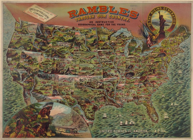
By Schaefer & Weisenbach Litho. Published by the American Publishing Co. purports to be an educational game for children.
Dennis Wood believes a map has the power to construct reality. Since the first map was introduced, they have helped people to recognize this world and themselves. When people believe what is told to them by the map, their identities and values are created by it; when people read the same map, and they share the values and recognitions created, these perceptions of the world are considered as “reality”. Maps made for children can have huge impact on the future. Children are naïve as they are only starting to come in touch with this world, therefore their perspective can be easily influenced. With vivid illustrations and simple words, values carried by these maps are constructing children’s “reality” like drawing on a blank paper. When they grow up, they carry with them their reality constructed by the maps of their childhood to the future. Thus, children’s maps have a large impact on the future of societies.
The ‘Rambles through Our Country’ Map from 1890 is a fitting example of how maps teach values to the youth. Right below the big title, a line of black words reads “an instructive geography game for the young.” This phrase clearly states the map’s purpose: to show the younger generation what their own country is like, that is, to shape their values of their own citizenship. It allows very young children to define themselves as “Americans”. The Children’s map plays an important role in giving children a chance to perform an act of citizenship by actively participating in the enactment of American cultural values.
The choice of color and illustration help the younger generation to build a sense of pride for their country. At first glance, this map seems quite green – it is generally showing the geographic landscape of the United States, but every landscape it shows in these illustrations is definitely not even a little accurate. These illustrations care nothing about whether the mountains, houses, trees or waterfalls are accurately placed or not. They only give a generalized view of the main features in a state rather than focusing on geographic precision. If the place is more urbanized, more houses are drawn in the state, like Massachusetts; if it is more wild and natural, more mountains, trees and animals are shown, like Nevada. I think the widely used green color implies the vigor and prosperity America – it was a time when America was rapidly developing and expanding, and the symbol of life carries the greatest wishes to the next generation of America. Accuracy was not applied simply because it was not necessary. The purpose of the map was just to tell the children what the features of each state are and how beautiful our country is, not where they exactly are.
With a closer look, we can easily see that states are illustrated separately. This separation along with the illustration of Statue of Liberty together shows the spirit of independence and freedom. Each state is an independent picture, so the border line can be easily recognized. This choice implies a sense of independence for every state, as each state has its own government and laws. But the whole map shares the same tone – similar range of colors is applied in all states. The Statue of Liberty on the upper right corner that reads, “to the rising generation,” represents the unity of America. It implies that although each state is relatively independent, they all share the same spirit of freedom and democracy. The balance between independence and unity is important to the current generation, and was a value they wished to pass down to their children. Mapmakers believed that the next generation would inherit the spirit of freedom along with their sense of independence and unity.
The progress of industrialization and a rapid development in transportation were also introduced to children by this map. As mentioned before, all natural landscapes are placed randomly except for one thing – the rivers. Unlike other landforms, rivers are placed in the correct position, and drawn with exaggeration. Compared to the area of states, they seem too wide, and the cartographers even add some details to them – there are ships and fish placed on several different spots. Not only do these cartographic choices give children some easy and vivid understanding of rivers, these illustrations also imply the value of transportation of that time. By 1890, people were still using carriage for short-distance transport, but waterways were playing an invaluable role in long-distance transport. So we can infer from the title that people “ramble through our country” by going through these waterways.
However, that was the way older generations rambled through our country. The “rising generation” would have more developed ways. Through the development of transportation, an expanding power is also shown in the map. I noticed an interesting picture on the lower left corner of the map, where a train runs into the place of the native Indians. Due to the Industrial Revolution, American transportation was entering a new era of railroads, by which the rising generation “rambled” through the country. This huge image that takes over much space of this map gives an indication to the children: the new era of industry is coming. At this time, Americans had already settled towards the West and were becoming more powerful on the international stage. I think the purpose of using native Indians as figures in this picture is to let children audience read these Indians as powerful symbols of people different from them – It tells them “We are not the intruders of this continent, but the Saviors of these native people that could bring them a better, faster, and more convenient life.” It implies that the United States of America ensures equality among everyone – the people similar to the audience, and the people different from them.
The strength of America is not implied in only one way. Although there’s no Alaska and Hawaii yet, there are a lot of large ships placed on the sea, both on the east coast and on the west. Even the harbor on the South is full of ships – and two of them are warships. All of these indicate the strength of America over the ocean, and imply the potential expansion of American power, giving children their national identity and, what’s important, a sense of pride of where they belong.
In a word, maps transmit their values to their audience, and therefore the map of children could have an impact on the future. By using its color, images, illustration and boundaries, etc, this children’s map successfully portrays a prospering, developing, expanding, and powerful homeland to the rising generation. It also helps them keep the ideals of America in mind – liberty, equality and democracy. The children will carry this sense of responsibility and national pride through their whole life, and make America even better.
-Li Li
Reference
Wood, Denis. The Power of Maps. New York, New York: The Guilford Press, 1992.
Litho, Schaefer/Weisenbach. Rambles through Our Country. American Publishing Co, 1890. Accessed February 24, 2014. http://www.bigmapblog.com/2014/rambles-through-our-country-childrens-map/
Li Li, great blog post! Just as this map tries to capture the spirit of America, you do an excellent job in harnessing the map’s underlying intentions. You provide an excellent analysis of the map’s true realities, not just what’s on the surface. For example, I like how you begin by sharing your thoughts on who the target audience is and how does this map affect them. The map skillfully portrays the U.S. as a whole and equal nation. Although we know now that in 1890 much of the U.S. was undiscovered or unpopulated, the map’s author clearly mean to propagate an idea to its audience. You tie this very well with the idea of manifest destiny and do a good job pointing out how imagery evokes meaning. I really liked how your analysis expanded (much like the U.S.) as it went on. By this I mean you began by focused on small details within the U.S. and concluded by highlighting how it related on an international scale. Your points on U.S. expansion, or even supremacy over natives, do well in noting that the map is projecting future values to children, tying to your intro paragraph nicely.
By the way, Mexico is covered up and Canada’s really not feeling the coloring love!
Pete
Really intelligent and analytical blog post Li Li you did a really great job! I loved the beginning with Dennis Wood and thought you hit all of the main points in the map. In particular, I really enjoyed your argument that this map created a “reality” for the children about every state, even if they do not visit them. In addition to this, I thought that your comment about the color green in the map helping to create a sense of prosperity was very intriguing. I didn’t notice this at first so great job in catching that detail! Finally, I really liked how you tied the concept of “hard power” into your map by discussing the ships and their roles as symbols for the United State’s expansion. I also found it noteworthy how the ships lined the entire United States border almost as if they were protecting the prosperous and green United States from the outside world. Hats-off to you Li Li — great job!
Brian