
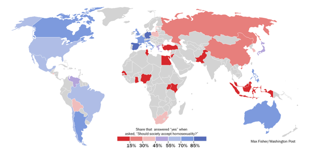
 The simplest questions often bring about the most controversial discussions. The prevalence of the debate regarding acceptance of homosexuality is increasing across not only the United States of America, but all countries. The extremely straightforward question “Should society accept homosexuality?” was asked to citizens across 39 nations spanning the world resulting in vastly varying results. What stands out at a first glance at this map is that nations with majority accepting views are clumped together and those with non-accepting views are clumped together in different parts of the world. Through observation of these patterns, viewers must consider causes for the world to be divided by one opinion. This map in particular is extremely telling of separation between countries of the world and what aspects of life may be valued over others. There are many contributing factors and visual tools used by the cartographer to display the opposing opinions in this debate. Cultural values on the acceptance of homosexuality, as displayed through maps such as this one, deserve deeper examination. One must delve into the many facets of this map to truly understand how telling it is of variation of lifestyle amongst people of the world.
It is evident that the results leading to the development of this map show nations with similar opinions on the topic are clumped together physically by their geographic locations. African countries in participation with this survey uniformly answered majority negative to the question of acceptance brought up. Stunning results came from Nigeria, where a whopping ninety-eight percent of citizens said that society should not accept homosexuality. South Africa is known for their gay rights movements, however, their results rung in at a low thirty two percent acceptance rate. Could this mean that the gay rights movements are not actually supported by the majority? These results raise questions about the development of this map. Fisher, the cartographer, does not disclose the methods of acquiring the data presented in the finished product. This map points to the politics of mapmaking in general because the cartographer did not have to disclose where exactly the data was acquired from and who was surveyed in the process. Areas of interest such as sample sizes and location of those surveyed are simply silenced by the mapmaker and not published with the map itself. This information would be very useful to users of this map in order to examine its level of accuracy (Fisher).
As far as classification by region is regarded, Latin American and Western countries are most accepting of homosexuals on the whole. European, Latin, and American countries ranked highest in racial acceptance as well as homosexuality, deeming them most accepting of cultural and physical differences across the board. A stimulating takeaway from this map is that America falls behind European nations in level of acceptance. I find it striking that, with current and prevalent changes in United States state laws creating equal marriage rights for homosexuals, Europe still trumps America in acceptance (Fisher). It is not told whether or not acceptance of homosexuality goes hand-in-hand with gay marriage laws . With regards to America, it is recorded that acceptance of homosexuality has increased ten percent since 2007, so this correlates with recent emphasis on the rights of homosexuals in recent years based on this ongoing change. It will be interesting to see if there will be changes within European laws regarding gay marriage in the near future proving that acceptance and change within the law are more closely correlated (Same Sex Marriage Laws). It would be useful to view a map of gay marriage laws in correlation with this map to show their current level of interaction (Fisher).
On the whole, countries that are very religious or almost homogenously one religion are least accepting of homosexuals. Ghana and Uganda in Sub-Saharan Africa are extremely Christian and are among the least accepting nations of homosexuality. This most likely correlates to the common interpretation of religious literature with its supposed bias against homosexuality. Similarly, Islamic countries tend to homogenously reject homosexuality as accepted. In the Islamic religion, the prohibition of homosexual acts is made very clear. Based on teachings of the Qu’ran, homosexuality clashes with natural order; therefore it makes complete sense that these nations have very little tolerance based on their religious views. What is most interesting about this information is that context for reasoning as to why homosexuality is not as accepted is not included or referenced; it simply must be known or researched by viewers of the map in order to connect the ideals in context (Watts).
Outliers are clear when you dive into the trends that this map contains with examination of the acceptance variations. The Philippines is perhaps the most prominent outlier here; a devoutly Catholic nation that also includes a very religious Muslim minority. The country acknowledges a third gender, who are referred as “bakla” and might identify in the West as transgender. Bakla refers to physiologically male Filipinos who are attracted to other men or even identify as women. This may lead to their acceptance of homosexuality (Fisher).
Although this map reveals differing views of homosexuality all over the world, there are also many missing aspects, such as the hundreds of countries that are not identified as more tolerant or intolerant of homosexuality. These silences on the map could be a result of difficulty of obtaining more data because surveys like these take a great deal of time and effort to carry out. Also, cartographer Max Fisher could have used his cartographic privileges’ to leave out nations, which do not correlate with a trend or pose an interesting opposition to a trend. Fisher does an exceptional job of choosing simple ways to make a bold statement. His color choice is one aspect that is very noticeable at a first glance. His choice of using the color red to represent those countries that are more unaccepting of homosexuality could be telling of his own opinions simply because the color red is more noticeable and linked with negative connotations. The simplicity of this map is most appealing because almost everyone should be able to understand what it is saying with little background knowledge of the topic or reasons for the separation of opinion. This map may lack deeper information regarding changes in acceptance over time because it simply relates to current day, however, it makes a bold statement about the current state of separation.
This map was chosen map of the week due to its importance in societal changes and controversy of this day and age. It has potential to yield more topics of controversy and debate, such as why some nations are more accepting than others and the reason behind it. Also, many people will wish to look into the past about acceptance of homosexuality and its evolution over time. I know that if this survey were taken thirty years ago the results would have been vastly different. It would be of interest to make a progressive version of this map, because I personally believe that there is change about this topic daily and this map is most likely already outdated.
The topic of fostering an accepting view of homosexuality is extremely widespread in our social changes and differences across nations. There can be many predictions made from this map and the reasons behind its results. It is likely that intolerant nations as a result of religious views will not change on the whole, however other nations could become more and more accepting, such as the Unites States, as time progresses. This map points out a social issue prevalent in all countries no matter their majority view on the issue of homosexuality acceptance. This is not a stagnant issue by any means and the way the world views homosexuality varies extremely as this map so clearly denotes. There are so many factors that go into the telling of why the information on this map exists as it does, but many things leading to the development of these opinions are unknown. This can be interpreted and theorized in a multitude of varying ways and create widespread discussion. I do not expect the importance or attention towards this topic to subside any time in the near future.
References
Fisher, Max. “A Revealing Map”. Washington Post. June 5, 2013. Accessed March 19, 2014. http://www.washingtonpost.com/blogs/worldviews/wp/2013/06/05/a-revealing-map-of-the-countries-that-are-most-and-least-tolerant-of-homosexuality/
Watts, Joel. “Ronans 1.26-7”. Huffington Post. July 19, 2013. Accessed March 19, 2014. http://www.huffingtonpost.com/joel-l-watts/bible-homosexuality_b_3612634.html.
“Same Sex Marriage Laws”. National Conference of State Legislature. March 6, 2014. Accessed March 19, 2014. http://www.ncsl.org/research/human-services/same-sex-marriage-laws.aspx
I think your choice to write about this map is great. The conversation on emerging social culture deserves a map like this. The silences on the map are just as telling as the information given. The fact that only a few select countries were surveyed even the map out between red and blue. It creates the reality that everyone in these countries hate/loves homosexuality as opposed to representing a percentage of the popultion. Great critique.
When reading this post, I really found this map interesting. The way you talk about the silences in the map prove really appeal to me. I liked how you showed that the religious countries were the countries that were least accepting of homosexuality. I also liked how you asked the question about the South African Gay Rights movement. This idea that geography affects views on homosexuality is fascinating to me. It proves that certain parts of the world are not as open as other parts of the world. Overall I like your critique on this map and find it a curious subject to explore.
As you addressed in this post, one of the largest downfalls of this map is the lack of information regarding data collection. The cartographer can almost skew the results because he does not tell the audience how he collected the data or who he collected the data from. Within the United States, for example, if the cartographer went exclusively to Alabama for data collection, his responses would be drastically different than if he asked people from New Jersey. Just as our class did with the DOD data, we had to represent the data that was available to us, so maybe the silences in the map can be attributed to a lack of information. I would suggest that the rise in homosexuality acceptance in Europe correlates with the recent decline of church attendance. This direct correlation between homosexuality acceptance and church attendance is seen all across the map. I agree with you that the cartographer made good color choices throughout the map, red tends to have a negative connotation, while blue is more moderate. I really like this map choice because homosexuality acceptance is an extremely prevalent topic in modern day politics, and I would be interested in seeing the evolution of this map as time passes.