Blog of the Week: GeaCron

GeaCron Home Page

GeaCron is a site dedicated to visualizing historical events around the globe.  With viewing selections such as time period, area, or event, one can truly get a sense of the changing dynamic of political power throughout our planet’s history.  By showing nations and their territorial control through color and arranging the years of a time period into different slides, GeaCron allows viewers to click through time periods and watch the changing landscape unfold before their very eyes.

Posted in Uncategorized | Comments Off on Blog of the Week: GeaCron

Map of the Week: Lloyd’s American Railroad Map


Library of Congress Enlarged Version

In the spotlight this week is an 1861 map of the extent of the rail system of the United States, entitled ‘Lloyd’s American Railroad Map.’  James T. Lloyd, the cartographer and designer of this map, published many similar maps during the mid 19th century, often depicting travel methods such as roads and railways.  This map in particular details the vast, interconnected nature of the American rail system and the towns and cities along each line. Lloyd’s map also contains a timetable showing the time differences between major American cities and an inset image of Pensacola, Florida and its surrounding rail lines and military bases.  These interconnected elements of a technologically descriptive map serve to highlight American’s developing industry and transportation abilities. A plethora of vivid rail lines controls the landscape upon which they are built, and translate a sense of closeness and accessibility across the country.  At a time when the country was segregated by the Civil War, this map takes a markedly unified look at the country through the lens of technology and industry.

One could look at this map and find its detailed network of rail routes and intricate town labeling impressive on its own.  However, there are more elements at play in this map than just detailed drawing.  First and foremost, this map shows the prominence and reach of the rail transportation system in America, which carries several connotations.  Primarily, it gives the viewer a sense of control over the land in which he or she lives. No longer is there an unknown frontier, and no longer will it take weeks to reach far distances.  Everything in the country is within reach, just a train ride away.  And with so many towns labeled as stops, it serves to show the variety of location and ultimately quantifies the railroad’s power over land.  Also, by truncating the country at the western borders of Missouri and Arkansas, the map gives the impression that the railroads do take up the whole country, despite the remaining half of the country that extends westward.  Although this land was just American frontier and not yet demarcated as states, the fact that Lloyd omits its existence in his portrayal of America speaks to his perception, or desired perception, of the railroad in America.

The omission of western land implies future expansion and that while the railroad exists in this half of the country now, it can, and most likely will, soon spread westward.  Map historian and cartographer Brian Harley has argued that silences of a map can have just as powerful of an effect on the observer as that which is actually depicted—a strategy Lloyd certainly employs here.  The absence, or silence, of this territory, speaks to a subconscious ideology of future control; that is, it is not worth depicting at the time of the production of this map, but will be worth detailing once the railroad, and ultimately the influence of American technology and culture, expands to fill it.

In addition to giving the viewer a sense of the railroad’s influence over territory, this map augments the development of the American geographical imagination itself. As Susan Schulten has noted, the expansion and movement of a culture is matched by maps of the territory into which it expands, promoting civic unity as it depicts the advancement of an entire society.  While I doubt even the creator had traveled every one of these rail lines and experienced every single stop along the way, this creation helps the viewer imagine where each stop is, and helps broaden the sense of the American country for any individual.  Even the stylistic choice of dark, thick lines representing the railroad affects the geographic imagination in that places do not seem so far from each other.  Two railroads that appear close due to the nature of their artistic presentation could in fact be a great distance apart.  This darkness and size also gives the illusion of a crowded network of railroads, as if the rail has a greater reach than it actually does.

Another aspect of this map worth noting is not the main feature of the railroads, but of the inset images as well.  First, Lloyd includes a time dial based on a time of noon at Washington, D.C, showing the corresponding times in approximately thirty other major cities, both inside and outside of the country.  In an age where immediate cross-country communication and satellites did not exist, it would be difficult to synchronize the times between distant towns and cities, making train departure and arrival times different for every location.  This time dial that Lloyd includes seems to be an attempt at fixing that issue, and if this map were widely disseminated, so would the standardization of times, which would ultimately benefit rail lines.

Next is the inset of Pensacola, Florida.  At first, a viewer today might assume this is included because it did not fit on the larger map, but upon further investigation, this inset serves as a piece of news and current events rather than a geographical addition. The almost overwhelming amount of information provided by Lloyd on this map serves to enhance its authenticity and affirm its accuracy and relevance to the American citizen.  During 1861, the Confederate and Union armies fought the Battle of Pensacola, which raged from January to November of that year.  Thus, Lloyd includes details of Pensacola’s rail lines and what looks like troop positions in order to give the American people a geographical image to relate to what they hear and experience through the news. As Schulten has emphasized in her writings, the purpose of maps in American History is to emphasize and document the evolution of the nation and to connect with current events and a cultural, national identity—not explore physical terrain.  In addition to detailing technology and physical location, Lloyd’s map is a comment on the national atmosphere at a time of war.  By contrasting an ordered, unified, and powerful map with a country divided and in disarray, Lloyd makes his projection of the American Railroad an image of comfort and control to the American public.  In this way, Lloyd’s map conveys order in a nation of disorder.

Posted in Maps of the Week | Tagged , , , , | 1 Comment

Map of the week: The Geography of Genius

http://bigthink.com/strange-maps/the-geography-of-genius

Taking an abstract piece of data and turning them into something that can be looked at and understood easily is what cartographers strive for. Frank Jacobs did this when he produced The Geography of Genius for the book Human Accomplishment: The Pursuit of Excellence in the Arts and Sciences, 800 BC to 1950 by Charles Murray. Jacobs decided to map something that most people would find impossible to map—what areas in Europe were producing influential figures in the four disciplines of science, literature, art, and music. He basically took data that some would assume to be purely statistical and turned it into a form that can be placed on a map. These maps track individuals in three time periods. The first quartet of maps ranges from 1400 to 1600, the second tracks the years 1600 to1800, and the last grouping of map ranges from 1800 to 1950. Each map has its own grouping and each can be analyzed to help reflect on the time period the map is from.

As we look at each time period we can notice shifts from one area to another. These shifts can be attributed to many different factors. When we look at the first set of maps we will notice each discipline on the map has a central location where most of members of this field derive from. These central areas tend to be the starting point for shifts that occur on the future maps. For Science and Art, the central areas both tend to be in Northern Italy. This isn’t the most surprising trend considering that during this time period, people of Italy were going through a golden age known as The Renaissance. People were trying to do certain things they have never tried before. People decided move away from the Church’s ideologies and think for themselves. Literature is focused around the city of London, England. One reason why is because of the work that was produced by William Shakespeare who wrote some of what many consider to be the most influential plays ever written. He and many other writers were apart of a progressive literature movement. Lastly we see music focused round the Low Countries of Belgium and the Netherlands. While all four of these subjects have central locations where significant figures were born, there were many cities represented on each map that were beginning to produce leaders in music. The denser areas for each subject tend to correlate to how wealthy countries were during this time period.

The maps showing the next 200 years illustrates the pattern of spreading out from a central location to other areas in Europe.  Dots are spread out across the entirety of Europe. Jacobs used dots to represent individuals for a good reason. They make the map more individualized. A map that only shaded in areas of influence would not have the same effect. In every subject there is either an expansion to many different areas from before or a complete shift from one area to another. Music really shows this complete shift well. Although it was focused in the Low Countries, this map shows no evidence of this ever occurring. Belgium and the Netherlands had a complete shift of leading the Western World in developing significant music figures to developing none at all. This culminated in Europe leading in the field of Art. Science and Literature branched out across Europe during this time period. Significant figures were found in a multitude of countries. I think this expansion in these two fields can be accounted for by the increasing popularity in the printing press. With more and more of these presses being made across Europe and the literacy rate increased almost everywhere. People could share ideas on paper much easier than before.

The last quartet of maps best illustrates how much the printing press affected the spread of ideas. The printing press led to an exponential rate of change and the spread of knowledge across Europe. In all four maps people can be found in cities in every area of Europe. Once again, literature and science are the most spread out of the four subjects. The printing press certainly changed the world, and these maps really illustrate that point.

If maps were produced for the birthplaces of modern members in each one of these subjects, I’m sure the expansion would be even higher. Today, it would be almost impossible to map geniuses across the world. Influential people can be found in every country. The invention of the Internet is similar to the invention of the printing press. Information is spreading faster than ever before. As our world develops into one where people have both increased access and ability to read, this combination has led to a huge expansion of countries producing significant leaders in each of these subjects.

Posted in Uncategorized | 1 Comment

Atlas of the Week

http://www.amnh.org/our-research/hayden-planetarium/digital-universe/

This atlas is really interesting because it’s mapping something that we don’t know very well. It might be a stretch but it can be directly related to what we are learning in class. This atlas certainly doesn’t reproduce reality. Instead it is a social interpertation of what we see the universe as. We automatically place the Earth in the center of the atlas, because it is where we view the rest of the universe from, although we have no idea what the center of the universe is.

Posted in Uncategorized | Comments Off on Atlas of the Week

Blog of the Week:

http://www.cartogrammar.com/blog/

This blog has some really interesting maps and some funny posts. One of my favorite maps on this blog is one that shows how skewed mercator maps can be. I knew these maps were skewed, but not to this extent.

Posted in Uncategorized | Comments Off on Blog of the Week:

Atlas of the Week: Omniatlas

http://maps.omniatlas.com/

The Omniatlas map of Europe from April 6, 1917, when the United States entered World War I.

Omniatlas maps regions of the world overdecades and centuries, showing how each region changed over the years. Simply click a button to advance to the next event in that region’s history and see how the geography of that region changed. A historical analysis of each event is also given. One can both read and see how international relationships changed the layout of countries over time in a level of detail which is not possible with traditional atlases.

Posted in Atlases of the Week | Comments Off on Atlas of the Week: Omniatlas

Altas of The Week

http://maps.nrel.gov/mhk_atlas

This is a National Renewable Energy Laboratory link mainly about the water, such as the wave, ocean current, and tidal stream. What I found interesting is that it includes many mapping and assessment of the United States specifically. Just by clicking on the index in the right side of the page, you can easily find out the changes in the maps, presenting the changes in when and where the water changes . It also might be a helpful reference when people plan to travel.

Posted in Atlases of the Week | Comments Off on Altas of The Week

Map of the Week:A World In A “Color book”

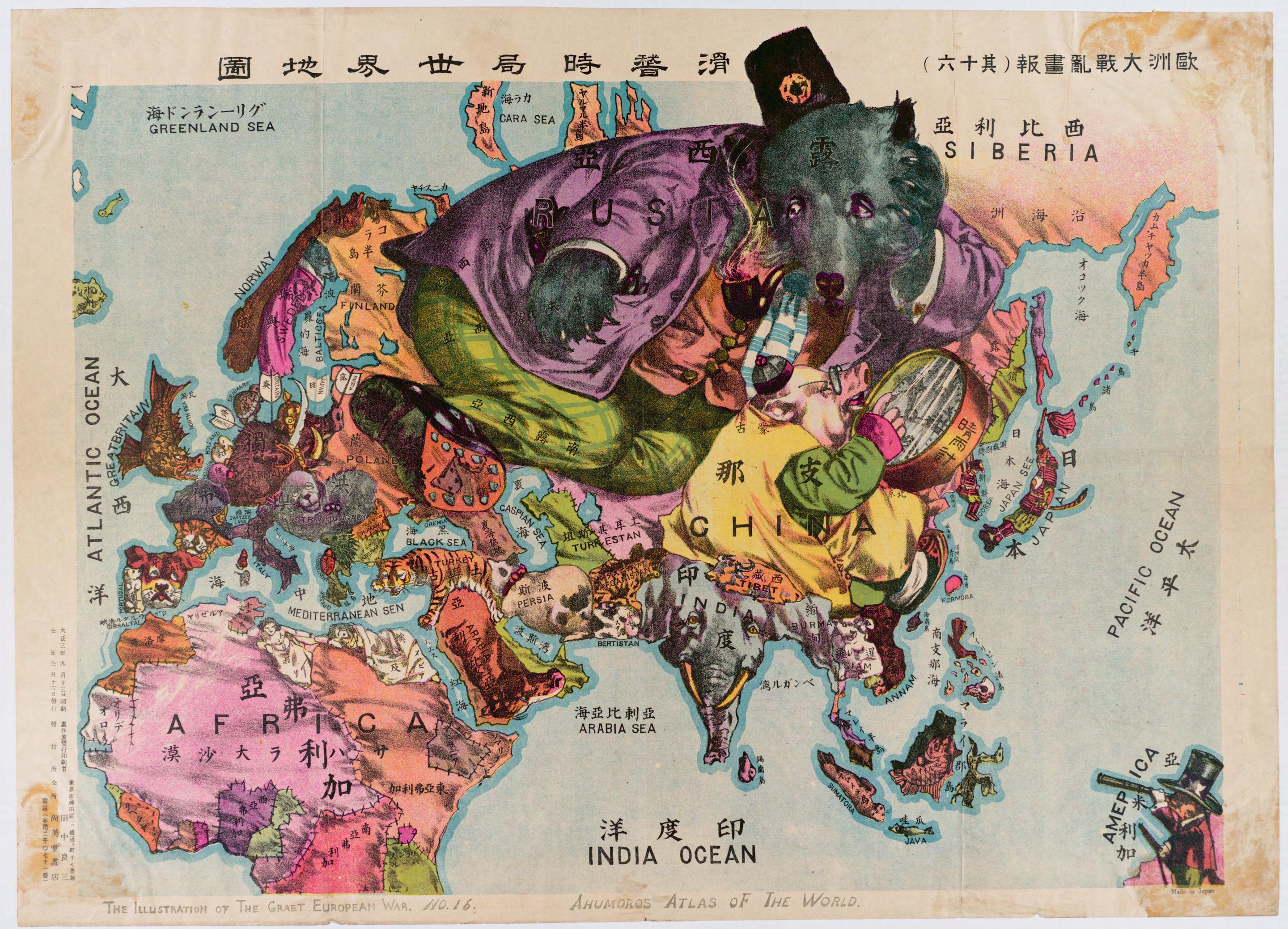
Oct.20 The Illustrations of The great European War No.1-A humorous Alas of the world, Ryozo, Tanaka, 1914

Are you sure this is a map? Seems like I entered a zoo.

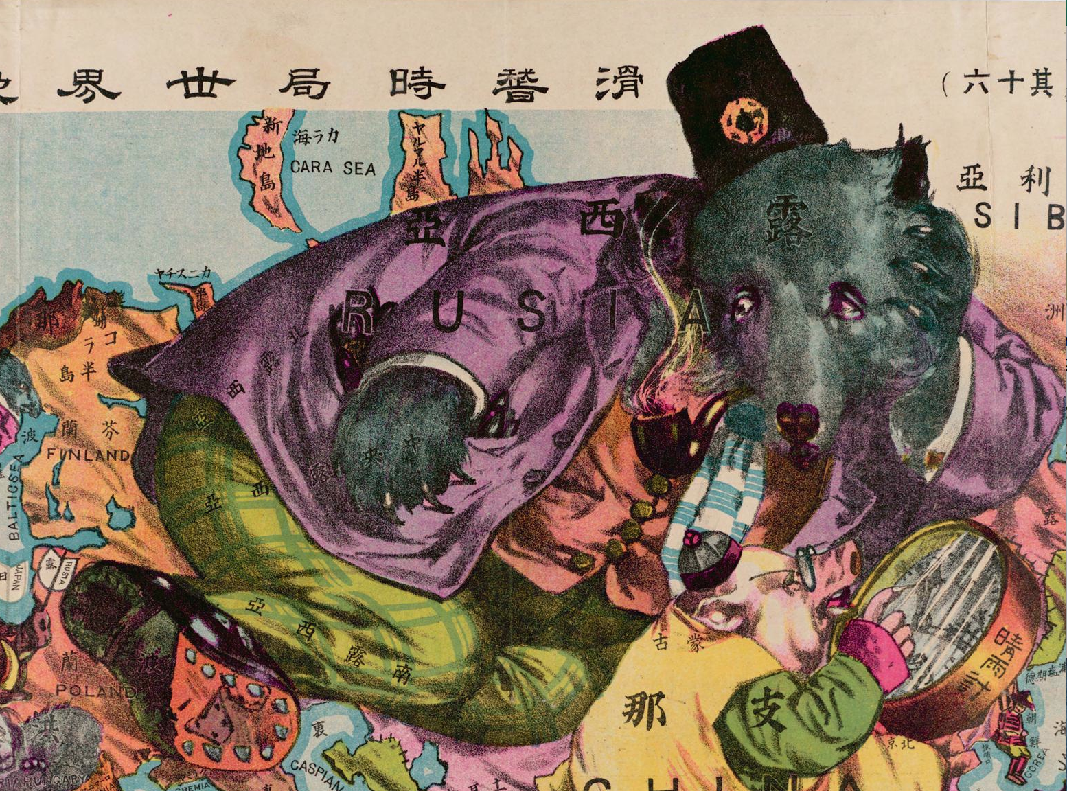
The Map we see here was produced during the World War I. It draws our attention to the medley of colors and animals, much like a children’s color book in kindergarten! Titled “The Illustration of The Great European War No. 16 — A humorous Atlas of the World,” the map was produced by Ryozo Tanaka, published in Japan, 1914. Tanaka is a prominent Japanese scholar on international relations. The Map was first published in a popular journal, presenting a world whose focus is on Asia, Africa, and Europe during the beginning of World War I. Although the Map appears as if it were from a random comic book, the symbolism used in the Map and the way the author distorts scale offer an insight into the author’s (and, what he understands to be, Japan’s) perspective in global relationships. Japan was competing at the time with major powers such as Russia and England, while the US was emerging as a threat. Using mapmaking elements such as scale, color, and symbolism, Tanaka expresses certain political interest of Japan. His choice of these elements indicates his understanding of which countries Japan should conquer, be vigilant of, or otherwise disregard.

What is in the MAP?

Some countries are drawn as animals, some are humans, and some inanimate elements. The range of symbolism reflects cultural, socioeconomic or political distinctions between the countries these symbols represent. To begin with, Tanaka symbolizes Japan with a samurai, one of a few human symbols in the Map. This alone suggests a belief in Japanese supremacy. In some occasions, Tanaka uses animals to highlight why a country may be worth noting. He uses an elephant to represent India, which, given India’s Buddhist belief, may suggest that Tanaka understands no tension between Japan and India. Between the human and animal symbols are the personified animals that wear clothes and other decorations, of which Russia, China, and Germany are a few examples. These symbols may suggest that Japan sees these countries as meaningful players in the world, whether as an enemy, ally, or target. Lastly, Tanaka represents African countries as rugs sewn together. This depiction underlines Japan paying no attention to the region, and finding no influence of the region over its concerns.


CHINA

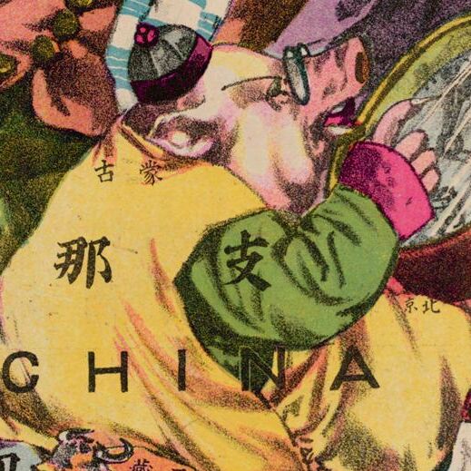
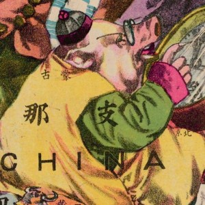
The Map depicts China as a fat, myopic pig that Japan believes it can exploit. The map produced at the end of the Qing Dynasty of Imperial China. Chinese society at the time was not considered very modern in terms of its industry and technology, so the author represents it as a pig wearing traditional clothes (compared to Russia with suit). The studious glasses are a comic depiction of Qing Administration’s “Seclusion Policy”, which isolated China from the rest of the world and made it unaware of the rapid progress happening around it. This may be the author’s reflection on why the once powerful empire has fallen behind, meanwhile as a warning to Japan to not do the same. That China was also resourceful and wealthy (despite its underdevelopment) informs us of its symbol as a big fat swine. From all of these, the map infers that Japan had acknowledged both the Chinese vulnerability in governing but also its richness in resource. From the angle of sight of Japan, the samurai has probably already aimed at conquering this wealthy but stupid land.


Russia

Tanaka draws Russia as a bear in a suit. The Russian bear looks massive and strong, as was its power at that time. Looking at the image more closely, the bear is glancing at Western Europe, whilst stomping its foot on Eastern Europe. This is an interesting portrayal satirizing how Russia disguised its desire to expand its involvement in the European war. Furthermore, now that the Bear is looking away from Manchuria (over which possession Japan fought vehemently against Russia), Tanaka may be implying Japan’s intention to take over Manchuria, as the big, stupid and often simple-minded bear is not paying attention. Finally, it is worth noting that however well-dressed is the bear, or however powerful it seems, it is big and stupid, which is distinct from the human, sapient Japanese samurai.
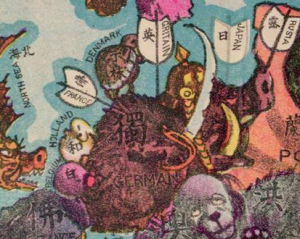
 

Germany

Shifting the attention to the west of the world, Germany, unfortunately, is depicted as being inundated and targeted by French, Japanese and British arrows. The armed Germany illustrates its eagerness to expand its power to the rest of the world. Meanwhile, the aggressive intention was suppressed by some tangible power in the world, as shown in the several white flags on the helmet-wearing wild boar. The crossfire is a representation of the initial outbreak of WWI.
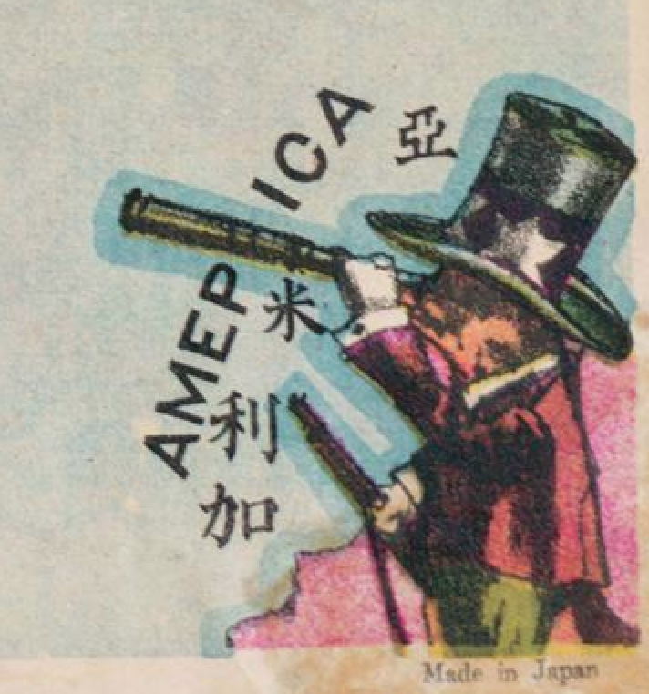
U.S

Let us now switch our attention to the right corner of the map, where the author leaves a comparatively small space for the exotic (to his Japanese audience). Instead of continue colonizing neighboring countries, America had already started to observe the world with its advanced technology. Tanaka portrays America as a badger holding a gun, while European countries are still using arrows. This not only suggests the U.S. being technologically advanced, but also conveys an underlying fear of the Americans on the part of Japan. It is important to note that it was Commodore Perry of the U.S. Navy who first broke the seclusion of Imperial Japan, from which point Japan had constantly modeled its modernization after the U.S. Therefore, Tanaka may have given the American badger a gun to warn his audience of the continuing threat from across the Pacific. Moreover, America is also holding a telescope (compared to the thick glasses of China) to see the distant continent over the Pacific Ocean, and wants to involve itself in the interests of the rest of the world. The direction of its sight is, of course, the Philippines. It is possible that America just wanted to make sure its colony was safe during wartime. The tiny size of the American badger and its distance from the center of the Map connote the minor American involvement in WWI at the time. Moreover, the small size also suggests that the author thinks the U.S. is paying more attention to South-East Asia, and is not of concern to Japan. This may be due to Japan still trying to develop and not yet planning to expand its influence to outside the Greater China Area. As readers, we may see how Japan did not regard the U.S. as a potential rival in influence over Asia, which changes drastically after WWI.
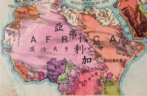
 

Africa

Furthermore, there are also inanimate representations that serve as the silent part of the map. For example, the African countries are mostly shown as patched rags. With little attention to the continent, the mapmaker blurs the contours of specific African nations. The characters in each country are only simple orientations such as East-Africa, South-Africa, North-Africa, indicating the perceived slightness of power on the African continent. From the perspective of Japan/Asia, they just regarded the whole continent as a negligible part of the world, although it does occupy a large mass.

The map is centered on Asia, far away transcending the limited boundaries. The vivid animations of each picture reveal the imminence of the explosive war, providing a motivational attitude but also revealing complicated circumstances. Tanaka shows us Japan’s strong interest in China (its wealth and resource). He suggests Japan watches Russia closely and has a good sense of the status of the European war (WWI). He also addresses (although limitedly) America’s presence and intention to expand its influence over South-East Asia. This map reminds me of our old pal Denis Wood’s words – “Maps are about relationships” (Wood pg. #). When we open the atlas and look through it, we probably gain a more clear and intuitive image of the war, but we also witness the nationalistic propaganda built on stereotypes. Instead of supplying piles of historical documents exploring international relationships, this map achieves the goal using a straightforward, clear, and humorous visual representation. The relationships shown in the map not only illuminate long-term relations between countries, but also serve as clues to predict the development of the world.

                                                                      Works Cited

Wood, Denis, and John Fels. The Power of Maps. New York: Guilford, 1992. Print.


Posted in Maps of the Week | Tagged | 6 Comments

Map of the Week: Electrical Sockets of the World, and Why the United States’ Socket is the Best

A map of the various electrical sockets used across the world.

There are many things people have to worry about when they travel to another country: Are their passports up-to-date? Do they have enough money to convert to a local currency? Will their electrically-powered devices plug in? While the trouble caused by the plug on a toaster not fitting into the wall may not be the most pressing concern when traveling abroad, it is a significant one. There are many “converters” available to buy which allow one type of plug to fit into another type of socket; however, not all of them work with every type of socket. So which converter is the right one to buy? This map appears to answer the question by the socket type(s) used by each country, but it also secretly tells its reader information about the power, both literally and figuratively, countries have. Through the use of stripes, placement of the legend, and color choices, this map illustrates the superior power of the United States compared to other countries.

Continue reading

Posted in Maps of the Week | 2 Comments

“How Communists Menace Vital Materials”

This map, published in 1956 and produced by Research Institute of America, shows the USSR’s attempts to extract resources from around the world during the early days of the Cold War.  Research Institute of America was founded in 1946 as a nonprofit, nonpartisan behavioral and social science research organization.  Originally interested in aviation and education, the organization has since expanded research into international development and health.

This map’s original purpose was to display to Congress how large of a threat the Soviet communists posed to American interests.  It is important to note that this map was drawn just following the height of the Red Scare, a period when Americans were wary of communism possibly infiltrating the US or our allies.  With Joseph McCarthy’s threatening philosophy at the forefront of Congressmen’s minds, the overbearing bold arrows and large hammer and sickle icon sit ominously at the center of the map.  The USSR’s forces extend out like a spider web, reaching the far corners of the world.

It is essential for us to analyze this map and all its features while remembering the overarching conflict of the Cold War.  The long militaristic power struggle between the US and USSR was only still in its early stages at the time this cartographic text was made.  The map is a form of propaganda, used by capitalists to showcase the risk communism caused and persuade Congress to act against Soviet power.

M. J. Heale’s book McCarthy’s Americans: Red Scare Politics in State and Nation, 1935-1965 includes this interesting tidbit regarding 1950’s-era US policy: Amid tensions within Congress itself, there was a great emphasis on passing anticommunist propaganda in institutes of higher education.  Heale states, “Education was a major responsibility of state governments, and red scares thus often focused on colleges or schools.”  He goes on to explain that when the red scare phenomena were at their “most destructive,” congressional committees targeted universities with the intention to “stamp out Communism in out educational system.”  We can infer from this that the techniques used in Congressional hearings, such as anti-Soviet maps and other cartographic texts, were effective enough in communicating their message that legislators fixated on influencing the next generation as well as their peers.

Heale, M. J. (1998). McCarthy’s Americans: Red scare politics in state and nation, 1935-1965 (p. 4, 86, 297). Athens, GA: University of Georgia Press.

Posted in Uncategorized | Comments Off on “How Communists Menace Vital Materials”