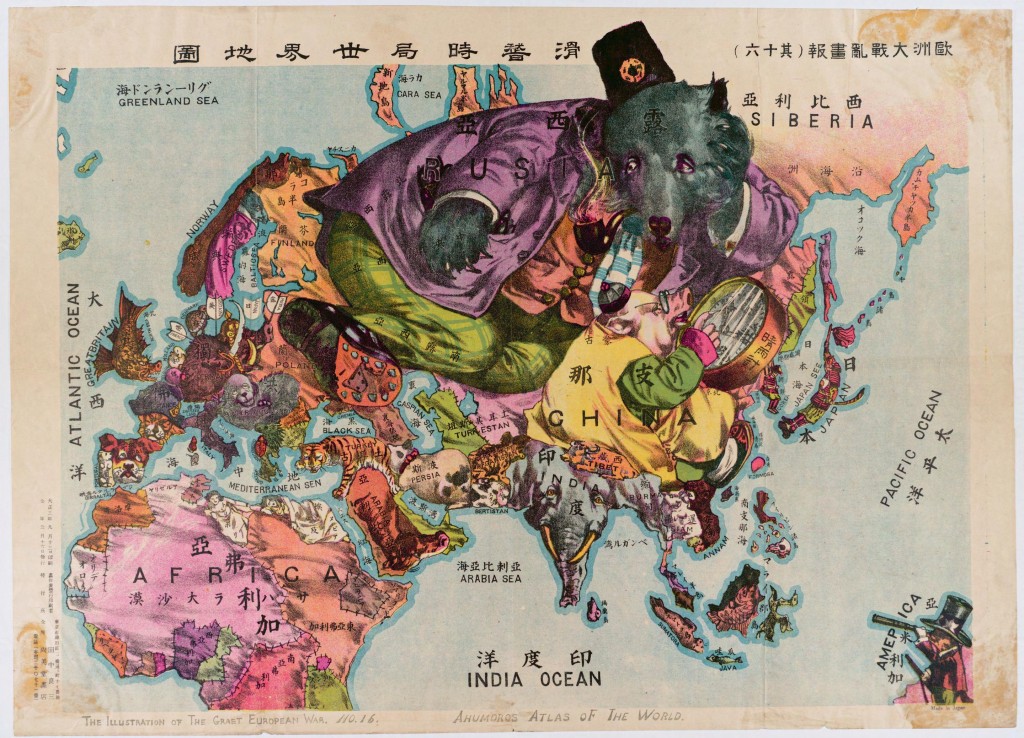
Oct.20 The Illustrations of The great European War No.1-A humorous Alas of the world, Ryozo, Tanaka, 1914
Are you sure this is a map? Seems like I entered a zoo.
The Map we see here was produced during the World War I. It draws our attention to the medley of colors and animals, much like a children’s color book in kindergarten! Titled “The Illustration of The Great European War No. 16 — A humorous Atlas of the World,” the map was produced by Ryozo Tanaka, published in Japan, 1914. Tanaka is a prominent Japanese scholar on international relations. The Map was first published in a popular journal, presenting a world whose focus is on Asia, Africa, and Europe during the beginning of World War I. Although the Map appears as if it were from a random comic book, the symbolism used in the Map and the way the author distorts scale offer an insight into the author’s (and, what he understands to be, Japan’s) perspective in global relationships. Japan was competing at the time with major powers such as Russia and England, while the US was emerging as a threat. Using mapmaking elements such as scale, color, and symbolism, Tanaka expresses certain political interest of Japan. His choice of these elements indicates his understanding of which countries Japan should conquer, be vigilant of, or otherwise disregard.
What is in the MAP?
Some countries are drawn as animals, some are humans, and some inanimate elements. The range of symbolism reflects cultural, socioeconomic or political distinctions between the countries these symbols represent. To begin with, Tanaka symbolizes Japan with a samurai, one of a few human symbols in the Map. This alone suggests a belief in Japanese supremacy. In some occasions, Tanaka uses animals to highlight why a country may be worth noting. He uses an elephant to represent India, which, given India’s Buddhist belief, may suggest that Tanaka understands no tension between Japan and India. Between the human and animal symbols are the personified animals that wear clothes and other decorations, of which Russia, China, and Germany are a few examples. These symbols may suggest that Japan sees these countries as meaningful players in the world, whether as an enemy, ally, or target. Lastly, Tanaka represents African countries as rugs sewn together. This depiction underlines Japan paying no attention to the region, and finding no influence of the region over its concerns.
CHINA
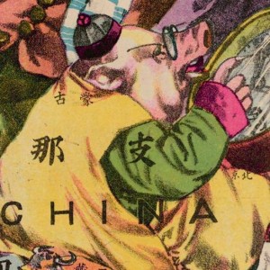
The Map depicts China as a fat, myopic pig that Japan believes it can exploit. The map produced at the end of the Qing Dynasty of Imperial China. Chinese society at the time was not considered very modern in terms of its industry and technology, so the author represents it as a pig wearing traditional clothes (compared to Russia with suit). The studious glasses are a comic depiction of Qing Administration’s “Seclusion Policy”, which isolated China from the rest of the world and made it unaware of the rapid progress happening around it. This may be the author’s reflection on why the once powerful empire has fallen behind, meanwhile as a warning to Japan to not do the same. That China was also resourceful and wealthy (despite its underdevelopment) informs us of its symbol as a big fat swine. From all of these, the map infers that Japan had acknowledged both the Chinese vulnerability in governing but also its richness in resource. From the angle of sight of Japan, the samurai has probably already aimed at conquering this wealthy but stupid land.
Russia
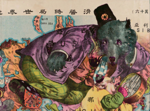
Tanaka draws Russia as a bear in a suit. The Russian bear looks massive and strong, as was its power at that time. Looking at the image more closely, the bear is glancing at Western Europe, whilst stomping its foot on Eastern Europe. This is an interesting portrayal satirizing how Russia disguised its desire to expand its involvement in the European war. Furthermore, now that the Bear is looking away from Manchuria (over which possession Japan fought vehemently against Russia), Tanaka may be implying Japan’s intention to take over Manchuria, as the big, stupid and often simple-minded bear is not paying attention. Finally, it is worth noting that however well-dressed is the bear, or however powerful it seems, it is big and stupid, which is distinct from the human, sapient Japanese samurai.
Germany
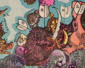
Shifting the attention to the west of the world, Germany, unfortunately, is depicted as being inundated and targeted by French, Japanese and British arrows. The armed Germany illustrates its eagerness to expand its power to the rest of the world. Meanwhile, the aggressive intention was suppressed by some tangible power in the world, as shown in the several white flags on the helmet-wearing wild boar. The crossfire is a representation of the initial outbreak of WWI.
U.S
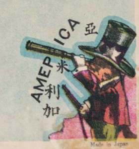
Let us now switch our attention to the right corner of the map, where the author leaves a comparatively small space for the exotic (to his Japanese audience). Instead of continue colonizing neighboring countries, America had already started to observe the world with its advanced technology. Tanaka portrays America as a badger holding a gun, while European countries are still using arrows. This not only suggests the U.S. being technologically advanced, but also conveys an underlying fear of the Americans on the part of Japan. It is important to note that it was Commodore Perry of the U.S. Navy who first broke the seclusion of Imperial Japan, from which point Japan had constantly modeled its modernization after the U.S. Therefore, Tanaka may have given the American badger a gun to warn his audience of the continuing threat from across the Pacific. Moreover, America is also holding a telescope (compared to the thick glasses of China) to see the distant continent over the Pacific Ocean, and wants to involve itself in the interests of the rest of the world. The direction of its sight is, of course, the Philippines. It is possible that America just wanted to make sure its colony was safe during wartime. The tiny size of the American badger and its distance from the center of the Map connote the minor American involvement in WWI at the time. Moreover, the small size also suggests that the author thinks the U.S. is paying more attention to South-East Asia, and is not of concern to Japan. This may be due to Japan still trying to develop and not yet planning to expand its influence to outside the Greater China Area. As readers, we may see how Japan did not regard the U.S. as a potential rival in influence over Asia, which changes drastically after WWI.
Africa
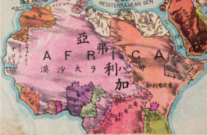
Furthermore, there are also inanimate representations that serve as the silent part of the map. For example, the African countries are mostly shown as patched rags. With little attention to the continent, the mapmaker blurs the contours of specific African nations. The characters in each country are only simple orientations such as East-Africa, South-Africa, North-Africa, indicating the perceived slightness of power on the African continent. From the perspective of Japan/Asia, they just regarded the whole continent as a negligible part of the world, although it does occupy a large mass.
The map is centered on Asia, far away transcending the limited boundaries. The vivid animations of each picture reveal the imminence of the explosive war, providing a motivational attitude but also revealing complicated circumstances. Tanaka shows us Japan’s strong interest in China (its wealth and resource). He suggests Japan watches Russia closely and has a good sense of the status of the European war (WWI). He also addresses (although limitedly) America’s presence and intention to expand its influence over South-East Asia. This map reminds me of our old pal Denis Wood’s words – “Maps are about relationships” (Wood pg. #). When we open the atlas and look through it, we probably gain a more clear and intuitive image of the war, but we also witness the nationalistic propaganda built on stereotypes. Instead of supplying piles of historical documents exploring international relationships, this map achieves the goal using a straightforward, clear, and humorous visual representation. The relationships shown in the map not only illuminate long-term relations between countries, but also serve as clues to predict the development of the world.
Works Cited
Wood, Denis, and John Fels. The Power of Maps. New York: Guilford, 1992. Print.

I think the map you chose is fascinating. In your analysis you do an excellent job at connecting the author’s prejudices to the symbols on the map. Because the map was made by a Japanese man, it enables the viewer to obtain a better understanding of the international relations between Japan and other countries. You mentioned the map was made in 1914, which I think is particularly important because it is right at the beginning of WWI. During this time tensions between countries would have been very high, and this map encompasses many of those tensions as they were seen by Japan. Particularly, I like how you emphasize that the countries on the map with personified animals and human symbols are seen by Japan as the countries that have more significant influences in the world. Your descriptions of specific symbols do a great job at explaining why the author made some of the choices he did. I think your analysis is intriguing especially because you have silences in your writing, just as the author has silences in the map. Due to the length restraints of the assignment, you were not able to analyze the symbols representing each country; therefore, you had to make choices to exclude certain information in the same way a cartographer must do when making a map. By only describing some of the symbolisms in detail, you have highlighted Japan’s relationships with these countries and brought the readers attention away from the other countries on the map.
This map is extremely interesting. The fact that the map was created in Japan in 1914 really tells a lot about cultural biases they had, well as what was going on during this time period. You did a great job breaking down each portion of this map and giving your diagnosis. You also did well explaining the biases Japan may have had against each nation you focused on. The map portrays China as a pig, which shows that China was hated by Japan and wasn’t as technologically advanced as many other nations were during this time period. 1914 was the very beginning of World War 1, and the U.S. had adopted an isolationist form of foreign policy at this point in time. This was well before Pearl Harbor and World War 2, so Japan didn’t have any serious prejudice against the U.S. yet. We are the only nation on the map shown with a gun, which shows us as being more powerful and sophisticated than most nations in the eastern hemisphere. We also are peering through a scope at Southeast Asia, which goes to show that while remaining isolationist, we are still paying attention to all that is going on in the rest of the world during the early portion of World War 1. I really liked how you focused heavily on the nations more thoroughly drawn up on the map. These tended to have more influence in the world and can show a lot about cultural tensions and prejudice.
This map’s unique approach to mapping the world allows it to be deserving of some analysis and critique. Furthermore, this map also shows the perspective of a particular area on the rest of the world at a certain time. Consequently the two factors, ingenuity and viewpoint, work dynamically to allow for this map to be worthy of an in depth exploration to examine what rhetoric and motives lie behind its curtain. The cartographer’s use of scale, as mentioned in the post, is critical for portraying which countries were of major concern to Japan at the time. By distorting the scale the cartographer was able to focus the audience’s attention onto certain parts of the map. For instance, Russia immediately catches the eye of the viewer due to the fact that it is represented by such a large bear. This distortion in scale is similar to that of the Mercator Projection, which uses an alteration in scale to shape the identity of the audience by focusing largely on Central European powers in order to make them appear larger and more formidable. Therefore one could infer that scale is used in each case as a rhetorical strategy despite the fact each uses it for a different purpose.
This is a really intriguing map and a well done job summarizing the themes within. When first looking at this map, it is almost over whelming. There are so many pieces to look at. You did a great job picking out the most important themes and deciphering them. I think your analysis on the United States and your explanation on how Japan viewed the world are both very well written. The maker of this map depicted the United States in a very simple manner, which is interesting. I wonder what the maker of this map would produce if he made the same kind of map but after World War II took place. How would he depict countries like the United States and the Soviet Union? How would he depict the countries of Africa that were beginning to be decolonized? I think these would be two of the biggest focuses of the post World War II version of this map. Overall I think this is a great map choice, and a very well done critique.
agree, because it gives a good and interesting work
apakah ini merupakan film kartun atau hanya gambarnya saja ?