World Atlas of the Week

I chose this atlas because at first glance it looks like a “normal” projection of the world, but if you look deeper, many critiques can be made.  

Posted in Uncategorized | Comments Off on World Atlas of the Week

The Interconnection of Transportation in the United States

We all know that transportation is a vital part of our everyday lives in the US, but do we really know the specifics of how it all works? The map that I have selected depicts the major transportation facilities of the United States in 1999.  The map was produced by the Department of Transportation which is a department that tries to improve the transportations systems in the United States. When this map was created, the United States had a highly developed transportation system equipped with many options for getting in and around the country. From cars and buses to trains and planes, all various forms of transportation were available to most American people. However, this map does not just depict what types of transportation people use, rather what areas in the United States see the most travel of goods and people.  As shown on the map, more urbanized areas and cities have the most highways, railways and waterways running through them.  In addition some things that are labeled on the map are major ports. The majority of these ports are found along the east coast.  This could be due to the fact that goods are being transported across the Atlantic Ocean from European countries.

I chose this particular map because transportation of goods, services and people often get taken for granted. When you pick up an avocado in the grocery store, you hardly think of how that avocado got from the farm, to the grocery store and into your hand. This map makes us think more about transportation and how urban areas are the hub of it all.  The transportation of goods and people contribute to the transportation of ideas across the US. This movement of ideas causes cities and ports to be more progressive in their thinking, which is shown in the map. In addition this map shows how connected major cities are across the country and this connection allows for the United States to be a nation based on industry and technology. The US has been built on the idea of infrastructure and industry. The elements of industry and technology contribute the pprogressiveness of the US.  This projection allows the audience to focus in on specific transportation across the US and see the difference in transportation between rural and urban areas.  Rural areas are more spread out and less people populate them as opposed to urban areas such as cities that are full of infrastructure and has a high population.

While looking and analyzing this map, I can find some critiques for it.  For example, I know that the map was developed by the US Department of Transportation, which is a federal administration with offices around the US. However, I would like to consider what group of people specifically made the map and if their views influenced the map.  Was the map developed in an urban area? If so does the urban area inflict bias towards the layout and the projection of the map? A common concept about maps that goes unnoticed is that maps show silences. These silences are the deeper meaning of the map and the important details that relate to the map but are not shown on the projection.  The silences on this map that I think about are economics and the flow of money when goods and people are transported.  For example, since urban areas and cities have the most transportation flowing through it, cities are taking in the most money. And therefore, the more Midwestern states and rural areas are bringing in less money due to the lack of transportation and goods going through the areas.

Another concept that is used to describe cartography is that maps are often very political. I would describe this map as an ethnocentric and political map because it only shows the transportation of the United States. The idea of transportation is political because it exposes the different relationships between people in the US who can afford more efficient transportation as opposed to people who cannot . This map also shows political aspects because it favors the US and puts our transportation system above others. Since the map was created by a US federal department, it is known that ethnocentric bias towards the US is going to be embedded in the map.  This bias can be derived from the people at the Department of Transportation who want to show off how industrialized our country’s system of transportation system is.

The Major Transportation Facilities of the US is a very insightful map  that shows the interconnection of cities and transportation across the country.


Posted in Uncategorized | 3 Comments

Blog of the Week: Worlds Revealed – Geography and Maps at the Library of Congress

This week’s blog is from the Geography and Map Division of the Library of Congress.  The largest and most comprehensive cartographic collection in the world, the Geography and Map Division contains over six million maps in addition to a wide array of atlases, globes, raised relief models, archives, a vast collection of digital data and a GIS research center.  This blog consists of unique historical maps both of the United States and the rest of the world.

https://blogs.loc.gov/maps/ 

Posted in Uncategorized | Comments Off on Blog of the Week: Worlds Revealed – Geography and Maps at the Library of Congress

Atlas of the Week: USGS Topographic Maps

This week’s atlas is the United States Geological Survey’s National Map, a collection of 7.5 minute topographic maps.  Produced from GIS (Geographic Information Systems) databases, these maps, called quadrangles, show the roads, elevation, and bodies of water of every square inch in the United States.  The maps are all to the same scale (1:24,000) and can be easily downloaded or purchased.  All the user has to do is type in the zip code or city that they would like to see and click “Go”.  The database then returns all available current (as of 2016) and historical maps for that area.

USGS National Map


Posted in Uncategorized | Comments Off on Atlas of the Week: USGS Topographic Maps

Most Accurate Map in the World

No map is perfect.  No map can one hundred percent accurately display the Earth’s geoid shape onto a two-dimensional surface.  Many have tried.  All have failed.

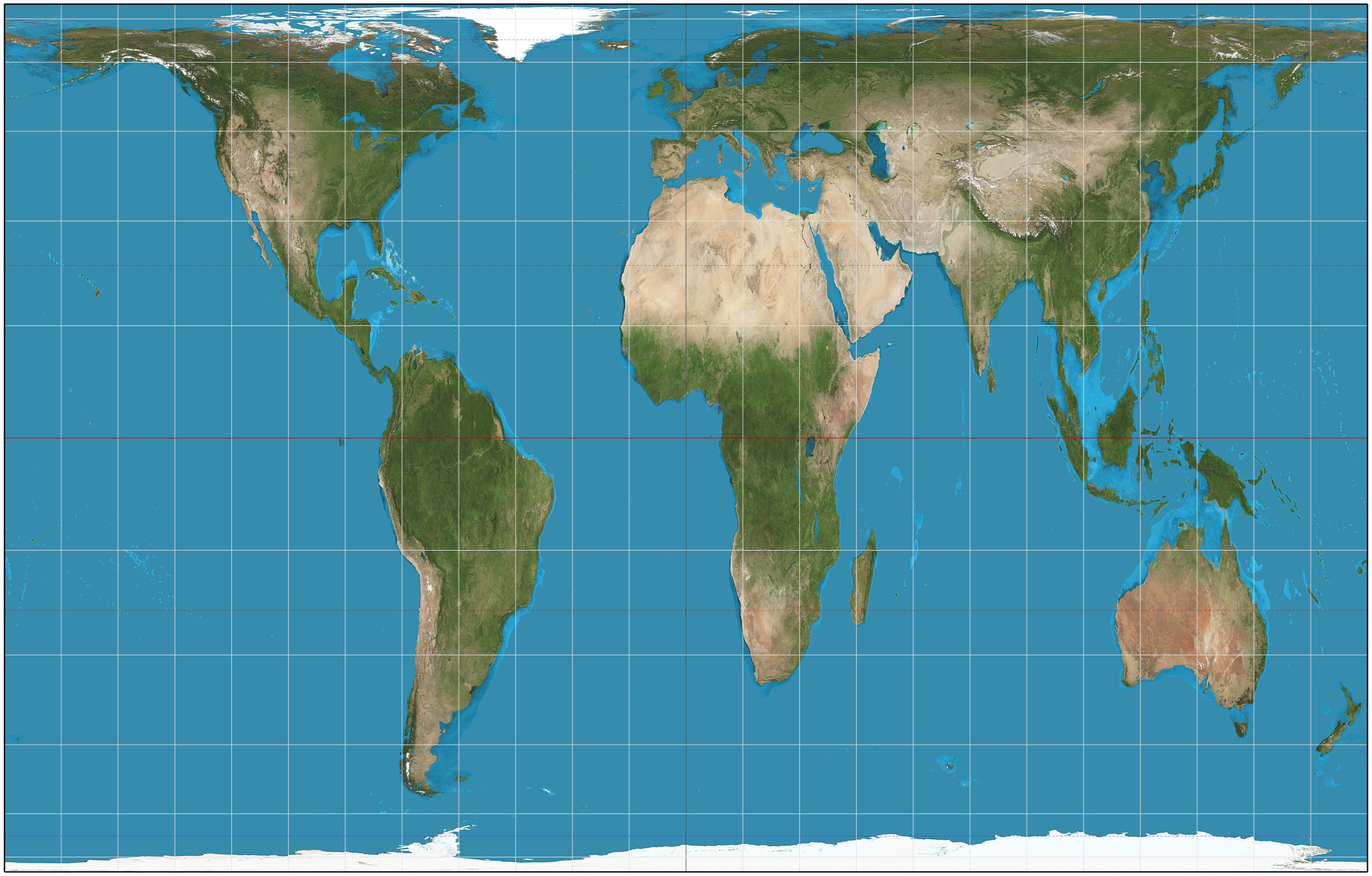
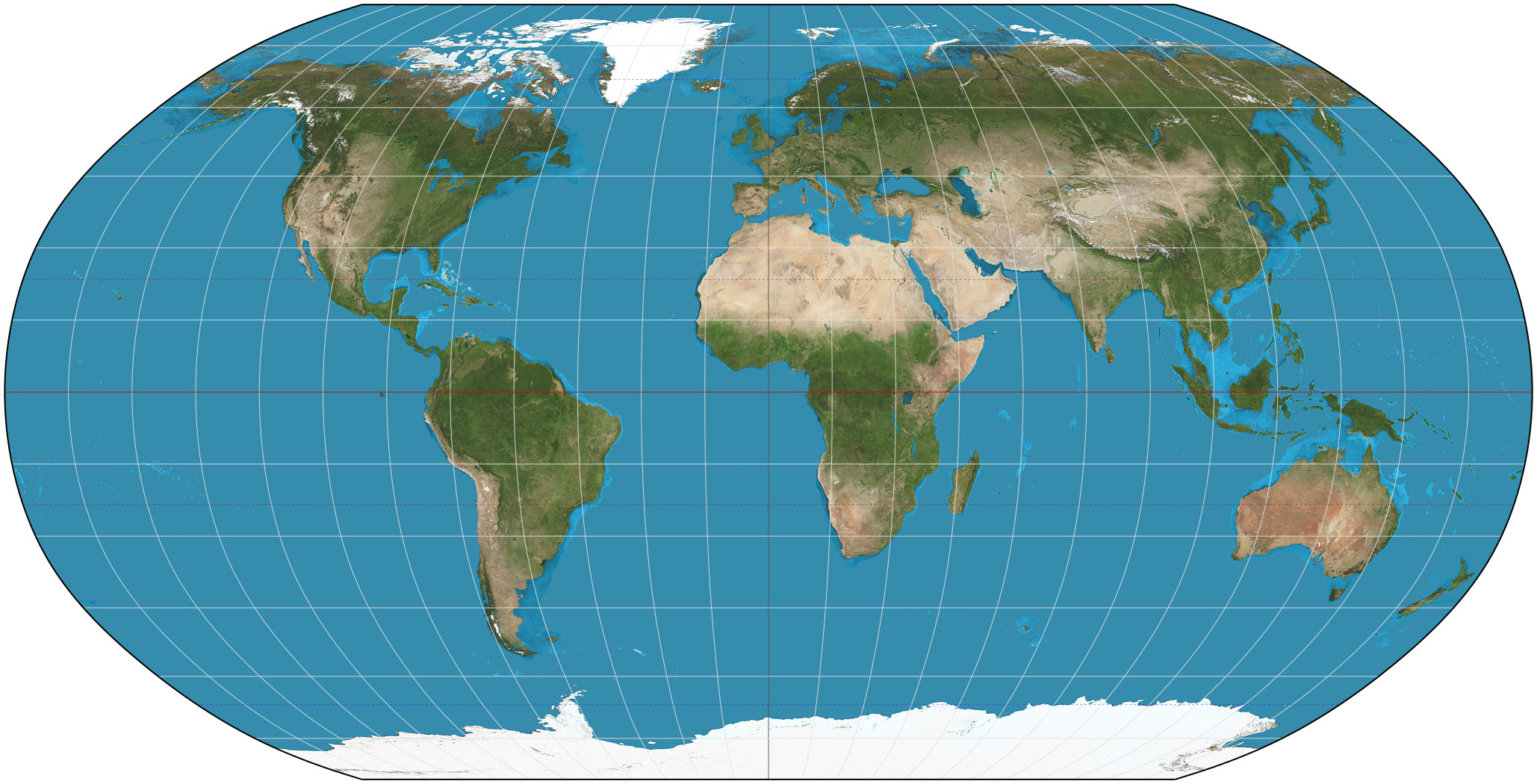
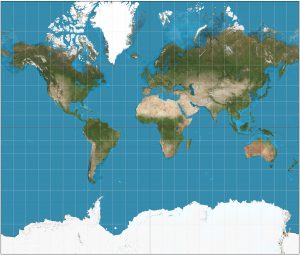
A map projection is a representation of Earth’s three dimensional surface on just two dimensions.  The Mercator projection, presented by Flemish cartographer Gerardus Mercator in 1569, became the standard map for nautical purposes because of its ability to represent lines of constant course.  However, the Mercator projection distorts objects as the latitude increases from the equator to the poles, so landmasses such as Greenland and Antarctica are much larger than in reality, whereas central Africa is shrunken down from its actual size.  The Peters projection corrects some of the distortions of the Mercator projection and is considered to be an equal-area projection.  However, in correctly portraying the area of the continents, Peters had to distort the shapes.  In the 1960s, Arthur H. Robinson developed a projection of the world that looked more like reality.  A pseudo-cylindrical projection, the Robinson projection preserves areas and shapes between 0 and 15 degrees latitude, largely distorts area and shape between 15 and 45 degrees, and barely distorts area and shape in the polar regions.  Unlike the Mercator and Peters projections, in the Robinson projection the only straight line is the prime meridian, all other lines are curved.  The Mercator, Peters, and Robinson projections may all be accurate representations of the world in some way or another, but there is one map that rises above them all.


Mercator Projection                                                  Peters Projection

Robinson Projection

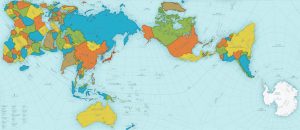
While the new AuthaGraph map may seem strange, it is in fact the most accurate map in the world and is the winner of the 2016 Grand Award from Japan’s Good Design Awards.  To correct all the distortions of previous world maps, Tokyo-based architect and artist Hajime Narukawa created the AuthaGraph map over the course of several years using a complex process that essentially amounts to taking the globe and flattening it out.  This new map no longer shrinks Africa, enlarges Antarctica, or minimizes the vastness of the Pacific Ocean.

The map was essentially created in five steps.  First, a spherical surface (the Earth) was divided into 96 regions.  Second, the divided regions are mapped on 96 regions on an inflated tetrahedron while maintaining their area ratios.  Third, the divided regions on an inflated tetrahedron are flattened to be a tetrahedron while it maintains their area ratios.  Fourth, a rectangular world map is obtained by cutting out the tetrahedron.  Fifth and lastly, the final rectangular world map is created with an aspect ratio of √3:4.

This map, like every other map, does have its highlights and concerns.  Lines of longitude and latitude bend, twist and curl, and figuring out which way is north is a challenge in some spots.  The countries are colored, most likely just so the reader can distinguish between them and not to portray that one color is better than another.  The only landmass not colored in is Antarctica; it is just plain white.  Either Narukawa was trying to show that Antarctica is not its own country (it is in fact claimed by several countries) or that the white represents ice, which is what Antarctica is comprised of.  It is also hard to take this two-dimensional map and turn it into a sphere like object.  With the Mercator projection, it is possible to print it out and fold the paper so that the opposite ends are touching making it appear that the two sides can be connected.  With the AuthaGraph map, this technique doesn’t quite work.

It’s about time that a “close to perfect but not perfect since no map can be perfect” map is produced and Narukawa’s AuthaGraph Map is that map.  Yes, it is hard to read at first, but it is a very accurate representation of something cartographers have been trying to do for years.  All maps do distort size and/or area and this map is one big compromise in that it hardly distorts either of those.  While this map is currently used in textbooks for Japanese schoolchildren, it’s going to take some time before this map will be used by everyone since, this map looks nothing like maps we are used to seeing.


Sources:

“Fundamentals of Mapping,” ICSM, 2016, http://www.icsm.gov.au/mapping/map_projections.html

“More Accurate World Map Wins Prestigious Design Award,” All That is Interesting,” 11/3/16, http://all-that-is-interesting.com/authagraph-world-map?utm_medium=email&utm_source=transactional&utm_campaign=wp-email


Posted in Uncategorized | Comments Off on Most Accurate Map in the World

Atlas of The Week: American History Atlas

This week’s atlas is an American History Atlas From “Albert Bushnell Hart & alii, eds., American History Atlas, Third Edition, Chicago, Denoyer-Geppert Co., 1930” The carefully selected maps provide comprehensive coverage for the major historical periods in American history. Whether you study each map in detail or glance through the atlas for an overview, you will enjoy this useful and well-designed portrayal of the ever-changing historical heritage of the United States of America.

https://www.edmaps.com/html/bushnell.html Enjoy!

Posted in Uncategorized | Comments Off on Atlas of The Week: American History Atlas

Blog of The Week: Maps Mania!

This week’s blog Maps Mania is a great website for any map enthusiastic, posts are being made every day with different topics. Covering the information about main historical events around the world and today’s issues in America.

http://googlemapsmania.blogspot.com/ Make sure you check it out!


Posted in Uncategorized | Comments Off on Blog of The Week: Maps Mania!

Most Popular Sports Around The World


Sports play a huge role now days, people all around the world compete and have passion for it. Millions of people are following and discussing sports in a daily basis. The improvements made in media and increased internet access across the world have resulted in how these days we can watch pretty much any type of sport event around the world. A map I want to talk about is one which identifies popular sports across the world and what each country favors the most as of 2015. It is really interesting to see how different culture, climate changes and historical events have a huge influence behind the popularity of each sport in various countries.

Football, or I should say soccer, is leading the world in popularity, as we can see in the map. More than half of the map is colored in green, which represents football. Europe, South America and Africa are the main continents related to this game. Why? During a typical soccer match, every position on the field has an equal opportunity to handle the ball.  If a particular player does not handle the ball it is often their choice, but certainly not the coach’s choice.  This ability to interact with the ball anywhere on the field makes it an easy and very popular sport, one of the few sports where nothing changes for either girls or boys that play. Rules are the same for both… All you need are friends, a ball, and some space. We see people using an empty parking lots, the streets, abandoned spaces or the beach. The Fédération Internationale de Football Association (FIFA), “estimated that at the turn of the 21st century there were approximately 250 million football players and over 1.3 billion people “interested” in football; in 2010 a combined television audience of more than 26 billion watched football’s premier tournament, the quadrennial month-long World Cup finals”( Britannica, 2017). Once again it shows how passionate people are in this world wide sport because, of its elementary style and beauty. It shows us how different cultures affect the spread of sports geographically, in this case soccer is heavily favored in South America, Africa and Europe.

Upper North America is all about the ice hockey witch did not really surprised me, but it is fascinating to see how the whole country of Canada is marked blue, without any exceptions, while the United States of America has multiple sports involved as every state presents their own favorite sport, whether American football, basketball or baseball. It is nice to see how less popular sports are being represented by little countries, which shows long kept traditions their culture and hobbies. Sports like table tennis, kick boxing, wrestling, skiing, and archery are great examples of it. I was impressed by the fact that cricket is so popular in Australia and some parts of Asia. Every culture brings in something new. We clearly see how different territories represent various interests. Football, hockey, cricket or American football show that each country has a story behind it. A map lets us see how each country contributes and adds something new to this sports map because of their background and choices made as a nation.

Decisions made by the author of the map should not have been hard because the context was not complicated or attached to any sort of projections or political boundaries. In this case a regular map set up was choose, this is just a data represented in a different style in order to show the interest of people across the world. Football, also known as soccer is no doubt a leading sport in the world today, but different ethnicities tend to follow their own hobbies and beliefs, as the map represents some unique sports and countries all around the world. It is hard to critique this map because not a lot information is given besides the legend. Such as the data and where it is coming from, or was it an accurate work of cartography. We can only assume and enjoy the diversity of sports represented around the world, which provides us enjoyment and a cultural context.


Works Cited

FunBuzzTime. “Different Types of World Maps.” FunBuzzTime, 9 Sept. 2015, www.funbuzztime.com/different-types-of-world-maps/.

Joy, Bernard, et al. “Football.” Encyclopædia Britannica, Encyclopædia Britannica, Inc., 15 Aug. 2017, www.britannica.com/sports/football-soccer.


Posted in Uncategorized | 1 Comment

The Message Behind Slave Populations in the South: 1860 U.S. Map Showing the Distribution of Slave Populations in the South

In the year 1860, America was in the midst of a war with itself. The altercation in our country revolved around slavery. The North was against the enslaving of blacks, and the South was dependent on the institution of slavery for its agricultural economy. This map is so fascinating because it had a major effect on the dispute of slavery in our country. To summarize the map, it shows the percentages of slaves in each county of the south in relation to all the inhabitants of that county. For example, in Henrico County, Virginia  34.5% of the people living there at the time were slaves. At the center bottom of the map, there is a chart showing free populations of each state,  and the slave populations of each state. The map is also color coded according to the percentages of slaves in each county. The higher the percentage of slaves in a county, the darker shaded the county is. This makes areas with high populations of slaves easily distinguishable.

According to the National Oceanic and Atmospheric Association (NOAA) office of Coast Survey, this map was put into circulation by the government but was created by cartographers working for  Edwin Hergesheimer, of the U.S. Coast Survey Drafting Division. The NOAA office of Coast Survey also declares that this map was a pioneer for other maps because of its use of shading techniques to show percentages, and  it was one of the first maps to involve statistical data. Besides this map being the first of it’s kind, there is also implicit messages  behind it. The cartographers, by using  statistics pulled  from the 8th census,  wanted to shift our country’s focus towards slavery, framing the South as a region highly concentrated by enslaved peoples. People looking at this map could visualize where high slave populations were located in our country for the first time, whereas before this map was produced, slavery wasn’t able to be geospatially imagined by outsiders. From this we can assume that  the mapmakers created this map with the intent to trigger a rebellion against slavery in our country. Once people saw the map, they instantly formed an opinion about slavery. Most viewers of the map would naturally relate the percentages on the map to being a problem, but the map also subtlety implies this by it’s shading. The map creators purposely shaded areas of higher slave populations darker, while areas with lower slave populations lighter. This expresses the evil in the South by making counties look dark and dangerous. The shading creates a “bad guy” persona of the south for spectators.

Cartographers of this map also purposely selected to only display the South. Northern states had slaves too, but just displaying the concentration in the South adds more fire to the rebellion against slavery and the confederacy.  The top of the Map says “Sold for the Benefit of the Sick and Wounded U.S. Soldiers, ” suggesting that this map was being sold to make money for the Union army who was fighting the confederacy. This confirms and explains why it was created to rally against the south and fight to abolish slavery. This map certainly did have an affect on the war too. The NOAA Coast Survey and many other legitimate sources claim Abraham Lincoln was very fond of this map. The Coast Survey states directly that he used the map to  consider the relationship between emancipation and military strategy.

In conclusion, this pioneering map representing the distribution of slaves in the south, implicitly sparks a feeling of rebellion against slavery in the south to benefit the U.S. Army. This map deserves to be the map of the week because of it’s importance in our country’s history. It was a stepping stone to a war against the South, making it a prime example of the power  maps can hold. Without this map where would our country be?


“Mapping Slavery In the Ninteenth Century.” Census.Gov, www.census.gov/history/pdf/slavedensitymap.pdf.

Schulten, Susan. “Visualizing Slavery.” The New York Times, The New York Times, 9 Dec. 2010, opinionator.blogs.nytimes.com/2010/12/09/visualizing-slavery/.

Posted in Uncategorized | Comments Off on The Message Behind Slave Populations in the South: 1860 U.S. Map Showing the Distribution of Slave Populations in the South

Blog of The Week: Maphugger!

Click this link http://maphugger.com/ to check out an awesome blog displaying some of our generation’s newest most artistic maps! This blog is all about the diverse art of mapmaking, and shows the most unique maps you’ll see. If you want to see maps that push the boundaries of cartography then this is the blog site for you!

Posted in Uncategorized | Comments Off on Blog of The Week: Maphugger!