No map is perfect. No map can one hundred percent accurately display the Earth’s geoid shape onto a two-dimensional surface. Many have tried. All have failed.
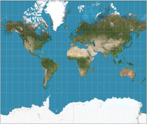
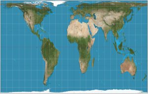
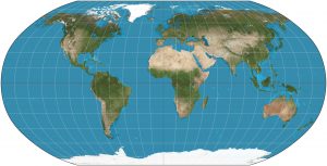
A map projection is a representation of Earth’s three dimensional surface on just two dimensions. The Mercator projection, presented by Flemish cartographer Gerardus Mercator in 1569, became the standard map for nautical purposes because of its ability to represent lines of constant course. However, the Mercator projection distorts objects as the latitude increases from the equator to the poles, so landmasses such as Greenland and Antarctica are much larger than in reality, whereas central Africa is shrunken down from its actual size. The Peters projection corrects some of the distortions of the Mercator projection and is considered to be an equal-area projection. However, in correctly portraying the area of the continents, Peters had to distort the shapes. In the 1960s, Arthur H. Robinson developed a projection of the world that looked more like reality. A pseudo-cylindrical projection, the Robinson projection preserves areas and shapes between 0 and 15 degrees latitude, largely distorts area and shape between 15 and 45 degrees, and barely distorts area and shape in the polar regions. Unlike the Mercator and Peters projections, in the Robinson projection the only straight line is the prime meridian, all other lines are curved. The Mercator, Peters, and Robinson projections may all be accurate representations of the world in some way or another, but there is one map that rises above them all.
Mercator Projection Peters Projection
Robinson Projection
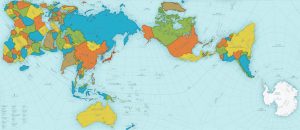
While the new AuthaGraph map may seem strange, it is in fact the most accurate map in the world and is the winner of the 2016 Grand Award from Japan’s Good Design Awards. To correct all the distortions of previous world maps, Tokyo-based architect and artist Hajime Narukawa created the AuthaGraph map over the course of several years using a complex process that essentially amounts to taking the globe and flattening it out. This new map no longer shrinks Africa, enlarges Antarctica, or minimizes the vastness of the Pacific Ocean.
The map was essentially created in five steps. First, a spherical surface (the Earth) was divided into 96 regions. Second, the divided regions are mapped on 96 regions on an inflated tetrahedron while maintaining their area ratios. Third, the divided regions on an inflated tetrahedron are flattened to be a tetrahedron while it maintains their area ratios. Fourth, a rectangular world map is obtained by cutting out the tetrahedron. Fifth and lastly, the final rectangular world map is created with an aspect ratio of √3:4.
This map, like every other map, does have its highlights and concerns. Lines of longitude and latitude bend, twist and curl, and figuring out which way is north is a challenge in some spots. The countries are colored, most likely just so the reader can distinguish between them and not to portray that one color is better than another. The only landmass not colored in is Antarctica; it is just plain white. Either Narukawa was trying to show that Antarctica is not its own country (it is in fact claimed by several countries) or that the white represents ice, which is what Antarctica is comprised of. It is also hard to take this two-dimensional map and turn it into a sphere like object. With the Mercator projection, it is possible to print it out and fold the paper so that the opposite ends are touching making it appear that the two sides can be connected. With the AuthaGraph map, this technique doesn’t quite work.
It’s about time that a “close to perfect but not perfect since no map can be perfect” map is produced and Narukawa’s AuthaGraph Map is that map. Yes, it is hard to read at first, but it is a very accurate representation of something cartographers have been trying to do for years. All maps do distort size and/or area and this map is one big compromise in that it hardly distorts either of those. While this map is currently used in textbooks for Japanese schoolchildren, it’s going to take some time before this map will be used by everyone since, this map looks nothing like maps we are used to seeing.
Sources:
“Fundamentals of Mapping,” ICSM, 2016, http://www.icsm.gov.au/mapping/map_projections.html
“More Accurate World Map Wins Prestigious Design Award,” All That is Interesting,” 11/3/16, http://all-that-is-interesting.com/authagraph-world-map?utm_medium=email&utm_source=transactional&utm_campaign=wp-email


