Blog of the week

This week’s blog of the week is definitely worth every penny… Well depending on what country you’re in. It’s a map here to tell you which countries you should tip in and how much.

http://bigthink.com/strange-maps/in-which-countries-should-you-tip-and-how-much

Posted in Uncategorized | Comments Off on Blog of the week

Open Happiness and Share a ____ With …


The map, “What Do You Call Sweetened Carbonated Drinks?” was created by Joshua Katz in 2014, to determine what people from each state call this specific kind of drink. He is examining the different dialect that varies from region to region. Joshua Katz is a statistician, and as you can see, the map is statistics put into a map, rather than a map with statistics on it. The map is a poll, and the poll takes the 4 different choices, Coke, Soda, Pop, or Soft Drink. The map shows the different type of slang throughout the United States, and how certain regions have a different way of speaking.

If you look at the West coast, states like California, Arizona, and Nevada, use the term soda, and ironically enough a lot of the far East coast, states such as, Vermont, New York, and Maine, use the same term. Where in society we think the East and West would be totally opposite, they are actually pretty similar. However, North and the Midwest completely differ from the South. Northerners and some of the Midwest prefer the term “Pop,” whereas the South just goes straight to Coke instead. I think we just get ideas of culture in our head because of things we have heard. Take Minnesota for example, I am sure we all thought they used the term soda because of things we have seen or heard about them, when in reality, they actually prefer “pop.” I just think it is interesting to see how cultures speak in different ways and can be totally different, but also have so many little similarities. This example of what we call sweetened carbonated drinks make us more similar to each other than we realize.

Although, I wish the map was interactive, it really is clear, precise, and definitely easy to understand. The outline of the U.S and the individual states make it easy to follow, and the color coding could be slightly better. Regardless, it still is really easy to tell the darker/harder the color, the more serious the area is on that dialect. The map may seem basic and sort of simple to the average viewer or just the quick glance, but when you actually sit down and think about all the things you can learn from this particular map, it is really impressive. As we have discussed, no matter what the map is or how unimportant it may seem, there is always a form of bias and purpose. Sometimes, it is hidden, other times it is not, but this map helps us look into the different dialects of the country.

This poll also invites a few major questions that are hidden from the viewer. There is obviously more choices of slang people use, so why are there only four options? Also, how many people were asked this question and how was the question asked? I think that it is important to know how he got ahold of the whole United States. I think these are more “Stats questions” than really “Map questions.” But, you can also ask why Katz decided to use these colors? In the key on the map it has “Soft Drink” as yellow but there is no yellow on the actual map. The color white is seen a lot on the map and I cannot really tell if that is because it is supposed to be yellow or if it is just areas that do not have a specific preference of word choice.

Sources: http://mentalfloss.com/article/59646/25-maps-describe-america

Posted in Uncategorized | 3 Comments

Team Map Presentation: “National Atlas of USA: Exports and Imports”

The “Exports and Imports of Commodities” map was published in 1970 by the National Atlas, whose stated purpose was to help US government officials visualize country-wide patterns and phenomena. With the Cold War going on during the time this map was printed, the tensions between the US and USSR are visible through the map’s design and hidden interests.

Because a war was transpiring between two large global powers, competition for control was a huge factor in escalating the problems between the US and Soviet Union. Each country wanted to assert their dominance through any means necessary, whether that was political, economic, or social. The commanding difference between these superpowers was their preferred systems of government. While the Soviet Union made decisions based on expanding communism, the United States took measures to promote democracy, including through the creation of this map.

By creating an exports and imports of commodities map, the US expanded their global control. With a projection that is US-centric, it depicts the United States as the center for all international trade. This gives off the impression that the rest of the world is dependent on the US to sustain their own economies. This is in complete contrast with the USSR which is covered up by a chart in the far right corner. This gives off the impression that the Soviet Union is not nearly as important when it comes to international trade. Also, the arrows pointing to all regions of the world show that there isn’t anywhere that the US cannot reach, even the Soviet Union. The use of the arrows link the US all across the globe, proving that they are essential to everyone else’s well-being. Because the US is all white and the rest of the world is colored, it depicts Americans as morally good and untouched by communism. The map also lacks the complete truth about America’s international standing. In 1970, the Vietnam war was going on, which was obviously not a successful time in American history. However, no where in this map is that apparent. It only shows the US in a positive light, making it seem like we have no problems and are readily available to help save other countries from the threat of communism. Although this map seems to be purely informational, it actually serves to protect US political interests during the Cold War era.

Posted in Uncategorized | Comments Off on Team Map Presentation: “National Atlas of USA: Exports and Imports”

Blog of the Week: TravelMap

This week’s blog is created by travelers for travelers. It allows you to create your own interactive map to show “who you are, where you’ve been, and where you’re going.”

https://travelmap.net

Posted in Uncategorized | Comments Off on Blog of the Week: TravelMap

Blog of the week: Mapbox

This week’s blog is dedicated to the different ways of mapping time and space. The blog tends to challenge the typical norm of America, and favors controversial maps.

https://blog.mapbox.com/a-new-kind-of-map-its-about-time-7bd9f7916f7f

Posted in Uncategorized | Comments Off on Blog of the week: Mapbox

Atlas of the Week: Atlas of Lost Cities

This atlas provides a travel guide to abandoned cities. It explains the process of a city’s birth, thriving years, and its eventual death. Written by Aude de Tocqueville, this atlas offers a new perspective of how both popular and unheard of cities rise and fall. If you’re interested in beautiful artwork, history, and the evolution of cities then, this is definitely the atlas for you.

For more information go to http://brilliantmaps.com/world-atlas/

“Atlas of Lost Cities: A Travel Guide to Abandoned and Forsaken Places” -Black Dog & Leventhal April 5, 2016

Posted in Uncategorized | Comments Off on Atlas of the Week: Atlas of Lost Cities

Map of the Week: Stereotypes, Maps, and Cities; Oh my

Have you ever judged someone based on how someone similar to them has acted in the past?


Oh, yes. Yes, you have.

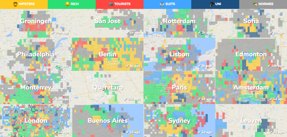
With its massive mélange of different cultures and backgrounds, it’s no secret that stereotypes exist in the United States. Whether it be stereotyping based on gender, race, occupation, or what, the practice of categorizing an entire group based on a few peoples’ actions has become a societal norm. Although stereotypes are often created by people outside of the group being judged, people on the inside can stereotype themselves as well. In Pieter Levels creation, Hoodmaps, participants do just that. The maps are completely run by the citizens who live in particular cities, causing people to be creators of their own stereotypes. However, this raises a few questions. Does everyone agree on these categorizations? Does this information serve to protect specific people’s interests? And, how do stereotypes vary from city to city?

“Hoodmaps” is a completely interactive site that allows users to explore cities based on the people who live there. This shows just how much maps have evolved over the years. In a society with more communication and technology, it is easier to make maps that people can participate in. Unlike a typical map, these maps are less about geography and more about symbols.  Pieter Levels came up with the idea in 2015 when his friend asked him where she should go on her visit to Amsterdam. To answer her question, he drew her a map.

The purpose behind creating this map was to allow people to find original and local places to visit when entering a foreign city. Level explained that people often fall into the trap of only visiting the tourist based locations and missing out on the genuine experience of becoming immersed in a new culture.

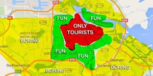
Each city on Hoodmaps is separated into six color-coded categories: hipsters, rich, tourists, suits, “uni” (students), and “normies. Users are also able add tags if they feel like the city needs another description that goes beyond the categories. Because the map is based on GPS, one can look up any country in the world. For me, I enjoyed looking through the map of my hometown and seeing what stereotype my neighborhood falls in. I find it interesting how the map uses humor to engage its audience. However, many of the jokes are specific to people who live there and can understand. This creates a problem because what’s funny to some people could be insulting to others.

My interest in this map lies in its irregular projection. Unlike a typical map, this map solely relies on design and color to depict various cities. Simply by looking at the level of color in each city, the reader is able to determine what type of people live there and where exactly they live.  I am also interested in the fact that the map is entirely interactive.  Although this allows for a fun way to design maps, it definitely raises a few issues. Because the map is relatively new, there is a lack of participation and unbiased representation. This makes the maps skewed toward the interests of only a few contributors. And, even if there were many people participating, the map would still be limited to only those people’s opinions. Whether this was the intention or not, this design gives people the opportunity to stereotype negatively. For example, stereotyping someone as a hipster could be unwanted and people could be offended. Another problem with the map is the limited number of categories. With only six stereotypes, not everyone will completely fit into these categorizations. As a citizen of Baltimore, I noticed that my city’s map was not entirely accurate. These stereotypes mostly resonate with what white neighborhoods look like. Speaking from experience, I can tell you that downtown Baltimore is not exactly “hipster’ or “suits.” It is ravaged with drugs, unemployment, and poverty. However, there is not a category for that.

When Levels created this map, he was more interested in creating a startup than depicting a completely accurate map without flaws and distortion. But hey, who can really even do that anyway? Sure, he is not a cartographer. But, he is an entrepreneur, one with an eye for design. In today’s society, anyone can make a map. It is no longer only up to cartographers to depict reality. This creates a completely different experience for the reader of the map, one that’s more raw and relatable.

Sources:

https:/hoodmaps.com

https:/www.citylab.com/life/2017/08/hoodmaps-sterotype-your-city-hipsters/538218/


Posted in Uncategorized | 6 Comments

Atlas of the Week: Political Control of North America

The Atlas of the Week that I selected showcases various maps of North America beginning in 1821 and continuing into the present. Colors indicate political control by country, and major battles are indicated with a roll-over feature for more information. This map helps organize all of the various events jumbled in our head from 10th grade history into a series of comprehensive and easy to follow displays. For more info, check out this interactive map at
http://omniatlas.com/maps/northamerica/18321012/

Posted in Uncategorized | Comments Off on Atlas of the Week: Political Control of North America

Not Just Your Drive to Work: How Commutes Impact the US Economy

Perhaps more than any country in the world, the United States is an extremely varied fabric of interests and industries. More often than not, Americans associate themselves with their nearby city, region, or even sports team rather than the state in which they live in. Thus, the traditional, 50-state map of the US fails to accurately represent the true boundaries of American communities. Two university fellows created a map in 2016 to introduce the idea of US economy being composed of “megaregions”, large networks surrounding metropolitan hubs, rather than a single market. The territories in a megaregion share topography, infrastructure, culture, and economic ties. By analyzing commutes and mapping them, the mapmakers associate regionalization with the US economy, as commutes pertain to population and jobs. In this blog post, I will look to unpack the mapmakers’ decisions in order to acknowledge a new configuration of the United States.

How does one determine where one megaregion ends and another starts? The mapmakers had the difficult job of restructuring arbitrary state boundaries into economic and cultural networks. Just as for any map, the mapmakers had to make important stylistic choices. The size of the data clusters represents the size of the metropolitan area and the number of people who affiliate themselves with the area. The mapmakers’ decision to affix the data clusters with labels of major cities emphasizes their point that the main centers of work are in cities. In order to illustrate daily flows, this map uses lines as opposed to data points to define commutes. These flows of people and their cars also represent how resources and capital flow through regions. The mapmakers made an important decision with their selection and use of color. The data flows in the Western US are pale and lightly colored, in contrast to the dark and prominent colors used in the East and Midwest. The visual qualities of the map express the mapmakers’ intention to highlight the scant concentration of major economies in the West. Furthermore, the boldness of colors and data transcend state lines, reiterating that megaregions are not necessarily confined to states.

For example, the Memphis megaregion extends from Tennessee into Arkansas, Kentucky, Illinois, Missouri, Mississippi, Alabama, Oklahoma, and Texas. Surely these data flows do not demonstrate literal commutes to Memphis, but suggest that Memphis is the center of a fairly homogenous region. Nonetheless, the mapmakers deliberately chose not to omit state boundaries. They likely did not want the map to vary too much from the traditional map of the US, and in the process, give megaregions an abstract connotation. The course of making artificial boundaries such as megaregions is tricky for mapmakers, as they often have to mask their interests to appear scientific and credible.

The map itself appears straightforward, given the mapmakers’ hidden agenda of restructuring the communities of the United States and showing how megaregions could be connected to reap benefits for the economy. The mechanics of the map and the nature of data display emphasize the influence of cities on their surrounding areas. Clearly not all commutes were plotted, especially those in the West; the mapmakers had to decide when data was aesthetically irrelevant in order to maintain the outward interests of the map. The map argues that a greater number of megaregions and economic strongholds exist in the Eastern United States. It is uncomfortable to think of America without the context of state borders, but maps like these bring this reality closer. If this map was to become widely circulated through American culture, would Americans view it as an interesting approach to our extensive economy, or a threat to state lines and an American identity that has endured since the late 18th century? The concept of megaregions is fairly new, and the traditional accepted map of the US is rarely challenged. This map thus has immense power to shape our understanding and awareness of how we are a part of a greater economic community.

Posted in Maps of the Week | 1 Comment

How Communists Menace Vital Materials – Presentation Reflection

“How Communists Menace Vital Materials” was created by the Research Institute of America in 1956, which was headed by the United States Congress House Committee on Un-American Activities. The map focuses on the USSR’s use of resources from different regions of the world, and its expanding interests. The map was produced during the Red Scare which was a period in America’s history during the Cold War when mass hysteria spread due to fear of Communism within American society. This was due to the American government’s practice of McCarthyism, which was essentially the making of accusations of treason/ subversion without the provision of sufficient evidence required to back them up. This map was commonly used as anti-communist propaganda within US Congress, and was also circulated amongst the American public.  

In the title, the use of the word “menace” ensues a heavily negative connotation of the USSR and creates the image that its use of resources endangers the existence of those resources, which were described as “vital.” The USSR is portrayed as exploitational towards the nations of the world due to its use of their resources, while America sees the resources of the world’s nations as its own, and seeks to protect them in order to ensure that they are able to use them

This map is also strikingly similar to the map ‘“Gulag” – Slavery Inc’. map discussed by Barney. It transforms Americans’ idea of communism from an abstract concept they were fighting against to a physical place/country they were fighting. Both maps were also circulated among the public in order to provoke increased anti-communist sentiments. “How Communists Menace Vital Materials” was produced by congress as propaganda to show how menacing/far reaching communism is, and was used to show that the US has power of info to make this map, representative of the tensions between the US and USSR.

Essentially, the purpose of this map is to generate support for anti-communist efforts in America and to create an ideological war between capitalism/democracy and communism. This was done through the spreading of fear within the American public of communism itself, and its rapid spread and growing influence. The map dehumanizes communists, and creates the sense that they are the “other.” The result of this is a misunderstanding of an entire people by the American public, and the spread of hysteria, anti-communism, and McCarthyism.

Additionally, the discussions that ensued during the presentation were insightful, as it was clear the audience was able to understand the meaning and overall purpose of the map and how it correlates to and reflects the sentiments of the Cold War era. The audience was able to identify the significant map elements, such as the provocatory title, use of imagery, and the projection as rhetorical tools.

Posted in Uncategorized | Comments Off on How Communists Menace Vital Materials – Presentation Reflection