
Have you ever judged someone based on how someone similar to them has acted in the past?
Oh, yes. Yes, you have.
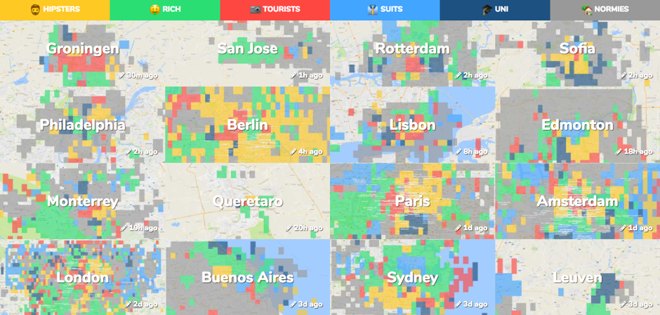
With its massive mélange of different cultures and backgrounds, it’s no secret that stereotypes exist in the United States. Whether it be stereotyping based on gender, race, occupation, or what, the practice of categorizing an entire group based on a few peoples’ actions has become a societal norm. Although stereotypes are often created by people outside of the group being judged, people on the inside can stereotype themselves as well. In Pieter Levels creation, Hoodmaps, participants do just that. The maps are completely run by the citizens who live in particular cities, causing people to be creators of their own stereotypes. However, this raises a few questions. Does everyone agree on these categorizations? Does this information serve to protect specific people’s interests? And, how do stereotypes vary from city to city?
“Hoodmaps” is a completely interactive site that allows users to explore cities based on the people who live there. This shows just how much maps have evolved over the years. In a society with more communication and technology, it is easier to make maps that people can participate in. Unlike a typical map, these maps are less about geography and more about symbols. Pieter Levels came up with the idea in 2015 when his friend asked him where she should go on her visit to Amsterdam. To answer her question, he drew her a map.
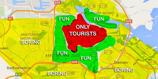
The purpose behind creating this map was to allow people to find original and local places to visit when entering a foreign city. Level explained that people often fall into the trap of only visiting the tourist based locations and missing out on the genuine experience of becoming immersed in a new culture.
Each city on Hoodmaps is separated into six color-coded categories: hipsters, rich, tourists, suits, “uni” (students), and “normies. Users are also able add tags if they feel like the city needs another description that goes beyond the categories. Because the map is based on GPS, one can look up any country in the world. For me, I enjoyed looking through the map of my hometown and seeing what stereotype my neighborhood falls in. I find it interesting how the map uses humor to engage its audience. However, many of the jokes are specific to people who live there and can understand. This creates a problem because what’s funny to some people could be insulting to others.
My interest in this map lies in its irregular projection. Unlike a typical map, this map solely relies on design and color to depict various cities. Simply by looking at the level of color in each city, the reader is able to determine what type of people live there and where exactly they live. I am also interested in the fact that the map is entirely interactive. Although this allows for a fun way to design maps, it definitely raises a few issues. Because the map is relatively new, there is a lack of participation and unbiased representation. This makes the maps skewed toward the interests of only a few contributors. And, even if there were many people participating, the map would still be limited to only those people’s opinions. Whether this was the intention or not, this design gives people the opportunity to stereotype negatively. For example, stereotyping someone as a hipster could be unwanted and people could be offended. Another problem with the map is the limited number of categories. With only six stereotypes, not everyone will completely fit into these categorizations. As a citizen of Baltimore, I noticed that my city’s map was not entirely accurate. These stereotypes mostly resonate with what white neighborhoods look like. Speaking from experience, I can tell you that downtown Baltimore is not exactly “hipster’ or “suits.” It is ravaged with drugs, unemployment, and poverty. However, there is not a category for that.
When Levels created this map, he was more interested in creating a startup than depicting a completely accurate map without flaws and distortion. But hey, who can really even do that anyway? Sure, he is not a cartographer. But, he is an entrepreneur, one with an eye for design. In today’s society, anyone can make a map. It is no longer only up to cartographers to depict reality. This creates a completely different experience for the reader of the map, one that’s more raw and relatable.
Sources:
https:/hoodmaps.com
https:/www.citylab.com/life/2017/08/hoodmaps-sterotype-your-city-hipsters/538218/
Christine,
I was looking at this map too for when I did my blog post! I found your point about reverse stereotyping—where people stereotype from the inside instead of outside— on this map to be extremely interesting. I also enjoyed how you used your personal knowledge on Baltimore to point out the vague categories on this map, and I liked how you offered an alternative category that would better represent an area.
This post inspired me look at a stereotype map of New York City(where I’m from); City Labs classified the entire east village as boring, which I think is completely false. You can always find something to do anywhere in the city, so the fact boring is even on the New York City map bothered me and made me question the integrity and biases of the map. As you said though, Levels was more interested in creating a premise for the map rather than depicting a factual map. So, we shouldn’t hold him too accountable.
Anyways, great job and thanks for sharing this really interesting map!
Kim
Christine,
I think this map is a great idea by Pieter Levels. It should really help someone who is interested in a specific city or area that they are not familiar with. I like how you used your hometown as an example to show why this map is not always right and what are some possible issues. Overall I think this website is a great idea and I will definitely try it out when I’m traveling. Thanks!
This is such a cool map! I think it’s really interesting that Levels is not really a cartographer. I also chose a map whose creator was not a cartographer (he was a comedian), so it is quite intriguing to see how that influences how they design their maps. In addition, I appreciate that the map’s aim is to encourage others to truly understand cities’ cultures as opposed to obtaining only surface-level comprehensions by looking at only tourist sites. I also appreciate that because of Levels’ lack of cartographic background, the maps inevitably lend themselves to more bias. They are not scientific; they are meant for entertainment purposes. Thus, I doubt that Levels placed accuracy at the top of his priority list in creating them. Thanks for the map! I appreciate that you added your own personal touches to this post, as well.
Christine, I think this a great choice of a map because it is so relevant to our current society. Stereotypes obviously do exist and are much more prevalent in the modern world. The idea of reverse stereotyping in which people on the inside stereotype rather than just an outsider is an interesting revelation and is not often considered when people contemplate these situations. The thought that people might be falsely stereotyping where they live or exaggerating it is surprising and this could lead to many discrepancies within a map. I think the fact that people can edit this themselves and the degree of accuracy can fluctuate heavily leads to many biases possible. Even though these factors may present themselves I think this map is very intriguing and is an interesting new way in which people can look at their areas. Very cool map and a great choice as a different type of map for the week.
Hi Christine,
This is definitely an interesting choice of map! In fact, the author of the map that I chose was also not a professional cartographer, and he focused a lot on the visuals just as Levels did. The idea of reverse-stereotype incorporated into the map is indeed compelling- it offers travelers the opportunity to gain insight into the unique cultures that only locals would experience. The simplicity of the elements on the map combined with the complexity of colors (which will only increase as people add more descriptions) contributes to the attractiveness of this map, and enhances the practical purposes of this map. I personally would love to take a look at this map before I explore a new city; it in someway shares the same concept as Airbnb, in which it allows travelers to experience the place through the perspective of the local people there. Although certain biases are present in the map, this issue in my opinion is actually inevitable when one tries to collect opinions from different people with different backgrounds living in different areas on one topic- even cartographers create maps that contain their own biases. Overall, I think that this map provides a creative idea for maps that intend to represent a pervasive topic (i.g. culture) behind the region; it is practical, appealing, and fun to explore. Thanks for sharing this map!
Christine,
Until your post, I had never heard of such a website and I am glad that I now have this future reference. The idea that a maps main purpose is to show what areas are like what based off stereotypes and provides the reader with the ability to go other places beside the touristy parts of city is a huge step in the right direction in today’s world. I would often find myself wondering what life is like in areas that aren’t the central hub for all things overpriced and cliché such as smaller, neighboring areas that serve as hidden jewels. I think that this idea and this map are really radical with that they have the ability to change how people see other areas and may even be able to trump stereotypes plaguing certain areas by giving to light other places to visit and things to do. This map was awesome to say the least.