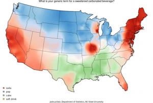
The map, “What Do You Call Sweetened Carbonated Drinks?” was created by Joshua Katz in 2014, to determine what people from each state call this specific kind of drink. He is examining the different dialect that varies from region to region. Joshua Katz is a statistician, and as you can see, the map is statistics put into a map, rather than a map with statistics on it. The map is a poll, and the poll takes the 4 different choices, Coke, Soda, Pop, or Soft Drink. The map shows the different type of slang throughout the United States, and how certain regions have a different way of speaking.
If you look at the West coast, states like California, Arizona, and Nevada, use the term soda, and ironically enough a lot of the far East coast, states such as, Vermont, New York, and Maine, use the same term. Where in society we think the East and West would be totally opposite, they are actually pretty similar. However, North and the Midwest completely differ from the South. Northerners and some of the Midwest prefer the term “Pop,” whereas the South just goes straight to Coke instead. I think we just get ideas of culture in our head because of things we have heard. Take Minnesota for example, I am sure we all thought they used the term soda because of things we have seen or heard about them, when in reality, they actually prefer “pop.” I just think it is interesting to see how cultures speak in different ways and can be totally different, but also have so many little similarities. This example of what we call sweetened carbonated drinks make us more similar to each other than we realize.
Although, I wish the map was interactive, it really is clear, precise, and definitely easy to understand. The outline of the U.S and the individual states make it easy to follow, and the color coding could be slightly better. Regardless, it still is really easy to tell the darker/harder the color, the more serious the area is on that dialect. The map may seem basic and sort of simple to the average viewer or just the quick glance, but when you actually sit down and think about all the things you can learn from this particular map, it is really impressive. As we have discussed, no matter what the map is or how unimportant it may seem, there is always a form of bias and purpose. Sometimes, it is hidden, other times it is not, but this map helps us look into the different dialects of the country.
This poll also invites a few major questions that are hidden from the viewer. There is obviously more choices of slang people use, so why are there only four options? Also, how many people were asked this question and how was the question asked? I think that it is important to know how he got ahold of the whole United States. I think these are more “Stats questions” than really “Map questions.” But, you can also ask why Katz decided to use these colors? In the key on the map it has “Soft Drink” as yellow but there is no yellow on the actual map. The color white is seen a lot on the map and I cannot really tell if that is because it is supposed to be yellow or if it is just areas that do not have a specific preference of word choice.
Sources: http://mentalfloss.com/article/59646/25-maps-describe-america


This is an awesome selection for the map of the week. This map is unique, interesting, and modern, it shows people how far cartography can really go. This map relates to me because I’ve always wandered why different family members of mine used different slang when referring to soda. I would never think to map out dialects from different places in our country, but once you are able to visualize the differences in dialect around the country you see the true meaning of being American. We are truly free to be ourselves in America. There are so many different ethnicities, foods, cultures, people, etc., and this map shows this by spatializing different dialects by region. Also to conclude Jacob did a great job interpreting this map and explaining it clearly. All in all this is a well done blog post.
Jacob, I really enjoy the map you ended up picking. Coming into college and a new place it is so interesting to have a group of friends and have every single one of them have a different name from the same thing. I like that the map you chose was very simple, easy to understand, and to the point. With the news full of such serious things it is nice to learn about something just as simple yet interesting as dictation. I do however wonder how much data was actually generalized for this map to be so regionally exclusive, or if regions truly do distinctly dictate our word choice. I also wish that this map included countries beyond the US to see what that data would show.
This is a really cool selection of a map because I find the different slangs in different parts of the country fascinating. I have seen these differences more in college because of living with people from all over the country, and I can’t comprehend how people would call soda anything different. It is also fascinating how there are some areas of the country that call it “soda” while they are surrounded by people who call it “pop”. I would be interested to see other maps of this type with other slang terms like “hoagie” vs “sub” vs “grinder” and others of this type. Overall, this was a fascinating choice of map with a great analysis.