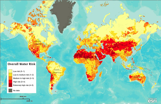
Team Map Presentation: USAF Lunar Wall Mosaic

This map was created in 1962 by the Air Force Aeronautical Chart and Information Center to aid with NASA projects like Apollo 11. At first glance, this map may seem devoid of useful information, however, the highlight of this map is the accuracy to which the topography is mapped. The location of craters, latitude and longitude, and other points of interest all serve a very specific purpose. Mapping the moon proved to be quite difficult for these cartographers however, because it had never been mapped in its entirety before, and because so much new information had to be gathered, such as calculating the equator and finding “sea level”. Unmanned spacecraft called Lunar Orbiters were sent into orbit around the moon to collect information and to take photographs, which served as the basis for this map. Such a detailed and accurate map of the moon was needed in order for NASA projects like Apollo 11 to succeed. Astronauts needed to know the exact topography of the moon in order to ensure a successful landing.

This map was created during the heart of the Space Race, a competition between the United States and the Soviet Union to be the first country into space and subsequently to the moon. American cartographers were in a race to collect data as well, since this information was needed in order to put a man on the moon. This map is a representation of the competition between the two super powers to collect information necessary for the success of space projects.

Posted in Uncategorized | Comments Off on Team Map Presentation: USAF Lunar Wall Mosaic

Map of the Week: International Drug Addiction

Image result for map of international drug addictionThe World High 

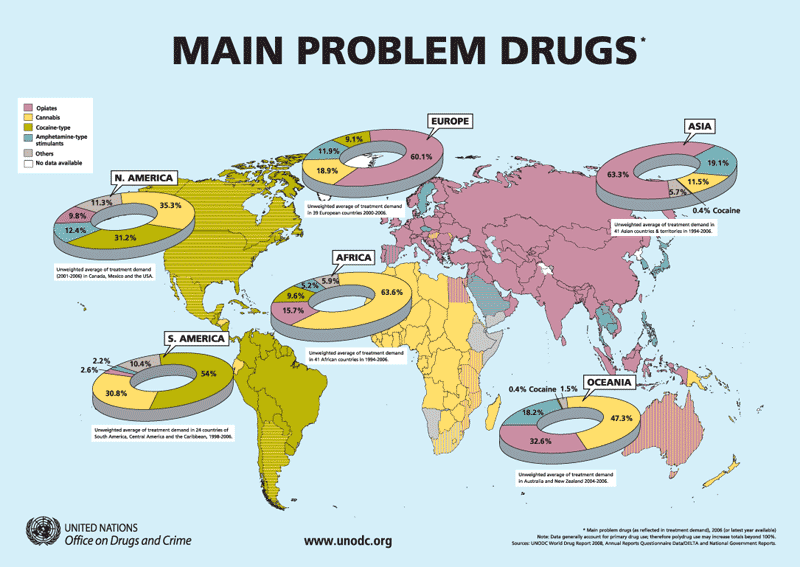
The World Drug Report estimated that in a given year, 250,000,000 people, that’s a quarter of a billion, used drugs.  Of those people using, it wasn’t all medicinal, it wasn’t all recreational, and it wasn’t all abuse and addiction.  Along with this combination of different types of categories drug taking falls into, comes the different categories of drugs: methamphetamines, cannabis, cocaine, opiates, etc. all played a role in this number.  That being said, in 2008 the United Nations Office of Drugs and Crime decided it was best to break down what drugs were affecting what areas of the world in terms of usage and prevalence from region to region.  Drug addiction and usage is a terrible thing in the world, but it is fair to say that some drugs are much more dangerous than others, and so mapping what drugs are being used where, the map is able to serve as a rubric for what areas are in need of the most reform in terms of drug laws.       

An ever growing topic of debate, whether you love it or hate or are undecided on the subject, the spread of drugs throughout the world grows exponentially as technology and laws change over time.  In today’s world, there are recreational and medicinal drugs ranging from common household items such as aspirin to heavy hitting heroin and methamphetamines.  Along with the growth of drug use and drug trade comes rather naturally the abuse and problems of that said drug.  As this map suggests, it shows the prevalence of the main problem drugs corresponding to the continents of the earth.  Asia’s and Europe’s is opiates, a sedative like drug akin to morphine derived from opium.  Africa’s and Oceania’s is cannabis, which falls under the category of a psychotropic drug.  South America deals with the cocaine based drugs which act as anesthetics, similar to opiates.  North America as well as some part of South America is striped with cocaine and cannabis to show that there is a prevalence for problems with both of those drugs in the region. With differing regions and areas came changing percentages of what drugs are deemed as problems.

One look at this map and the mind is bombarded with thoughts that everyone in that region is high off of the said drug with the highest percentage.  This map in turn makes the entire world look like one sleazy back alley club where morals are through the floor and drugs flow like a river, but that’s not the case.  The map is to show what drug is use the most, among drug users.  Not everyone in the pie charts have drug addictions, not everyone on the pie charts are high school dropout nobodies.  The map is mapping out popular drugs by percentages around the world and what causes one area of the globe to have an abundance more of a certain drug compared to another area are fluency, availability, pop culture, and laws.

Humans have a tendency to want to do something more when they are told no (just look at the story of Adam and Eve), so if “the man” tells you not to take a drug, the odds of people wanting to take that drug more skyrocket.  An increase in laws preventing certain  drugs from being consumed can lead to both an increase in addiction but as well as the pricing of the drug and its availability.  With cannabis being legalized by more states in The United States, the black market price for weed as plummeted since the only thing keeping the prices high were all caused by the danger of the production and selling of it.  The stricter laws there are in an area for a certain drug, the higher the danger and in turn the higher price for that drug.  Fewer people want to buy it in a smaller amount which can all lead to a scale down of addiction and users.  Now, since every drug is different and should be handled as so, a drug such as cannabis that is being welcomed into the ever changing world is a drug that wouldn’t need a strong control since theoretically it is a less dangerous drug than some of the drugs on the list (there have been no confirmed deaths from cannabis use).  Drug laws and drug use are all subject to their own change since they are all different.    

Popular culture has always been a hub for drugs.  Whether it be Snoop Dogg and Wiz Khalifa smoking joints on stage at their concerts or Prince overdosing on Fentanyl, an extremely potent opioid, the music industry has seen its fair share of drug users.  What drugs are used as muses in music pieces add to what drugs are popular concerning pop culture.  It was once “cool” to smoke cigarettes and now there is an all out war being waged on big tobacco companies because times, ideas, and yes, pop culture, have changed.  Will it eventually be deemed “cool” to do heroin or smoke weed or snort a line of cocaine, maybe, but that’s only if the media puts a positive and glamorous spin on the drugs.  Take a look at North America on this map for example, where it seems like every day there’s a new rap song about smoking weed or casually doing cocaine with friends, the drugs most prevalent to that area and the culture.  The map is able to be used to break down what regions use what drugs, and that could then serve as to what is popular or cool to do there.      

The UNODC aimed to raise awareness of problematic drugs in areas in order to spur ideas of how to fix those problematic drugs and why they are problematic there. When looking at the map, the map creator divides it up into the main continents of the world, classifying the problems in percentages of the continents.  Pie charts are thrown in to make the reading off the map more quantitative to the reader.  In doing this however, the mind of the reader is to think it’s 30% of the population, and not drug users, making them fear that everyone around them is using the drug, a scare tactic to goad people into wanting the expungement of the problematic drug.  Another awareness tactic that is applied in this map that would make a chart less effective is the reader’s ability to pick out exactly where they live and see what drug is problematic there.  Seeing the borders of your country and having meth be the problematic drug is pretty scary if you’ve never encountered it yourself as compared to just seeing a bar that says “Europe” because you don’t associate that bar on a bar graph with your area, just “the other parts of Europe.”

Some countries may be exempt from the problem drug and what percentage they carry of drug users on that continent.  This is where legality comes into play because a certain drug might not be as readily available in one place so a different drug is abused, but they are still grouped into the overall continental problem drug. For example, Sweden is colored blue instead of purple to show that they deal with amphetamine type stimulants rather than the opiates that plague the rest of Europe for one reason or another.  

In terms of choosing coloring for the percentages, the map maker most likely chose the color closely related to that drug.  Opium is originally a reddish brown before it is synthesized into opiates, so a maroon pink color suited.  Cannabis mainly has a light green hue, so a mustard color is used.  Before cocaine is turned into the white powder everyone is accustomed to, it started out as leaves of the coca plant which are a faded green, so a faded green color was chosen.  Most of the amphetamine drugs used in today’s world come in forms of small tabs, often of a blue color, or a generic pill with one side clear so you can see the drug inside with the other being a solid color, mainly blue.  

It’s no argument that there’s a drug problem in the world.  This map aims to put a number to those drug problems.  Not all drugs are harmful, if used correctly.  Some drugs mapped out on this map have a great future in the medical if they are used properly, but putting a stop to drug problems and drug addiction can’t be put in effect without knowing exactly where and what drugs are doing the harm.  Thanks to the UNODC, we know just exactly what drugs we are fighting.    


Posted in Uncategorized | 4 Comments

Team Presentation: United States Imports and Exports of Commodities: 1967

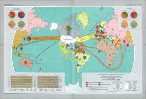
This map was created in 1967 and published in “The National Atlas of The United States in 1970. The base map was published in National Geographic. The different colors help the audience easily differentiate thematerials being imported and exported. The legends in the corners show U.S. total imports and exports, the different shipping weights and materials, and categorize them by commodity group. The arrows and pie charts depict the amount of money and supplies being exchanged. The materials are categorized into food, crude materials, fuels, chemicals, and manufactures (manufactured goods).

It is an America-centric map which presents America as the main source of economic power and the center point of all global economic activity. Russia is cut in half and placed on the edges of the map to make it not look as big or powerful. This was a time where the U.S. and Soviet Union were battling for control of developing countries. The U.S. and Soviet Union were fighting for influence and this map shows the United States as a strong international power. The map makes it seem as if countries that do not work with the U.S will deal with economic trouble while also  making the Soviet Union look weak. It reflects the United States as the “good guys” as they are helping these countries develop economically. The arrows reach out out all over the world and “trap” the Soviet Union. This enclosure of the Soviet Union reflects the United States’ effort to contain the spread of communism. 


Posted in Uncategorized | Comments Off on Team Presentation: United States Imports and Exports of Commodities: 1967

Map of the Week: Expansion of ISIS


In today’s modern times, many different governments and organizations are in constant conflict.  While these are mostly foreign policy issues, the reality is countries in complete disagreement with one another and this leads to unease in how to resolve the situation.  On top of this is the idea of terrorism, which has been a constantly evolving threat for the past few decades.  Currently, the main organization that is a threat is ISIS, which has all parts of the world nervous. They are a radical group that is constantly growing in members and in their attacks. One of the most frightening aspects of ISIS is that they no longer are attacking a singular region. They have evolved into attacking places all over the world. “ISIS”, which stands for the Islamic State of Iraq and Syria, is no longer a group of individuals in that region that are wreaking havoc throughout the Middle East. They now are recruiting members from places all over the world. Places such as Canada, where ISIS presence was unprecedented, are now producing new members. Their range of base has now moved out of just Iraq and Syria into places such as: Saudi Arabia, Turkey, Lebanon, Iran, Egypt, Tunisia, Russia, Jordan, and others. Their reach now is significant and has foreign governments worried. They inflict mass destruction without the slightest sense of care. For instance, in 2016, a man affiliated with ISIS drove a truck through crowds in Nice, France. These people were celebrating France’s National Day and he ended up killing 84 and injuring many more. They are brutal individuals who do not care about how many people they kill, and their mission is to inflict pain and suffering around the world.

The chosen map details the growing regions of attacks and demonstrates the magnitude of their destruction. This map was created by GeoCurrents, a news outlet for all of the noteworthy events in the world pertaining to people and places, offering various discussions of current events. The mission of this article, along with many of their others investigating the growth of ISIS, it to focus on specific regions and then update those maps frequently in accordance with what movements ISIS is making. It shows many of their attempts and the locations they are primarily focusing on in Europe. The most frequently attacked countries in Europe by ISIS are France, Germany, and the United Kingdom.  This map also illustrates the number of foreign fighters in each region. These terrorists have killed thousands of people and injured many more. This map uses many intelligent symbols in order to depict all that is occurring within these countries. For example, a country with an orange box around its name means that it is a target of ISIS through their threats and recruitment. Over time, these icons have grown vastly throughout the regions of this map. Another example of an intelligent symbol is the explosion icon. Red means it was a direct ISIS coordinated attack and yellow means that it was an ISIS-inspired attack. Additionally, explosion symbols with a black dot in the center indicate that the attack was thwarted. The cartographers of this map have a very keen sense of detail in order to illuminate all the actions ISIS is making.

This map is important because it shows to what degree ISIS’s attacks and targets have grown. They are no longer simply a regional terrorist organization, they are now an international group of radicals whose sole mission is attacking countries worldwide. They are constantly evolving and becoming more of a global threat. Their mass destruction is becoming more commonly talked about and governments are working tirelessly on plans to combat this terrorist organization.

Terrorism, to most people, seems like something that will never affect them. More often than not, we tend to think these actions are something that simply occurs in the Middle East and could not ever happen in our home country. Most people don’t think their region of the world will really be affected by terrorism and that is why in most cases they overlook it. In reality, it is imperative that more maps like this continue to be released, not only for the general public to be made aware of, but for governments worldwide. These are difficult issues in many parts of the world and they cannot continue to be overlooked. While this map is quite helpful in understanding the attacks that ISIS has attempted and completed, I find that it fails to illustrate the magnitude of destruction they have caused. It is distorted in the sense that it primarily only focuses on Europe with only smaller portions of other countries represented. Yes, the majority of ISIS’s attacks have been in Europe and the Middle East, however, this map leaves out countries such as the United States, most of Russia, and virtually all of the Middle East. While it does an impressive job of showing the degree to which these countries have been impacted, it is also distorted because it is leaving out larger portions of the world. The producer of this map does demonstrate some bias being that the majority of the map is centralized on Europe without displaying many of the other target locations of ISIS’s attacks. Despite this, The International Centre for the Study of Radicalisation and Political Violence’s mission is to further educate the public and policymakers to further aid in combating the acts of terror that groups such as ISIS commit. Through their vast research of attacks and the accumulation of data, it leads to maps that can help us further investigate their agenda and targeted areas. It is organizations like these that can make a significant difference in the way we fight terror and better prepare ourselves for it.  Maps like these need to become more readily available and continue the talking between governments. Only through the collaboration of governments will this radical organization be stopped and a greater sense of safety be restored throughout the world. The maps created with the data from the ISCR assist in calculating the number of attacks attempted, and though they might appear to have no direct correlation, they demonstrate just how serious and rapidly increasing the threat of ISIS is. Through maps like this, we gain a broader knowledge that can only benefit the global situation and allow us to continue making advancements with the goal of ending terrorism.

References:

Lister, Tim. “ISIS: 143 Attacks in 29 Countries Have Killed 2,043.” CNN, Cable News Network, 13 Feb. 2017, www.cnn.com/2015/12/17/world/mapping-isis-attacks-around-the-world/index.html.

Bremmer, Ian. “ISIS Foreign Fighters: Which Countries Do They Come From?” Time, Time, 14 Apr. 2017, time.com/4739488/isis-iraq-syria-tunisia-saudi-arabia-russia/.

“Home / ICSR.” ICSR, icsr.info/.

Posted in Maps of the Week | 7 Comments

Blog of the Week: North Carolina Maps

Continuing with the narrative of interesting places to explore in North Carolina, the blog of the week that I have chosen focuses on maps within the state. This blog is interesting in an exploratory sense because it features maps of the various counties, regions, and major cities of the state. Not only does it focus on North Carolina, but there are posts that pertain to other states and the significance of this region of the country. This blog is a phenomenal outlet for gathering a greater knowledge of the cartographic history of North Carolina and its surrounding areas.

http://blog.ncmaps.org

Posted in Uncategorized | 1 Comment

Blog of the Week: These Chinese Cities have GDPs that Match Those of Entire Countries

For anyone interested in international economics, this is a truly fascinating post. Frank Jacobs explores 35 different Chinese cities with GDPs that are the same as entire countries. This post shows how much of an economic force China has become with city GDPs equal to major countries including Peru, Chile, and U.A.E.

http://bigthink.com/strange-maps/these-chinese-cities-have-gdps-that-match-those-of-entire-countries

Posted in Uncategorized | 1 Comment

Atlas of the Week: Transit Maps of the World

For the Atlas of the Week, I have chosen to look at the atlas, Transit Maps of the World. This atlas is the first and only collection of modern and historical maps of every rapid-transit system on earth. This atlas provides very detailed and colorful maps of transit systems across the globe and can be extremely useful to any world traveler looking to discover the easiest ways to travel around cities throughout the world.

https://www.penguinrandomhouse.com/books/318909/transit-maps-of-the-world-by-mark-ovenden/9780143128496/

Posted in Uncategorized | 1 Comment

Map of the Week: Overall Water Risk

When thinking about water risk around the world, you immediately think about Africa, Asia, South America, and other developing regions of the world, not the United States. Surprisingly, many different regions in the United States have water supplies views as high risk. For the map of the week, I have chosen the Overall Water Risk map. The overall water risk map identifies areas with higher exposure to water-related risks and is an aggregated measure of all selected indicators from the physical quantity, physical quality, and regulatory and repetitional risk categories.This map is an interactive one found on the Water Resources Institute’s website, wri.org. The interactive version allows viewers to break down specific water risks such as the physical quality or access to water. The interactive map also allows users to enter coordinates to have a much more detailed insight into the water risks in a specific area.

As one might be able to predict, some of the highest risk areas include northern Africa, the Middle East, and Asia. These regions are typically what comes to mind when discussing areas that have water struggles. However, areas in the United States, such as the southwest and midwest, are considered “high risk” areas. This came as a surprise to me when I first discovered the map. However, after conducting further research, it makes sense given the formula that is used by the mapmakers. The areas in the southwest score poorly in physical quantity due to frequent and severe droughts that residents of the area experience. Furthermore, much of the midwestern United States has been labeled as “extremely high risk” for physical quality. This is due to examples such as Flint, Michigan that have suffered from contaminated, unhealthy water sources. Fortunately, the United States is in an area of “low risk” for regulatory and reputational risk.

One aspect of this map that I found particularly interesting was that far northern countries such as Canada, Russia, Sweden, Finland, Denmark, and Norway all have remarkably low water risks, much lower than a majority of the rest of the world. Part of the reason that these countries enjoy such low risks are due to the fact that they are well developed and wealthy countries that are able to have clean, well managed water systems. However, the United States is also a wealthy, well developed country with clean water but have somewhat large areas that are labeled as “high risk”. This leads me to believe that part of the success must also be as a result of the northern climate that these countries are in; as mentioned earlier, part of the reason why the southwestern United States is deemed high risk is due to the extreme droughts that the residents are suffering through.

The projection of the map, as is the case with an overwhelming majority of maps, reveals biases held by the mapmaker. Africa appears much larger than what is seen from most maps that one would encounter in the United States. The author may have done this because Africa is a nation that faces many water issues and the larger projection of it allows for better detail to be added, as well as make the regions affected appear very large. This can cause a viewer of the map to view the issue of water risk much more seriously based on the size of these affected areas in Africa.

This map could be very useful to many world travelers as they can develop a solid idea of the water situation in potential areas of interest if they are unsure of the current conditions. I genuinely enjoyed finding and exploring this map. Prior to viewing I would not have thought that the United States could be an area of high risk water but this map has changed my thoughts and hopefully does the same for others as well.

Posted in Uncategorized | 3 Comments

Atlas of the Week

In the spirit of the holiday season and with the thoughts of traveling on everyone’s mind, this Atlas of the Week should be intriguing if anyone will be visiting North Carolina anytime soon. This Atlas focuses on 86 cool and unusual attractions in the great state of North Carolina. These destinations are more remote and offer a neat way to see different parts of the state. There are so many fantastic places to visit in North Carolina, but this Atlas gives many more options for people with an adventurous spirit. The options span throughout the entire state so for anyone driving through there are bound to be options if they feel like seeing something new.

https://www.atlasobscura.com/things-to-do/north-carolina

Posted in Atlases of the Week | Comments Off on Atlas of the Week

Atlas of the week

For you people who love scary movies and get excited with playing Ouija, you are going to love this weeks atlas of the week. The Atlas of Cursed Places. The atlas goes into depth of every place on the Earth that has been marked or reported as haunted, chaos, disaster, and even death.

27 Best World Atlases For Map Lovers In 2017

Posted in Uncategorized | Comments Off on Atlas of the week