Source: http://www.foreignpolicy.com/articles/2013/06/24/2013_failed_states_interactive_map
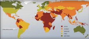
Failed States Index map of 2013 is created by Fund for Peace, an independent, nonpartisan, non-profit research and educational organization that strives to prevent violent conflict and promote sustainable security. This map is published by the Foreign Policy on their web magazine. Each year’s Failed States Index analyzes how countries performed during the previous year, e.g., 2013’s index measures countries’ performance in 2012. In the map we are looking at, red (Critical) corresponds with scores of 80 or higher, orange (In Danger) corresponds with scores of 70-79.9, yellow (Borderline) corresponds with scores of 50-69.9, light green (Stable) corresponds with scores of 30-49.9, and dark green (Most Stable) corresponds with scores lower than 30. What makes the Failed States Index map unique are the interactivity and flexibility. It’s not a solid map but a map that allows the viewer to play with it. Thus the viewer can be able to further engage with the information provided by the map.
According to the definition of “failed” by Foreign Policy, countries that are politically, socially, economically struggling are regarded as failed states. Each year, the map is frequently referred to help the U.S and U.S AID Department make decisions about resource allocation and humanitarian rescue plan. However, the compositions of the ranking are very subjective. They are chosen by Foreign Policy based on the U.S standards, and indirectly assert the U.S power of governing the world.
In discussing the physical attributes of this map, the most obvious would be the subjective choice of color. Political bias is seen through the colors in that the green colored countries are likely to be allied with the U.S, while red ones are relatively unstable and dangerous to the U.S. Also, different colors provoke different emotional responses: green makes the view feel comfortable while red evokes the tension in terms of our foreign relationship with those countries. Secondly, there are no names or physical labels in the map. This map is not for geographical purposes, but more for a political purpose: red is the sign of emergency, which means those countries are the ones that need help from the U.S. Besides, the distortions in the map also reflect the subjectivity. Africa with large coverage of red in the center of the map stands out to most of the viewers. Then comes the Middle East and Asia that form as a “Failed Region”. People would feel worried about those countries instead of the green ones. Green countries such as the U.S and Canada are more likely to be assumed as stable and safe places where people have a life with high living quality.
Critically, a term that Dalby (2013) mentions in The Pentagon’s new Imperial Cartography, the “global war on terror”, also can be reflected in the Failed States Index Map. Before 9/11, the public would generally think that countries that are economically and politically powerful such as U.K and China were threats to the U.S. However, after 9/11, there was a general realization that those undeveloped (red) countries are more dangerous in different ways. Connectivity gathers countries together and deal with global problems, but those red countries that are not connected are still undergoing violence, extreme poverty, and a variety of tyrannies. “In recent years, it seems we’ve had more security problems from states that have been in trouble than we have from strong states that have been an adversary to us in the traditional way. Yet, state weakness is something that the United States and its allies are still largely unprepared to either prevent or manage. (Dalby, 2013).” Another reason why the U.S values this map is that the U.S is interested in a stable and efficient international relationship. Political leaders are gradually realizing that there is no more “us” or “others” since globalization has shrunk the world to where “we” is not interconnected within the whole world. There is a need to use soft power to control these unstable countries to help them benefit from economical and political interactivity while the aid helps to eliminate the threat.
Nevertheless, as map critics, we must always ask if the U.S is truly helpful in aiding these undeveloped countries as well as if these countries are experiencing improving conditions. If so, why are some countries like Somalia continuously ranked as the most failed states through 2010-2013? What globalization has not fully achieved is the cultural interaction. We should ask ourselves, are we aware of the life and society those red countries are experiencing? And should we? This map is simply a tool to help us analyze these questions. The subjectivity, distortions and silence that come along with the map require deep critical thoughts and actions.
-Trista Li and Grace Chang
Reference
Dalby, Simon. “The Pentagon’s New Imperial Cartography” Paper presented at the annual meeting of the International Studies Association, Hilton Hawaiian Village, Honolulu, Hawaii, Mar 05, 2005

