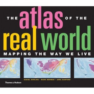
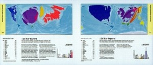
The Atlas of the Real World: Mapping the Way We Live by Daniel Dorling, Mark Newman, and Anna Barford consists of 366 maps that show geographical and social statistics. The number of maps may seem intimidating to shift through, yet the approach to display so much information is refreshing that one can’t help turn more than a few pages without learning something new. No matter what issues are being discussed (resourcefulness, trading, economic, social, perilous, or environmental) the atlas addresses the visual problem that arises when comparing two countries with similar populations that vary in sizes (ex. Nigeria and Russia) by using cartograms. Specifically the method used to create cartograms is courtesy of Michael Gostner and Mark Newan, where a density of interest (ex. birth rate, mortality rate, and etc.) is treated as a diffusing fluid that spreads out from areas that are most dense into areas of lower density (an example is shown below).
The atlas is thought-provoking by acknowledging that all maps distort sizes and shapes of counties, hence embracing what one could see as a weakness and turning it into a strength.
– Marissa Nino
Source:
Dorling, D., Newman, M. E., & Barford, A. The Atlas of the Real World: Mapping the Way We Live (2nd ed.). London: Thames & Hudson, 2010. Print.


