
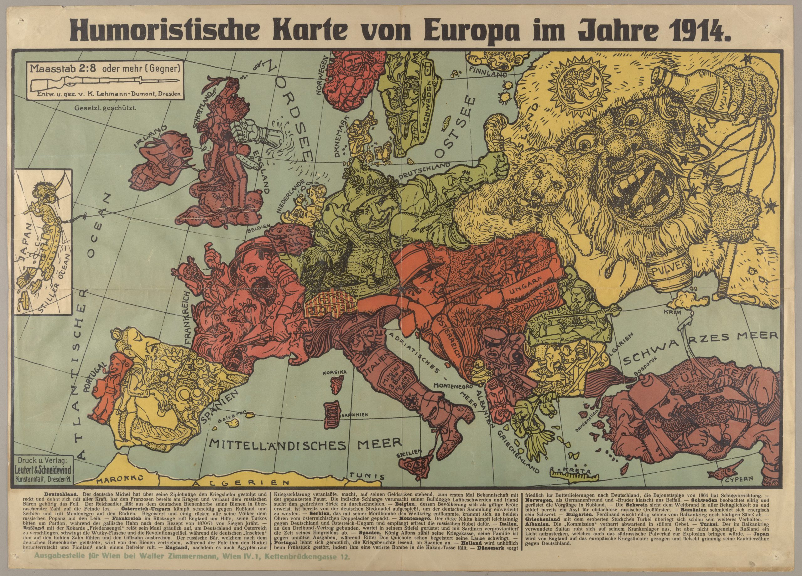
At first glance, the Humoristische Karte von Europa im Jahre 1914 is a rough portrayal of the European continent. Upon second look, the country boundaries morph to vaguely resemble human and animal representations. After several more scans over the map can it realize its true form as overt political World War I propaganda.
Even though the human personification of continents and countries can be seen for centuries predating World War I, human and animal metaphors on maps peaked in Europe between 1845 and 1945 with political animated cartoon maps. The increase in prevalence of these satirical maps reflected the significant political and cultural changes that occurred during the time. Political figures were caricaturized, and European nations were assigned symbolic identities that provided humor and accessibility to the geographical map and international relations at the time. This unique political caricature map of Europe illustrates the continent at the commencement of World War I. The map was made by Karl Lehmann-Dumont in Dresden, and shows the Germans’ position on the alliance and territorial disputes towards the end of the first year of World War I. The countries involved in the war are represented by human and animal caricatures with various objects that help illustrate the state of Europe during the war.
This map is relatively entertaining propaganda from early in the war that was employed to ridicule and stereotype the opposition. Political cartoons such as these were produced by both sides and neutral entities. Each country is depicted in a captivating and relatively lighthearted manner, as this map was made fairly early in the war, before many deaths. Germany is extending and spreading himself with all his might, stoutly defending his homeland by already grasping the Frenchman by his throat and punching the Russian bear. The country’s Imperial Eagle unleashes bees from its hive to attack its enemies, which appear on the map as both bees and missiles. France, already confused and covered in bees, appears to retreat, and calls to England for help. The Russian has an “Angel of Peace” emblem on his hat, with a bottle of alcohol in his left hand and a whip of “revolution” in his right hand. The nasty, voracious giant Russia opens its mouth wide, attempting to swallow Germany and Austria, but is dissuaded by the German bees. England stands on bags of money while being punched in the face by an iron fist, alluding to centuries old grievance that England could afford to pay other countries to fight wars, causing political and social instability without risking British lives by intervening on the continent in a major way. The English bulldog finds it difficult to breathe with a snake wrapped around its neck. The Englishman also seems to be dragging Japan into the war by holding a string that is attached to Japan depicted in an inset on the left side of the map. Lehmann-Dumont particularly seems to criticize Slavic peoples in the Balkan Peninsula. Bulgaria is depicted as a mini-Russia, washing its saber, still bloody from the Balkan War, while Serbia as a swine is hunched over caught by both ears by the Austrian double-eagle, as the country which ignited the world war with its murder-bomb, and Montenegro as a louse, foolishly fighting against Germany and Austria-Hungary and ecstatically getting Russian rubles for doing so. Numerous other complex relations and symbolic references fill the map.
Obviously, the countries being depicted in Lehmann-Dumont’s map are far more culturally complex than the biased stereotypes they are being reduced to. Lehmann-Dumont made this map from a German point of view, which explains the vilification of Russia and the mockery of Great Britain, as well as the inclination towards Germany and the approval of Austria-Hungary. Setting a fixed image of a nation or generalizing about an entire country is unfair, even if it is for the sake of humor or satire. Stereotypes do not account for the fact that nations and its citizens are individually complex, with each one possessing a unique constellation of personal attributes. Geopolitically, stereotyping dehumanizes people, and places all members of a group into one homogeneous category, often solely because of the actions of a powerful leader or influential group.
All maps contain some sort of message about the world and the areas they depict. They are inherently arguments, however, due to the nature of maps, they are often interpreted as fact and reality, when this is not the case. The mapmaker tries to induce the reader to believe in the completeness of the information, and he does so by critiquing (or at least satirizing) all the nations on the map, all in an attempt to prove the truth and reliability of the map. While Lehmann-Dumont is German, Germany is still shown to be brash and expansive, perhaps to show Germany’s responsibility in the outbreak of World War 1. Karl Lehmann-Dumont’s cartoonist, satirical style of his Humoristische Karte Von Europa im Jahre 1914 allows the viewer of the map to consume it not from a scientific standpoint, so the viewer can realize the bias and messages the map portrays. This experience is what Lehmann-Dumont intended. Interpreting the map as current events, as well as art makes the messaging more palatable to the viewer and the directed audience of the political cartoon.
Works Cited
Lehmann-Dumont, Karl. “Humoristische Karte Von Europa Im Jahre 1914.” Cornell University Library Digital Collections, Cornell University, 25 Aug. 2015, digital.library.cornell.edu/catalog/ss:3293872.
Peacay. “Dogs of War: Satirical Maps of the First World War.” BibliOdyssey, 3 Aug. 2008, bibliodyssey.blogspot.com/2008/08/dogs-of-war.html.
I think this is such an interesting map. As you mentioned, it doesn’t carry the pretense of neutrality we’ve come to expect from maps. The mapmaker was very bold in his decision of portraying each country. Obviously, it’s inherently problematic to generalize entire countries into mere stereotypes. From a historical perspective, however, this generalization shows us a lot about the political context at the time. Each detailed description that you’ve made for each country fits in very well with how most in the west perceived WWI at the time. It’s fascinating that a map can both capture such intricate popular sentiments with ease and communicate it back to its viewers.