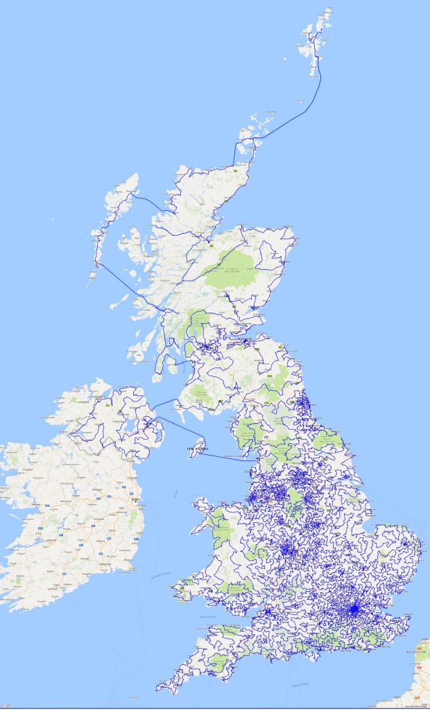
The ‘pub crawl’ is a ubiquitous facet of British popular culture. The premise is simple: you and your friends proceed from one bar to the next, typically without a structured, predefined plan for the evening. But what if you did have the night charted out? What if you had the mathematically perfect bar-hopping experience laid out in front of you? Behold: the mother of all pub crawls. This week’s selection depicts the shortest route possible between every pub in the United Kingdom.
This map was created by the Faculty of Mathematics at the University of Waterloo as an exercise of the ‘Traveling Salesman Problem’ or TSP. The TSP is a classic fixation of cartography: given a series of locations, what is the shortest route possible that visits all locations exactly once and returns to the origin? The problem may appear trivial when considering a small sample of locations, but at large scale – say, 24,727 pubs large – the complexity increases exponentially. While the TSP may seem like an esoteric brain-teaser for computational mathematicians, it has vital real world applications. After all, what profession doesn’t concern itself with efficiency? City planners want to plot roads that quickly transport people to as many essential locations as possible. Sanitation departments want to devise optimal routes to save time and money. Nurses want to make their rounds swiftly to ensure every patient receives the attention they require. That’s why the UK pub crawl map is so significant – it’s the single largest TSP ever completed, and a monumental step forward in the automation of these problems.
More than the methods and meaning behind the map, however, my interest lies in the relationships unintentionally hinted at by this geovisualization. Upon first glance, the map appears to be a complex labyrinth of lines that carve intricate contours into the landscape. In reality, there is but one line on the map which traverses the whole United Kingdom, and every change of direction reveals a little information about the demography of the area. Take for example the varying line density across the map. Major cities are labelled on the map not by their names (they are in fact obscured), but by the deep blue that seemingly outlines their jurisdictions. London is most noticeable, as the line work reaches its peak density in and around the southern capital. So why does the concentration of line segments matter? In a way, it’s a means of charting population density, which makes sense; it stands to reason that the more people there are in an area, the more pubs there will be, meaning the more unique locations the line must hit, resulting in a higher density of line segments within that area. This results in an area like London being rendered in dark blue while the whole of Scotland has a measly few line traversals across the entire country. Personally, I found this surprising at first, not because I was unaware of Scotland’s sparse population, but because my popular perception of Scottish excessive drinking overrode my initial understanding of what the map was really illustrating. This is not a map of alcohol consumption. It’s a map of physical establishments of business, and those are always going to be more plentiful in population centers.
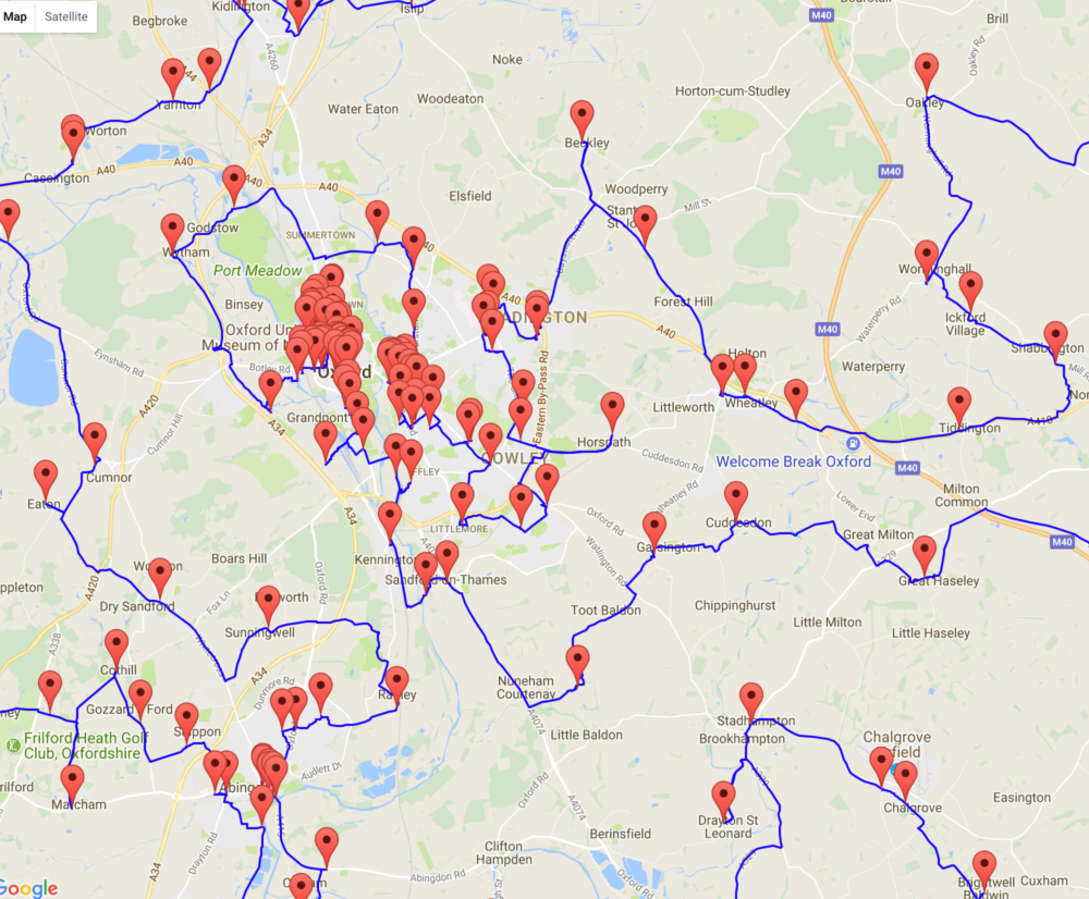
Similar to viewing the map at a national level and easily being able to identify London as a populous area, changing the scale to the county of Oxfordshire allows us to see the most popular areas at a local level.
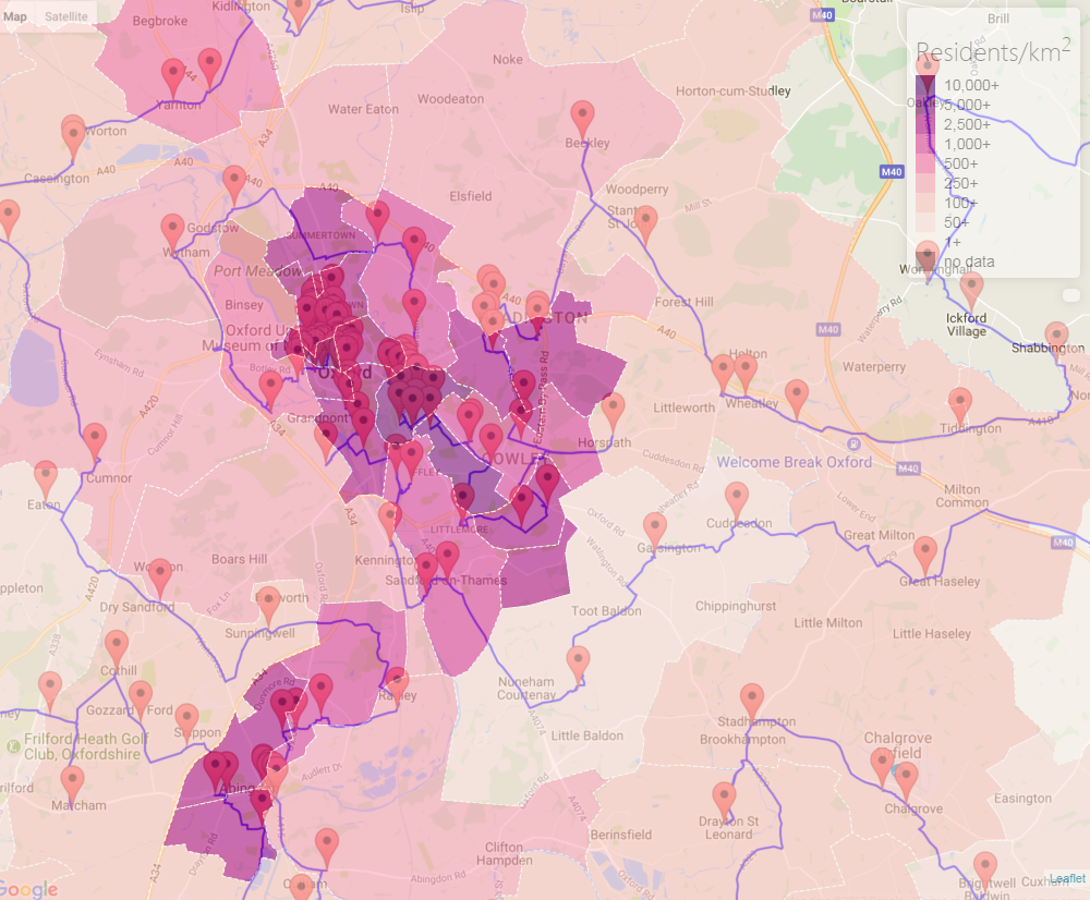
How accurately does this correlate with the actual population distribution of the city? Surprisingly well, in fact. Take a look at this map of Oxfordshire population densities I found online:
Source: plumplot.co.uk
It may be hard to tell by looking between the two maps, but a strong relationship exists between the presence of pubs and heightened population density (what I’ve affectionately dubbed the ‘Pub-Pop. Correlation’). Using image editing software I overlaid the maps onto one another by matching topographical features (thankfully they utilized the same basemap). The composite image:
The correlation is clear: people live where pubs lie. The darkest sections of the population density visualization correspond directly with the most pub-heavy regions. But these maps actually show entirely different datasets. The population map may tell us where people live, but the pub map illustrates where people choose to spend their time. In a way, this is a far more significant statistic. Everyone has access to census data, but to truly know where people tend to be, down to the street level, is powerful. In the case of Oxford, the combined map demonstrates that the residential and recreational districts are one and the same, which is to be expected of a college town. Again, this should come as no surprise; after all, pubs are social nodes; they are places of comings and goings – sorts of physical landmarks of our connections to others. Therefore, from this composition of maps (and indeed from the pub map alone), it is also possible to infer the most popular roadways within the city. From tracing the blue line through Oxford (in which it seems to radiate out of the University), it’s easy to get the sense that the busiest streets are those in the immediate vicinity of the various colleges around town.
So what happens if you take the colleges out of the equation? After conducting similar analysis on the center of London, it becomes clear that the correlation isn’t nearly as strong.
Population map source: plumplot.co.uk
At first glance, the two data sets appear to line up fairly well; the most densely populated district is also the most dense with pubs. However, beyond that, the shadings of population density fail to correspond with the drinkeries (noticeably directly north of the London Bridge). This may seem insignificant, but it reveals a rather important distinction between the cities of London and Oxford. There’s more movement within London. People don’t mix leisure and residence as much as in Oxford. It’s a cosmopolitan capital city and one of the largest economic centers in the world, not a college town. As a result, London has specialized to craft socially-constructed ‘drinking districts’ that exist aside from where people actually live.
As I mentioned above, when I first viewed this map I was mostly intrigued in the prospect of using pub placement as an unconventional metric for measuring population density. After all, at the national scale, it already appears similar to a population heat map. It wasn’t until I actually cross referenced this map with population data that I realized the danger of assuming the correlation exists across the country. From a strictly data perspective, the map displays the same parameters of information at every locale, but if you were to look at the map and believe you could infer the same population trends from Oxford as from London you would be sorely mistaken. This map is deceptive. That may come as a surprise considering its objective, mathematical nature, but one must consider that all maps operate through their selectivity. The information that is withheld often shapes the audience’s perceptions even more than what is shown, no matter if it’s a conscious decision or not. So the next time you’re looking for something to do in the UK, take this map, make good choices, don’t make assumptions about correlations that may or may not actually exist, and have a safe 28,269.4 mile journey.
Works Cited
24,727 UK Pubs. University of Waterloo Faculty of Mathematics,
www.math.uwaterloo.ca/tsp/road/uk24727_tour.html.
Jacobs, Frank. “The Shortest Route Between All the Pubs in the UK.” Big Think, The Big Think, Inc., 10 Jan. 2017, www.bigthink.com/strange-maps/the-shortest-route-between-all-the-pubs-in-the-uk.
Plumplot. “Inner London population statistics.” Inner-London population stats in maps and graphs.,
www.plumplot.co.uk/Inner-London-population.html.
Plumplot. “Oxford population statistics.” Oxford population stats in maps and graphs.,
www.plumplot.co.uk/Oxford-population.html.


