

What the heck is that? That’s the question that was running through my head the first time I saw the International Emigrants Map and International Immigrants map in my geography class. I thought that they must be the most distorted maps I have ever seen… With no names but weird shapes for all the countries, I can barely recognize any of them, even China (where I come from). However, let’s take a look at the bottom left in both maps——a normal land area map with same colors as the distorted one. We can get a better idea about the location of countries through the normal maps that we see the most in our daily life. Then when we go back to the migration maps, we might think the map is over distorted. But I would like to argue that those distortions are actually very reflective and helpful for the viewers to further perceive the information contained in those maps.
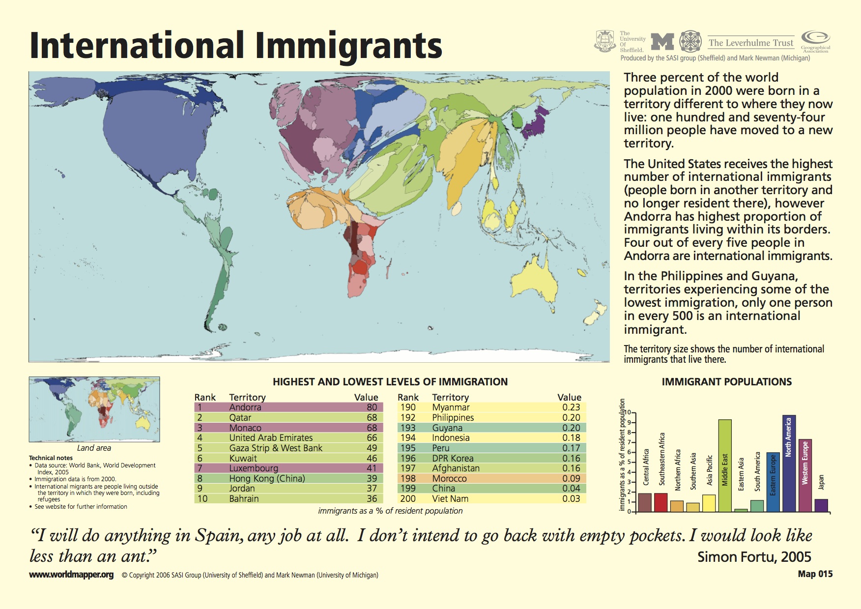
According to Knox and Marston, migration is a long-distance move to a new location. Moving from a particular location is defined as emigration while moving to a particular location is defined as immigration (2013). Frist, the International Emigration map shows us the proportion of how many people leave from their home country for another: the bigger the size of the country, the more people are leaving. Similarly, the International Immigration Map shows the proportion of people flowing into a certain country. The more people come in, the bigger the size of the country.
However, besides indicating the number of moving population, the size of the countries also represents the stability and power of the countries. Through the distortions in the International Emigrants Map, it seems like most countries on the right (or the center I would say) have way more emigrants than countries in the North America do, especially America. America appears as a very small piece of land while some European countries that are usually very small in other normal maps seem incredible large, not to mention India, Mexico and Middle East countries. The exaggerative distortion implicitly raises a tension that the living condition, the income and the social warfare may fail to provide content for people who live in the distorted countries, so that they want to leave and find opportunity elsewhere to provide themselves a better life. At the same time, America and Canada become more of a stable, safe and happy wonderland since their citizens are satisfied with their life and not many of them want to leave forever. As a result, the capability of the government is shown on the map too. More people moving out of the country means the government is doing not so well to sustain its citizens, while the more stable population in America implies that the U.S government is competent. Along with the International Immigrants map, the American power is further emphasized through the distortions. As the legend on the right of the map says, “the United States receives the highest number of international immigrants (people from other countries)”. American puffs like a balloon that is almost going to explode in the International Immigrants map, while countries the South America and South Asian are squeezed into poor slim lines. The balloon reveals a fact that America is socially and economically attractive to people from all over the world, but countries like China, Peru and Egypt where not many people would like to immigrant to have nothing to compete with America.
Nevertheless, while embedded with the U.S power in those migration maps, the balloon also points out a serious problem that the U.S government is facing: the over immigration issue which urgently needs to be managed. The globalization shrinks the world economically, politically and culturally, and makes countries more interconnected. People from all over the world have more access to other places, and America is one of the places where the largest population flows into. Immigrants who are seeking for a better life includes people who used to have life struggles, and people who have outstanding skills or knowledge that could contribute to American. The former is more likely to be regarded as the resource consumer while the latter can be the resource producer in terms of technology and urban development etc. Thus the U.S government needs to balance the absorption of elites and the scarcity of the resources, as the explosion of the balloon is a potential threat.
Monmonier (2007) points out that all the maps is a lie and all the maps are subjective. Mapmakers use maps to exhibit and hide information at the same time to make the viewers receive what they are expected to receive instead of what they should. However, as for the International Emigrants Map and International Immigrants map, I would argue that the irregular distortions are actually very reflective and figurative. Imagine a normal and beautiful map with a Mercator projection, no matter how big and complicated the numbers of immigration and emigration are in the legend of the normal map, I believe that the viewer will be more impressed by the distorted map with direct visual impact. Besides, rather than a “lie” per se, the map is an argument that an audience can engage with, and it is clearly not for geographical but instructional uses; thus I think it is fine of being subjective about the distortion.
References
Knox, P. L. and Marston, S. A. 2013. Human Geography: Places and Regions in Global Context. Upper Saddle River, NJ: Prentice Hall.
Monmonier, M. 2007. In The Introductory Reader in Human Geography, Eds. W. G. Moseley, D. A. Lanegan, and K. Pandit, 42-45. Oxford: Blackwell Publishing.
By Minyao Li (Trista)
Trista’s post first caught my attention because it reminded me of the map I submitted for the Map of the Week—both are cartograms that highlight a particular factor on a global level, comparing it across countries. The map I chose looked at GDP disparities across the world, while Trista’s maps display trends in immigration and emigration. Trista had a good point when she said that the distortions add to the effect of the map in a positive way; instead of masking the cartographer’s interest they broadcast it so that no viewer can miss it. Sometimes we have a habit of assuming that any agenda that a map might have is a bad thing, but we forget that all maps have a purpose so having a motive is simply part of being a map. I also like how Trista analyzed the implications of the two cartograms. The maps shed light on which countries are more powerful in that they have more appeal to immigrants. Countries that are portrayed as larger on the emigration map are most likely less desirable places to live, while those larger on the immigration map have more appeal.
I enjoyed the “International Migration” maps, as well as Trista’s analysis of them. I agree with her opinion that the distortions of the maps reveal important arguments to the audience, rather than the lies that are traditionally concealed within maps. The first thing I perceived when looking at the maps was that the countries looked overly distorted, both in size and shape. However, as Trista points out, these maps actually make powerful statements about the stability and power of countries. The countries that have more emigrants than immigrants, represented by large areas on the emigration map and small areas on the immigration map, may not be the most stable countries. Their sizes on the maps imply that many people are leaving, possibly due to poor standards of living, and that the conditions are not attractive to immigrants. On the other hand, it can be assumed that the countries that have many people immigrating and few emigrating have high standards of living, because many people want to live there and few people leave in favor of other countries.
I thought it was particularly interesting that Trista chose to focus on the implications these maps make about American power. The U.S. is represented by the largest amount of land by far in the immigration map, and its area is greatly decreased in the emigration map. Trista notes that the U.S. is attractive both socially and economically to immigrants from countries all over the world. Another interesting point to consider is that as the immigration map notes in the upper right hand corner, there does not seem to be one country from which more people emigrate than others. This makes sense, because the United States is made up of immigrants from a large variety of countries.
At the same time, it is interesting to consider that these maps also point out a problem faced by the United States. As can be seen clearly by the large “balloon” that represents the United States on the immigration map, the US receives a larger number of immigrants than any other nation in the world. This map helps show the importance of sustaining a balance between the resource consumers and resource producers who are immigrating to the United States. As Trista points out, if this balance is broken, the US faces the potential threat of the “explosion of the balloon.” This warning is a fascinating observation to make about this very non-traditional map.