Paper Map Project Plan
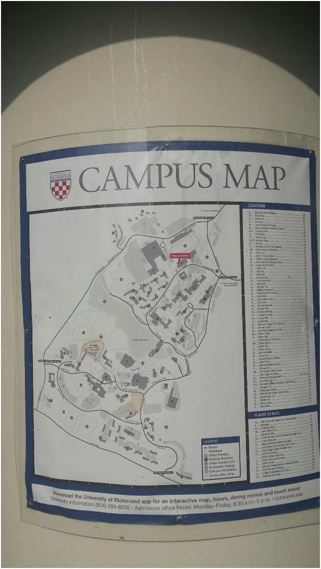
For my project, I will redesign the large campus map that is currently displayed on the information kiosk outside of the university admissions office. This map is essentially an enlarged reprint of the standard flat map displayed on the UR website (like the ones we looked at in class). With such a large space available, it doesn’t make sense to use the same elements you might put on a small, handheld map. The list on the side is confusing, the numbered buildings look cluttered and messy, and the colors are drab. On this new map, I will replace numbers in a list with labels on buildings, add color to the map, erase unnecessary data, and simplify the legend/iconography so it is more readable and user-friendly.