http://arcg.is/1qUqYec
Ian Gallagher Final Project – 1980’s AIDS Timeline
Tyler and Ian Map Blunders
Answer Key:
Removed Gazebo
Added facilities label near right bottom corner
Removed Weinstein Center Label
Final Map Project – Ian Gallagher
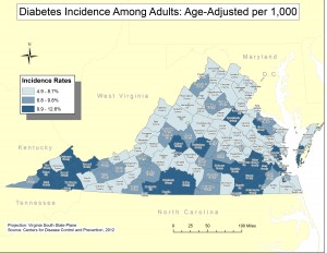
My map shows the incidence rate of diabetes among adults in the state of Virginia. The data is categorized by county, as seen by the different shades in each county, representing the incidence rate of diabetes in that county. With the average rate being 9.3% and a standard deviation of +/-.5 added, the lightest shade is below average incidence rates, with the medium and darker shades being average and above average incidence rates respectively. The incidence rates are age-adjusted per 1,000 residents, which allows the map to make a more fair comparison between counties with large age differences. For example, a county with a large amount of elderly people (likely more at risk for diabetes) would be normalized to be more fairly compared with that of a much younger aged county.
Ian G. Project Update
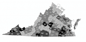
Ian G. Project Screenshot
Diabetes rates in Virginia – darker shaded areas have higher rates of diabetes incidence per 1000 residents.
Project Proposal
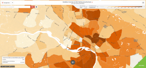
For my project, I would like to create a map of Richmond that shows the correlation between diabetes rates and poverty. In my SSIR class, we read an article entitled “Ghetto Miasma” which talked about the relationship between being impoverished and health issues associated with this. Diabetes is an interesting problem to look at because a lot of the time this is a health problem (specifically type II diabetes) that can be prevented with a healthy lifestyle that includes exercise and healthy eating, which is something that is hard to achieve for people living in poverty because both of these things cost money to obtain. I would like to show that there is a strong connection in a large city like Richmond of areas that are generally more adept to poverty also having much higher rates of diabetes within the population. In order to do this, I will have to create a project that displays side by side maps, or something along these lines that will allow me to present two different sets of data to the reader while trying to convey the simple message that diabetes shares a strong connection with poverty.
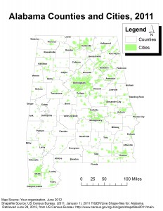
Alabama Counties and Cities, 2011
Swiss Cheese Map Reflection
This article helps give a real life example of why maps are so important, and how bias in a map can cause a lot of problems. The Israeli-Palestinian Conflict is one of the most complex and ongoing problems in the world today, and has been for many years before. The fact that a map could play such an important role in this conflict shows how maps permeate all aspects of life and can be used just about in any situation. The other thing that stood out to me is again the fact of how important it is to pay attention to detail. Since the original map in the peace talks was poorly done, it was offensive enough to actually have a negative affect on the peace talks. Much like a speech or contract in a peace talk, every aspect of the map must be carefully considered as to make sure it is getting across exactly what you are trying to say or present.

