Rough Draft:
Final Draft:

A UR Campus Map with 5 Blunders:
Answer Key:
This is a photo of my final draft for our first map project. It shows the standard deviation of number of chronic obstructive pulmonary disease (C.O.P.D.) cases in New York.
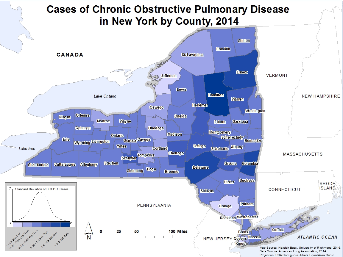
This weekend, I decided to change my project idea. I still plan to create a map of health data, but now am working to make a map that shows the number of COPD cases in New York by county. I have included a photo of my progress so far. 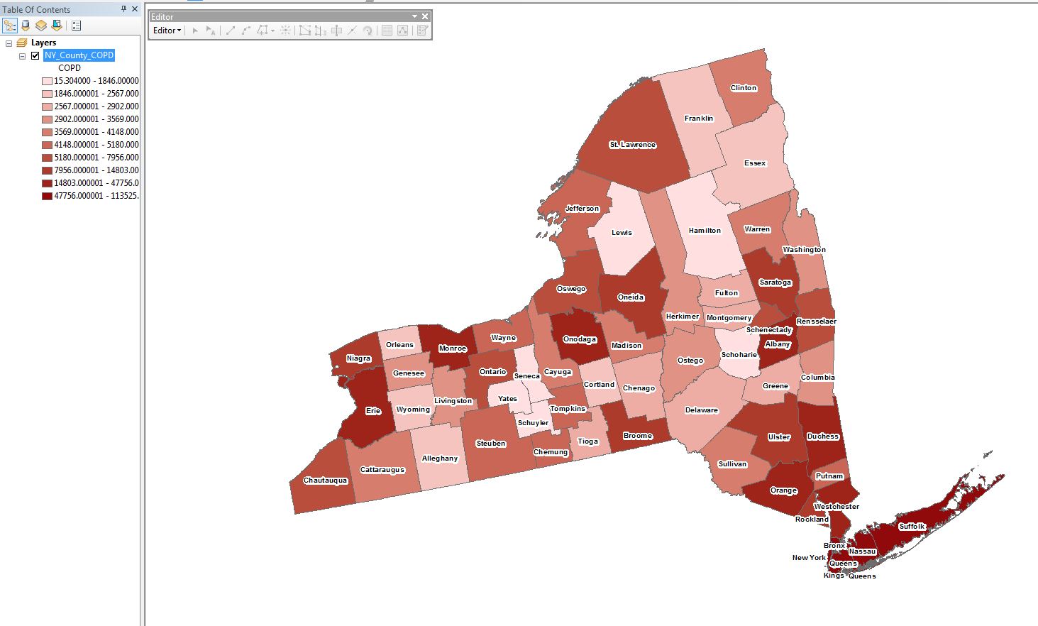
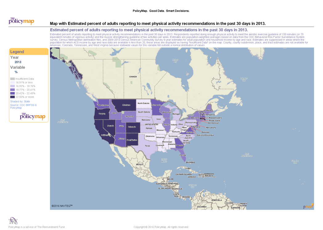
For my project, I plan to create a map showing the number of female cardiovascular disease deaths per 100,000 population in the United States. Over the past year, I have learned a lot about the large impact of heart disease, especially in the US. While abroad this past semester, I took a class called “Health Beyond Borders” that covered several global health topics. One main topic was the shift from communicable diseases to non-communicable diseases as the top burdens of disease. We discussed the leading causes of death in each country and saw a common theme of heart disease being the top killer. This past summer, I also interned in the Cardiology department at my local hospital. I was able to meet and interact first-hand with several patients who struggled with heart disease. In my map, I hope to convey the enormous impact that cardiovascular disease has on Americans.
To create my map, I was able to find data from 2014 for the number of heart disease deaths per 100,000 population by gender in each state. I will focus specifically on female Americans. I plan to use the Albers projection, since we discussed in class how this projection was superior to Mercator for displaying the United States. I also plan to use color hue to show the differences between states. My goal is to create a map that conveys the vast effect that cardiovascular disease has in the United States.
The Motro article, “Lessons from the Swiss Cheese Map,” made me consider the role that maps and their design can play in the peace process between two countries. We spoke in class about how maps can be used to manipulate the way that certain territories are viewed and which countries control them. Before reading this article, I had never considered how the artistic features of a map, such as color palette and label selections, could burden the peace process between two countries. Looking at the original Oslo map, however, it is apparent that it is visually unappealing and confusing. The map segregates Palestinian territories in an unattractive, blotchy fashion. The Motro/Corum Geneva Map on page 50, however, is much more aesthetically pleasing. The cool greens and blues are peaceful and much less harsh and violent looking than the original blood red color scheme. While both maps have the same goal, they create completely different moods. Prior to taking this class, I had only considered a “good” map to be one that accurately shows geographical features, such as roads and borders. However, that is not enough. This article helped me to realize the importance of incorporating not only technical, but also artistic considerations, when creating an effective map. I plan to bear this in mind when making maps of my own in the future.
Hello! My name is Haleigh Bass and I am a junior majoring in Healthcare Studies. GEOG 280 is the first geography course that I have ever taken. Initially, I was signed up for GEOG 260, but decided to switch after I found out about the introduction of this class this semester. Given that I have never taken a geography class, I do not have extensive knowledge on map reading and making. One of the main incentives for taking this class is that it satisfies a requirement for my major. Aside from that, however, I am excited to take this class for other reasons as well.
This past semester, I had the opportunity to study abroad in Copenhagen, Denmark. The sixteen weeks I was there was the first time that I had ever explored a foreign country on my own. Throughout my experience in Denmark and nine other countries, I used a variety of map apps regularly. Prior to my departure, my roommates and I used AirBnb to find an apartment. This website allows you to enter your desired location and then locates apartments for rent. The site provides a large map with pinpoints of all the available options. Since we were going to two different schools, our most desired location was one between the two universities. Using the virtual map, we were able to accomplish this. After selecting an apartment, we used Google maps on our computers to familiarize ourselves with our new home location as well as the routes to school and other main destinations we wished to visit. Upon arriving in Copenhagen, we used map apps on our phones frequently. Every street name and building was new to us, and without a map we would have been lost much more often. While we found ourselves consulting maps less and less as our time in Denmark went on, we still needed the map apps every time we traveled to a new country. These experiences definitely allowed me to improve my map reading skills, but I hope through this class I will be able to learn even more about map reading, as well as the processes and software that goes into making the maps that my roommates and I relied on.
As I mentioned before, I am a Healthcare Studies major. During my time at Richmond, I have become more aware about the role of geography and mapmaking in this field. In one of my classes, we discussed John Snow, one of the first epidemiologists. Snow was able to find the link between the 1800s London cholera outbreak and a contaminated water pump. He was able to show this connection by creating his famous dot map that allowed for the visualization of outbreak clusters in specific parts of the city. Mapmaking is still an essential tool today in public health. For example, it is extremely beneficial in charting the spread of diseases. I hope that in this class I will gain basic skills, specifically in mapping software, that I can potentially use in my future career. With this increasingly digital world we live in, I believe that these tools will be extremely beneficial. I am looking forward to a great semester!
Welcome to blog.richmond.edu. This is your first post. Edit or delete it, then start blogging!
Powered by WordPress & Theme by Anders Norén