
Well, hello there gang!
If you ever happen to be looking for information or topics on large scale climate issues then look no further than Nasa’s climatological website. As soon as you visit the site’s homepage you see a wealth of information on a variety of climate issues. How about arctic sea ice levels? Yep, they have that. Carbon Dioxide information? Of course. Sea levels and global temperatures? You bet. How about land ice, do they do land ice? Most definitely.
There are also tabs on the homepage related to key indicators like carbon dioxide concentration, evidence like sea level rising, causes like greenhouse gases, effects like weather intensification, and uncertainties like the effects of solar output on Earth. The tabs for each of these climatological phenomena are easily accessible in the event that any skeptics visit the site at any point. If you ever need to make an argument for the existence of climate change, this website is a fantastic place to start your research for such an arguement.
Perhaps the most persuasive and fascinating aspect of Nasa’s climate website is the wide selection they have of satellite imagery obtained by one of their three Earth orbiting satellites (called “Grace,” “AIRS,” and “Jason-1”) like this:

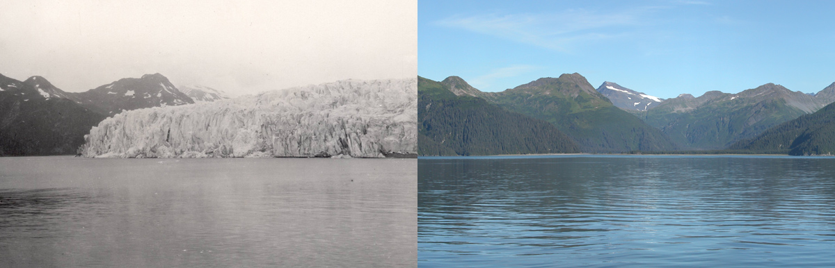
Of the images on the website, Nasa also has a wide array of photographs taken from people in the field like this:
Whether you’re doing research in order to debate against a climate change skeptic, for school, or for your own personal interest, Nasa’s climate website ought to be your first stop!
I agree with the above comment, this is a great resource. Nowhere else provides (presumably) solid live-data on our planet’s climate. While most of the figures are forecasts, it’s still troubling to see how quickly and how universally climate change has spread. What’s most unnerving is the world surface temperature map. It goes from being mainly blue to mainly red over the times observed. While the colors represented draw a stronger reaction than they would, say if they were reversed (red to blue), the map serves as a huge eye-opener that over 30 years, average surface temperature has increased by about 4 degrees. I also learned something about sea level that I didn’t think about before. I always thought that ocean rising was a result of melting ice, but this site also mentions the effect that heating can have on ocean volume. Since heat causes objects to expand, some of the sea level increases are the result of thermal expansion. Really interesting.
I would also agree that NASA website provide great information on temperature and Global Warming related data. The website is also very interactive; you can find videos and stimulations on climate change. Also, some of the NASA scientists blogs are interesting to read, even thought they might not be as reliable as the actual website, because the blog mainly provides information from one or a small group of scientists. NASA is somewhat unbiased; we should not forget that the agency research is sponsored by the government, however.