Map of the Week: Mexican-American War Overview Map

A Mexican-American War Overview Map generated by the United States Military Academy is certainly a qualified map for Map of the Week. This map illustrates the vast territorial expansion of the United States because of the Mexican-American War. Mexico lost half of its land as a result of the Mexican-American War! Not only did the war change the map of the United States, it changed the diplomatic relations of the United States and Mexico.

Imagine the contiguous United States without the American southwest? Can you? Well, if the United States had not won the Mexican-American War in 1848, the United States would strikingly different.  The Mexican-American War (1846-1848) stemmed from the United States’ annexation of Texas on December 29, 1845. Mexico felt that the United States had no right to annex Texas as Texas was part of Mexico until the Texas War of Independence in 1835. Mexico warned the United States that an annexation of Texas would lead to a war between Mexico and United States.

The Mexican-American War Overview Map highlights the disputed territory that caused a war between Mexico and the United States. This United States Army produced map also highlights the blockades set by the United States Military and the important military battles of the war. This map is deceiving, at a casual glance it appears to be a map of Northern Mexico during wartime, it is only after the viewer looks at the legend, does the viewer discover this is a map of the territorial expansion of the United States through military aggression.

This map illustrates a critical period in the United States’ history as a nation, the era of territorial expansion. If America had not won the Mexican-American War, if the America was not given Mexico’s land in the Treaty of Hidalgo, how would the map of the country look? What would America be like  it was not 50 states, if the American southwest were not a part of America? These jarring questions were at one time real possibilities; the United States even with its superior military force was susceptible to defeat. How would the national identity of the United States be different if there were no American Southwest?

The Mexican-American War Overview Map is not a historical document; it was not produced at the end of the war for the general public. The Mexican-American War Overview Map is a modern day map produced to teach military history to military students. There is no specific author credited for this map production rather it is a product of the United States Army at-large. This map is an ode to Army General greats, General Zachary Taylor and General Winfield Scott and their military brilliance which won the Mexican-American War. The map accompanied by a timeline of the war referencing important military battles during the war as well as a synopsis of both Taylor’s and Scott’s campaigns. Why would the army not praise two of its own who won the war that allowed Mexico to cede a half of its national territory to the United States?

The United States used its superior military force and resources to conquer Texas as well as force Mexico to cede its land. Through the use of maps, the United States was able to strategize how to defeat Mexico, mark where it had beaten Mexico, and redefine its territorial dominion. With the massive gain of territory for the United States, new maps including the territory won by the United States were created, and America’s dominance in North America reaffirmed. The United States’ ability to acquire territory from its weaker neighboring nation showed the United States shift from a relatively new nation-state into a Western Hemisphere superpower. The aftermath of the Mexican-American War was the undisputed imperium of the United States over the Western Hemisphere.

Posted in Maps of the Week | 2 Comments

Atlas Choice of the Week: Civil War Atlas

http://www.rare-maps.com/details.cfm;jsessionid=84309229957bc339349f2a5c6f273e666e10?type=maps&rid=850023

Published between 1891 and 1895, his atlas comes from “The Atlas to Accompany the Official Records of the Union and Confederate Armies”. This atlas has a large amount of information regarding the Civil War. The maps present in the plate include many battles of the Civil War, including the Battle of Cross Keys, and defense of certain cities, such as Knoxville. I enjoy the history of the Civil War and I found this map interesting because it brings you into the battle and defenses as if you were there, and shows very specific locations of troops and other military objects.

Posted in Uncategorized | Comments Off on Atlas Choice of the Week: Civil War Atlas

The Cassini Projection: How Should Earth Be Portrayed?

The Cassini Projection: How Should Earth Be Portrayed?

            The map shown above detaches itself from traditional cartography. To the average person, this map looks strange. It’s looks different and feels unnatural, contrasting greatly from a conventional map. The map is portrayed in the “wrong” direction and gives a person the feeling that it should be adjusted and set straight. For example, South America is stretched in strange ways, Africa is completely rotated and Central America is almost unrecognizable. You may think that this new interpretation of the world was never used, but this map is actually dates back to the late 1740’s.

The map shown above is defined as “The Cassini Projection”, proposed by César-François Cassini de Thury, a French astronomer and cartographer. Before creating the Cassini projection, César-François studied space and the stars through his work in astronomy and generated several topographical maps of France, specifically Paris. In his projection, the globe is first rotated so the central meridian becomes the equator. In the Cassini projection, the scale along the central meridian and to the immediate right of it is correct. On other spots of the map, as one gets further from the central meridian, areas become more and more distorted. Despite the fact that this map looks as if it is gnarled and inaccurate, the Cassini map was used often up until the 1940’s, when it was eventually replaced with the multiple types of the Mercator style.2 The original purpose of the Cassini map and similar maps during the eighteenth and nineteenth century was to give accurate results of smaller countries that were believed to be complete on their own, including France, Great Britain, and Belgium.2

The Cassini map is unique and different from the traditional North/South East/West maps of today. The way the map is visually portrayed makes the audience think differently of conventional directions. The projection of maps has been defined a certain way for centuries, most following the North/South East/West projection. To the eye of the average person, the Cassini map seems odd and out of sorts, especially due to the fact that Antarctica is nearly dead center, North America is to the south and Africa is rotated ninety degrees. This puts into play the politics of projection. The map symbolizes a somewhat “smaller” world, a world that is thin and stretched. It also reminds the audience that the majority of the world consists of water and indicates that most of land activity is actually focused above the equator (in this case the meridian).

The orientation of a map controls a person’s perception. North, South, East, & West are all rhetorical & social constructions. To this day, the origin of maps depicting the typical North, South, East, West orientation can be traced back to early AD. The original cartographer who invented the typical projection set the standard of what every map “should” and “should not” look like. When a person sees a map that has a different orientation, such as the Cassini projection, that map feels strange and out of place. North and South are just inventions that are taken for granted. The world needs these strange projections in order to remind us that maps aren’t normal givens. For a United States citizen, one might say, “Why is my country not where it normally should be?” Another example is due to the fact that Africa is centered and “North” above the equator, political implications are put into play. This could cause cartographers and social activists of today to argue that Africa has a greater importance in the world.

The “oddness” of the Cassini projection map raises the questions, “How should a map be orientated?” and “How are we actually orientated in space?” As Denis Wood said in his novel The Power of Maps, “what the map shows us is…reality”. Maps create a sense that there is no reason to question the true orientation of the world. As one looks at the Cassini projection map, it helps us question the true idea of a map and where certain countries are located, and the importance of their location. The map itself is an argument presented rather than a reality. This argument is how should a country, some continents, or the earth as a whole be presented to an audience. The cartographer creates the map through his/her own bias, and as the audience views the map through the lens of the cartographer, our view is skewed. This allows maps of all different types to socially and culturally construct the earth through several different scales and perspectives. The true power of the map lies within the hands of the mapmaker and he/she decides which way the world should be depicted. The mapmaker does have a large amount of power when they choose to depict the world in a certain way, but the audience has a similar amount of power in the way they interpret and digest that particular projection. The power struggle creates a tension between the mapmaker and the audience.

The Cassini projection map portrays to us the difference in orientation. The world is still round and it is impossible to be captured on a single, flat page. If one looks specifically at the Artic and Antarctica, it is easy to acknowledge that the world is round. On conventional maps, these two locations are distorted but are not on this map. This relates directly to the mapmaker and his motives. Why would he/she put certain locations in certain spots on the map? Without the Cassini map and similar projections, millions of people would never be able see the world from a different perspective. This map sets the tone of how a different orientation can change one’s viewpoints and causes them to question how something should be orientated. The politics of projection can shape a person’s perspective without that person consciously realizing and whoever decides this positioning has an immense power to change their perspective. Cassini’s projection is almost never seen today and one might think, what if we began to use this map projection instead of the traditional map? Would our view of the world still be the same? The Cassini projection causes us to think of these questions and how the world should truly be portrayed.


—Ryan O’Reilly—

 Works Cited


Wood, Denis, and John Fels. The Power of Maps. New York: Guilford, 1992. Print.

“The Cassini Projection.” [ARCHIVED CONTENT] GeoFacts from Ordnance Survey:. N.p., n.d. Web. 20 Oct. 2014.


Posted in Uncategorized | 3 Comments

Atlas of the Week: Revolutionary War: Southern Theater, 1776-1781

http://wps.pearsoncustom.com/wps/media/objects/2428/2487068/atlas/atl_ah2_m002.html

This atlas shows all of the battles between the British and the Americans in the south during the Revolutionary War between the years 1776 and 1781.  The different colors of the arrows represent movements by the British and American armies during this time period in the war.  There are also miniature sparks on the map that represented victories by either army.  The cartographer even wanted to include movements by the separate armies by water as well.  He or she really sought to prove to the viewer of the map that there were some brutal battles between the Americans and British in the southern region of the Americas.

Posted in Uncategorized | Comments Off on Atlas of the Week: Revolutionary War: Southern Theater, 1776-1781

Map of Week: Greetings From Long Island

For this week’s map of the week, I decided to choose a map that I was particularly familiar with and has a certain relevance to me.  As long as I can date back my lineage, my entire family has lived on Long Island.  Long Island has always been and will always be a place that I feel like I can trace my roots back to.  My Dad and his family originally lived in a town called Hicksville, which is shown in the central part of the map, before they eventually moved to the town that my family and I live in today, Garden City.  Many of my fondest childhood memories have taken place on Long Island and although I may be biased I have always felt that it has so much to offer to those who live there as well as those who come to visit.  Whether its going to the beach, boating, attending a concert of your favorite band, international airports, golf courses, historical sites and near one of the largest cities in the world, Long Island has everything that someone could ever want if they lived here or even if they just stopped by for a visit.

I find this particular tourist map of Long Island to be very unique.  Even though Long Island is an island, it’s located right next to Connecticut and New York.  This map of Long Island completely takes Connecticut and New York out of the picture, making it really stick out to the viewer’s eye.  It forces the map viewer to see all of the things that you really can do on Long Island.  Similar to the North Carolina State Highway map that we looked at in Denis Wood’s novel, this particular map of Long Island is trying to sell to people on all the things you can do on Long Island and that you should visit.  Both of these maps looked to prove to the viewer that there are various activities to do as well and many different places to see.  These maps also wanted to make sure that no space on the map was wasted and tried to include as much information as they could. The cartoonish nature of the map is also something that stuck out to me.  These animations show all of the different sites and events that you can do and see on Long Island.  For example, the fisherman and boats represent all of the great fishing and boating locations that Long Island has to offer.  I think the author, who is anonymous, really wanted to show to the viewer just how unique these opportunities are.  It is not often that you have waters that are great for fishing and have access to calm waters for boating.  Whether it’s taking your boat out of Montauk past the Montauk lighthouse looking for a that massive catch of the day or casually boating in the calm waters of the Long Island Sound, this map shows all of that through the cartoon pictures along the coastline.

There were also some very interesting images on the inland portion of the map that stuck out to me and reminded me of some of my past experiences.  Some of these things that stuck out to me were the cartoon pictures of the golfer, the racehorse and the Ferris Wheel at Coney Island.  The golfer is there to represent the Bethpage Black Course, one of the most difficult golf courses in the country and the racehorse represents Belmont Park, the location of Belmont Stakes each year.  The Ferris Wheel is one of the main features of Coney Island’s famous amusement park.  It’s amazing how cartography can make you remember some specific events in your childhood.  When I see these cartoon pictures pictured on the map, they immediately bring me back to some specific events in my childhood.  I remember playing golf at Bethpage in the summer with my friends, attending horse races on Sundays with my Dad and I also remember riding on the Ferris Wheel on trips to Coney Island with my family.  I feel like the author decided to include these particular features because they are some of the main attractions for people who live on Long Island as well as tourists who come to visit Long Island.  These are just some of the things that I will think about and remember when I see this map.  For someone who has never been to Long Island, they would be able to tell from looking at this map that Long Island has a ton to offer to people.  The cartographer didn’t waste any space on the map and tried to include as many of Long Island’s main attractions as he could.

This anonymous tourist map of Long Island ended up having more of a personal connection to me than I had originally thought.  As I continued to dive deeper into the map I realized just how meaningful Long Island is to me.  This tourist map brought me back to some fond memories I have as I remembered participating in the various different activities that Long Island has to offer.  It truly is a place that I can call home.  This particular map really helped me to realize this and it is incredible how what seems like a simple tourist map of Long Island can have such a special impact on someone.

Posted in Uncategorized | 6 Comments

Map of the Week: “Smileage Guaranteed”

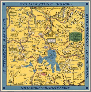
     At first glance, Jolly Lindgren’s 1936 map, “A Hysterical Map of the Yellowstone Park with Apologies to the Park”, immediately pulls you in with its intensely mustard-yellow color  and its “Smileage Guaranteed” promise. Its initial intrigue is a result of its strangeness and deviation from the typical historical and roadmaps of the period, but upon further analysis of its historical context, this map gains a deeper meaning as a tool to mitigate the cultural anxiety of Americans during the Great Depression.

Firstly, a description of Lindgren’s map: The entire park is colored yellow, possibly indicative of the park’s name, with the roads clearly marked in red. All throughout the map are drawings of mountains and their respective elevations. These elevations are the only numbers on the map. The most obvious missing parts of the map are the legend and scale, which is ironically replaced by a musical note scale. The locations of interest are accompanied by small, pictorial representations of their names. For instance, Hot Springs is literally a picture of springs that are sizzling. These interest points are included for the benefit of a tourist; the map shows hotels, large waterfalls, peaks, Yellowstone’s famous geysers, and so on.

This map was created during the Great Depression and it represented one possible way that Yellowstone was imagined, which created a sense of escape for its dispirited readers during this time of great suffering for America and the world, The Great Depression is most often remembered as the decade of bread-lines, Hoovervilles, and the plunging of the American morale. From this psychological pit emerged the humor of the 1930s, which served to combat the “creeping paralysis of will and spirit that had sapped the American people”(American Literary). Lindgren implements this 1930’s humor in the creation of his map of Yellowstone Park in order to lift the burdens of his audience, if only for a few moments.  Among the characteristics of 1930s humor is the use of silliness. The original intention behind creating Yellowstone Park was to protect its natural “curiosities” and “wonders” (National Parks for). Lindgren uses these “curiosities” to project silliness on to the map with small pictorial representations, from the “Hot Springs” on the bottom to the “Gr-r” of “Roaring Mtn.” in the upper half to the left.  In addition, the gaudy yellow that covers the entire map conveys a sense of happiness. Because the yellow is unnaturally mustard-colored, it contrasts sharply with the real natural world and works to transport the reader into a alternate world, where their suffering is alleviated. This color was chosen for all of Lindgren’s Hysterical Maps, as it draws attention to the map while helping its reader escape the anxiety of the Great Depression.

Lindgren’s map also uses another characteristic of the humor of the 1930s, its ironic critique of previous eras, in his Yellowstone map. He incorporates this by using what Wood would call “silences”. The audience expects a traditional historical map, but that expectation is immediately rejected upon reading the title, which makes a point of calling the map “hysterical”. The title also points out that the map includes “ a few minor ? changes”, while the changes are actually huge contrasts to the typical map. Usually, maps try to project a scientific reality through preciseness, but this map makes no such effort; instead, it uses irony to mock this type of mapping. The lack of a legend and the use of an unconventional scale and uncertain compass rose all display this map’s immense amount of irony, amusing the audience while critiquing traditional “scientific” maps. As Wood discusses, legends can be dispensable and when they are used, they only explain a portion of the symbols on a map. By leaving out the legend, Lindgren is challenging the idea that they are needed at all to understand maps. He also notes that a scale is unimportant to his own map by replacing the numerical scale with a musical one, a gently ironic stab at precise, “true” maps. The amusement continues with the compass rose, which claims that  “This part is correct, so ‘elp me,” implying that the rest of the map may be wrong. This directly contrasts with the priority of scientific maps, which focus on being precise and promote “objectivity”. By leaving out numerical measurements and the typical tools of a map, Lindgren is arguing that this objectivity does not really exist in mapping. The end result is a map that is focused on being extremely amusing and symbolic through its cartoonish puns, while playfully subverting conventions of mapping at the same time.

This map also functions as an encouragement to readers to leave their worries behind for a bit and enjoy nature in Yellowstone, if not by physically traveling then by imagining a trip there. During the 1930s, Yellowstone started building shelters for cars in the park and paving its roads in order to accommodate tourist travel. This marked Yellowstone as a destination to visit, a place to spend leisure time, and something to get Americans’ minds off of their troubles. Visitation exploded with the automobile and as a result of the park’s efforts. Lindgren’s map emphasizes this tourism-driven aspect of Yellowstone by clearly distinguishing its roads with a bold red color and displaying the points of interest all along these roads. This purposely shows the ease with which a tourist could visit the “wonders” of the park, effectively shouting “Come and visit!” Even if the reader could not physically go to Yellowstone, due to restrictions of money or daily life, this map creates an optimistic geographic imagination, which Schulten writes about, that relieves the burden of the Great Depression, if only for a moment. It creates a space in the geographic imagination of America where there is the possibility of pure enjoyment. The yellow covering the entire park applies this idea of pleasure to the idea of Yellowstone and helps socially construct Yellowstone to be associated with happiness. All the reader had to do was imagine a trip to Yellowstone and they could escape the burden of the Great Depression, if only for a short time.

     The humorous nature of the pictorial representations, dramatically giddy yellow color, and tourist-focused nature of the Lindgren’s map give it a personality of its very own. With its musical scale, Lindgren’s map is definitely not a calculated, scientific map that pretends to be purely objective. Instead, it becomes a “living and breathing” active document that creates a whole new, happy reality for its burdened audience. Its joking tone tells the story of a fun-filled, yet leisurely, trip to Yellowstone Park to escape the struggle of everyday life that remained the reality during the Great Depression.

Bibliography

Gates, Robert Allan. American Literary Humor During the Great Depression. Westport, CT: Greenwood, 1999. Print.

Lindgren, Jolly. A Hysterical Map of the Yellowstone Park with Apologies to the Park. Lindgren Brothers, 1936. Accessed October 15, 2014. http://www.davidrumsey.com/luna/servlet/detail/RUMSEY~8~1~260351~5522946:A-Hysterical-Map-of-the-Yellowstone#

Machlis, Gary E., and Donald R. Field. National Parks and Rural Development: Practice and Policy in the United States. Washington, D.C.: Island, 2000. Print.

McClelland, Linda Flint. Building the National Parks: Historic Landscape Design and Construction. Baltimore: Johns Hopkins UP, 1998. Print.

National Parks for a New Generation: Visions, Realities, Prospects: A Report from the Conservation Foundation. Washington, D.C.: Conservation Foundation, 1985. Print.

Schulten, Susan. The Geographical Imagination in America: 1880-1950. Chicago: Univ. of Chicago Press, 2001.

Wood, Denis. The Power of Maps. New York: Guilford, 1992. Print.


Posted in Maps of the Week | 1 Comment

Atlas of the Week: Beyond Planet Earth

The Times Atlas of the Moon

This atlas is the one-stop shop for anyone mildly curious about the moon. It includes general information, the history of mapping the moon, and techniques of lunar flight, etc. The maps of the moon are displayed in sections from a grid of the moon. On page 58, you can see Tranquility Base, where Neil Armstrong and Buzz Aldrin first landed on July 20, 1969.

One of the primary goals of mapping the moon, according to the information in the Atlas, was mapping landing sites. We were projecting ourselves on to another mass in space for the first time, taking another step in our a long relationship with the moon. The atlas, printed in 1969, even implies that we should develop and construct on the moon, which is becoming more and more of a reality in the present day.

“Adequate maps are a prerequisite for proper development. They are needed for efficient and orderly planning, prospecting for and recording the land’s natural resource, selecting sites, and alignments and for construction.” (Lewis)

This atlas is available in the library in the Oversize Books section, Call Number QB595 .T5x.

Lewis, H. A. G. The Times Atlas of the Moon. London: Times Newspapers, 1969.

Posted in Atlases of the Week | Comments Off on Atlas of the Week: Beyond Planet Earth

Atlas of the Week: Growth of a Nation

http://www.animatedatlas.com/movie.html

This is an animated atlas that displays the geographic history of the United States of America, beginning in 1789.   It is really unique in that it is animated and, therefore, is a single map that changes as you progress along the time line at the bottom.   The atlas discusses changes due to wars and relations with other countries, growth and expansion over time, and battles within the US.   You have the option to either play straight through or break it up into three sections of history, completion of territory, the civil war, and post civil war.

Posted in Atlases of the Week | Comments Off on Atlas of the Week: Growth of a Nation

Map of the Week: It’s a Small World

Since its introduction in Disneyland in 1966, It’s a Small World After All has been one of the most well known rides with a catchy, and often annoying, theme song.   From the first reindeer on a hilltop in Scandinavia to the final “Au revoir,” this lighthearted boat ride takes many children on their first global adventure in a unique way that, while bright, colorful, and lively, may not be so accurate.

Due to the space available and the implications that come with a children’s boat ride at a theme park, the journey takes place along a cartographically inaccurate route.   The audience travels along an extensive, winding river that travels the “world” with the postcard-perfect pictures of various countries with mechanical dolls dancing and the prominent architecture and stereotypical clichés associated with that country appearing on either side.   Disney focused on the prominent memorable features of each country and displayed what the audience would be familiar and happy with, instead of anything about the country or its culture.  While these icons, such as the Taj Mahal in India or the pyramids in Egypt, are not inaccurate, they minimize the experience of the world to a few main symbols when, in reality, there is much more depth to each country through the culture, the food, and the daily lives of the people.  This same approach was present in the route and layout of the world throughout the ride.   However, Disney’s ideology is crucial because it provides the basis for the “geographical imagination,” or the cultural and geographical understanding, of the world for the majority of people who board this ride and may not have the opportunity to visit all of the countries around the world.

The map “It’s a Small World” by Jonah M. Adkins captures Disney’s ideological viewpoint perfectly.   It displays the journey on a fun, colorful map of the route the boat takes around the world.   On the map, the individual countries are labeled, but there are no lines or barriers to portray a distinct separation; instead, the countries all connect together in one continuous strip.   While it makes sense that a ride appealing to children would present the world as a harmonious, fluid place, this portrayal conceals the reality of the world we live in where borders and wars over territory exist.   Not only is there little distinction between countries on the map, but also the groups of countries that represent the assorted continents and regions flow into each other seamlessly, making it appear as if it really is just one small world after all.

The only tactic that does, however, separate these regions is the color-coding by the cartographer.   The ride may link the entire world together into one, but the cartographic choice to color different regions different colors enables the audience to see the distinction between various areas around the world.   It also gives the viewer a more concrete idea of the order the ride progresses through the world and which regions are put next to one another.   This choice by the cartographer is a political one because he felt the need to distinguish between regions even though that distinction wasn’t present on the ride he is portraying.   This grouping indicates some relationship or similarity between the countries included in each color, which is an inaccurate assumption that ignores the diversity present within each continent.   Conversely, Disney chose not to specifically identify the various continents, even though it did conform to the idea of continents through the order the ride progresses.

The order itself is an interesting component brought out by the map that, while not a choice of the cartographer’s, reveals more about the identity and viewpoint of Disney.   The world is travelled in a circular way, starting in Europe and proceeding to Asia, Africa, South America, and the South Pacific, and ending in North America.   There is a unique contrast between the commencement in Europe, the origin of American colonization and the continent that shaped many of America’s core values, and the conclusion in North America, creating a feeling of returning “home” after a long journey around the world.   These ideological decisions made by Disney show the origin of the ride and the company itself by making its familiar homeland the grand finale.

The other curiosity apparent from this map is Disney’s decision on the location and inclusion of certain countries.   Holland is located next to Spain, Thailand is across the water from Japan, and Hawaii borders Australia.   The image of one small world and the inclusion of visually appealing buildings and dancing machines take priority over global accuracy, which is a curious choice for a ride that introduces many young children to the entire world for the first time.   Given that this may be their first “experience” with the world, Disney’s choices may influence the idealizations or stereotypes of its younger audience.   Along with the inaccurate location of the countries, the choice to make the second-to-last region the South Pacific instead of the final continent of Australia again reveals the ideological nature of the map.   The most efficient method would have been to organize the boat ride through the continents.   Since, however, the continent of Australia only includes one country, it would have paled in comparison to the other continents, so the next-to-last section is the greater South Pacific area instead.   Along with this breaking of the continent theme, certain countries are in questionable locations, such as the inclusion of Hawaii in the South Pacific instead of North America and the placement of Mexico next to Central America in the South American section of the map.

Overall, this map is an excellent portrayal of Disney’s It’s a Small World After All with its bright colors and journey through various countries on the fun boat ride around the world.   However, the map highlights some ideological choices made by Disney that speak to Disney’s identity and the impression it leaves on naïve children.   The themes and décor and the inclusion of stereotypes, along with the general flow of the ride, put the educational value of the ride at risk.

Posted in Maps of the Week | 3 Comments

Atlas of the Week: Atlas for the Blind

Atlas for the Blind

The David Rumsey Map Collection has preserved and digitized this unique 1837 atlas of the United States.  Made by Samuel Gridley Howe to help children at the New England Institute for the Education of the Blind, the atlas compiles embossed images of each state, complete with borders, rivers, mountain ranges, and text each marked by a different textured engraving.  For instance, borders are represented by dotted lines and rivers by smooth lines, each protruding from the page.  Accompanying each state image is a page of text verbally describing the tactile experience of exploring the state.  Even though geography is predominately understood visually, this atlas disregards convention and takes mapping and cartography into a remarkably new frontier.

Posted in Uncategorized | Comments Off on Atlas of the Week: Atlas for the Blind