North Korean Prison Camps Map

camps-overview-with-boundaries

camps-overlay2

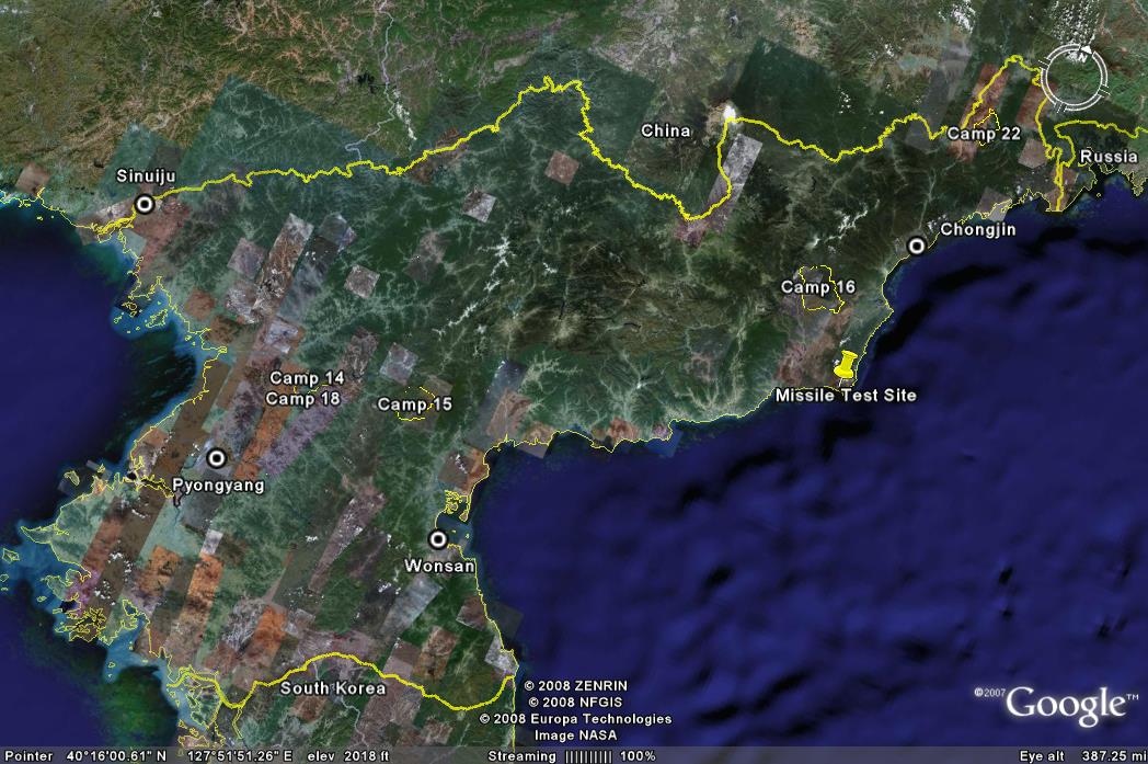
The maps of North Korean PrIson Camps were made to introduce North Korean Prison camps through google earth. The map contains two parts, which are the North Korean Prison camps and the google earth. Therefore, we divided our presentation into these two part. In the presentation, before we moved on to the main topics of our map, we first briefly introduce the evolution of digital mapping. In the 1950s, due to the inconvenience of computer tools, cartographers simply used that computer software to change the shades of areas on maps in order to show population density or other thematic data. Then in the 1970s, cartographers were able to add time into the map. After 1996, the new era of cartography started, which brou ght “democratization” into maps-everyone were able to access into map creation.  

Then we moved on to our first topic-North Korean Prison Camps. There are three types of prison camps in North Korea-Political Prison Camps, Labor Reeducation Camps and Collection Center and Labor training centers. Political Prison Camps were normally very large, punishing political criminals. However, under North Korean policies. The family members of the criminal would also be sent to other camps simultaneously, which creates a domestic terror of North Korean regime’s systems. Labor Reeducation Camps were mostly for people who were caught trying to flee the country, and Collection Center and Labor Training Centers were for economic criminal. Due to the insufficiency of food, many people died in the camps within one year.

Google Earth is a computer software that was created by a company that was funded by the CIA in 2004.  It was bought by Google in 2005, and released for public use.  It is a virtual 3D perspective of the world that is made by placing images taken from satellite images, aerial photography, and geographic information systems onto a globe.  Many people use Google Earth to look at various places in the world that would be hard to see otherwise, and make their own points.  Google Earth also allows people to upload their own images.  There are some potential downfalls of having an application that allows people to make their own data points on maps and upload their own images.  For example, these maps are not necessarily correct — since they are being looked at from a bird’s eye’s view, some of the makers of these maps could have misinterpreted what they were looking at and published false information.  Also, people may upload images of a place that is not where a picture is taken.  When using an application that can zoom closely into the entire world, you would like the images taken there to actually be taken there.  However, there is no way that Google Maps edits the images for accuracy.  

There are also some societal issues that come about with an application like this relating to private and national security, and information.  People are not warned when the images are being taken, so Google Earth can show aspects of their lives to anyone that people may not want photographed.  Another issue relating to individual security is that this application can actually show all of the possible entrances to a house, which can lead to robberies and people feeling unsafe.  Some of the issues with national security is that we can see clearly images of other nations, such as their army bases and prison camps, and these are things that they may not want anyone with a computer to have access to.  Another aspect of this is it could be potentially dangerous to have this information available to anyone, and terrorist attacks could occur.  One of the societal question relating to information is: If the technology is available and owned by a company that wants to share it with the public, then should it be allowed to have restrictions by various nations?  By having this information available, it can also show countries their weak points and allow them to protect themselves more.

Through discussion we discussed how even Google Earth is biased, even though it is actual images of the earth.  We also discussed how like the airplane, satellite imaging can bring the world closer and closer together.  

–Emily Ferkler and Violet Zeng

Posted in Uncategorized | Comments Off on North Korean Prison Camps Map

New “Executive Abroad” Map, Courtesy of UR’s Digital Scholarship Lab

18121799_10101757109785097_6334872925368555657_o

[Click on the map above to enter the Executive Abroad site on the DSL’s American Panorama]

Before the twentieth-century, no sitting president and only a single secretary of state traveled outside the United States. With several modest and one very significant exception–Woodrow Wilson’s more than half year abroad at the end of the First World War–it was not until the Second World War that international travel became common for presidents. In the first decade of the twentieth century, Theodore Roosevelt and William Howard Taft together made three trips to two places, the U.S.-administered Panama Canal Zone and just across the Rio Grande into Mexico. A century later their counterparts George W. Bush and Barack Obama together made more more than 300 trips, traveling to all corners of the globe.

Beginning with Franklin Delano Roosevelt, foreign travel by presidents became the norm. This both reflected and reinforced the United States’s government’s more active role as a global power in the twentieth century. But some of the more dramatic bumps in on the frequency of travel by presidents are arguably more a product of technological innovation than any change in the U.S.’s stance towards the world. The noticable increase in 1959 followed the introduction of a Boeing 707 jet for presidential travel; that of 1990 a new, more capable and luxurious Air Force One. Executive travel represents an important form of soft power, and this map projects its growth during what’s been called the American Century.

Sources

The majority of the data for foreign trips by presidents and secretaries of state come from the Office of the Historian, Bureau of Public Affairs, United States of America. 2016 travel data for Barack Obama came from Wikipedia and for John Kerry from the U.S. Department of State website. An excellent study is Richard J. Ellis’s Presidential Travel: They Journey from George Washington to George W. Bush (Lawrence, Kansas: University Press of Kansas) 2008.

Acknowledgments

This map is authored by Robert K. Nelson, Justin Madron, Timothy Barney, Lily Calaycay and the students in Barney’s “The Rhetorical Lives of Maps” seminar: Will Alpaugh, Bryan Carapucci, Zach Clarke, Emily Ferkler, Cathryn Flint, Mitchell Gregory, Paige Harty, Annie Hunter, Madison Kloster, Sean Menges, Dan Robert, Michael Roberts, Lauren Scheffey, Maddie Shea, Mason Zadan, and Violet Zeng.

The Andrew W. Mellon Foundation generously provided grant funding to develop American Panorama.

Posted in Uncategorized | Comments Off on New “Executive Abroad” Map, Courtesy of UR’s Digital Scholarship Lab

Blog of the Week: Something About Maps

https://somethingaboutmaps.wordpress.com


Somethingaboutmaps is a fascinating cartography blog. A blog kept by Daniel Huffman, not only does the blog contain different maps, but the core of its content focus around Huffman’s cartographic techniques. Mapping islands, overlaying rivers and choosing fonts are some of the cartographic issues Huffman covers in his blog.

Posted in Uncategorized | Comments Off on Blog of the Week: Something About Maps

Atlas of the Week: Maps of the First World War

https://www.loc.gov/rr/geogmap/pdf/plp/occasional/OccPaper7.pdf

Whereas an Atlas is a books of maps, Maps of The First World War is an essay of maps. All sorts of maps from World War I, depicting supply lines, orders of battles, and America’s largest offensive of the War, are strung together in this atlas. The atlas’s publisher, Philip Lee Phillips Map Society of the Library of Congress, was “established to stimulate interest in the Geography and Map Division’s car- tographic and geographic holdings.”

Posted in Uncategorized | Comments Off on Atlas of the Week: Maps of the First World War

A Chart of Cosmic Exploration

P-Space_Zoom-9-20

Click here for a zoomable image (Courtesy of Big Think)

A Chart of Cosmic Exploration, on its surface, may seem like a harmless, information-delivering apparatus intended for a casual audience. However, at a time when science is being politicized, this chart comes as a way for that casual audience to get in touch with a side of humanity that has always pushed us forward: our need to explore.

The first choice of the author is blatant, yet is easily naturalized in the map. The choice to make the solar system appear linear, with the Sun barely making it on the page on the far-left side, and Jupiter catching the eye as the apparent center of the system, is reflective of a long struggle between traditional thinkers and scientists. There was a time when astronomers were jailed for suggesting Earth was not the center of our universe because their remarks threatened religious institutions and the like. Even though all of the spacecraft originate from Earth, Jupiter is undoubtedly the center of the map. Given that our solar system exists in a vacuum with no sense of direction other than what we assign as relative to the Sun, it is clear there must have been distinct intention by the author to create the two-dimensional map with our Sun to the left, Jupiter in the middle and Planet 9 all the way on the right.

The second most important choice by the author was not including any sign of nationality. Looking closely at the image of Earth, North and South America, as well as portions of Europe and Africa, are the only continents in view. However, other than that inclusion, which can be attributed to the fact this map was American made, none of the spacecraft, all of which originated from countless countries (The European Space Agency is responsible for a number of the launches, and through corporation partnerships/direct memberships is associated 31 different countries) have no country of origin on the map. The Chart breaks each craft down by its destination, purpose (Fly-by, Orbiter, Lander, Atmospheric Probe, or Rover) and name. In a field of research born into and defined by the Cold War space race, it is remarkable that in today’s day and age, perhaps the only comprehensive chart of man’s endeavors into our universe is not defined by nationalities. This speaks in volume to the idea that exploration is an inherent trait in all humans, not just Americans.

This map, though simple at first look, compels its readers to find their need to explore. As science is generally associated with being math-centric and complicated, an intentionally neat, aesthetically pleasing map allows casual readers to interact with what they may only find elsewhere in scholarly journals or 100-page Wikipedia articles.


References

Berman, Robby. “A Massive Poster of Earth’s Spacecraft and Missions, So Far.” Big Think. 04 Dec. 2016.

Williams, David R., Dr. “Tentatively Identified Missions and Launch Failures.” NASA. NASA, 26 Nov. 2014.

Nikis, Mario. “What Is ESA?” European Space Agency. 24 Jan. 2017.

Posted in Uncategorized | 2 Comments

Fragile States Index (2016) Blog

2016heatmap

Our map was the 2016 Fragile State Index. It highlights, based upon several criteria, which states are at the greatest risk of collapse, and those which would likely remain stable for the foreseeable future. The categories nations fall into go from blue, being the most stable, to red, being the least stable. The criteria evaluate a country based on Demographic Pressures, Refugees and IDP’s, Group Grievance, Human Flight, Uneven Development, Poverty and Economic Decline, Legitimacy of the State, Public Services, Human Rights, Security Apparatus, Factionalized Elites, and External Intervention. The goal of the map is to predict future conflicts, and thus help to reevaluate public and foreign policy in order to avoid catastrophic conflict.

 
During our in-class discussions we analyzed the context of the map, and evaluated how the map relates to our previous studies. The map should be able to adequately represent the conflicts going on during the published year, and even predict future events. Some current events evident include the Civil War in Syria and North Korea’s nuclear threats. Still, we failed to see how the criteria, and the portrayal of any data, could be comprehensive or reliable enough to do so. We do not have access to the algorithm, and so cannot see how evidence is weighted. Further, the criteria themselves are dubious, as one issue in a nation could lapse into more than one category.

 
As for how we used the map to compare Cold War era mapping to the present day, there is a definitive shift in how we view the developing world. In Cold War era mapping, it was more black and white, with developed nations and undeveloped nations, wherein aid given to those nations were performed with the intention of gaining allies against the Soviet Union. In the Fragile States Index, it views the world as more complex, with a gradient view of the world’s stability. Also, in Cold War mapping the only relevant conflict was the impending threat of nuclear war between the United States and the Soviet Union. This is not the case in the Fragile States Index, as there is evidence of many, more complicated conflicts. Furthermore, the Fragile States Index does not uphold the United States to be the shining example for the world. Rather, the welfare based nations of Northern Europe are seen as the example. If this is caused by a bias, it can be attributed to the NGO that organized this project, as they are traditionally left leaning and see safety net policies as indicators of stability.

 
Even if we dissociate from the possibility of unseen bias, there are still obvious indicators of a political agenda, and more broadly, flaws in the portrayal of the data. For instance, Crimea is still included with the Ukraine. Macau and Hong Kong are considered to be a part of China, despite the fact that they are autonomous city-states (though it is debatable whether that is changing). Their stability should, be all means, be higher than mainland China. Other nations are presented without data, including Taiwan, French Polynesia, Greenland, and Norwegian Svalbard. More problematic is the presented dichotomy between failed and stable states, and the misconceptions that can form from an uneducated eye. Within a failed state there are pockets of wealth and success, while in a first world nation there are regions that would be more closely associated with the third world. The result is an uneducated, marginalizing view of those nations apart from Western society. While there is much that could be gained from an index of this kind, the execution of the data and its portrayal on the map avoid the very intentions set out by researchers in the first place.

Posted in Uncategorized | Comments Off on Fragile States Index (2016) Blog

Walt Disney World Atlas for Cast Members

In 1986, Walt Disney World distributed this atlas to its employees to show various locations throughout the resort.  These locations included existing locations, like the Magic Kingdom, the EPCOT Center, the Fort Wilderness Campground, the Contemporary Resort, Lake Buena Vista Village, and Walt Disney World Village.  The atlas also included future locations, like Disney-MGM Studios and Pleasure Island.  This map was only distributed to employees, and was not for public use at all, since it showed employee entrances and exits, including a map of the underground tunnels underneath the Magic Kingdom.  This map is really fascinating because it is interesting how much the resort has changed and grown over the last thirty years.

Disney World Cast Member Atlas


Posted in Atlases of the Week | 1 Comment

Children’s Map of the World

Children's Map of the World

While searching for maps, I came across a map that was very similar to the first map that I ever saw in elementary school.  This bright, colorful, and bold map drew my attention because of the colorful cartoons that made me interested in visiting as many of these places as possible.  This map sparked my interest in traveling the world.  While I was not sure what every country on the map was, it gave me some information about the different type of people in each region.  In 1966, the Genuine Company Limited created the Dino map, which is the world’s leading producer in children’s illustrated maps for educational purposes.  These maps are used in classrooms worldwide, and are often students’ first experience studying maps.  Analyzing how this map manipulates young viewers into thinking certain things about different places.  The various images projected on different countries can lead to some judgements about each country and the type of people that live there.  These images can lead to many stereotypes for different locations, which can lead to stereotypes for different types of people.  Since these stereotypes are being presented on a map targeted toward young children, it can lead children with impressionable minds to have certain opinions about types of people that may be false and harmful to a person’s future view of the world.

This map displays various important historical events, famous architectures, various modes of transportation, different animals indigenous to each location, and even stereotypes of types of people from various places.  These images are important because they are highlighting what the map maker finds significant about each location.  Also, the place where they put each image is important because it could potentially block another important location.  This map is very U.S. centric.  Nations other than the United States are misrepresented by the stereotypes that people in the United States have of these nations.  The images projected near these other nations present the history that Americans think about, which might not be the most significant part of their culture.  An example of this is for Ireland, where the map shows St. Patrick driving the snakes out of Ireland.  This is for many Americans, the only thing that they know about Ireland’s history, even though there is a much richer history in Ireland.  For Germany, there is a woman in Dirndls drinking a beer with the word “Oktoberfest” underneath.  In the Atlantic Ocean, near Gabon, there is a simple boat that is labeled “African Boat.”  This is actually quite offensive because Africa is a continent with many countries with hundreds of different cultures.  By putting all of these nations and tribes under the same category for a type of machinery, this map is ignoring the diverse cultures in the continent of Africa.  In Scotland, there is an old man in a kilt playing the bagpipes, and the Lochness monster.  My final example of this is in Mexico, where every figure has a sombrero on it.  These negative stereotypes can give young viewers with impressionable thoughts preconceived ideas about people from certain places.  These stereotypes that are represented in this map can lead to many misinterpretations for young viewers about places, especially about the people who live in these places represented on the map.  Since this map is targeted towards a young audience it is especially important to see how things are properly represented because this map is supposed to be shaping the maps of future generations.  Maps can cause a myth that leads the audience to feel a certain way about these different types of people based on the stereotypes represented in the cartoons on the map. These stereotypes on the map can lead to future generations of American having negative views of people that are different than them.

However, in the United States, the map shows many of the best aspects of the nation.  For example, there are two students with graduation caps on with the words “Harvard and Yale University” underneath the picture.  This is inaccurate information because these universities are about two-hundred miles apart.  There are even quite negative representations of different cities in this map represented on the map.  For example, where Detroit is, there are two men in baggy clothes holding up peace signs with the word “Rapping” underneath.  While rapping itself is not necessarily negative, the fact that the entire city is defined as rapping is stereotyping the whole city as being into rap culture.  People often equate rap culture with African-Americans, and there is a high percentage of African-Americans in Detroit.  By writing “Rapping” underneath the city of Detroit, this map could be alluding to the high percentage of African-Americans, which emphasizes the racism on this map.

There are a few inaccurate representations on this map that could misconstrue a viewer’s opinion of the world based on viewing this map.  For the notable locations, states and cities, in the United States, it includes New York, Washington, DC, and Mississippi basically right next to each other.  There are many states in between these locations, but these locations are overshadowed on the map by what the mapmakers perceive as important locations.  There are also a number of mythological creatures featured on this map, such as Aliens, the Lochness monster, and a vampire.  While these images may give an accurate description of what people in that area may believe and their traditions that are based on these creatures, it can be misconstrued by the viewer.  Since the viewer of this map would be a child, the children could actually believe that Vampires live in Transylvania.  These images can give children false beliefs in unreal characters and also give young children a false idea of what the people in these places actually believe in.  These inaccuracies can lead to a false understanding of the world to the young viewers of the map.

While the illustrations represented on these maps can be helpful in engaging younger audiences, some of the images detracted from the accuracy of the map.  This should be considered, especially when thinking about who the audience of the map is.  Young children are extremely impressionable, so changing this map to make it portray less stereotypes is extremely urgent.  When teaching children about the world using maps, we need to consider whether it is more important to keep them fascinated by using bright colors and pictures, when there may be social repercussions based on the inaccurate stereotypes and inexact information on it.

Posted in Maps of the Week | 3 Comments

The Nuclear Club

Nuclear Club (2)

The Nuclear Club map was created in 1981 in London by Michael Kidron and Ronald Segal. This map can be found in State of the World Atlas, which was part of the Pluto Project. The Pluto Project was the work of economic and Marxists theorists, who believed that Europe was more than just an area between Russia and the United States. They wanted to highlight Europe and show that it had real power on a world scale. Most maps in this atlas drew on doomsday imagery and could be considered radical maps. These radical maps contained overt propaganda and did not try to mask any bias or preconceived notions. The Nuclear Club map is a perfect example of a radical map that plays on the fear of nuclear weapons to make an impact. This map uses the Mercator projection, but also contains an enlarged version of Europe. This is a testament to the authors who attempted to highlight Europe in their maps. The map is colorful with outrageous text and includes a “kill-zone” chart that gives the readers a glimpse into the power of nuclear weapons. The map also reflects the historical events at this time. In 1981, Reagan was elected president, and he intensified the Cold War in the early stages of his presidency. Just two years before, the Soviets had invaded Afghanistan. Additionally, both the US and the USSR exponentially increased spending on missile production. The choice by the authors to include pictures of nuclear weapons, as opposed to numbers, indicates how they wanted to create a map that made a statement about the impending nuclear war and strike fear into the hearts of the readers.

For our team project, our group was tasked with dissecting a Cold War era propaganda map. During our presentation, there were several rhetorical elements of The Nuclear Club that we went into detail about in order to help convey a basic understanding of our map. One of the first tasks anyone trying to gain an understanding of a map should do is find out who was responsible for the creation of the map. In this case, it was published by the Pluto Project and created by two economic Marxists. Right from this start, this indicates that there will be heavy bias in favor of a more European centric map with economic and political interests in the forefront of the discussion. Color also plays a crucial role in shaping this map. We noted that the map creators used bright colors such as red to draw the reader’s attention to areas of the map that the authors wanted to stress. Accompanied with these colors was a generous use of militaristic imagery. This is a perfect example of imagery and color being paired together to create a powerful message. The combination of these two elements play into a major rhetorical element of this map in that the authors were in no way trying to hide their political message. They wanted people who were looking at their map to take away a certain message, that message being that the nuclear buildup between the USSR and the US was going to leave destruction. When viewing The Nuclear Club, the audience needs to keep these elements in mind as they all shape how one should contextualize the map.

-Maddie S. and Zach C.

Posted in Uncategorized | 1 Comment

United States Imports and Exports of Commodities: 1967

The mNational Atlas Exportsap pictured is a representation of U.S. imports and exports of commodities from the year 1967. The National Geographic society compiled the data from the U.S. Bureau of the Consensus and included the map in a 1968 issue. Around this time, many maps were being created to convey geopolitical strategy. The Cold War was built on U.S. and Soviet Union ideological battle for influence over other nations, not to mention, the U.S. was at war with Vietnam at this time. The map also conveys the West vs. East cartographic theme; trading between NATO is predominantly shown whereas USSR involvement not as noticeable. Specifically, developing continents regions such as Middle and South America, Africa, Near East Asia, South and East Asia are shown as opportunistic battlegrounds for competing East vs. West post-war ideologies. Greater trade relationships of Northern Hemispheric regions show a dominance of trade between moreso developed “north” countries. On the contrary, a lesser concentrated pie chart array in the Southern Hemisphere give off the idea of a lesser developed “south.”

The map is projected using the U.S.-centric Van der Grinten Projection. The National Geographic society derived this projection from the more prominent Mercator projection in attempts of providing less latitudinal distortion in the map. The numerous pie charts showing imports and exports throughout the map reveal the vast U.S. economic influence post Word War, and also overall industrial power. It is shown that the U.S. held strong trading relations with many countries, particularly Canada, Japan, Venezuela, France, U.K., West Germany, Netherlands, and Italy. The pie charts themselves reflect overall shipping weight by commodity category in corresponding countries. The charts are scaled to overall weight with exports on left and imports on right.  Regions are color-coded with a European split along NATO and Warsaw Pact borders. Canada, possesses its own distinctive region due to being U.S.’s largest trade partner. Specifically included is the West Europe trade split between EFTA countries, EEC ( a baseline for future EU), and independent countries.

The total imports and exports charts cover up the USSR land mass, diminishing its visual geopolitical and economic importance. The import and export arrows snake around developing countries and continents reflecting U.S.’s economic power while surrounding USSR. It can be determined that U.S. trade deficits with developing nations, such as Venezuela, increases economic and therefore political value of trading with U.S. Similarly, trade surpluses with developed nations in West Europe and Japan may reflect economic ties from post-war Europe reconstruction (Marshall Plan) and Japanese reconstruction. There are a few distinguishable features, such as the “West Indies” label which conveys imperialistic connotations. It can also de deduced that lack of trade with China was a result of Mao Zedong’s revolution, and Nixon had not yet made his visit to China. The map as a whole signifies how the U.S. seeks to influence developing countries economically while projecting its power.

-Will A. & Dan R.

Posted in Uncategorized | Comments Off on United States Imports and Exports of Commodities: 1967