
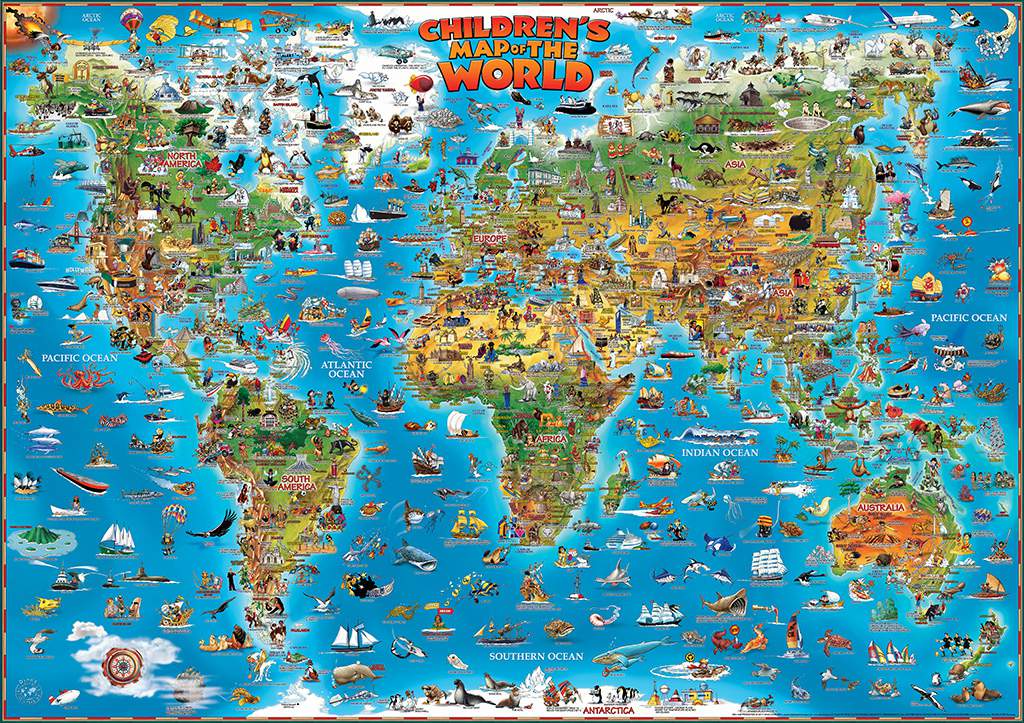
While searching for maps, I came across a map that was very similar to the first map that I ever saw in elementary school. This bright, colorful, and bold map drew my attention because of the colorful cartoons that made me interested in visiting as many of these places as possible. This map sparked my interest in traveling the world. While I was not sure what every country on the map was, it gave me some information about the different type of people in each region. In 1966, the Genuine Company Limited created the Dino map, which is the world’s leading producer in children’s illustrated maps for educational purposes. These maps are used in classrooms worldwide, and are often students’ first experience studying maps. Analyzing how this map manipulates young viewers into thinking certain things about different places. The various images projected on different countries can lead to some judgements about each country and the type of people that live there. These images can lead to many stereotypes for different locations, which can lead to stereotypes for different types of people. Since these stereotypes are being presented on a map targeted toward young children, it can lead children with impressionable minds to have certain opinions about types of people that may be false and harmful to a person’s future view of the world.
This map displays various important historical events, famous architectures, various modes of transportation, different animals indigenous to each location, and even stereotypes of types of people from various places. These images are important because they are highlighting what the map maker finds significant about each location. Also, the place where they put each image is important because it could potentially block another important location. This map is very U.S. centric. Nations other than the United States are misrepresented by the stereotypes that people in the United States have of these nations. The images projected near these other nations present the history that Americans think about, which might not be the most significant part of their culture. An example of this is for Ireland, where the map shows St. Patrick driving the snakes out of Ireland. This is for many Americans, the only thing that they know about Ireland’s history, even though there is a much richer history in Ireland. For Germany, there is a woman in Dirndls drinking a beer with the word “Oktoberfest” underneath. In the Atlantic Ocean, near Gabon, there is a simple boat that is labeled “African Boat.” This is actually quite offensive because Africa is a continent with many countries with hundreds of different cultures. By putting all of these nations and tribes under the same category for a type of machinery, this map is ignoring the diverse cultures in the continent of Africa. In Scotland, there is an old man in a kilt playing the bagpipes, and the Lochness monster. My final example of this is in Mexico, where every figure has a sombrero on it. These negative stereotypes can give young viewers with impressionable thoughts preconceived ideas about people from certain places. These stereotypes that are represented in this map can lead to many misinterpretations for young viewers about places, especially about the people who live in these places represented on the map. Since this map is targeted towards a young audience it is especially important to see how things are properly represented because this map is supposed to be shaping the maps of future generations. Maps can cause a myth that leads the audience to feel a certain way about these different types of people based on the stereotypes represented in the cartoons on the map. These stereotypes on the map can lead to future generations of American having negative views of people that are different than them.
However, in the United States, the map shows many of the best aspects of the nation. For example, there are two students with graduation caps on with the words “Harvard and Yale University” underneath the picture. This is inaccurate information because these universities are about two-hundred miles apart. There are even quite negative representations of different cities in this map represented on the map. For example, where Detroit is, there are two men in baggy clothes holding up peace signs with the word “Rapping” underneath. While rapping itself is not necessarily negative, the fact that the entire city is defined as rapping is stereotyping the whole city as being into rap culture. People often equate rap culture with African-Americans, and there is a high percentage of African-Americans in Detroit. By writing “Rapping” underneath the city of Detroit, this map could be alluding to the high percentage of African-Americans, which emphasizes the racism on this map.
There are a few inaccurate representations on this map that could misconstrue a viewer’s opinion of the world based on viewing this map. For the notable locations, states and cities, in the United States, it includes New York, Washington, DC, and Mississippi basically right next to each other. There are many states in between these locations, but these locations are overshadowed on the map by what the mapmakers perceive as important locations. There are also a number of mythological creatures featured on this map, such as Aliens, the Lochness monster, and a vampire. While these images may give an accurate description of what people in that area may believe and their traditions that are based on these creatures, it can be misconstrued by the viewer. Since the viewer of this map would be a child, the children could actually believe that Vampires live in Transylvania. These images can give children false beliefs in unreal characters and also give young children a false idea of what the people in these places actually believe in. These inaccuracies can lead to a false understanding of the world to the young viewers of the map.
While the illustrations represented on these maps can be helpful in engaging younger audiences, some of the images detracted from the accuracy of the map. This should be considered, especially when thinking about who the audience of the map is. Young children are extremely impressionable, so changing this map to make it portray less stereotypes is extremely urgent. When teaching children about the world using maps, we need to consider whether it is more important to keep them fascinated by using bright colors and pictures, when there may be social repercussions based on the inaccurate stereotypes and inexact information on it.
Wow. I don’t think I ever would’ve perceived a map in such a negative connotation unless someone pointed it out, as you did in your analysis. I agree, this map does show some negative and unnecessary stereotypes that seem to overly embody certain regions that have nothing to do with the incorporated image. Especially considering a society of visual learners, this map can certainly be misleading to child-viewers all over the nation. I think your final point is very intriguing. Is a map like this necessary in order to teach groups of children minimal amounts about different cultures and already conceived stereotypes or certain regions? Or should maps used in elementary-level classrooms be more accurate to demographics and developed modern day cultures? As much as I wan’t to disagree with you since the map a work of art, I think the map needs to be adjusted in some aspects to eliminate these stereotypes. I think it is fair to say that the map is simply outdated. If we look at the changing culture of the U.S., stereotypes were not nearly considered nor recognized in the 1960’s— when the map was created– as they are now. Nonetheless, I think you turned a simple, good-natured map into a societal analysis of issues in the world today; people fail to realize that prejudices are not genetically inherited, they are taught.
Likewise, I never thought to consider the rhetorical nature of maps such as this geared towards a younger and therefore more innocent audience. I believe Will is correct to suggest that the map may be outdated based on the perceptions of the author at the time given changes to our culture since this map’s creation. However, stereotypes and other subconscious biases may still be present in future recreations of this children’s map. Similar maps in the future would still hold intrinsic biases, of which may be genuinely subconscious or possibly even deliberately presented to corrupt an innocent audience with the author’s beliefs. In this more negative aspect, I agree with your critique that this map could influence younger audiences with older stereotypes, thereby encouraging these stereotypes to persist in the future. I read an article a while ago that Boston Public Schools are removing the Mercator projection to mitigate potentially undesirable biases against younger audiences that include students of color. The rhetorical aspect of maps geared towards younger people probably should receive harsher criticism.
I like how you analyze this map from children’s perspectives. For us, when we look at new maps, we know that maps do not reflect the truth and they are embedded with the authors’ opinions. However, from children’s perspectives, they will just believe maps are truth, which will create misleading information to them. Also, I like the examples you gave in your blog post. When I first saw this map, there were too many icons, so I did not know where to start. However, as I read through your blog, I was able to see a lot of interesting stories about the map. When I looked at the map in details, I was surprised that even though this was a map of the world, there was not any nation’s border appeared on the map. Although the map has many errors and misleading information, I believe by not showing the borders actually create an idea that the whole world is together. There is no difference between nations. It draws people from all over the world together and creates a closeness of the world, which will have a very positive effect on children in the future. Thank you for sharing this interesting map with all of us!