
-
Recent Posts
- Map Duo Presentation – William Guy and Michael Zhang
- Map of the Week: Unraveling the Borders of Israel and Palestine Through Time
- Map Duo Presentation – Carter House and Ryan Soulis
- Map Duo presentation by Peter and Yaozhuo
- Yaozhuo Sun — Map of the Week: City Maps That Orient You Better Than Google Can
Recent Comments
- Luke Hedlund on Map of the Week: Voici les Bases Américaines dans le Monde: Que est l’agresseur? Qui Menace?
- Luke Hedlund on Map of the Week: Unraveling the Borders of Israel and Palestine Through Time
- Owen Goss on Mexico’s Crippling Water Crisis
- Owen Goss on Map of the Week: German and Polish Borders Across Time
- Lucy Duggan on Map of the Week: A Serio-Comic Map of Europe
Archives
- December 2023
- November 2023
- October 2023
- September 2023
- May 2022
- April 2022
- March 2022
- February 2022
- November 2021
- October 2021
- September 2021
- May 2021
- April 2021
- March 2021
- February 2021
- May 2018
- April 2018
- March 2018
- February 2018
- December 2017
- November 2017
- October 2017
- September 2017
- May 2017
- April 2017
- March 2017
- February 2017
- December 2014
- November 2014
- October 2014
- April 2014
- March 2014
- February 2014
- December 2013
- November 2013
- October 2013
- September 2013
Categories
Meta
Mapping Divisions and Debates in Modern American Values
As I grow older, my awareness of my own values and how they compare to other people’s has become much more acute. In my mind, it is crucial that citizens are aware of their own values, but also of the values around them. And, it is therefore even more crucial that we have resources to educate us about the values around us. Maps are particularly helpful resources for this. The American Values Atlas (AVA), created by the Public Religion Research Institute (PRRI) in 2014, uses a simple yet interactive map of the United States to show the distribution of values in the United States. On a familiar projection of the continental United States, the AVA displays survey results on political and social attitudes by year, from each state, region, and 30 metropolitan areas. This interactive map is a tool for representing and tracking the intricacies and changes in attitudes in our society. Furthermore, the AVA is a live map—it changes annually. To ensure the map shows an accurate study of America’s political and cultural climate from year to year, the PRRI annually samples 50,000 random Americans. To activate the map, you select a topic from the sidebar and a question to explore. Then, you click on any state, region, or city to compare results.
It is imperative that people track diversity in a society with increasingly diverse attitudes, biases, and beliefs, so that they are aware of how many perspectives there are and know why different people react differently to politics. The American Values Atlas makes this possible. It is a portrayal of modern, meaningful relationships in American society, while also a guide to tracking the changes in those relationships. For instance, the map shows that in 2015, 25 percent of Mississippi respondents favored same-sex marriage. And, in 2016, 37 percent of Mississippi respondents favored same-sex marriage. That is a fairly abrupt change. And shows that, even in the state most reluctant to accept the idea of same-sex marriage, people’s values are changing. Further, the data of the map details America for what it is: a dynamic encounter of cultures, religions, and political ideologies. Yet, the view of an isolated United States projects the message that we are all Americans. The map says, “Look, these are the states, these are the people who make up the states, look at all this difference, yet we are the United States of America.” It identifies the diversity, and solidifies debate as American.
Moreover, the map shows the views on immigration, religion, and a variety of social issues associated with different geographic regions. Americans want to understand the demographics of their state. They want to know where their state sits on the political spectrum. And they want to know what direction their state is headed. For someone foreign to the United States, this map shows the distribution of demographics and ideologies throughout the nation. The map’s interactivity gives it an advantage over non-interactive maps because it allows the user to select the information they need to see and suppress the information they don’t need to see. In other words, the map can contain a lot of information while not showing it all at once. Because the map is digital, the authors can update it whenever they need to without having to create an entirely new map.
What this map fails to show, however, is each state’s population. Especially with the context of the map, one would think that the creators would offer each state’s population as a context for comparisons between states. This failure fosters a perception bias that the relative size of the state is more significant than the relative population. But, in truth, the population, and the demographics, are far more significant factors to be concerned with than the spatial projection. My home state of Iowa, for instance, appears equal in size, if not slightly bigger, than New York, which may be true spatially, but, what the map fails to convey is that New York has nearly seven times as many people than Iowa, and therefore carries greater influence.
I chose this map because of my interest in American politics and social issues, more specifically, social discrimination. This map showed me something I knew, but with greater precision: in the United States today, there is a profoundly deceitful claim that social discrimination does not exist in our American society. For example, if you look at each state’s response to the question, “Just your impression, in the United States today, is there a lot of discrimination against blacks, or not?”, (which can be found under the sidebar topic “discrimination”) it is evident that a substantial number of Americans are unaware of the social discrimination in American society. But, the survey question is ambiguous, it asks people to measure “a lot” but, as the map shows, “a lot” is measured differently by different people. The map also fails to represent indicators of social inequality in each state, which can lead people to assume that the factors perpetuating social discrimination are consistent across the nation. Yes, social discrimination in the United States has improved in the past 100 years; still, the extent to which our improvements have met our generation’s cries is unsatisfactory.
Values make us human. And it’s important to remember that the contrasts between our values do not have to separate us, but can bring us together in a society that fosters independent growth, and encourages new perspectives. We, the United States, need to do a better job to ensure that our society lives up to the values we proclaim to hold. The American Values Atlas, although lacking a few specifications, delivers what it is intended to deliver: insight into the distribution of values in America. And, in doing so, it reminds us that the United States still has a lot of work to do before we can identify social equity as a common value of American society.
Posted in Uncategorized
Comments Off on Mapping Divisions and Debates in Modern American Values
Atlas of the Week– City Atlas: Discover the Personality of the World’s Best-Loved Cities

This week’s atlas is City Atlas: Discover the Personality of the World’s Best-Loved Cities in This Illustrated Book of Maps by Martin Haake. This atlas brings to life thirty best-loved and famous cities from around the world by bring out the personality of each city. It contains iconic landmarks, cultural details, many unique places in each city, a few facts, and a variety of activities and attractions within the city. Through reading this atlas, readers could virtually tour the thirty famous countries in one book!
Posted in Atlases of the Week
Comments Off on Atlas of the Week– City Atlas: Discover the Personality of the World’s Best-Loved Cities
Blog of the Week—Galaxy Map
This week’s blog website is Galaxy Map, which contains of course maps of the galaxy! This site contains two types of maps: a Milky Way Explorer from Google maps interface that shows what our galaxy would look like through infrared, microwave, and radio frequencies, and a face-on set of maps that displays the galaxy from an interstellar spaceship. There are three types of face-on maps: a full-detail map, the Milky Way Explore, that could be zoomed in and out, an overview map which shows most of the objects on the main galaxy map, and many detail maps that show the galaxy map objects in twenty two locations.
If you want to learn more about our galaxy, check out this blog!
Blog link: http://galaxymap.org/
Posted in Uncategorized
Comments Off on Blog of the Week—Galaxy Map
Map of the Week- International Number Ones
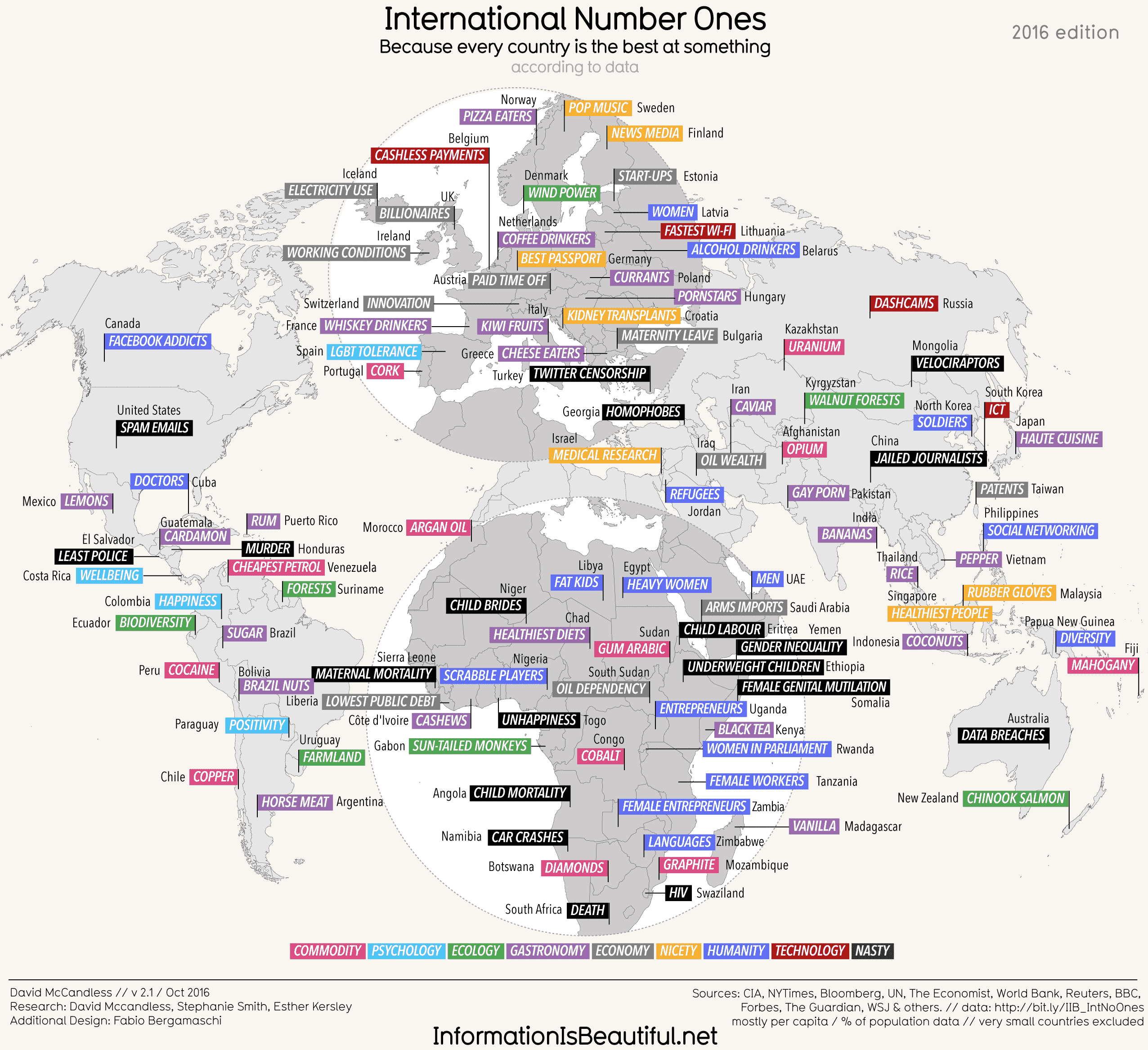
What?
You don’t understand what Africa specializes in? You don’t know which country has the largest amount of annual export? You have no clue about what life in the Middle East is like?
What?!
As the world becomes increasingly interconnected between nations and regions, the need to acquire a global perspective that relies on a basic understanding of the world is undoubtedly necessary. We need to enhance our understanding of the social, political and environmental forces that shape our existence. What better way to start learning the world than by looking through a map that combines the specialty of each country with cartographic features that illustrate the location of different countries in the world? By using such a map that contains unique, outstanding visuals and certain biases, the readers could explore different parts of the world and form their own understanding and critiques.
The map “International Number Ones,” published by Information is Beautiful, offers an illustration that contains particularly straightforward information about each country’s “No. 1” in the world. The British-based information design organization compiles statistics and visualizes them into a graphical representation to educate the public. This specific map allows the audience to gain insight into the underlying social, political, and environmental issues of each country. In addition, it(s map) form presents the audience with the information and issues more vividly and memorably than plain text, specializing data in a way that no other medium could achieve.
Despite having the challenge of displaying the entire world, the symbols, fonts, and colors used portray a strikingly simple map with an eye-catching and comprehensible cartographic layout. The map is broken down into different countries (marked with the color grey and the country name in lowercase letters), with each country having a subject that that particular country is best at in the world in all uppercase letters to attract attention, and a specific color assigned to the “specialty” of the country. The different colors correspond to different categories that are illustrated in the legend at the bottom of the map. There are nine colors in total, with categories ranging from commodity, ecology, gastronomy, psychology, economy, technology, to nicety, humanity, and, nasty. On a broader level, this color coding not only thoroughly portrays how each category is scattered throughout the world, but also may reveal any underlying patterns between each nation or region. For instance, Africa contains both the most blue and black colors, corresponding to the humanity and “nasty” categories respectively. Europe in particular appears to have the most grey, with the color representing “economy.” The colors purple and pink, representing gastronomy and commodity, are fairly scattered in all the continents, as both of the categories could be considered as “natural resources”, and each continent possesses different habitats that foster different resources. These hidden connections reinforce the idea of Wood, that a map links a territory to what comes with it, whether it is cultural values, certain phenomenon, or specific products.
In spite of the information portrayed in this map, the reaction that most people will have while looking at this map for the first time will probably be a shocking “WOW”, as the map contains several obvious unusual factors. The first apparent “oddity” is that the “No. ones” in this map are truly a mix between some “expected” ones that are seemingly plausible, some nearly unknown yet interesting ones only to be found in Trivia, and some that are extremely controversial, radical, almost “inappropriate” to be deemed as the country’s “best” thing to offer, and do not appear to have any scientific basis as support. For instance, the map speaks that Afghanistan is the world capital of opium production and Brazil produces the greatest amount of sugar, which is fairly reasonable. It also shows that the French people are the biggest whisky-drinkers and Sweden is the number one in pop music, which are interesting facts that are a less known. However, it also includes that Pakistan is the country that consumes the highest number of gay porns, that Togo is the country with the highest level of unhappiness. In fact, the controversial aspect of the information could already be noted in the legend, as one of the categories of specialties is labeled “nasty”. Furthermore, the map contains proactive humor in its text, heightening the dramatic/visual effects, which really subverts the expectations of how maps usually work
As Wood may suggest, every map has a purpose or intent that its author has injected into and hidden within the map. A country does not necessarily only have one “Number one”—it could be the number one in several different fields and industries; yet why does the author only choose this particular number one to put next to a country’s name? Why does the author rather list out some negative number ones instead of other possible positive things that the country may have which deserves to be admired about? For instance, the United States is universally recognized as being stellar on a global level in many different fields, including higher education institutions, scientific research, medicine etc. Nonetheless, the map only lists out a negative “No. 1” that the US has internationally—spam emails. Indeed, the author definitely manipulates the “No. ones” for each country to achieve the effect of benefiting certain countries and imposing negative impressions of other countries. On the other hand, however, this approach allows more developed countries such as America to be critiqued as well—it reminds us that not all “No. ones” absolutely great.
Another central idea from Wood is that maps are choices of politics and power—this particular map is critiquing expected uses of maps, which is a very political choice. The organization created this map is Britain-based; consequently, one can noticeably see that the European countries on the map are correlated with the most positive connotations of categories, such as “economy”, and contains the least amount of negative information. On the other hand, North America, where the United States and Canada are located, is only linked with negative information, such as the most Facebook addicts for Canada, and the most spam emails for the US. This information choice almost degrades US and Canada, for they are some of the most developed countries in the world, and could have possibly threatened the standing of certain European countries, such as Britain. Another obvious political bias reflected upon the map is that the cartographic feature of the world map is largely Europe-centric, most specifically Western Europe-centric; there is even a “globe” around the western European region! In addition, the size of Russia is altered to occupy a smaller space on the map to decrease the significance of Russia, and the position of the whole Europe is elevated in order to be not only centric, but also to be on the top of the map to grab the audience’s attention.
Wood also emphasizes the notion that maps are indeed social constructs. While reading the map, the first thing that stands out to me is the small number of countries drawn on the map, as some relatively “insignificant” countries are ignored by the author to be included in the map. For instance, North America in this map does not even contain Mexico within its region. Another use of social convention in this map is the colors used to represent each category: nasty is represented by black, and ecology is represented by green. These colors, although seemingly significant, actually plays a huge role in reinforcing the layout of the entire world. Social constructs are moreover ingrained in the author’s choice of picking each country’s number one; remember that Africa contains the most blue and black regions? Both of these colors correspond to categories that have a negative connotation, and the author has chosen to use these as the number ones for certain African countries, instead of other potentially positive ones. Through this mapping choice, the product is promoting particular stereotypes of certain regions and countries unconsciously.
One significant fact to keep in mind while reading this map is that the map is not designed by a professional cartographer, but by a graphic-design organization that compiles data to transform into their graphical forms. As a result, the data source might not be as reliable and credible, given that the map is used for entertainment. On the other hand, however, the simple layout, colorful visuals, proactive humor, and the rich cultural information indeed greatly engage the readers with this map. Furthermore, this map also provides many opportunities for the readers to interpret and re-examine certain countries with a different mindset, such as looking at America not from the “superpower” perspective but from a more humbling one. Although the map has certain biases, the map is truly an interesting and simple one that is able to provide most people with a basic understanding of the world.
Works Cited:
McCandless, David. “International Number Ones.” Information Is Beautiful, May 2010
Wood, Denis. The Power of Maps. The Guilford Press, 1992
Posted in Maps of the Week, Uncategorized
3 Comments
Team Presentation for “Post-War New World Map”

This map depicts what one map maker visualized the world looking like after the conclusion of World War Two. Maurice Gomberg hailed from Philadelphia, PA, “The City of Brotherly Love.” Him being an American puts a political spin on his projection because chances are he wanted to win the war, so any land that he gave or took away from varying countries on the map would coincide with the Allied forces, of which America was a member of. The map shows what countries would expand their territories after the war from the lost land of the losing countries i.e. the Axis Powers. The Axis powers were labeled as “quarantined states” and are outlined in a thick black border and were fostered into the neighboring territories. Other than borders and newfoundland, some details were given showing the Burma Road the Ural Mountains to expand the power of the Allies. They were significant functions during the war. Given the title, the map was created to show a “New World”, one without conflict or violence because the enemy would’ve been defeated in it’s entirety. “New World” gives way to the conspiracy theory of “The New World Order” which is a theory that all of the world reign would eventually come through one all powerful totalitarian government. In extinguishing its enemies and giving more power to already powerful countries, the name seems to fit.
During the presentation, we had asked a few questions that the class had answered.
Q: Why is it odd an American made a post war map prior to 1942?
A: America wasn’t directly involved in the war yet because this map was created before the attacks on Pearl Harbor which ultimately drew the US into the war, but this map was still produced as propaganda and foreshadowed which side the US would enter into upon entering the war. This showed an idea of what the world would look like compare to what it actually looked like at the time creating a difference between ideology and reality.
Q: How would you identify national identity and American power?
A: Looking at the map title, you can see who in the world is being regarded as a leading power in the New World Order of which the US was spearheading. Also, when looking a the map, the US has military outreach in the Pacific Ocean and serves as protection of those territories.
The class showed interest and input and came out with the same responses to the questions that we had originally predispositioned.
Team Members: Rong Bao & Noah Yuro
Instructor: Dr. Barney
Posted in Uncategorized
Comments Off on Team Presentation for “Post-War New World Map”
The Other Side of Trade
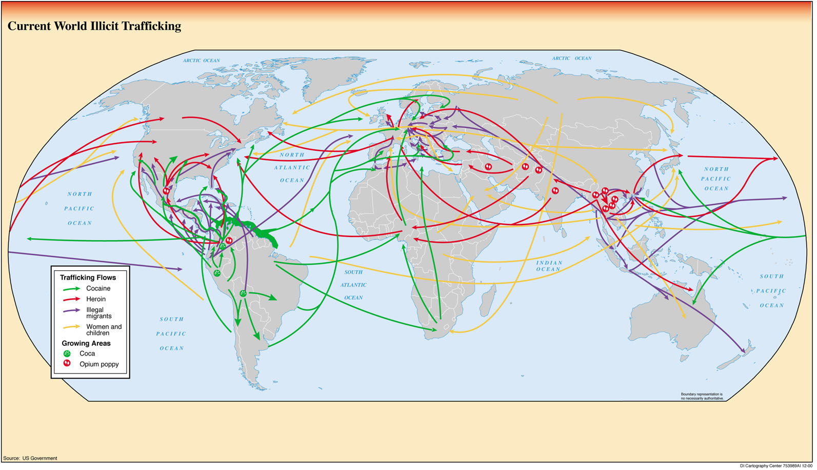
The Netflix series Narcos, which I have recently finished, is based on the cocaine dealers of Colombia, specifically Pablo Escobar and the Cali cartel, and shows both how they were caught, but also how they were able to make huge profits and get many countries, specifically the US, hooked on cocaine in the 1980s. The transportation of goods like cocaine to the US is very complicated and requires expert planning to be successful. Pablo Escobar and the Calí cartel were just the beginning of the trend of illicit trafficking that still exists in the world today. However, now it is expanded from cocaine to other drugs such as heroin, as well as the movement of illegal migrants and trafficking of women and children to different countries. There are so many maps that have been made of the transportation and trade of legal goods and services throughout the world like sugar, wheat, or rum. However, the more secretive side of international trade, like illegal trafficking through black markets and smuggling routes gets much less recognition. This map not only shows the interesting relationship between developed and developing countries, it also reinforces stereotypes of the goods that are selected.
There are several fascinating observations that can be made from this map. First off, almost all of the movement is going from a developing country in South America, Africa, or Southeast Asia, to a developed country, usually Europe, the US, or Australia. In regards to cocaine, it is almost all grown in South America in countries like Colombia (which is where it began with Escobar), Bolivia, and Peru and going to America, Europe and some of the larger countries in Africa like South Africa and Nigeria. Heroin, meanwhile, is mostly made in Southeast Asia and the Middle East, with a little bit in Central America, and is then transported to the more developed countries. This trend for the two drugs displays the politics of development, in that the countries that produce the goods are not necessarily the ones that are the most successful. In the developing countries, it is usually the case that a steep inequality develops between the people who supply these goods to the developed countries (Escobar was one of the richest men in the world when he was at his peak) and the rest of the country.
The illegal migrants follow a similar path, but one interesting thing about them is that they tend to not cross an ocean: they usually just move to the closest developed country without having to worry about going through airports to go across the Atlantic and Pacific. The women and children trafficking flows are a little bit different, as there is a large group of arrows originating in Russia and Eastern Europe, with less originating in South and Central America. This map may at first seem complicated with all of the arrows, but it shows a general trend in the transportation of illicitly trafficked goods.
While this map seems simple at first, there is some criticism that I can apply to this map in regard to its selection of certain things. First off, the choice of what illegal trafficked goods to put on the map raises some questions. While these may be four of the biggest goods, they are certainly not the only goods that are smuggled. Others include wildlife, tobacco, and counterfeited goods. The creators of this map may have chosen the goods they chose because they are the most controversial ones, and so it would get more attention from the world. Also, the map creators decided to not include any specific places in the countries where the goods come from or went to. For example, the cocaine in Colombia just seems to come from the whole country, not any specific place, and goes to various non-specific parts of the US, not certain cities like LA, Miami, or New York. This makes observes of the map feel as though the entire country of Colombia is a drug-infested mess, when in fact it is certain people who are contributing to this stereotype. However, since these people are usually the richest and have a lot of power, they create a nationwide stereotype. This connects back to Dennis Wood’s idea that “cartography was primarily a form of political discourse concerned with the acquisition and maintenance of power” (Wood 43). Similarly, the decision to only show the goods going to countries and not cities creates a feeling that more goods are coming in because people get the idea that the goods are coming into the country as a whole and not to a specific city. This helps to emphasize the level of this problem without giving specific numbers about the amounts that come in.
While at first, like many maps, this map seems to not be written with any sort of message, it becomes clear that the creators of this map, which in this case is the US Government, want to stress the importance of illicit trafficking around the world. They use a bland color like grey for the countries, putting more of a focus on the goods trafficked then exactly where they are going. This map is straight-forward enough to where, after a little bit of analysis, people begin to understand the problems of illicit trafficking in the world and may want to see what they can do to help, which will benefit the US government. Ultimately, this map, like many others, both raises questions and present biases while displaying an important topic throughout the world.
Works Cited:
Wood, Denis. The Power of Maps. The Guilford Press, 1992
Posted in Uncategorized
1 Comment
Blog of the Week – All Over the Map
This week’s blog website is from Betsy Watson and Greg Miller of National Geographic. It contains a wide variety of maps, including different maps of the solar eclipse and a one-hundred year old map of Rome that still stands up today. It is not updated very often (only one or two a month), but the posts are very engaging with fascinating maps, which makes up for it.
Blog Link: http://www.nationalgeographic.com/people-and-culture/all-over-the-map/
Posted in Uncategorized
Comments Off on Blog of the Week – All Over the Map
Atlas of the Week – Digital Atlas of Roman and Medieval Civilizations
This digital atlas on Harvard’s website contains details about ancient civilizations, especially the Roman Empire. It contains lots of details of the Roman Empire at its prime, including ports, military forts, and various transportation landmarks. While it may seem overwhelming and a little confusing at first, it does a great job of the vast area that the Roman Empire occupied and true scope of their power.
Atlas Link: http://ags.cga.harvard.edu/darmc/
Posted in Uncategorized
Comments Off on Atlas of the Week – Digital Atlas of Roman and Medieval Civilizations
Post War-New World
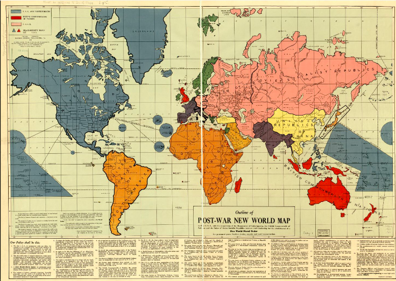
The Post War-New World Map created by Maurice Gomberg in October 1941, but not published until 1942, provided the world with a new and intriguing prediction of the world would look once the dust from world war two settled. While Gomberg created the map as a personal project, it quickly became nationally recognized and was picked up by the Library of Congress.
The purpose of the map is to predict how the world will look after WW2, and to show how the organization of the new world differs from that of the old. Gomberg proposed a new world with 14 sovereign states– compared to the 63 at the time–13 of which would be democracies, 10 demilitarized, and 3 quarantined states–Japan, Italy and Germany (Axis powers). The USA, USSR, and British Commonwealth of Nations would be the three main powers and would act as the world police. Gomberg also included a list of 41 statements which state the New Moral Order after the war: create permanent peace, freedom, justice, security, and world reconstruction. Gomberg incorporated quotes from Franklin D. Roosevelt’s Four Freedoms speech, which can be viewed as propaganda for the war efforts.
This map has a strong sense of American identity. In Gomberg’s proposal, the United States would gain all of Canada, Mexico, Central America and several smaller territories throughout the world. The new U.S. would span across the entire globe, thus demonstrating the US world dominance. This is similar to the British Empire of the early 1900’s, and the saying “the sun never sets on the British Empire”, could simply be changed to “the sun never sets on the Americans.
Gomberg was extremely delusional and unrealistic with his goals for the New World, and there are many potential complications that he didn’t account for. First, he didn’t anticipate the coming friction between USSR and USA political viewpoints. During the cold war, tensions were high between the two world powers. If Gomberg’s organization of the world had come to fruition, both the U.S. and U.S.S.R. would gain significant amounts of territory, making another global conflict inevitable. Also, he simply grouped entire continents together, without considering the repercussions of such a drastic action. This is similar to the partition of Africa in the late 1800’s. However, in this case the nations that Gomberg is attempting to group together have the means to mount a resistance against any invaders. Plus, it is very unlikely that after years of fighting, the allied powers would be willing to use their militaries for another campaign, just to reorganize the geographic landscape of continents that they don’t have any stake in.
-By Kim Kiess and Luke Salvati
Moriarty, Thomas. “The Post War II New World Order Map: A Proposal to Rearrange the World after and Allied Victory.” Global Research. Org. N.p., 12 June 2010. Web.
Posted in Uncategorized
Comments Off on Post War-New World