
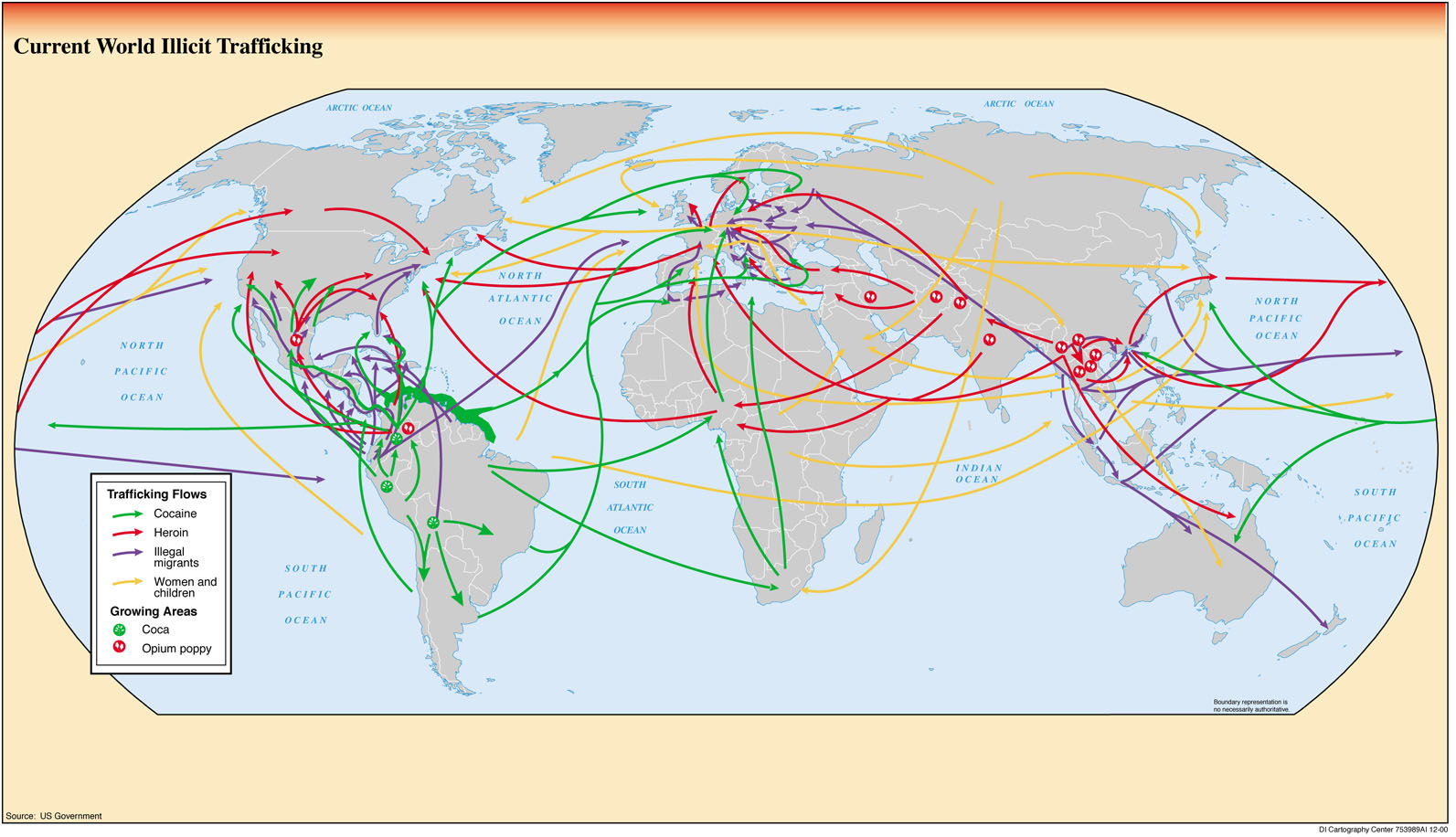
The Netflix series Narcos, which I have recently finished, is based on the cocaine dealers of Colombia, specifically Pablo Escobar and the Cali cartel, and shows both how they were caught, but also how they were able to make huge profits and get many countries, specifically the US, hooked on cocaine in the 1980s. The transportation of goods like cocaine to the US is very complicated and requires expert planning to be successful. Pablo Escobar and the Calí cartel were just the beginning of the trend of illicit trafficking that still exists in the world today. However, now it is expanded from cocaine to other drugs such as heroin, as well as the movement of illegal migrants and trafficking of women and children to different countries. There are so many maps that have been made of the transportation and trade of legal goods and services throughout the world like sugar, wheat, or rum. However, the more secretive side of international trade, like illegal trafficking through black markets and smuggling routes gets much less recognition. This map not only shows the interesting relationship between developed and developing countries, it also reinforces stereotypes of the goods that are selected.
There are several fascinating observations that can be made from this map. First off, almost all of the movement is going from a developing country in South America, Africa, or Southeast Asia, to a developed country, usually Europe, the US, or Australia. In regards to cocaine, it is almost all grown in South America in countries like Colombia (which is where it began with Escobar), Bolivia, and Peru and going to America, Europe and some of the larger countries in Africa like South Africa and Nigeria. Heroin, meanwhile, is mostly made in Southeast Asia and the Middle East, with a little bit in Central America, and is then transported to the more developed countries. This trend for the two drugs displays the politics of development, in that the countries that produce the goods are not necessarily the ones that are the most successful. In the developing countries, it is usually the case that a steep inequality develops between the people who supply these goods to the developed countries (Escobar was one of the richest men in the world when he was at his peak) and the rest of the country.
The illegal migrants follow a similar path, but one interesting thing about them is that they tend to not cross an ocean: they usually just move to the closest developed country without having to worry about going through airports to go across the Atlantic and Pacific. The women and children trafficking flows are a little bit different, as there is a large group of arrows originating in Russia and Eastern Europe, with less originating in South and Central America. This map may at first seem complicated with all of the arrows, but it shows a general trend in the transportation of illicitly trafficked goods.
While this map seems simple at first, there is some criticism that I can apply to this map in regard to its selection of certain things. First off, the choice of what illegal trafficked goods to put on the map raises some questions. While these may be four of the biggest goods, they are certainly not the only goods that are smuggled. Others include wildlife, tobacco, and counterfeited goods. The creators of this map may have chosen the goods they chose because they are the most controversial ones, and so it would get more attention from the world. Also, the map creators decided to not include any specific places in the countries where the goods come from or went to. For example, the cocaine in Colombia just seems to come from the whole country, not any specific place, and goes to various non-specific parts of the US, not certain cities like LA, Miami, or New York. This makes observes of the map feel as though the entire country of Colombia is a drug-infested mess, when in fact it is certain people who are contributing to this stereotype. However, since these people are usually the richest and have a lot of power, they create a nationwide stereotype. This connects back to Dennis Wood’s idea that “cartography was primarily a form of political discourse concerned with the acquisition and maintenance of power” (Wood 43). Similarly, the decision to only show the goods going to countries and not cities creates a feeling that more goods are coming in because people get the idea that the goods are coming into the country as a whole and not to a specific city. This helps to emphasize the level of this problem without giving specific numbers about the amounts that come in.
While at first, like many maps, this map seems to not be written with any sort of message, it becomes clear that the creators of this map, which in this case is the US Government, want to stress the importance of illicit trafficking around the world. They use a bland color like grey for the countries, putting more of a focus on the goods trafficked then exactly where they are going. This map is straight-forward enough to where, after a little bit of analysis, people begin to understand the problems of illicit trafficking in the world and may want to see what they can do to help, which will benefit the US government. Ultimately, this map, like many others, both raises questions and present biases while displaying an important topic throughout the world.
Works Cited:
Wood, Denis. The Power of Maps. The Guilford Press, 1992
Sam,
I found your map choice very interesting, and find it especially awesome that you picked a map that dealt with the subject matter presented in one of the shows you watch. Specifically, I liked your idea about how this map really only represents one demographic of people (the rich involved with drugs) and how it can easily be misinterpreted and give off the idea that all of Colombia is infested with drugs. I was initially overwhelmed by the different colored arrows that seemed to take up the whole page but I think that you did a great job clarifying the important features of the map as well as critiquing elements of it. Overall, I really appreciated this post!