Atlas of the Week: Atlas of the Transatlantic Slave Trade

Atlas of the Week: Hey gang! Check out this atlas of the transatlantic slave trade. There is a fairly new database, which has collected over 30,000 documents detailing specific slave voyages that took place from 1500 to 1900. It is very interesting to see the numbers of African Americans that they brought to America, and how they relate to other historic events that have taken place in the same time period. The information is clearly articulated and illustrated in a way that makes it easy to follow, even though the primary sources date so far back and are definitely worded differently from the language of the 21st century. So read this, or at least analyze the numeric values, because you may need it for your next History class.

Posted in Atlases of the Week | Comments Off on Atlas of the Week: Atlas of the Transatlantic Slave Trade

Map of the Week: (Un)Happy Nations

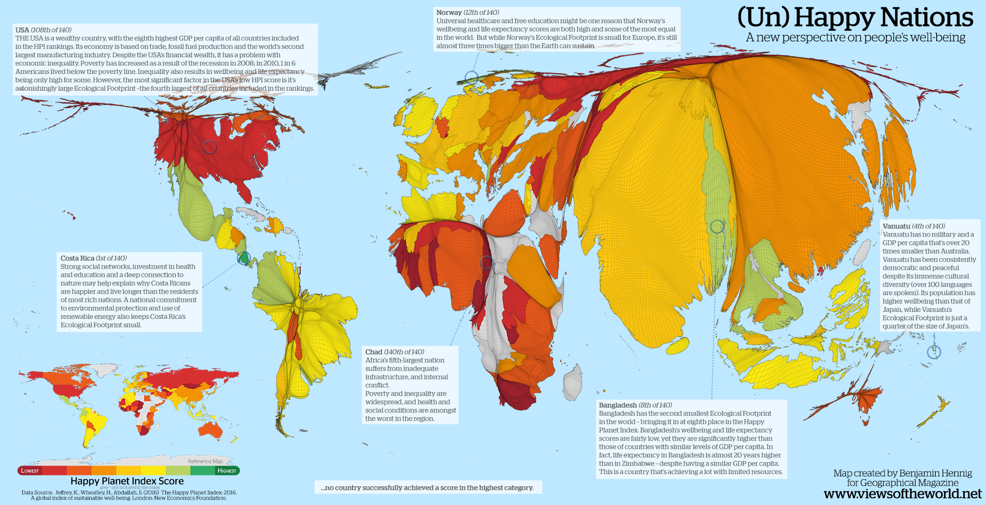
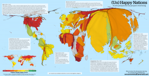
The title of my map is (Un) happy Nations, or (Un) happy planet as first named. This map was made by Benjamin Hennig, and is included in his book entitled, “Rediscovering the World: Map Transformations of Human and Physical Space”. The map is a unique and extremely drastic projection of the world. It presents such a biased, yet sensible opinion on the amount of happiness, or lack thereof, in these nations. The colors of this map tell the audience the level of unhappiness. With red meaning no happiness at all, orange and yellow representing a moderate level of happiness, and light and dark green being the highest level of happiness. Not only do the colors make a statement, but the countries’ shapes paint a picture to the readers as opposed to being your typical map. By shaping the nations as butterflies and tree branches and, with the addition of the variety of colors, these features mimic the look of the season of fall or spring. The many aspects and nuances of the social statement of this map causes it to become an interesting, thoughtful, and extravagant map.

First, let’s dig into the colors of this map. So, the legend that you see is the measurement of each country’s Happy Planet Index (HPI) Score. Red represents the nations with the lowest amount of happiness—the United States, parts of South and West Africa, Russia, and scattered parts of Europe and Asia all are colored in red. The colors of each country says a lot and provides contemplative thoughts. Each color was based upon the score all 140 countries, accounted for, received. In comparison to other countries, it does not surprise me that the U.S. would be one of a few countries with the lowest happiness score. Russia is pretty unexpected, I did not expect for it to have been colored by the second darkest shade of red on the spectrum, I was expecting a lighter color, like orange. The brightest, happiest colors are mainly in South America, Mexico, and countries in Latin America. This area has the colors green and yellow, representing moderate to high levels of happiness. Costa Rica has the darkest shade of green on the map, representing the happiest country.

The map is also distorted in a very extravagant way, with various factors that contribute to the message of the map. Instead of drawing the countries based on their size, population, or GDP, the mapmaker does something different by distorting the countries based on its Happy Planet Index score. This results in the inclusion and subsequent bashing of countries for their, “unstable economic developments, rising inequalities, and environmental change”. In addition, the countries in the map are completely skewed and several countries are enlarged or minimized, leading to the assumption that the map maker would rather them seem generally less or more important. The western hemisphere is definitely minimized and relatively smaller than it is in the most common map projections of the world. Canada, especially, is tremendously condensed, as well as Russia. Countries in Asia, like Bangladesh and China, are enlarged and cover a big part of the map, they attract the eyes of the audience and are clearly an important part of the map. Mexico is also very large, and even looks to be the same size, or larger, than the United States. The reason behind these drastic, and intentional, distortions are clearly due to the amount of happiness in each country and causes the readers to picture a world where happiness is a crucial factor. Of course, this would alter where all the tourists went for Christmas break– if they were under the impression that the amount of happiness in a country coincided with the level of hospitality and fun, it would influence their decisions. The countries with the relatively lower scores of happiness are much more distorted than the ones that are colored yellow or green and have relatively higher scores of happiness. However, not all countries that have light colors and high happiness scores, are as enlarged as the specific countries that the map maker has chosen to distort. Not even the country with the highest score of happiness, Costa Rica, is as proportionally enlarged as the others. Although Costa Rica is the country with the highest level of happiness, because it is not a superior country or a country of global importance compared to the U.S. or Russia, it is not enlarged or projected the way it should be based on the credits of this map. The way that the mapmaker decided to color the countries definitely signals to the audience the ‘good’ and ‘bad’ countries, and the way they are spatialized definitely adds to this impression. It is creative that the mapmaker decided to turn happiness into a geographic variable, and I believe he does this explicitly and effectively by choosing the colors that he did.

The shapes of the continents on the map are also very distinct. The countries are shaped as a butterfly, tree branch, bird, and various shapes that give the notion of fall or spring, seasons that are calm, cool, yet colorful and vibrant. The shape of this map must have been intentional and the map maker chose these shapes so that the audience could relate to the view which the mapmaker believes about this topic. This sort of projection is very unique and displays a purposeful message to the audience that encourages them to think of certain countries as better than others. A higher level of happiness implies that it will be a great country.

The map maker also chose six countries to highlight, by writing a small summary consisting of some facts on the country, its issues, and, for some, positive attributes of the country. The first country, Costa Rica, has the highest amount of happiness in comparison to the others and is described in a positive and praising manner. The map maker emphasizes that the country has a deep connection to nature, which could contribute to it being a very happy country, and it compares the fact that people who live there often live longer than in most rich nations. Also, the map points out Chad which received the 140th of 140 score on the happy planet index. The map maker continues to explain the issues of the country, some being the worst in the region, and the summary of Chad is also relatively short and would not cause someone to feel positive towards the country. The mapmaker decides to include these summaries in his map in order to fulfill his political idea of happy countries being better off than countries who may not be so fortunate in the category of happiness. In addition, the idea is also suggested that if a country is not happy it cannot be successful and is therefore not equal to the other, happier, countries.

This map is one of many aspects and carries a unique message comparing countries based on their levels of happiness. Happiness is one aspect of life that people often overlook or do not view as something important. It is particularly interesting that the map maker decides to choose a topic as simple as happiness, and then distorts and discredits countries for not keeping their citizens completely happy. This is definitely a special kind of political map that I’m sure many of us have yet to come across, until now. This map definitely opens the eyes of the audience and causes them to view these countries in a unique way, categorizing them according to their level of happiness.


Sources:

http://geographical.co.uk/places/mapping/item/2057-un-happy-planet – Published by Benjamin Hennig January 21, 2017

http://www.viewsoftheworld.net/?p=5376#more-5376 – Published by Benjamin Hennig March 20, 2017

https://ideas.ted.com/7-thrillingly-new-perspectives-on-the-world-and-how-we-live-today/ – Published by TedTalk December 22, 2016

Posted in Maps of the Week | 1 Comment

Atlas of the Week: Birds Diversity, Behavior, and Conservation

This atlas provides a look into the world of birds, from where they’re found to how they adapt to their environment. Written by author Mike Unwin, the atlas provides a global perspective on elusive species, as well as those common to our very own backyards. As well, the map discusses the harsher side of things, going into issues like conservation and endangerment. For those interested in birds, this a great resource in learning and entertainment.

Posted in Atlases of the Week | Comments Off on Atlas of the Week: Birds Diversity, Behavior, and Conservation

Map of the Week: Atlantic Political Map and Depth Contours

Mapmakers have always used their positions of power to incite their personal views on those who end up viewing their work. Perpetuated through subliminal imagery in the map’s creation, the map subtly influences its reader into adopting a view more agreeable to that of its maker. The map above, is no exception. By combining a conventional portrayal of the Atlantic Ocean with carefully selected map-markers, the author reveals his personal agenda, waiting to be discovered.

One of the long-term major goals of oceanographic mapping has been looking at how humans globally interact with the ocean in all parts of life. Use of oceanic vessels to search for new lands, travel from place to place, and research the water below capture just some of the ways humans have interacted with the seas. In April 1912, The infamous sinking of the Titanic actually marked the turn of a new era of oceanic exploration. Realizing they could bounce electromechanical sound waves off submerged objects, a whole new realm of mapping opened researchers eyes. Earlier versions of maps lacked the depth and adequate research to accurately map all aspects of the ocean, but with new technological advancements coming along every day, things became clearer.

This map, a modern adaption of the Atlantic Ocean, seems pretty basic, unbiased, and informational. However, upon closer inspection, the map’s true nature is revealed. Despite being centrally focused, the map includes just 3 of South America’s largest port cities, and only 7 of Africa’s largest port cities. In just the USA alone, at least 10 port cities are shown while in Europe, at least 17 port cities are shown. While it may be a hard pill to swallow, modern society presents the USA and Western Europe as pinnacles of prosperity and, simply put, as the best places on Earth. Some people see this as true, and not some down – it really depends on where you’re from. However, this map unabashedly perpetuates the idea of the north being more populated, more developed, and just better in general than the rest of the world through its unproportionate portrayal of port cities.

Centering the map on the Atlantic Ocean may seem like an obvious and clearly unbiased decision, but consider how the world connects. The prominence of the Mid-Atlantic Ridge establishes a huge divide between worlds. Considering the two divisive objects observes so far (the ridge and city prominence), the idea of the world in quadrants begins to develop. While this probably wasn’t the map-makers explicit goal, it reveals how potently map-makers’ subconscious biases can influence the product of their work. The ideas perpetuated here raise the northern countries onto pedestals while distancing their oversea relationships. A large part of global commerce and interaction comes through the use of cargo ships, passenger ships, and most seafaring vessels, but this map counteracts this idea with its neglect of global perspectives and fair distribution of cities.

While we think we may know everything there is to know about the vast blue, our knowledge pales in comparison to the research still being done. The Seabed 2030 project, initiated in June of 2017, plans to develop a comprehensive map of the world’s oceans. Using 100 ships circumnavigating the world for the next 13 years, this group of international oceanographers aims to put to rest all speculations about the ocean floor by creating an extremely detailed map. While this map’s may be innocent, it lives a double life as an informant. Critics of this map worry about it’s implicative uses for mining industries who seek to exploit the ocean floor for its mineral capabilities, destroying it in the process. However, the map would likely help marine ecologists and biologists in better grasping the workings of marine ecosystems and adaptations.

Despite the author’s personal biases, the map does present valid information. Maps like these provide researchers with knowledge to further their studies, thus furthering humanity altogether. In particular, this map’s simplicity allows researchers to focus in on just the depth gradient. The purpose of the “subliminal message” implanted by the map’s cartographer is not to take away from the product’s overall quality, but to subtly influence the readers. If the message is too obvious, the map may be viewed as irrelevant or too outlandish, tarnishing the cartographer’s name forever.

Globally, oceans provide humanity with a plethora of natural resources, livelihoods, and mystery. The advent of maps has made progress towards solving those mysteries in ways accessible to the general public. Sometimes, in order to progress as a society, we need to ignore the obvious differences and take things at face. In modern times, knowledge is power, so by providing people knowledge of such imperative parts of their lives, it can reduce the idea of this north-south division in superiority. While it’s impossible to get rid of map biases completely (since decisions must be made to make a map), perhaps one day, they won’t be so alienating.

Resources:

The NOAA – http://oceanexplorer.noaa.gov/history/breakthru/breakthru.html

Smithsonian Magazine- https://www.smithsonianmag.com/science-nature/first-complete-map-ocean-floor-stirring-controversial-waters-180963993/

Encyclopedia Britannica (Map Source) – https://www.britannica.com/place/Atlantic-Ocean

Posted in Maps of the Week | Comments Off on Map of the Week: Atlantic Political Map and Depth Contours

Blog of the Week: Cartogrammar.com

This blog, maintained by cartographer Andy Woodruff, provides a multitude of interesting, interactive, and just generally cool maps. His most recent post titled “Beyond the Sea, flowing and exploding edition” provides an interactive world map which uses colored lines to reveal what you could see from any coastline across the world. His blog also contains maps about things like where rain water would flow if poured anywhere in the world, land by latitude globally, and a map where you can play the piano by counties in Ohio. Woodruff combines his interests in cartography with his skills in technology to develop new and creative maps that provide a unique perspective on the world. Check it out below!

http://www.cartogrammar.com/blog/ 

Posted in Uncategorized | Tagged | Comments Off on Blog of the Week: Cartogrammar.com

Blog of The Week:

I picked Something About Maps to be this blog of the week. This blog was created by Daniel Huffman who used to be teacher and a chemist and now is a freelance cartographer. This blog is where he publishes maps he creates.So, if you ever want to create a map, ask him. He also runs cartastrophe.wordpress.com where he critique maps. If you are interested in maps as a work of art rather than just data on paper, definitely check out this blog!

Click this link to discover more about this interesting blog! http://cargocollective.com/somethingaboutmaps

Posted in Uncategorized | Comments Off on Blog of The Week:

Atlas of the Week: The World Atlas of Coffee

What is something most grown Americans cannot go the day without? Coffee. The World Atlas of Coffee by James Hoffman explores the origins of coffee, the role of colonialism and how it affected its production, and it maps the growing regions. In addition, this atlas also talks about the politics of coffee and how the people that grow it live.  So, read this atlas if you are a coffee addict like me and care to know about the way coffee is made and how it will affect your consumption. Want to know what is the best tasting coffee bean? Well, read this and you will find out.

Posted in Uncategorized | Comments Off on Atlas of the Week: The World Atlas of Coffee

Snap Map Is More Than Just A Map

Before this class, there were only two maps I interpreted regularly: an app called Maps and Snap Map. Maps assisted me in traveling from place to place while Snap Map had a more obscure purpose; Snap Map allowed me to stalk my friends. A little strange right?

On June 21, 2017, Snapchat–a technological powerhouse with over 500 million daily active users– introduced a new feature called Snap Map. Snap Map allows users to share their location around the world with mutual friends. In addition, it grants users access to see when the last time someone opened up the app. Of course, every person has the right to their own privacy and can turn off their location–which is referred to as “Ghost Mode”.

My personal experience with this map has evolved over time. First, like most people, I was weirded out that people could see where I was whenever I opened up snapchat, which is quite frequently. However, as I saw the growing popularity of people switching from private to public, my opinion on this map changed. I began to see the real intent of the map as a tool to stay connected with not only my friends, but the rest of the world. In a matter of seconds, I can click on a hotspot and virtually travel to Brazil to watch the Fluminense vs. Flamengo soccer match or see Octoberfest in real time from real people’s perspectives. Snap map allows people to see the hidden culture of the world that isn’t usually the headline of the morning’s paper. Today’s mapping allows us to spatialize global interconnectedness in real time. Now, with Snap Map, those “oh I wish I knew about that” moments will not happen. People are now able to see play-by-play of when and where things are happening, and can now get up and go experience it for themselves: instead of finding out days later. Now, we are able to live in the moment instead of reflecting on it.

Everyone has a different Snap Map, so there can never be a uniform critique. Everyone knows different people and have different connections and relationships with those people; there are a myriad of different experiences and millions of different Snap Map. No two Snap Maps will be the same. Looking at my map, it says a tremendous amount about me and my character. One of the first things I noticed on my map is the stark contrast between the east and the west coast. Secondly, by zooming in on New York City,  it shows my favored bias towards this area. My Snap Map extends worldwide–I currently have two people on Snap Map in Europe–however, the place that is home for me is New York and therefore the rest of the world in screenshot does that matter.

According to Denis Wood, a map is out of date immediately after it is made. This statement applies to Snap Map because Snap Map plots hundreds of people’s exact location at an exact instance in time. Immediately after this data is produced, there is new data because with so many living data points, it is most likely that at least one out of the hundreds of people will move their specific location within an instance. Snap Map is only accurate when everyone updates their location at the exact time. Otherwise, as seen in picture three, there are people that do not update their location in over 46 mins, which overall creates a delayed and inaccurate map.

Another part of Wood’s philosophy is that maps show the idealized versions of the world, and Snap Map is no exception. Like with most social media,  people only show the highlights of their life, and this pattern can be seen with Snap Map as well. Snap Map only responds and plots data that people choose to show and discuss about their experiences. On Snap Map, every data point  is a choice rather than a fact. Some people only go on public when they are out doing things, however, when they are home, they resort back to the private setting. This need to always feel like you are doing something relates back to American culture and identity. The skyrocketing usage of social media shows that the average American millennial is obsessed with knowing where everyone is at all time and whether they are being disincluded from something. People are constantly worried about missing a cool event or photo opportunity and Snap Map allows these people to know what is happening in an instant. Snap Map takes this vulnerability of the American culture and uses it to its advantage.

Additionally, another critique of this map is that it is projected in a way which makes the world feel smaller. Like with any map that converts a 3D space into a 2D space, there will be some sort of distortion. Snap Map condenses the entire world into a 5in by 3in space, and in this small area you are able to slide and zoom in on locations across the world. Therefore, people perceive the world to be smaller when using this map because it so easy to “be”  anywhere in a second. Maps similar to Snap Map makes you think your are closer and more connected to these people and their cultures than you actually are. In reality, you are only really experiencing the highlights of their culture that people choose to share and are not really connected at all.

A last key component of Wood’s logic is that the audience should measure a map based on intent rather than accuracy– because accuracy overall is just a social construct. Snap Map, like any map, can be inaccurate. Sometimes, my friends and I will be miles in on shore and it will say one of  them is in the middle of the ocean. However, that mistake is not important and does not distract from the map’s overall purpose. Even with it flaws, the audience needs to realize how this map combines data in real time from all around the world. With millions of data points to keep track of, things might get lost in translation, but people should overlook its flaws and appreciate the overall purpose of unifying the world.

In this time period of technological advancements, the new trend for successful products is they need to be hands-on and keeps their user engaged. Maps like Snap Map will soon become the norm; interactive maps rather than a traditional paper map will become standard because humans rely so much on instant feedback and results. This new standard of personalized mapping tells us a great deal about how modern day culture has changed so much from early times. So, the next time you use Snap Map, think about how it’s not just a feature you can stalk people but it is a cultural excursion that is revolutionizing the way we can use and perceive maps.


Works Cited

Schneider, Benjamin. “What Snap Map Says About the Future of Mapmaking.” CityLab. N.p., 18 Aug. 2017. Web.

Wood, Denis. The Power of Maps. N.p.: Routledge, 1993. Print.

Map: Kim Kiess’ personal Snap Map on 10/25 /17


Posted in Uncategorized | 2 Comments

Atlas of the week – Historical Atlas of North America

The ‘Historical Atlas of North America’ compiles notable events which have affected North America across its history into a large collection of maps, ranging from 1832 to 2014. This atlas maps America’s history from its very foundation to its growth into the superpower it is today in a very unique and easy to access way.

And the best thing is, its available online for free: http://omniatlas.com/maps/northamerica/18321012/

Posted in Atlases of the Week | Comments Off on Atlas of the week – Historical Atlas of North America

Blog of the week – All Over the Map

‘All Over the Map’ is a blog  launched by National Geographic and curated by Betsy Mason and Greg Miller. This a cool blog that analyzes maps and cartography from all time periods and from all over the world. It provides interesting insight into why maps are the way they are, and is very much similar to Mappenstance!

Blog link: https://www.nationalgeographic.com/people-and-culture/all-over-the-map/


Posted in Maps of the Week | Comments Off on Blog of the week – All Over the Map