
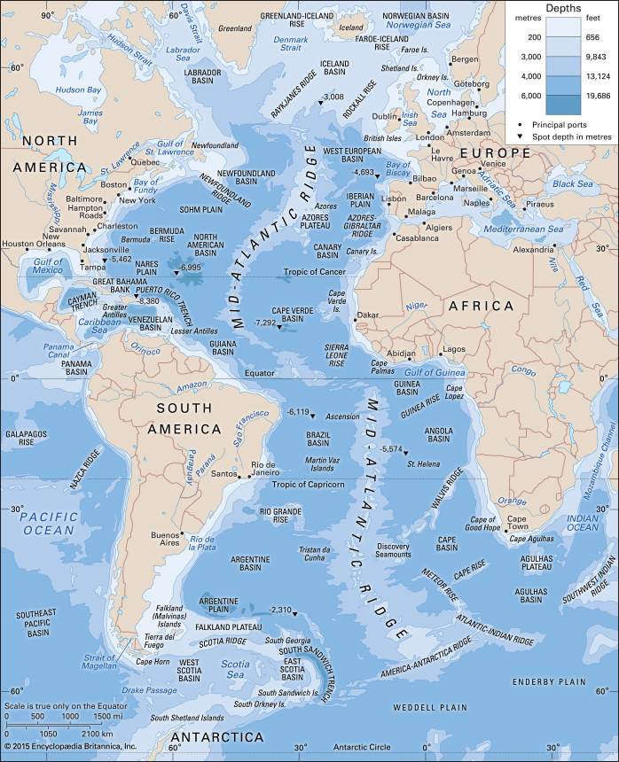
Mapmakers have always used their positions of power to incite their personal views on those who end up viewing their work. Perpetuated through subliminal imagery in the map’s creation, the map subtly influences its reader into adopting a view more agreeable to that of its maker. The map above, is no exception. By combining a conventional portrayal of the Atlantic Ocean with carefully selected map-markers, the author reveals his personal agenda, waiting to be discovered.
One of the long-term major goals of oceanographic mapping has been looking at how humans globally interact with the ocean in all parts of life. Use of oceanic vessels to search for new lands, travel from place to place, and research the water below capture just some of the ways humans have interacted with the seas. In April 1912, The infamous sinking of the Titanic actually marked the turn of a new era of oceanic exploration. Realizing they could bounce electromechanical sound waves off submerged objects, a whole new realm of mapping opened researchers eyes. Earlier versions of maps lacked the depth and adequate research to accurately map all aspects of the ocean, but with new technological advancements coming along every day, things became clearer.
This map, a modern adaption of the Atlantic Ocean, seems pretty basic, unbiased, and informational. However, upon closer inspection, the map’s true nature is revealed. Despite being centrally focused, the map includes just 3 of South America’s largest port cities, and only 7 of Africa’s largest port cities. In just the USA alone, at least 10 port cities are shown while in Europe, at least 17 port cities are shown. While it may be a hard pill to swallow, modern society presents the USA and Western Europe as pinnacles of prosperity and, simply put, as the best places on Earth. Some people see this as true, and not some down – it really depends on where you’re from. However, this map unabashedly perpetuates the idea of the north being more populated, more developed, and just better in general than the rest of the world through its unproportionate portrayal of port cities.
Centering the map on the Atlantic Ocean may seem like an obvious and clearly unbiased decision, but consider how the world connects. The prominence of the Mid-Atlantic Ridge establishes a huge divide between worlds. Considering the two divisive objects observes so far (the ridge and city prominence), the idea of the world in quadrants begins to develop. While this probably wasn’t the map-makers explicit goal, it reveals how potently map-makers’ subconscious biases can influence the product of their work. The ideas perpetuated here raise the northern countries onto pedestals while distancing their oversea relationships. A large part of global commerce and interaction comes through the use of cargo ships, passenger ships, and most seafaring vessels, but this map counteracts this idea with its neglect of global perspectives and fair distribution of cities.
While we think we may know everything there is to know about the vast blue, our knowledge pales in comparison to the research still being done. The Seabed 2030 project, initiated in June of 2017, plans to develop a comprehensive map of the world’s oceans. Using 100 ships circumnavigating the world for the next 13 years, this group of international oceanographers aims to put to rest all speculations about the ocean floor by creating an extremely detailed map. While this map’s may be innocent, it lives a double life as an informant. Critics of this map worry about it’s implicative uses for mining industries who seek to exploit the ocean floor for its mineral capabilities, destroying it in the process. However, the map would likely help marine ecologists and biologists in better grasping the workings of marine ecosystems and adaptations.
Despite the author’s personal biases, the map does present valid information. Maps like these provide researchers with knowledge to further their studies, thus furthering humanity altogether. In particular, this map’s simplicity allows researchers to focus in on just the depth gradient. The purpose of the “subliminal message” implanted by the map’s cartographer is not to take away from the product’s overall quality, but to subtly influence the readers. If the message is too obvious, the map may be viewed as irrelevant or too outlandish, tarnishing the cartographer’s name forever.
Globally, oceans provide humanity with a plethora of natural resources, livelihoods, and mystery. The advent of maps has made progress towards solving those mysteries in ways accessible to the general public. Sometimes, in order to progress as a society, we need to ignore the obvious differences and take things at face. In modern times, knowledge is power, so by providing people knowledge of such imperative parts of their lives, it can reduce the idea of this north-south division in superiority. While it’s impossible to get rid of map biases completely (since decisions must be made to make a map), perhaps one day, they won’t be so alienating.
Resources:
The NOAA – http://oceanexplorer.noaa.gov/history/breakthru/breakthru.html
Smithsonian Magazine- https://www.smithsonianmag.com/science-nature/first-complete-map-ocean-floor-stirring-controversial-waters-180963993/
Encyclopedia Britannica (Map Source) – https://www.britannica.com/place/Atlantic-Ocean