Atlas of the Week: Atlas of World History

Atlas of World HistoryIncluded in this atlas is the story of humankind from the very beginning to contemporary times. Within the story, there are sections about each time period that consist of the political, cultural and religious themes of that time. Different maps, text, and drawings are used to depict these themes allowing for the past to be known in an easy manner.

Posted in Atlases of the Week | Comments Off on Atlas of the Week: Atlas of World History

An Ever Growing Map

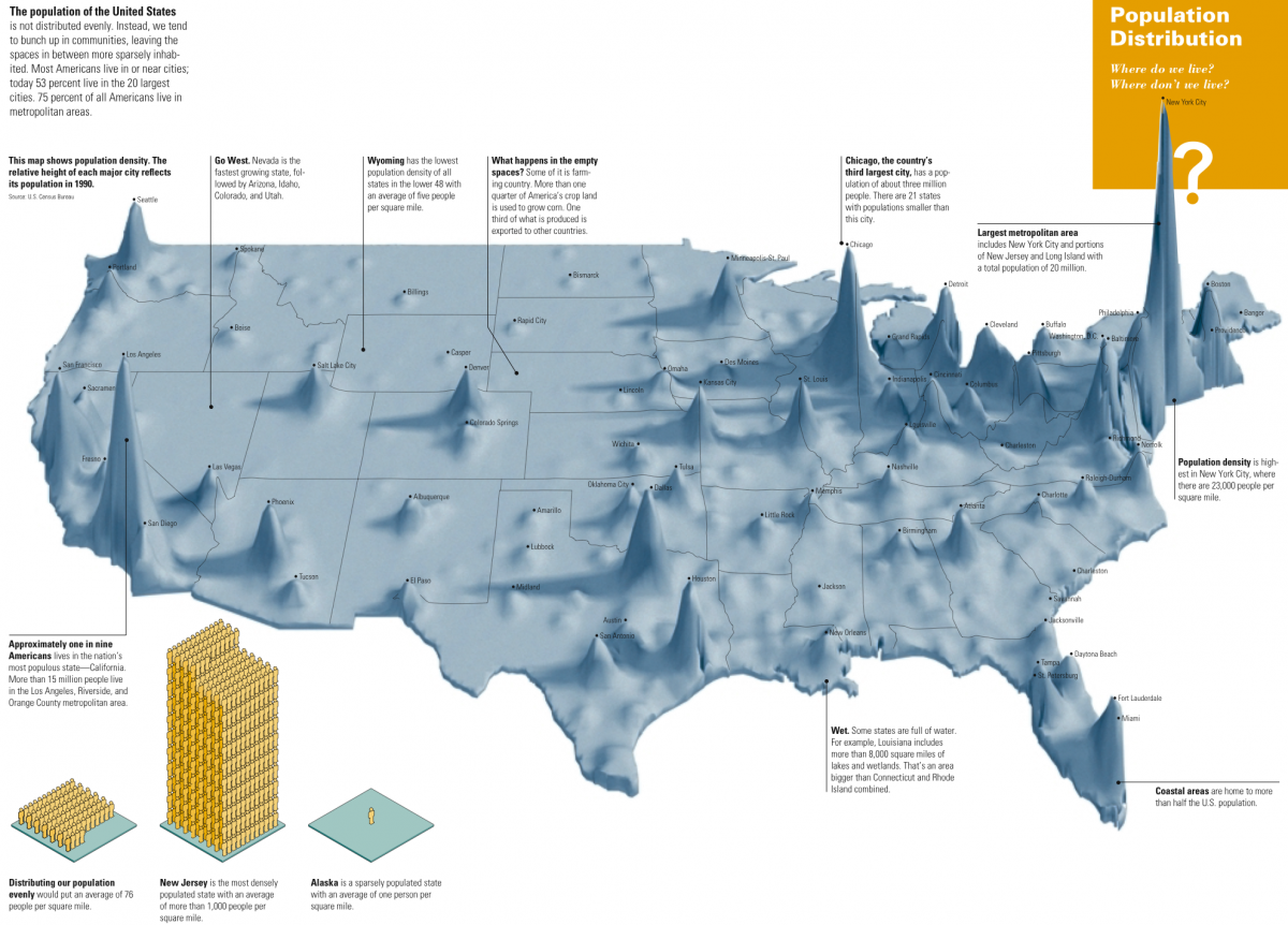
Space. The amount of space left available in the United States is always diminishing. This was especially true in the later part of the twentieth century. After the 1990’s, there was an immense influx of immigrants because of the Cold War as people wanted to start anew. People migrated to new places and constructed new communities to support the mass of people migrating. Although it may not have seemed like an important problem at the time, you can see that now the influx of people has presented a challenge relating to the space available in certain parts of the United States. This being said, certain places were severely affected. This map shows this extreme dichotomy.

The Population Density Map of US 1990 is a visual representation of the uneven distribution of the population within America. It uses a quasi-3-D topographical technique that depicts the population densities. This map was a front to a much bigger problem happening at the time. Just before 1990, the Immigration Reform and Control Act of 1986 drastically increased the number of immigrants allowed into the United States, resulting in 32.7 million immigrants travelling to America between 1990 and 2000. Although the Immigration Act of 1990 established a new “cap” on the level of immigrants, the number of admissions was still increasing because the fine print of the act could be distorted and manipulated.

The population problem didn’t start here though. In the 1920’s, the national-origins quota system allowed for each nationality to have a quota of immigrants based on the nations’ representation already in country. Having heard of the land of opportunity, most immigrants to the major cities that they heard the most about, which is exemplified by New York City, and most of the East Coast. Because of this, in June of 1963, John F. Kennedy started a reform for this process of immigration, stating the quota system was “intolerable.” Although Kennedy’s assassination prevented him from carrying out the reform, Congress took up his cause and implemented the Immigration and Naturalization Act of 1965. This worsened the problem by allowing the reuniting of families from foreign countries, and even allowing skilled labor forces into the United States. This caused an even greater migration of immigrants into the United States; looking at the map, this explains why populations were increasing in the middle of America as there was more space. Now, this was only legal immigration — illegal immigration was a whole other situation. What the map doesn’t show is that number of illegal immigrants grew from 540,000 to 2.5 million in the years between 1969 and 1990; this increased at a greater rate from 1990 to 2016 with almost 11.3 million illegal immigrants being in country today. Even in supposed statistical based cartography, there is still room for error, and even bias, as some individuals would not have been accounted for — purposefully or not. For example, there is no information regarding if the populations in the map contain the number of illegal immigrants. Biased or not, the overwhelming wave of people flooding into the United States will eventually cause problems.

As the map is based off of varying data, it is very unique; it is different to other kinds of cartography in the sense that it actually does grow. In the words of Denis Wood, “maps themselves don’t grow (or develop),” however the processes behind cartography do.[i] Thus, since this map represents increasing data, it grows in itself. If you look closely at the map, in the small print, the small print accentuates the difference in size of populations in certain areas compared to others. There are also figures that show how population density varies in different parts of the United States.

As population increases exponentially, maps are needed to see how the world is changing. This map does exactly that! Maps are tools, and the more you know about them, the more you can utilize them to do whatever you need. Information is needed on the map before you can truly understand what is trying to be portrayed. For this map, it is rather statistical, however the statistical data for immigration is left out in whole. This map could be completely different if the number of immigrants were incorporated into the map, or maybe they are, and are just not mentioned. With more background knowledge behind a map, the more powerful a map can be in the right hands.

[i] Wood, Denis, and John Fels. The Power of maps. London: Routledge, 1993.


Posted in Maps of the Week | 2 Comments

Atlas of the Week: Atlas of the Civil War


This atlas includes a myriad of new maps guiding the viewer to the expansive American Civil War. A conflict encompassing the eastern United States, plaguing hundreds of communities deserves an atlas as expansive as this piece of work. Including cartographic battlefields and broad displays of movements, this atlas follows the war as it unfolds across America.

Posted in Atlases of the Week | Comments Off on Atlas of the Week: Atlas of the Civil War

Blog of the Week: Big Map Blog

This blog site is filled to the brim with huge maps encompassing histories most fascinating sects. Maps of concrete jungles and their evolution from small town to sprawling city fill this site alongside intriguing conversations on the maps themselves. Every post includes an introduction to the subject and its history providing a detailed overlook at the map.


http://www.bigmapblog.com/

Posted in Uncategorized | Comments Off on Blog of the Week: Big Map Blog

Map of The Week: Soviet San Francisco


Soviet San Francisco

This Soviet rendition of San Francisco, published in 1980, paints a picture of the tensions between the United States and the Soviet Union, presenting a side of history often ignored by Americans. It was created by the Soviet government depicting the San Francisco Bay Area. Looking at the United States, a place so familiar to us, through the eyes of a non-American is so rare to those who have lived in the nation all their life. It is especially uncommon to look from the perspective of an enemy, such as that as the Soviet Union. San Francisco is almost undecipherable at a first glance. Without English guiding directing our attention to San Francisco, Alcatraz, The Golden Gate Bridge, San Jose, or any other part of this metropolitan area, one must evaluate the values of the author and translate them into a more familiar language.

Intentions of this map can only be assumed without the author revealing why he was commissioned to draft this piece. The 1980’s saw an end to the détente the two nations enjoyed throughout the 1970’s, reinstating hostilities after the Soviet invasion of Afghanistan. The unjustified invasion was the beginning of the end for the Soviet Union, helping to lead to its collapse in 1991. However, before they dissolved the socialist republic, they enjoyed a decade of volatility and aggression with the United States. The US elected a severely anti-Soviet president, Ronald Reagan, which prompted Soviet retaliation in the form of increased preparation for offensive and defensive measures. The Soviet Union could never conduct a full-scale invasion of the United States along the eastern coast because they would have to traverse Western Europe first to move supplies and troops. This would lead them instead to Alaska and the west coast as a means of ground invasion. Taking key cities along the west-coast (Los Angeles, San Diego, Portland, Seattle, and of course San Francisco) would be essential to securing a center of operations to move eastwards against the remaining defensive units. The Bay Area has been key to the United States technological innovations since the 1970’s and is a major port for international trade so cutting this region off would hinder US economic growth. These factors brought the Soviets attention to the Bay Area and prompted the need for a detailed recreation of this region.

The idea of “imagined geography” ties back into everything the Soviets did with the Bay Area in this map. Instead of projecting their domestic borders to present a mighty Soviet Union and describe their national pride in terms of geographic extensiveness, they mapped a part of another sovereign nation in their image. This map does not consume the city under the Iron Curtain, but rather implies the power, intentions, and capabilities of a nefarious Soviet Union. It tells the United States and its military if they wanted to, they could. This would quickly be disregarded by intelligence agencies in the United States as likely or even possible but would fester in the minds of America’s policy makers and the citizens. They would ask themselves “could they?” This was the very goal of the map, to impose onto the Bay Area Soviet values to construct a tool that could be used for an invasion, but more effectively and immediately be used for indoctrination and propaganda.

This detailed rendition of the Bay Area reveals Soviet values regarding the United States. The map presents the entrances and exits to this sprawling city, citing every harbor, airport, and freeway. This is what is important to the Soviets at a time like this, understanding the layout and having a guide to assist in quickly maneuvering the city. This would be as practical as it is fear inducing for Californians. Additionally, the map is overlaid with a very accurate topographical map showing the changes in elevation and navigable portions of the inner bay. The Soviets were devoted to developing a detailed map of the region for two reasons, neither of which would please American officials.

Posted in Maps of the Week | 2 Comments

Slew of the Flu


This year, the flu virus has been uncommonly widespread, wreaking havoc within the American population. For this reason, a dynamic map to compare the progression of the flu in the past few years is a useful diagram to illustrate the extent to which the flu virus has affected public health in the United States. As a rapidly evolving virus, the Class A strain of the flu is far more harmful than other flu strains. This map, created by the CDC, compares how this year’s flu relates to flu activity in past years. Through four separate images, the use of color marks the change over time and the extent of infection.

State political boundaries are included on the map. In order to demonstrate flu activity in each state, colors are associated with the extent of infection experienced by the state population. We typically associate colors like red, orange, and yellow with stop, danger, and caution. By using these colors to depict flu progression, the map uses color rhetorically to warn citizens and create a sense of fear that will encourage the public to make wise decisions about their own health/hygiene choices. However, isolating the flu outbreak with arbitrary state lines takes away from the map’s accuracy, permitting the idea that sickness throughout the country changes by crossing these arbitrary political borders. It is easy to assume from this map that in January of 2016, one could cross the state border from Virginia to West Virginia and decrease their risk of acquiring the flu. In reality, pockets of outbreaks are everywhere and cannot be looked at in a broad, statewide view. Taking the average of flu outbreaks over an arbitrarily determined domain takes away from the overall science of mapping disease. Another issue that arises from defining flu activity by state is that the map makes no reference to the underlying causes such as regional access to healthcare that influence the concentration of disease in a population. As a result, this map, just as any other map, has its limits.

The CDC map of flu activity in the United States has the primary goal of presenting clearly and concisely the change in flu activity from January of 2015 to January of 2018. Each state, while not labeled, is recognizable as an independent domain. Therefore, this map perpetuates the power and sovereignty of each state that makes up the United States. Also, in leaving out the names of the states and maintaining borders between states, one could argue this gives the states more power by assuming the reader is already familiar and in consensus with the territories drawn on the map. It is by this notion that someone could reference the fact that Oregon is the only state in which the flu is not as widespread as it is in the rest of the country this year. The assumption that the audience will recognize the state of Oregon without having to label the territory is further verification of the state’s sovereignty.

By projecting scientific data in this mapped form, the overall analysis reflects the author’s biases. This map could by no means be used for navigation around the United States because it has the specific goal of projecting the spread of the flu. Biases manifest through choices such as leaving states unlabeled, yet drawing borders and the density of infection aligned with color. The Centers for Disease Control and Prevention (CDC) is the United States’ primary federal institution entrusted with managing the outbreak of disease, gathering and analyzing disease, and uncovering disease origins. As the CDC is a highly respected scientific institution, the American audience is inclined to take this map as accurate and realistic to pathogenic events taking place throughout the country.

Overall, this dynamic map of flu activity is a highly persuasive tool, not only demonstrating the increased flu activity seen over four years, but also implicitly validating the United States’ domain in the world. This map works by creating a “healthy dose of fear” in the population, which makes sense, as it is the CDC’s job stay on top of public health issues in the United States. The bias in this map is more intentional than unintentional because in omitting such details like topography and not naming domains it stays focused on, which is warning the public of the growing health concern and implications of the flu virus. Ergo, this seemingly simple map of flu activity since 2015 reveals its underlying biases through rhetorical choices such as omission and inclusion just as any other map.


Posted in Uncategorized | 2 Comments

Map of the Week: Humoristische Karte von Europa im Jahre 1914


Humoristische Karte von Europa im Jahre 1914 contradicts traditional western cartography in its depiction of World War I. World War I began because of a system of entangling alliances. After the political assassination of Austrian Archduke Franz Ferdinand by Serbian political terror group, the Black Hand, Austria-Hungary declared war on Serbia one month later. This had a tremendous trickle-down effect. Austria-Hungary was a member of the Triple Alliance which included Germany and Italy. On the other hand, Russia backed Serbia in war because of their common Slavic heritage. The larger issue was Russia was a member of the Triple Entente with France and the United Kingdom. When Austria-Hungary declared war against Serbia one month later, a majority of Europe went to war. Following the outbreak of war, Humoristische Karte von Europa im Jahre 1914 served as a piece of German political propaganda that utilized caricatures to mock cultural stereotypes of their adversaries.

The overwhelming feature of Humoristische Karte von Europa im Jahre 1914 is the use of caricatures. Before the 20th century, caricatures were predominately used to satirize a subject, often politics or cartoons. Humoristische Karte von Europa im Jahre 1914 takes a different approach. Caricatures are utilized as political propaganda. Caricatures are a hallmark of political propaganda and reduce geographic areas to stereotypical characteristics based on ethnic or national identities. Reducing nations to human faces is anthropomorphism. On one hand caricatures simplify global war, but instead distort and exaggerate ethnic composition. An example in Humoristische Karte von Europa im Jahre 1914 is Russia’s caricature. Russia is characterized as monstrous figure with a bottle of vodka and bear. This illustration is validated by Russia being stereotyped as a society of heavy drinkers and the bear as a symbol of their empire.

Each nation is depicted with a distinct caricature that resembles their country. In comparison, the Central Powers are portrayed more favorably than the Allied nations. Considering the map is from the German perspective and current political conflict, the author intentionally drew Germany and Austria-Hungary with no derogatory stereotypes. Instead stereotypes were to applied to every other nation. For example, the United Kingdom is harshly criticized. A portion of the caricature illustrates a man standing on a pile of money while being punched by a fist of water. Embedded in this caricature is a series of codes. The piles of money the caricature is standing on is a representation of the wealth England has accumulated from being an Imperial power. However, England is punched in the face by its global colonies for dragging them into a European conflict. Both the pile of money and water fist can be viewed as signifiers. A signifier is a symbol that stands for a signified, a deeper meaning. Therefore, the pile of money symbolizes wealth and the water fist portrays angry colonial holdings which are the signified explanations of the symbols. From a propaganda perspective, the author is able to criticize the shortcomings of each country.

Humoristische Karte von Europa im Jahre 1914 is an unorthodox cartographic depiction of World War I. Standards for western cartography traditionally emphasize geographic accuracy and detail. Although, accuracy is a cartographic choice. Instead of replicating geographic terrain, the author chose to socially construct reality. He implemented his own agenda into his work. The map has a distinct red coloration. Dull and opaque shades of red are used for most of the major Allied Forces and Ottoman Empire. In comparison, the Austria-Hungary Empire is depicted in a brighter red. The author utilizes different shades of red to highlight German attitudes towards nations. Dull and opaque coloration for enemies and weak allies while a brighter red for a favorable ally. Another unique attribute is a legend situated at the bottom of the map. The legend provides the significance behind each nations caricature. At the time of publication, the legend would have been a expendable feature of the map. Any individual in Europe would have been able to view the map and understand the cultural stereotypes each caricature portrays. Viewing from a modern context, the legend is more relevant. The legend delivers a story narrative. It allows viewers to understand the cultural stereotypes that persisted throughout Europe in the early 20th century.

Overall, Humoristische Karte von Europa im Jahre 1914 takes an alternative approach to illustrating the start of World War I. Caricatures are the overwhelming feature of the map and illustrate cultural stereotypes of each nation. Code is embedded throughout the map and serves as signifiers that represent a deeper meaning, the signified. Various shades of colors are used to reflect positively or negatively on countries. A legend is positioned at the bottom of the map and provides context to the caricatures. With an unorthodox approach and appealing attributes, Humoristische Karte von Europa im Jahre 1914 is a relevant map that should continue to attract modern audiences.

Posted in Maps of the Week | Comments Off on Map of the Week: Humoristische Karte von Europa im Jahre 1914

Atlas of the Week: The State of the Middle East Atlas

The State of the Middle East Atlas is authored by Dan Smith and documents regional change and global impact. The atlas serves as an essential tool for understanding the Middle East and the regions impact on global politics. The atlas, discusses the Middle East’s place in world history, outside intervention, and place on the global stage. Maps and graphics are used to illustrate events and their impact on the world. 

Posted in Atlases of the Week | Comments Off on Atlas of the Week: The State of the Middle East Atlas

Blog of the Week: Radical Cartography

Radical Cartography has an immense library of cartography at its disposal. The site has three subcategories: geography, problematic, and genre. Each subcategory has numerous filters within themselves. From viewing geography, population density, and spatial time, an individual can spend hours browsing through detailed scientific maps. I highly recommend visiting the website.

http://www.radicalcartography.net/


Posted in Uncategorized | Comments Off on Blog of the Week: Radical Cartography

Blog of the Week: Strange Maps | Big Think

When we think of cartography and maps in general, interesting and engaging topics do not pop up. Under Big Think’s sub-category Strange Maps, the user is hit with a multitude of maps that interpret anomalies of the world. One can spend hours upon hours just scrolling through the pages upon pages of maps, or choose from one of seven categories: Surprising Science, Personal Growth, Mind & Brain, Sex & Relationships, Technology & Innovation, Culture & Innovation, Culture & Religion, and Politics & Current Affairs. The choices are endless.

Blog Link : http://bigthink.com/articles?blog=strange-maps

Posted in Uncategorized | Comments Off on Blog of the Week: Strange Maps | Big Think