Tuesday, November 5, 2013
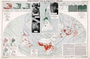
Atlas of Diseases: World Distribution of Spirochetal Diseases
Created in 1950, this map was included in the set of maps released by the American Geographical Society in conjunction with U.S Armed Forces and various international pharmaceutical corporations to catalog where the disease such as polio, starvation, and malaria, are and where they could spread. The head of the project was scientist Dr. Jacques May, who was himself named by Newsweek Magazine as The Map Doctor. This map embodied ‘medical geography’ which was a type of cartographic style that sought to show the connection between the geographical location of disease and the prevailing features of the surrounding environment.
In itself, the map is extremely scientific using heavy amounts of information (right hand corner with detailed definitions of the diseases, their latin names, etc.) and other comparative data in the remaining 3 corners. However, the ‘scientificness’ is countered by the choices reflected within the map, for example, with projection, the map uses a Briesemeister projection which is an equal area projection, with the only point free of distortion at the center of the map —Africa. Centralizing on Africa and the rest of the third world, focuses the reader’s attention on them and the epidemic that has spread and its potential to spread even more. The use of photography is also essential to how the map creates rhetoric because the pictures are able to create a distinct boundary between the Northern ‘cleaner’ hemisphere and the infected Southern hemisphere.
This map —compared to other maps, has no clear indication of a bias because of its scientific nature, yet is a concrete example of the United State’s exertion of power because it may not directly catalog economic or military power, but it is able to show how vast America’s knowledge is. The knowledge and resources that are available to the United States’ is a reflection of how far their sphere of influence reaches.
Kim D’Agostini and Jonathan Quenard

