
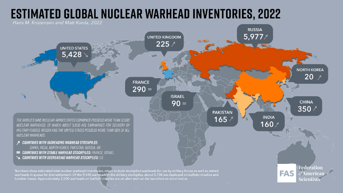
The Map I chose is closely related to events occurring around the world today. As many know, tensions are rising as Russia is becoming a global threat. As they have clearly shown with their intentions to invade Ukraine, they’ll wage war and continue to ravage anyone who gets in their way. The idea of a future war is much more realistic than many would like to envision. The map I found represents Nuclear Forces all around the globe. Not only is this relevant, it is very relevant and scary to imagine. The map shows the estimated global nuclear warhead inventories as of 2022. Nuclear weapons consist of very dangerous missles and bombs that cause huge explosions. Nuclear weapons are capable of destroying and killing hundreds of people.
The source I found the map from is the Federation of American Scientists (FAS). The FAS is a nonprofit group that uses science to try and make the world as safe as possible. This credible source was first founded in 1945 by scientist who helped develop the first atomic bombs.
There are a couple of alarming facts to note as you look at the map from a quick glance. First, Russia has more nuclear weapons than anyone, including the United States. Secondly, nuclear weapons in multiple western countries such as Russia, China, North Korea, India, United Kingdom, and Pakistan are increasing in number. This is shown by the up arrow next to the countries. One good point to note is that the United States has the second most right under Russia. This map shows that countries have been increasing their nuclear weapons to pose a threat to other countries as well as to feel more comfortable and protected.
The map is estimated because the exact number of nuclear weapons held by each country is a secret in most cases. With that said, this map does not display the data with 100% accuracy. In this case, I believe not having the exact numbers does not make a huge difference, because it still accurately gives you an idea of who has a lot and who does not. When people look at this map they do not care as much about the exact number of nuclear weapons each country has, they just want to be able to look and see which countries have them and whether or not they have an abundance. Continuing with this point, I think this map is well done because it is simple and easy to read. The visual makes it very easy to see which countries are big nuclear threats and which are not.
A couple of questions came to mind while analyzing the map. Only nine countries are shown within the map having nuclear weapons. Does that mean that none of the other countries even have 1 nuclear weapon? I was unaware that only nine countries have nuclear weapons as of now. If so, is this expected to change in the near future?
The idea of this map showing estimated data made me think of the Turnbull reading from early on in the semester. Turnbull discussed the relationship between maps and theories and compared them to each other. The truth found in maps may be from what we believe in our heads or may contain objective facts. Regardless, we must have some type of theoretical knowledge to understand maps. Although the numbers from the nuclear weapon map may be estimated, viewers still use the theories they are aware of to explain and interpret what they see being displayed. It is interesting to me how maps like this one have a unique way of making a huge issue like nuclear weapons into a spatial perspective so that we as viewers are able to compare and contrast weapons all over the world.
WORKS CITED:
Fas. “Status of World Nuclear Forces.” Federation Of American Scientists, https://fas.org/issues/nuclear-weapons/status-world-nuclear-forces/.
Fas. “Striving for a Safer World since 1945.” Federation Of American Scientists, https://fas.org/.
Turnbull, David. “Maps Are Territories: Science Is an Atlas ; a Portfolio of Exhibits.” Amazon, Amazon, 1997, https://www.amazon.com/Maps-Are-Territories-Science-Atlas/dp/0730006883.
Nice work Connor. I thought your analysis was well written and presented some insightful questions about the map. I like how you started with a little background of the Ukraine situation before getting into the core of your map. My map was also about the Ukraine situation so this was relevant and interesting to me. It is scary to think about the grim possibility of war in the future but I believe it needs to be thought about and taken seriously in order to take action towards preventing this fate.
I like the incorporation of this map on the blog, Connor. You did a great job highlighting the appeal to fear of this map, by depicting Russia with such large amounts of power in nuclear weapons, the largest in the world, it can strike fear in the hearts of many Americans. I also liked your clarification of the accuracy of these numbers, considering most countries try to keep the exact numbers as secret as possible. I am also curious as to whether the countries not highlighted in the map have any nuclear weapons at all, I feel as though this could maybe be a silence within the map.