
 Oh, no! It is starting to creep in, get the towels! These are just some of the statements I heard from family as floodwaters began to rise rapidly around my home. If you ask anyone I say I am a proud Houstonian and resident of Harris County, however, my hometown has had its fair share of flooding disasters in recent years. So, it is safe to say flooding is in every Houstonian’s DNA. The city flaunts itself as a cosmopolitan city, which simply means the city is very diverse. Following the landfall of Hurricane Harvey, there was a lot of questions that needed to be answered regarding the areas within Harris County and the city of Houston that were more prone to flooding. Questions regarding the environment and climate change as well as urbanization and the imminent threat of other hurricanes forming and hitting the Gulf Coast also began to rise. The Kinder Institute, a think-and-do tank at Rice University whose primary focus is tackling urban issues in Houston and other cities, partnered with many local officials to answer some of these questions. Scientists, meteorologists, and many federal workers began to work on the collection of data to see where most the issues regarding the flood prone areas along waterways and tributaries across the Houston metropolitan area lied.
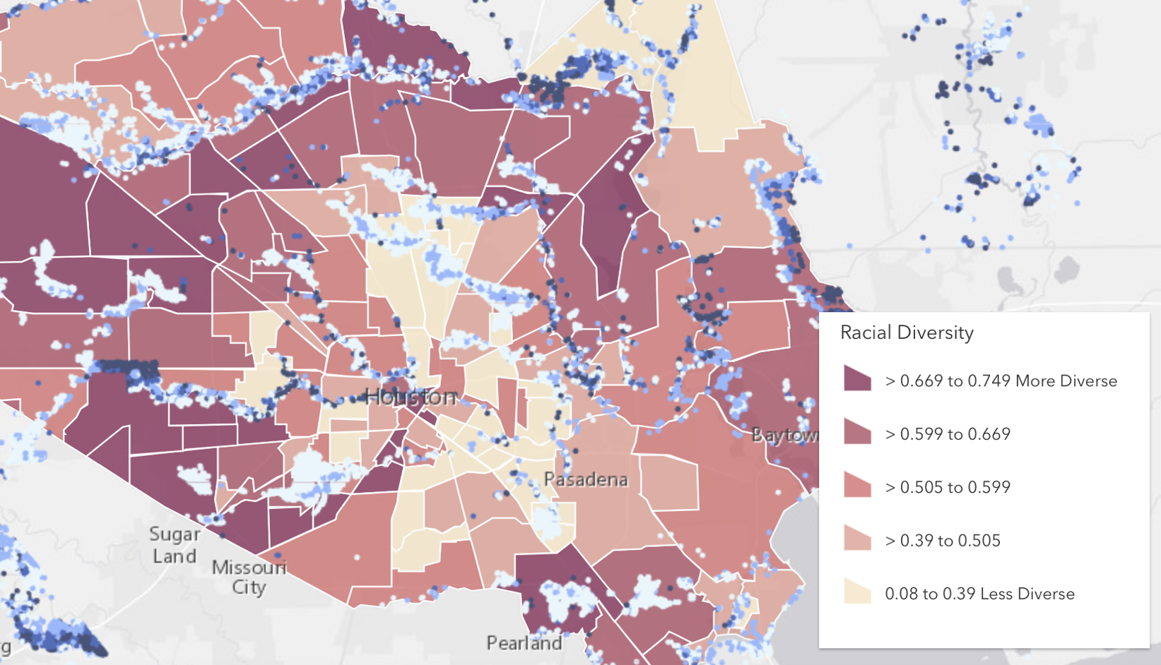
For starters this map shows a wide range of tributaries and rivers that traverse Harris County but lacks labeling. One of the main things you see from the map is the legend in which there is a display of the racial diversity across the different neighborhoods that encompass the county. The darker the shade, the more diverse a neighborhood is, meaning there are more demographics and ethnic groups in these neighborhoods. On the other hand, the lighter the color, the less diverse the neighborhood is, meaning there are populations that are predominantly white. One important purpose of the map is to show the flooding effect across Harris County however the map lacks the labeling of bayous, rivers, and neighborhoods. The range of flooding is not implicitly pictured, thus leading to some confusion at first glance. Fortunately, the map does show the cities within the county such as Houston, Sugarland, Missouri City, Pearland, Pasadena, and Baytown. The labeling of these cities is important because it can help further research and locate the effects of flooding in the county based on a particular city’s diversity index.
The City of Pearland in Pasadena is known for their large Latinx population, while the outskirts of the Sugarland and Missouri City area outside Harris County are known to be predominantly White. The index of a more homogeneous neighborhood, where most of the population is within the same ethnic and demographic group, shows that they were more likely to see less effects of catastrophic flooding than those who were more of a heterogenous neighborhood. The omission of the names of certain neighborhoods across the county, the labeling of the flooding data, and the labeling of rivers, lakes, and streams can highly affect the data and the readers perspective. This can give a completely different view of what the data was meant to show: more diverse neighborhoods had a higher effect of flooding than those of less diversity.
Racial diversity ties in with the infrastructure that is available for that neighborhood. These neighborhoods that are more diverse meaning they encompass minority populations are less likely to receive large amounts of funding from the city and the county. This is the opposite when it comes to neighborhoods that are predominantly white and less diverse who tend to receive the most of the amount of funding from the city’s coffers.
Additionally, one of the main sources of flooding in the city of Houston has to do with street flooding. The county’s infrastructure is built so that highways, roads, and boulevards flood as a safety mechanism to prevent properties from flooding. However, the sewerage system in less diverse and predominantly white neighborhoods are more maintained than those of more diverse minority neighborhoods.
This map created by the Kinder Institute shows that areas with less diversity have a clear advantage to see less flooding than those who live in neighborhoods with a more diverse, minority populations. In line with one of our readings, the effect of silence on a map can be great. Harley emphasizes the power of silence and how the choice in how you display data on a map can change the overall depiction of a map. Leaving out the names of these well-known Houston neighborhoods, flooding data, and names of tributaries just gives a consensus of the diversity of the county and flooding in the map but does not show that the more affluent, less diverse, and predominantly white neighborhoods fared a lot better than those neighborhoods with minority, more diverse and less affluent neighborhoods.
Finally, cartography and what is displayed on a map can have drastic effects on a reader’s perspective. Especially when it comes to the display of data from a devastating storm that question the effects of climate change, increased urbanization, and lack of upgraded infrastructure within a city. This just shows the power that a map can hold over its readers. This map was chosen because it displays a looming crisis in climate change and the inequities of city infrastructure and how the research and data play a major role in the perception of how natural disasters truly effect the people. So yes, this topic hits close to home, literally, but if you’ve seen your fair share of flash flooding events occur in front of your eyes, you would be just as critical of any irregularities.
Works Cited
Chakraborty, Jayajit, et al. “Exploring the Environmental Justice Implications of Hurricane Harvey Flooding in Greater Houston, Texas.” American Journal of Public Health, vol. 109, no. 2, Feb. 2019, pp. 244–250. EBSCOhost, doi:10.2105/AJPH.2018.304846.
Lee, Katherine D., et al. “A Once-in-One-Hundred-Year Event? A Survey Assessing Deviation between Perceived and Actual Understanding of Flood Risk Terminology.” Journal of Environmental Management, vol. 277, Jan. 2021, p. N.PAG. EBSCOhost, doi:10.1016/j.jenvman.2020.111400.
Lieberknecht, Katherine, et al. “Hurricane Harvey: Equal Opportunity Storm or Disparate Disaster?” Local Environment, vol. 26, no. 2, Feb. 2021, pp. 216–238. EBSCOhost, doi:10.1080/13549839.2021.1886063.
Kinder Institute. “Mapping Tool Helps Neighborhoods Better Understand Harvey, Houston.” The tool from the Kinder Institute brings together a wide range of datasets, including recent flood data. Houston, 3 September 2017.
First off I just want to say I really like how you choose a map that you had a personal connection to. I think sometimes there is a fear of attacking our own biases or those directly present in our worlds. You, however, did recognize the problems of Houston while still making your immense pride for the place known. The relationship between social inequities and environmental issues is very interesting and it is also important that we discuss these parallels. This was mentioned in the blog post but I think it is particularly significant to note the diversity measurement. The color coding is an important cartographic choice as the idea of more diverse areas containing more people with darker skin tones and how less diverse areas of our nation are predominantly white is reflected in this “key”. Also, the way this racial diversity chart is placed carefully as a visual central part of the map, but there is no information about the level of flooding is important. Viewers are meant to assume the amount of flooding is correlated to the number of blue dots present while viewers do not need to assume what the different areas shade means. This emphasis on the diversity of the locations over the flooding the map is also supposed to display is significant; it further outlines the racism as there was the belief that this inherently problematic color-coding system needed to be explicitly stated whereas the flooding indicators did not need to be. I appreciate that since you have a background in understanding the geography of the area you could even more adequately discuss the silences of the map. The discussion of not labeling specific well-known areas is really significant as that is a clear cartographic choice that results in a map silence. This then makes me reconsider maps I have looked at in the past as they could have been leaving out important information such as extremely well-known towns or neighborhoods, but I would not have known since my knowledge of the area was reliant on the map.
Angel – I really like your selection of map. The fact that you chose a map that is this important to you and intertwined your own personal experiences into the analysis is super cool and unique to your own post for sure. It’s also super interesting how you highlight the more diverse communities and the correlation between their lack of funding and how significant that lack of funding is when it comes to important infrastructural means. This map, and your critique, definitely make me think a lot about how a better distribution of city/state/national funding in more diverse areas could prevent a lot of the disasters we see in the aftermath of large storms or hurricanes.