
“Redlining” has become more and more of a political buzzword lately, never straying too far from news headlines. But what exactly is it? This history takes us back almost a full century. As part of the New Deal, the Home Owners’ Loan Corporation under the Roosevelt administration began to create guidelines for creditworthiness of properties in major American cities. During the mid-1930s, a host of maps were produced by the HOLC showing neighborhoods in the U.S. labeled with an A, B, C, or D rating, complemented with a color code that ranged from green to red. The grading scale relied heavily on racial composition as a key metric. Specifically, only areas with “0% Negros” were able to qualify for a green A rating. The higher percentage of black people there were in a neighborhood, the lower the rating became. Practically, this meant that the presence of African Americans brought down property values significantly; massive white flight to the suburbs resulted partially from this. As white people settled into the rapidly growing suburbs labeled A and B lined in green and blue, black people were left behind in inner cities labeled C and D lined in yellow and red. With these low ratings, black people were unable to secure government-insured mortgages and became trapped in poor neighborhoods lined in red with no way out. And thus the name: redlining.
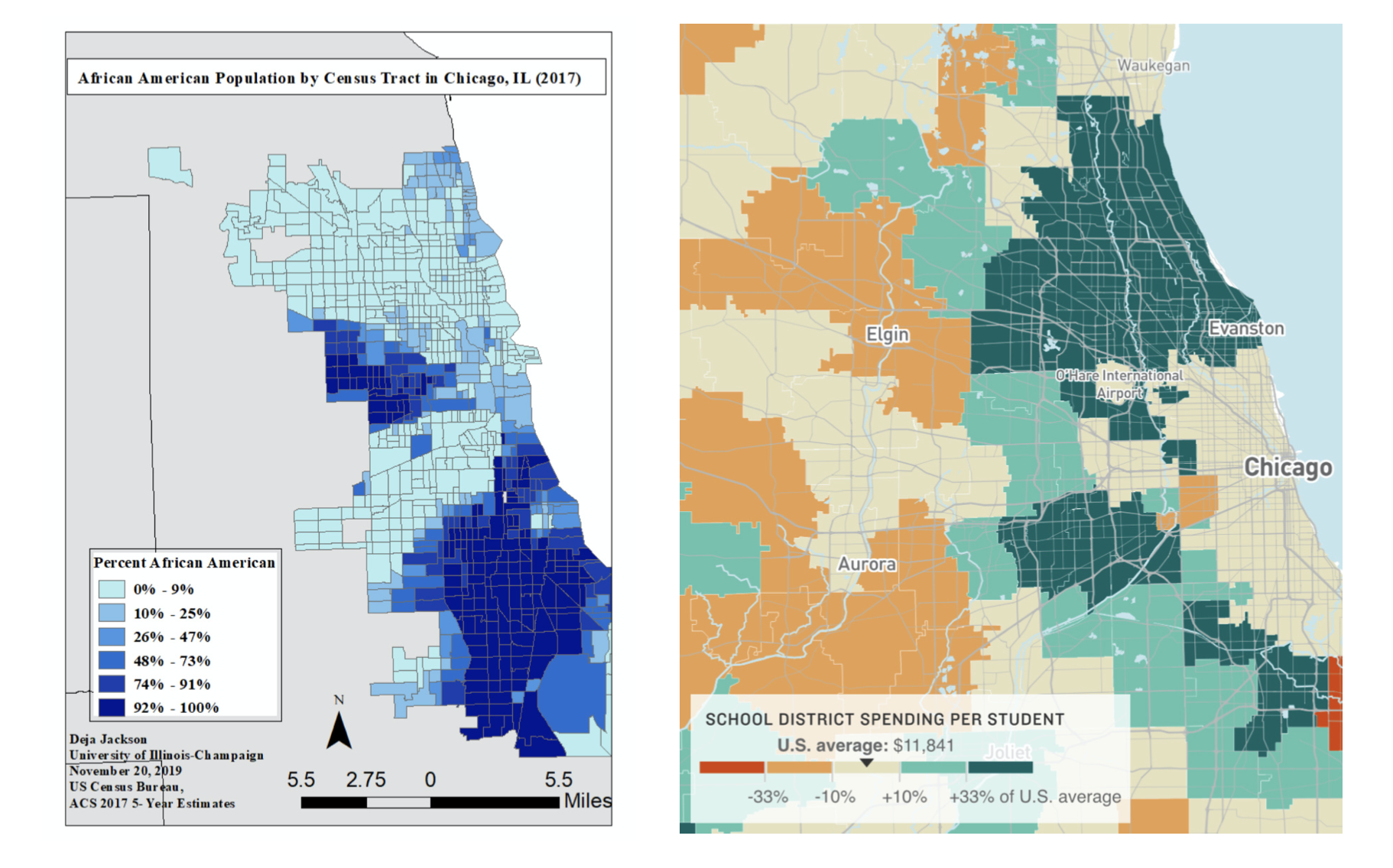
As can be seen on the map on the left, there remains a heavy concentration of African Americans in inner-city Chicago today. That part of the city is generally referred to as simply the “South Side.” This is the part of the city where suburban parents warned their children away from, and where gun violence has rocked the nation. This is also the part of the city with a 93% black population, compared with a 29% total black population in Chicago. Almost a century later, Chicago is still a deeply separated city. The real-life effects of this de facto segregation is still playing out today; nothing is a better testament to this than public education funding in the South Side versus the neighborhoods further up north.
It’s not a coincidence that the South Side has stayed black, nor that it has stayed poor. The map on the right shows the per-student funding of school districts in Chicago as a percentage of the national average. Comparing the two maps, it’s easy to see that the percentage concentration of African Americans has an almost exact indirect correlation with the amount of funding received by school districts in the area. Even though the South Side is on par with the national average in terms of funding, Illinois schools are about $5,000 better funded per-pupil than the national average. Thus, the South Side isn’t quite receiving its due. In fact, schools in the South Side receive an average of $0.73 per-pupil for every $1 that schools in nearby suburbs (with a lot more white students) receive. Illinois has sidelined the South Side because it’s been black and poor, and it’s stayed that way without proper support and investment from the state. Black students from these high-poverty areas with more need from schools are left behind again and again, generation after generation––3 in 4 adults there today live in the same neighborhood they grew up in. As USA Today put it, “racial injustice has been baked into our education system since its genesis.” These two maps laid out side-by-side are a direct confrontation of past wrongs that need to be corrected.
And therein lies the power of maps. These current housing patterns and school districts exist the way they do because of maps drawn by old white men who have long been six feet underground. And yet, its harmful impacts are still felt vividly today. The Home Owners’ Loan Corporation, the government, and the banks in the 30s all asserted their power over housing in Chicago through maps. They made maps that bordered and ordered the lives of the people in the city, doing the work of the state and the white men in power. These maps have shaped, and continue to shape, the lived experiences of countless Chicagoans of every race. Now, school districts are once again determined by and enforced on maps. A map’s inherent power––especially when backed by the state––in holding unparalleled authority over all things spatial makes it a scarily effective tool of control. The instant a school district map is drawn and published, it begins to feel like an unquestionable authority already set in stone. Recognizing that this power came from maps means that we can repurpose the power. At the very least, we can use the two maps above to point out the injustice of Chicago’s funding of public schools. These maps can become tools of education, and they easily present an argument of necessary change. Taking it a step further, activist groups can take the information from these maps and build new ones that house fairer school districts. This kind of counter-mapping as a form of protest can both promote productive dialogue and present real alternatives to current school district divisions. Creditworthiness maps from the 1930s formed the Chicago we know today; a better, more equitable Chicago can be rebuilt with new maps made by the right hands.
Works Cited
Bruce, Baker D., Danielle Farrie, and David Sciarra, “Is School Funding Fair? A National Report Card,” Education Law Center, 7th Edition, February 2018, Accessed 27 September 2021, https://drive.google.com/file/d/1BTAjZuqOs8pEGWW6oUBotb6omVw1hUJI/view.
Coates, Ta-Nehisi, “The Case for Reparations,” The Atlantic, June 2014, https://www.theatlantic.com/magazine/archive/2014/06/the-case-for-reparations/361631/.
Conidi, Anna, et al. “The Segregated Urban Landscape of Chicago,” Story Maps, 12 November 2020, https://storymaps.arcgis.com/stories/913025e92c024d3eb421f7e7c40fea71.
Guastaferro, Lynette, “Why racial inequities in America’s schools are rooted in housing policies of the past,” USA Today, 2 November 2020, https://www.usatoday.com/story/opinion/2020/11/02/how-redlining-still-hurts-black-latino-students-public-schools-column/6083342002/.
“Race and Hispanic Origin,” United States Census Bureau, 1 July 2019, https://www.census.gov/quickfacts/chicagocityillinois.
Reyes, Cecilia, “Same City, Different Opportunities: Study Maps Life Outcomes for Children from Chicago Neighborhoods,” Chicago Tribune, 16 October 2018, https://www.chicagotribune.com/investigations/ct-american-dream-for-chicago-analysis-htmlstory.html.
Turner, Cory, “Why America’s Schools Have a Money Problem,” NPR, 18 April 2016, https://www.npr.org/2016/04/18/474256366/why-americas-schools-have-a-money-problem.
Selena – I really like that you chose a map that is personal to you as you are from Chicago. I think that this gives you a unique experience and ability to analyze this that someone who is less familiar with the area would not have. I really like how you tie the significance of redlining and the harm it has caused into the “power of maps.” I think it is a great critique that all of the constructs we see in our cities and metropolitan areas today come from “old white men who have long been six feet underground.” Redlining is a perfect example of how maps can be used for harm and to reinforce the existing power structures.