
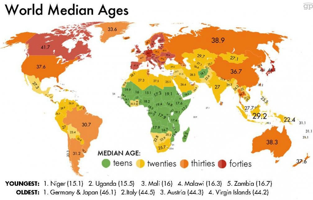
The map that I chose is a map of the world median ages from every major country across the continent. I found that this map is much easier to understand than previous maps my peers have studied this semester and maps that we have discussed as a class throughout the semester. It is much easier to understand because it is very simple and universal to everyone around the world that can read numbers. Another difference I saw is that this map has zero propaganda in it. In previous maps that my peers chose, there was a prevalent amount of propaganda shown through the creation of the map. The map I selected was created to obstruct any bias because the focus of the map was to present the facts on a blue print of the Mercator projection. You are unable to find any bias in this map because you cannot use the median age factor as a bias due to the fact that there was no evidence to back up any claim for a lower median age rate or a higher rate.
The median age maps data was gathered in 2014 by the Central Intelligence Agency and the map was finalized at the end of that year. Some of the data gathered shows that there are 7.5 billion people in the world today and of those, “There are 1.2 billion people between the ages of 15 and 24 in the world today–200 million of whom are in Africa – about 75 million are looking for work” (Guardian). This quote from the Guardian shows that not only are there a majority of young people around the world today, but that there is a huge chunk of them living in Africa. There has to be a reason for the high numbers of young people living in Africa. My hypothesis is that the people in Africa do not have the schooling that other major countries have, which would cause people to have a lower level of education.. This could result in a higher birth rate because they may not be educated on sex education, birth control, and they may not realize the responsibilities that parenting requires. Another quote from the Guardian gives insight on how many people there are in this young age group. “Nearly 300 million people in sub-Saharan Africa are aged between 10 and 24, and that number is expected to climb to about 561 million by the middle of this century. Africa has the highest concentration of young people anywhere on the planet”(Guardian). Some of the other data shows that the world’s youngest country is Niger, with a median age of 15.1, and Uganda comes in at a close second at 15.5. Another reason why these countries have such a lower median age is because their life expectancy is much lower then countries like the U.S, which have a median age that is double of the one for Africa. Africa’s life expectancy is 64, while the U.S is 78 (Statista).
On the flip side, an aging population presents a different set of problems: Japan and Germany are tied for the world’s oldest countries, with median ages of 46.1. This is relevant when you look at the reason for these countries having a median age 30 years older than Africa. The reason that they are much higher is because these countries have a much more stable economy, and a much better education system along with being more developed nations overall. This is very important to note because having a higher median age rate directly correlates to the state of the nations economy and development. The other thing that this demonstrates is that the older median age countries tend to have a much higher life expectancy rate. This shows that they have a much healthier society than the other countries with a lower age.
Just because one country’s median age is higher, doesn’t always mean their economy is better off. For example, the U.S has a median age rate of 37.6 while Russia has a median age rate of 38.9. Even though their ages are pretty similar, there is a huge difference between these two countries. Russia has a GDP of 1.3 trillion while the US has a GDP of 18.6 trillion. This just shows that the US has a much better economy and is a wealthier nation than Russia. As a whole, I think this map taught me a lot through a greater understanding of the meaning behind the varying median age ranges in different countries. This map gave me deeper insight of a new map to look at the country we live in and the countries that surround us.
http://www.africaneconomicoutlook.org/en/in-
depth/youth_employment/http://www.prb.org/Articles/2013/youth-unemployment-africa.aspx
https://www.statista.com/statistics/262884/countries-with-the-highest-fertility-rates/